

MYAIZG 咖啡包装
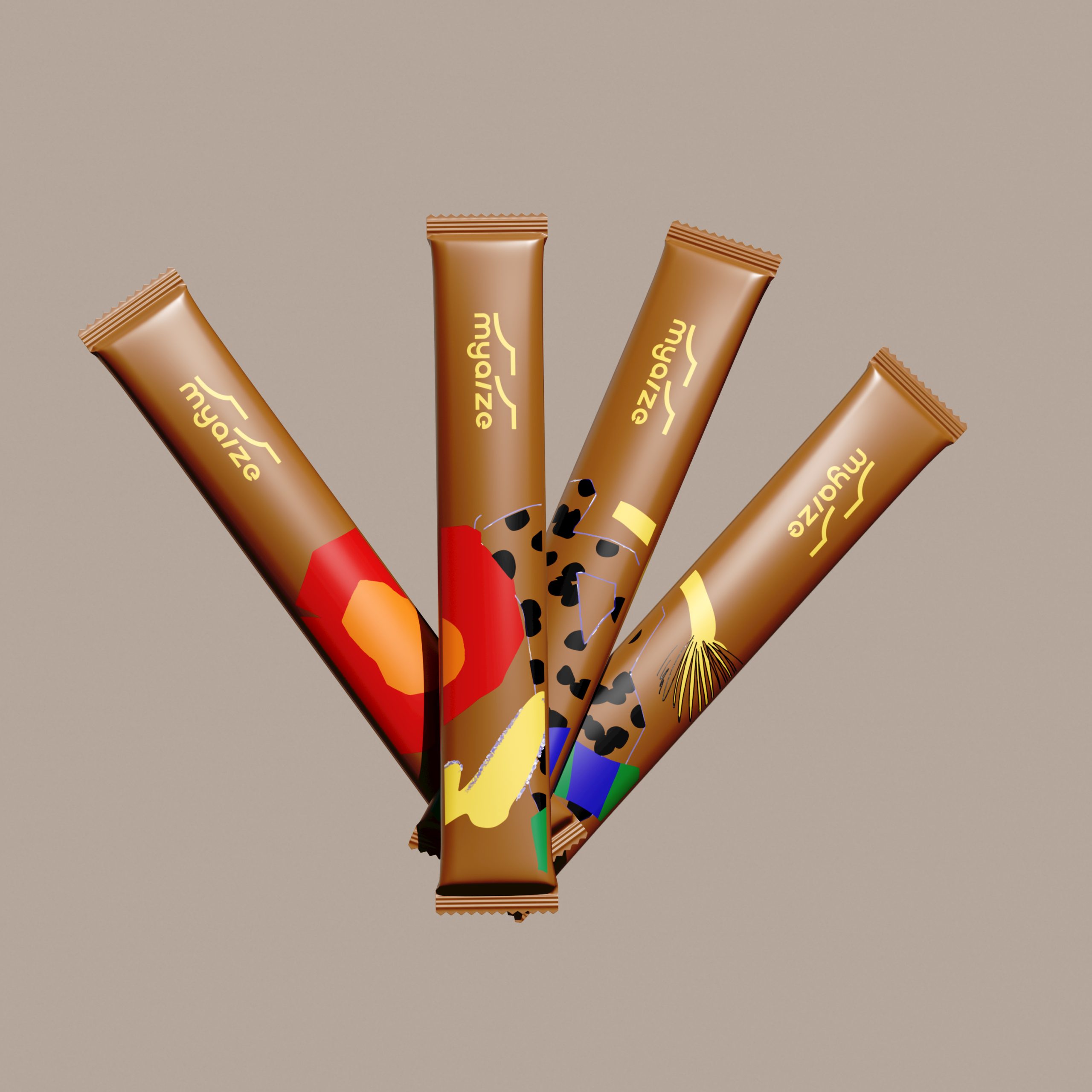
The coffee packaging for its Ethiopian Yega Sheffi Godib series takes an unexpectedly playful route for a specialty coffee brand, ditching the usual craft-paper minimalism in favor of bold, flat illustration work that feels closer to contemporary art print than commodity product. The three-variant set uses a shared structural format while letting color do the heavy lifting across differentiation: a warm terracotta brown, a clean off-white, and a pale mint, each carrying the same explosive collage of abstract shapes, dots, stripes, and organic forms in a palette that reads loud and confident. The brand mark sits quietly at the top, letting the illustration take center stage without competing. It is the kind of system that signals a younger, design-forward coffee culture that wants its shelf presence felt, where the box itself becomes a reason to pick it up.
Curator’s Insight:
What makes this series quietly sophisticated beneath its loud exterior is the structural discipline holding it together. The illustrations change dramatically across the three variants, yet the composition logic stays consistent: shapes bleed toward the same zones, visual weight is balanced in the same way, and the brand mark anchors each box from the same position. The result is a family that feels cohesive in a store set without being repetitive. Myarze is also making a subtle cultural argument here, positioning specialty Ethiopian coffee not through provenance reverence but through pure creative energy, a shift in how origin story gets told on pack.



 Stefano Bracci
 Backbar Studios
 Leyma Design
 AUN BRANDS
 Melo Studio
 Agniya Karelskaya
 monther al omari
 Blend Strategy Company
 宏洛图品牌设计HONGLT
 M.I.L.K.
 madns
madns Oksana
 EvaArias
 Sara Trefz
 Heramb Arora
 Carreto Concepts Design Studio
 Modern Theory
 DESIGN CONCEPTS
 Andrea Del Prete
 Le Studio G
 Julia M.
 eliza
eliza B&WGraphicLab