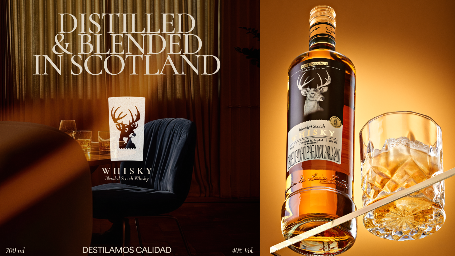

Kind Selection, a whisky importer, needed a label that authentically honored its Scottish roots while firmly establishing the product in the luxury segment. The challenge lay in capturing the essence of Scotland’s midlands—its misty hills, lush forests, and majestic reindeer—without falling back on tired industry clichés.
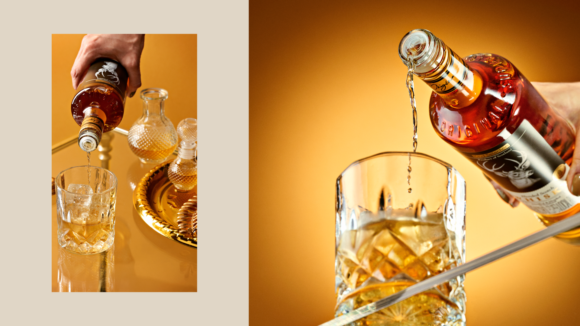
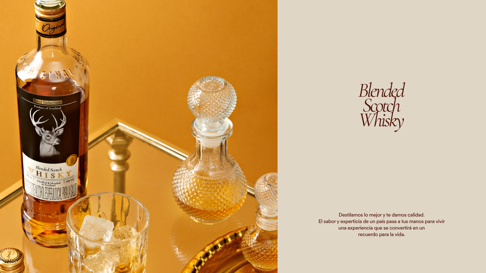
To achieve this, the new packaging system balances deep-rooted heritage with a sophisticated, contemporary aesthetic. The design translates the atmospheric Scottish landscape into elegant visual cues, leveraging classic typography alongside a highly refined composition. By elevating these cultural markers, the packaging ensures the region’s identity is unmistakable on the shelf, delivering a look that is both fresh and timeless.
The label now serves as a powerful strategic asset. It transforms into a compelling brand narrative that invites consumers to experience exquisite craftsmanship, successfully driving the product’s premium appeal.
View this post on Instagram


 United Creatives Studio
 Kingdom & Sparrow
 Anastasia Bakhmatskaya
 CreativeWise
 Great and Golden
 Ximena Ureta Design Studio.
 Sorted Branding
 Lisa Sirbaugh Creative
 vitoramockup
 YQIAN
YQIAN Navegante
 Anastasia Cherepanova | xtramez
 Polaris Designs
 pavlyai
 Milena Kocharyan
 monther al omari
 Mohamed sherif midoo
 DESIGN CONCEPTS
 mmdesign
 markcreativestudio
 Rosario Lo Iacono