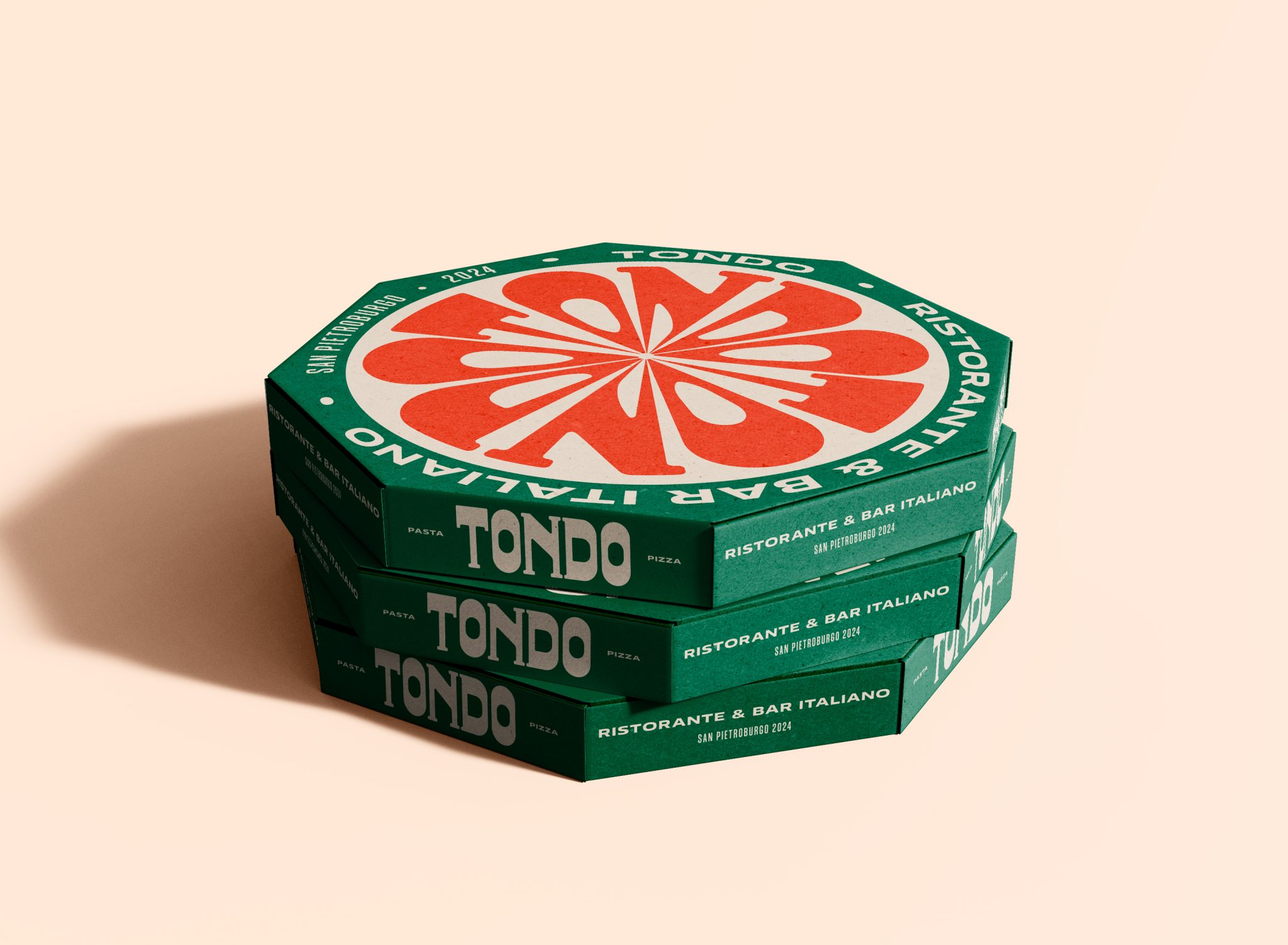

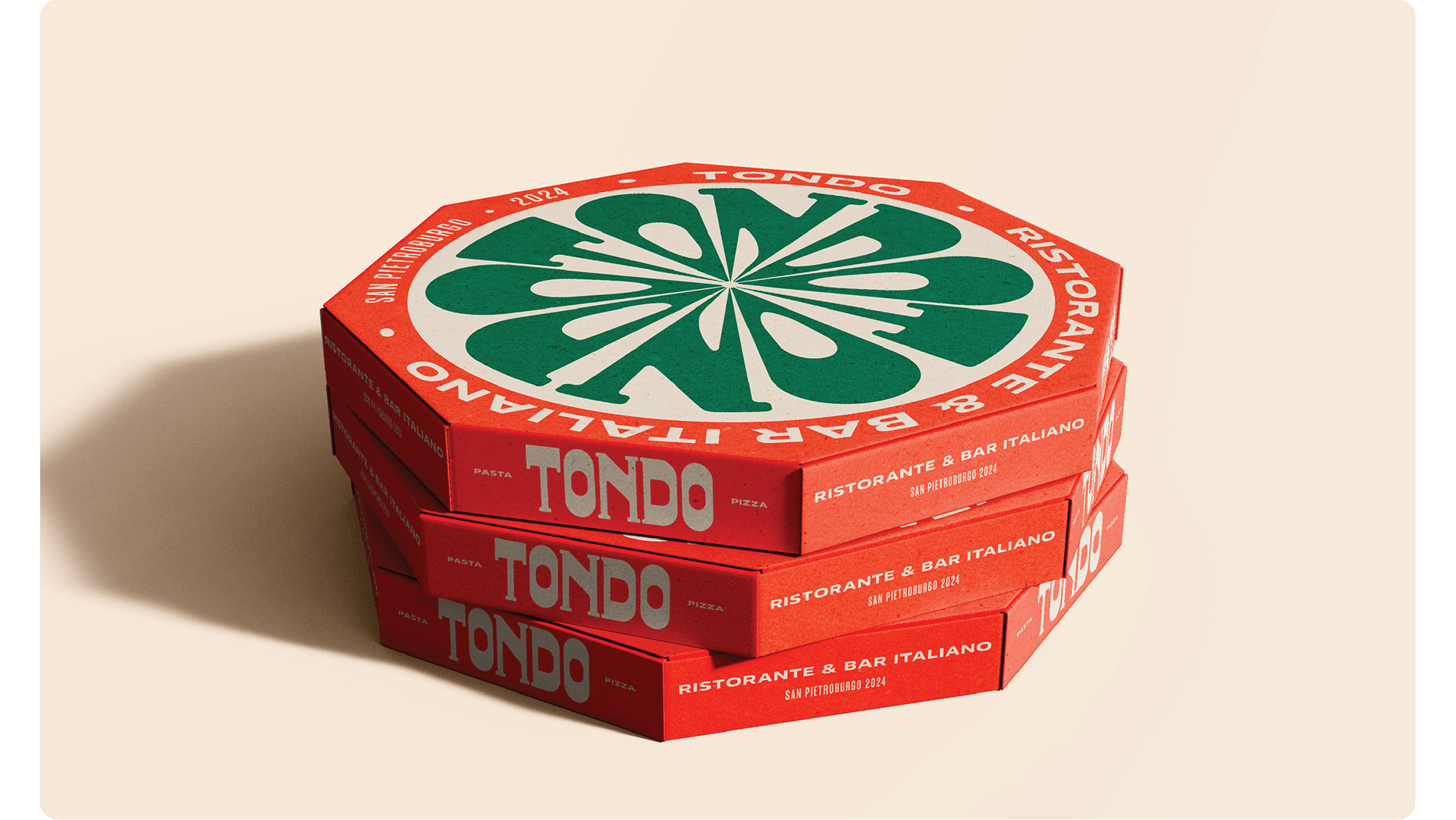
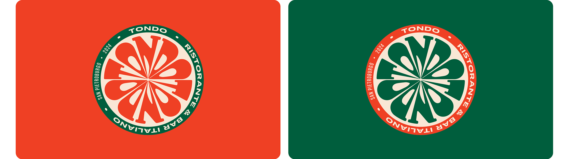
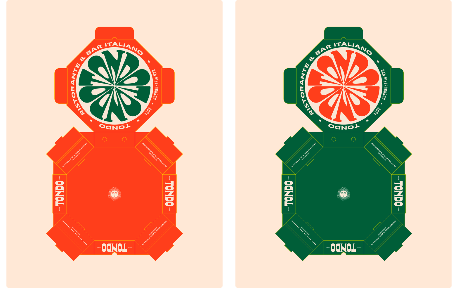
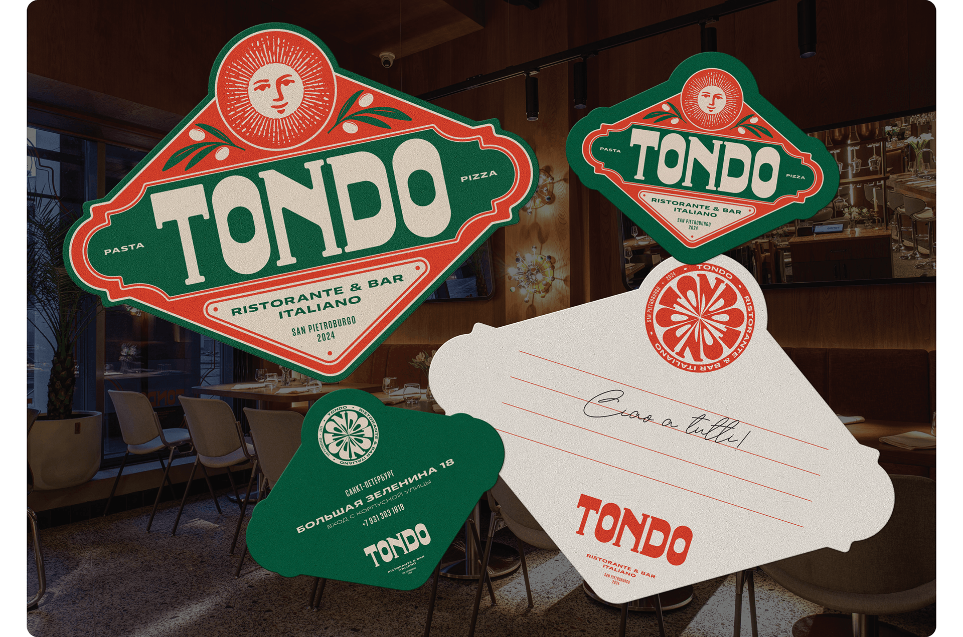
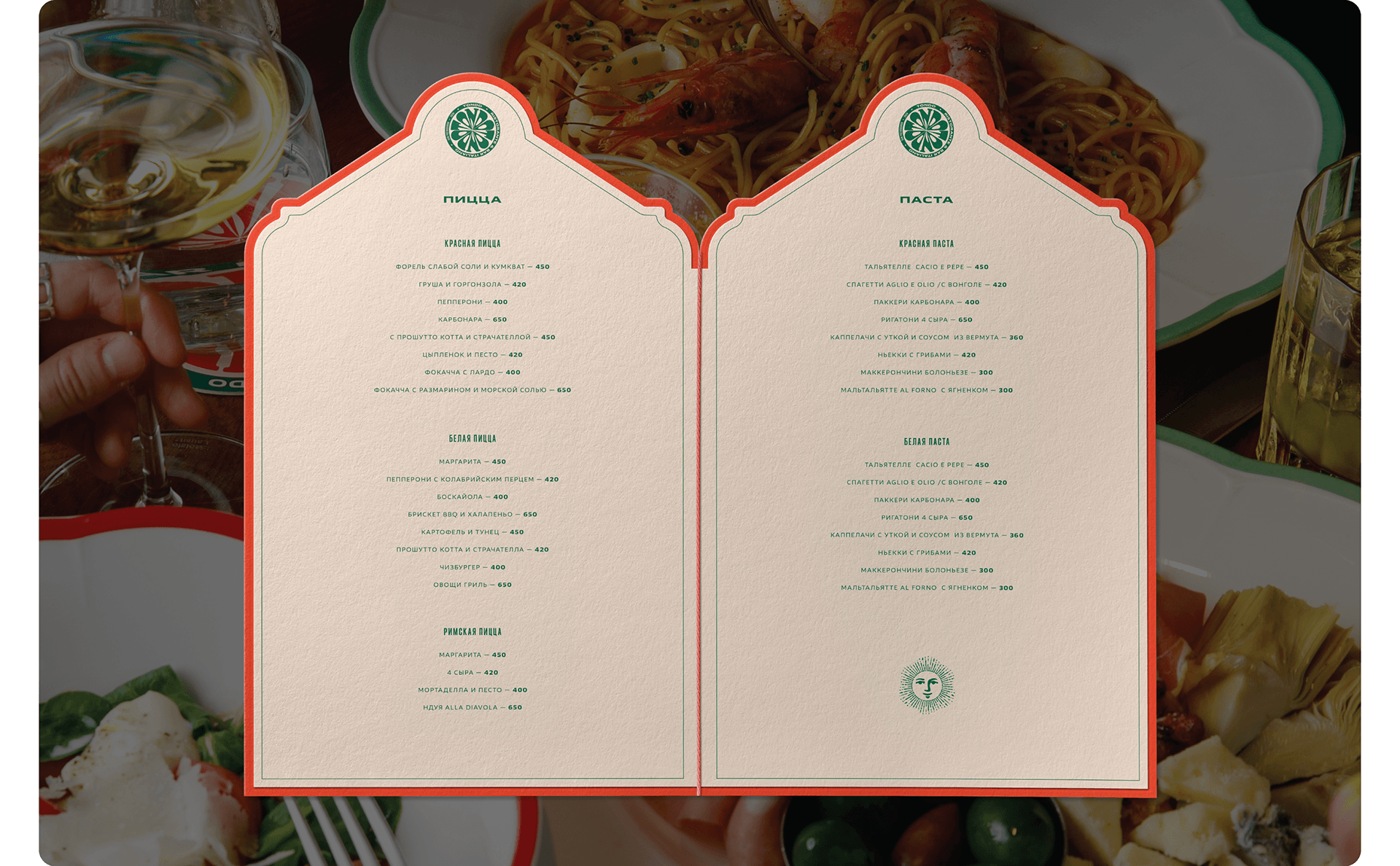
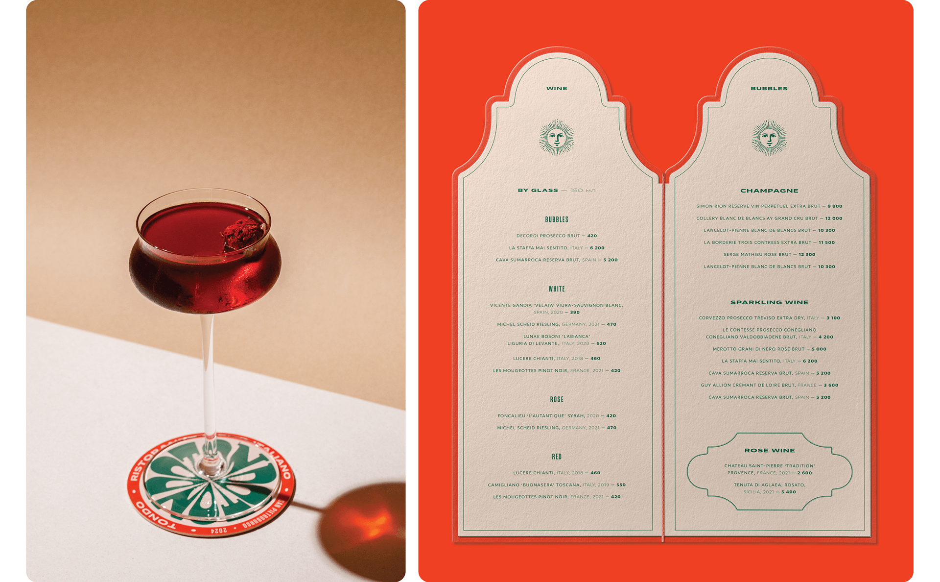
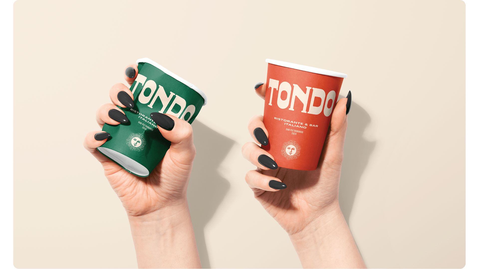
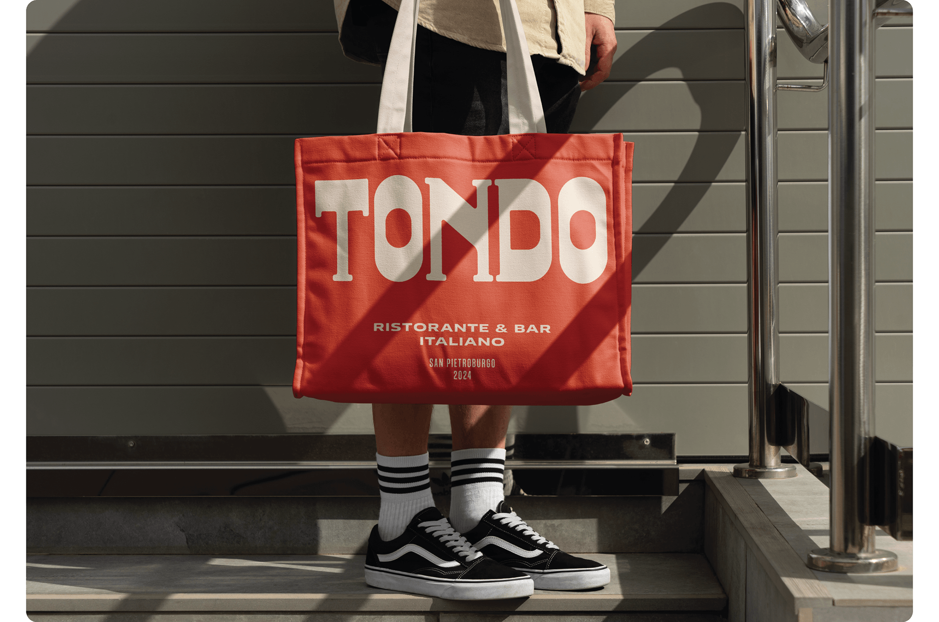
Tondo is a contemporary Italian restaurant and bar inspired by the aesthetics of 1960s–70s Italy. The identity unfolds through a tactile packaging system, where every object — from take-away boxes to branded materials — contributes to a cohesive restaurant experience. The logotype is built on bold, custom-drawn letterforms referencing Italian signage from the mid-20th century. The name “Tondo” — Italian for “round” — becomes both a verbal and visual foundation of the brand. The visual language is based on symmetrical composition, geometric rhythm, and typographic contrast. A signature sun symbol sits at the center of the system, reinforcing the nostalgic yet confident tone of the identity and evoking vintage Italian packaging, signage, and architectural references from the 1960s–70s. The packaging system uses rich shades of red, green, and beige, directly connected to the interior and culinary themes of the restaurant: pasta, pizza, tomatoes, herbs, warmth, and hospitality. Across boxes, bags, napkins, menus, uniforms, and spatial details, the identity combines adaptive logo compositions, bilingual typography, die-cut forms, debossing, and tactile finishes to create a cohesive material language. The result is a packaging and identity system that translates the atmosphere of Tondo into physical objects and reflects the restaurant’s positioning as a modern interpretation of classic Italian hospitality.
Curator’s Insight:
The octagonal box format does more work than it might first appear. It’s not purely decorative; the shape rhymes with the circular sun mark on the lid, creating a structural echo between the container and the graphic sitting on top of it. Most pizza box design treats the lid as a billboard and the form as a given. Here the two are in dialogue, which is a more considered approach than the brief lets on.
There’s also something worth noting about the stacking shot. Seeing three boxes in a column makes the side panel typography readable as a repeating sequence, and the name “TONDO” at three different scales across the stack inadvertently becomes a typographic composition in its own right. Whether intentional or not, it demonstrates how well-resolved modular packaging rewards the kind of casual, in-context display that restaurant environments actually produce.



 Studio Zak
 Ander Sanchez
 Atipus
 Widarto Impact
 hovski
 Ohmybrand
 CreativeWise
 Rauf Karaev
 Hooperstudio
 La Nube de Ideas
 Modern Theory
 Akim Melnik Design Studio
 preflightcreative
 Seyf El Haq Menouer
 Badraddine Attik
 Samriddhi Ravi
 Alessandro Ammaturo
 Amblr Studio
 vladlenalevit
 Sis Tsarukyan
 monther al omari
 alchimistestudioParis
 designsbysukaina
 About House of Ta
 Amjad Battal