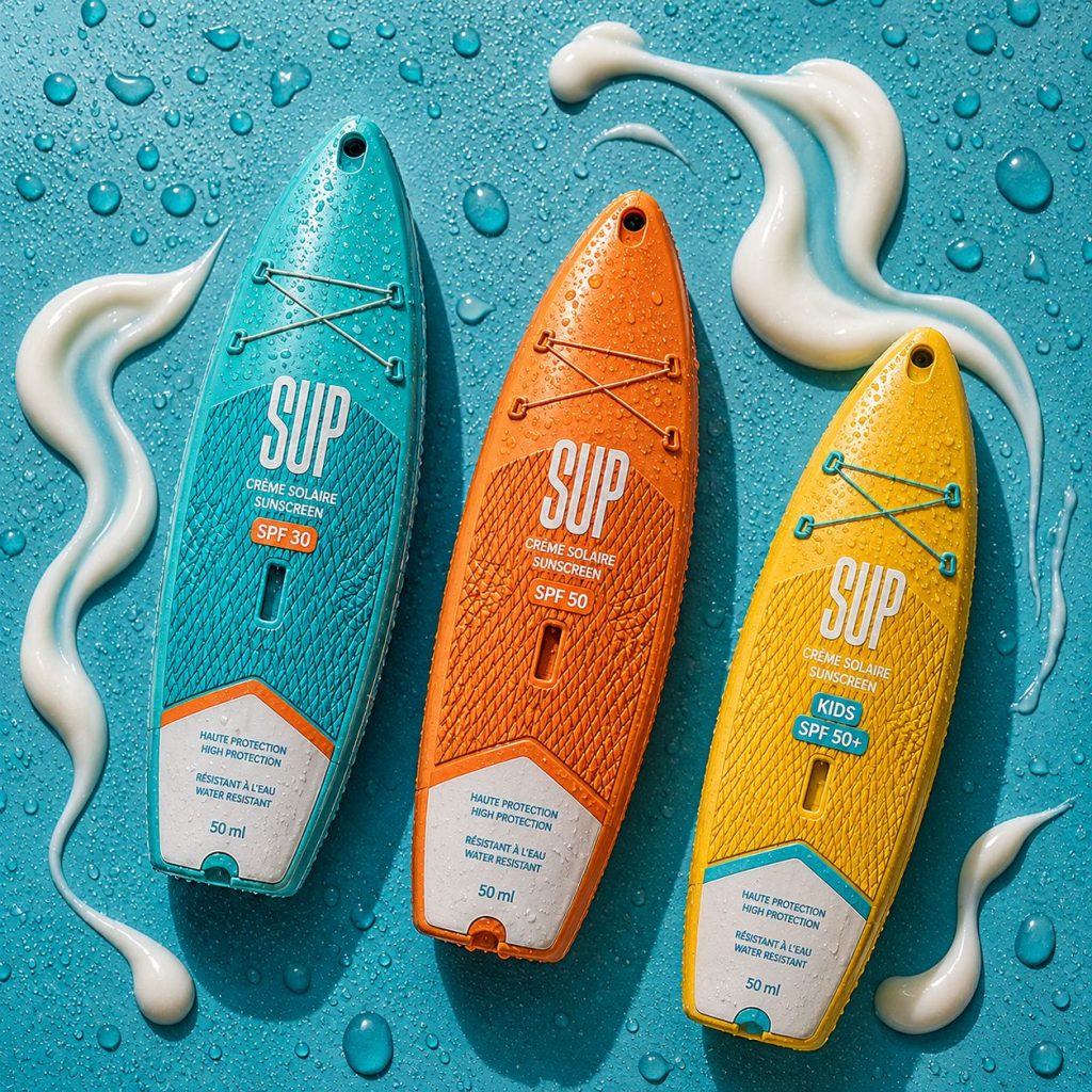

SUP — Sunscreen Driven by Motion
SUP, short for Stand Up Paddle, is a sunscreen brand inspired by one of the most iconic symbols of summer freedom and outdoor adventure: the paddle board.
The project was born from a simple observation: consumers do not experience sunscreen as a cosmetic product alone. They associate it with movement, travel, water sports, sunshine, and memorable moments by the sea. Through our Data-to-Motion™ approach, we analyzed the visual and emotional codes surrounding beach culture and discovered that motion itself could become the foundation of the brand identity.
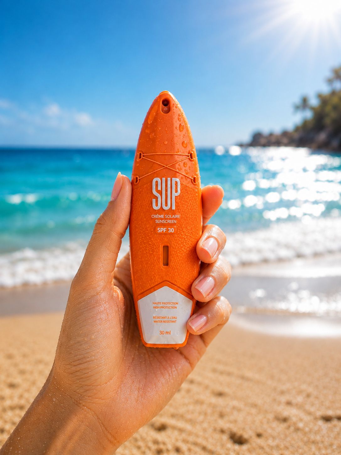
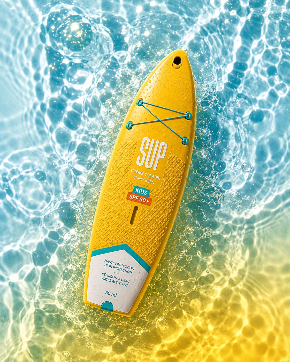
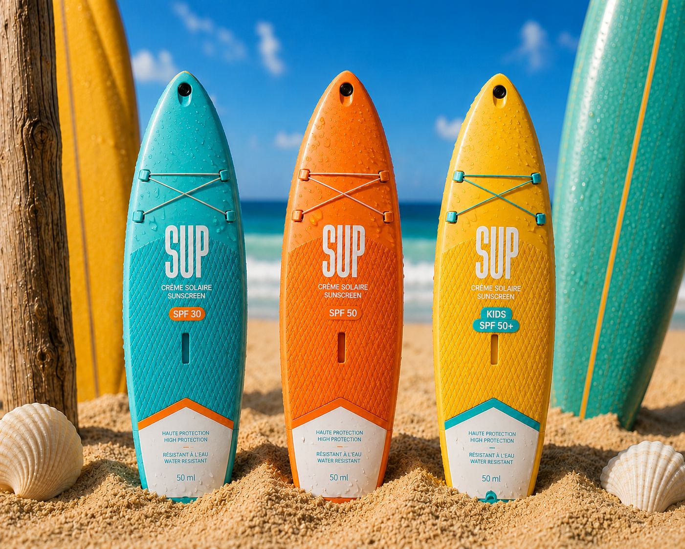
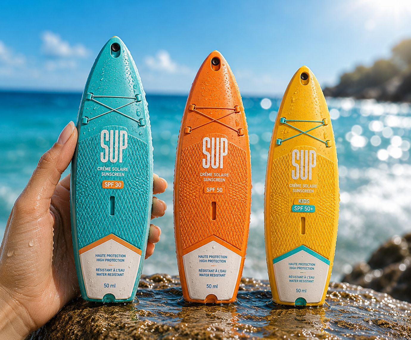
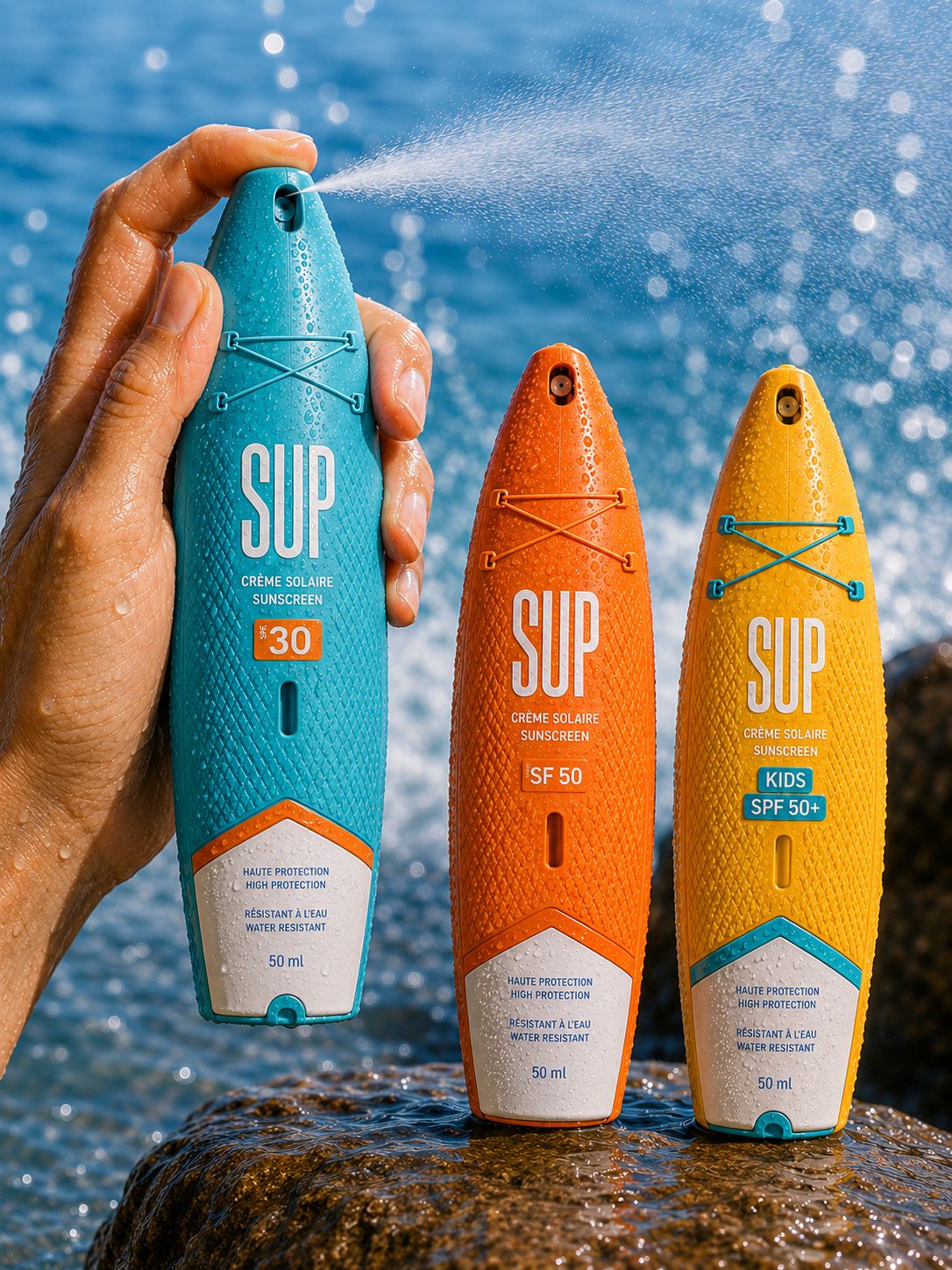
Instead of designing a conventional sunscreen bottle, we transformed the packaging into a miniature paddle board. Every element contributes to this narrative. The elongated silhouette mirrors the proportions of a real SUP board, the textured surfaces evoke anti-slip deck pads, and the elastic cord system references authentic paddle-board equipment. The result is a package that instantly communicates its universe before a single word is read.
The color architecture was carefully developed to create clear product differentiation while maintaining a cohesive brand system. Inspired by the vibrant palette of coastal environments, each variant reflects a distinct moment of the summer experience while remaining unmistakably part of the same family.
More than a packaging design, SUP demonstrates how strategic insights can be translated into physical form. By transforming data into motion and motion into design, the product becomes an experience, a memory trigger, and a lifestyle statement.
SUP proves that packaging can do more than contain a product—it can embody the very emotion consumers are seeking: the feeling of being out on the water, under the sun, moving freely toward the horizon.
 MID-AIR STUDIO
 Heramb Arora
 monther al omari
 Tríona O'Donoghue • Design
 Cocoon Prague
 hugo zapata
 Bonsanco Creative Studio
 parawaradesign
 UPRISE
 Brand Society
 Que Cálido Studio®
 Richest Branding Pvt. Ltd.
 STRATEDGY
 Shapers Studio
 Platon Ivantsov
 WPA Pinfold
 giselepereiradesign
 ShalaSketches
 05Creation
 Voit Studio
 SSTO
SSTO Abox Agency