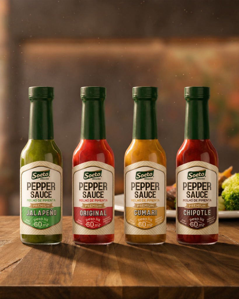

The new Soeto hot sauce line was developed to stand out in a highly competitive category where products often share similar visual languages and compete for consumer attention within seconds. The challenge was to create a packaging system capable of elevating the perceived value of the product while ensuring strong shelf presence and easy flavor identification.
The design strategy focused on balancing tradition and sophistication. Inspired by classic food packaging, the visual identity incorporates a striped background texture that introduces a subtle retro aesthetic, reinforcing the brand’s heritage while creating a distinctive appearance within the category. This graphic element became a key asset in building recognition across the entire product range.
A clear information hierarchy was established to prioritize product visibility and facilitate decision-making. The product name takes center stage, while a dedicated flag-shaped element highlights the “Premium” designation, strengthening the perception of quality and positioning the line above conventional competitors. Carefully selected typography contributes to this positioning by conveying elegance, confidence, and authenticity.
Color plays an important role in the system. Each flavor is identified through a distinctive color palette, allowing consumers to quickly differentiate products while maintaining a cohesive family appearance. This balance between consistency and variation creates a strong visual block at the point of sale, improving recognition and shelf impact.
The packaging structure itself also influenced the creative process. The unique bottle shape and label die-cut were used as guiding elements throughout the development of the visual identity, ensuring harmony between form and graphics. Metallic finishing details further enhance the premium character of the line, adding refinement and visual depth to the final result.
Beyond the individual products, the project was expanded into a gift box designed for the complete hot sauce collection. Following the same visual language and design principles, the packaging system creates a unified brand experience across all touchpoints, strengthening recognition and increasing perceived value.
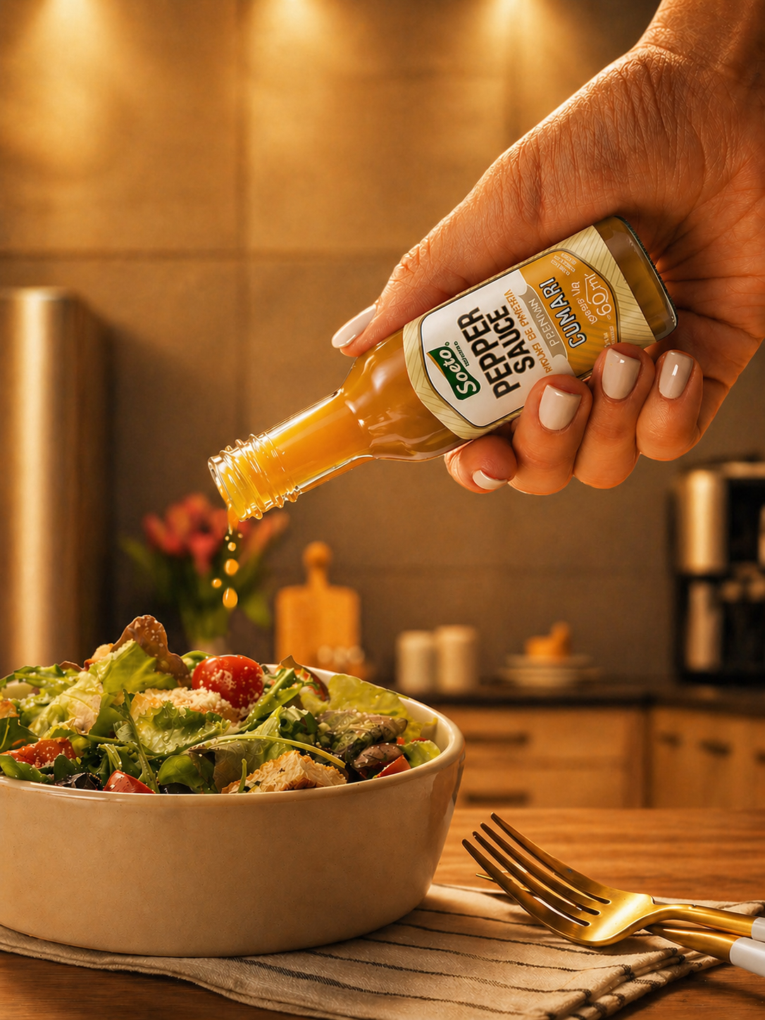
The result is a cohesive packaging family that transforms a traditional condiment into a premium visual experience. Through strategic use of typography, color, materials, and structural integration, the new Soeto line communicates quality, flavor, and confidence before the first drop is tasted.


 Derrick Lin
 43oz
43oz vitoramockup
 Oksana
 KOS
KOS Hui Hua
 Rana Elkady
 Modern Theory
 Eclectic M
 Katya Slobodskaia
 Evgenia Beresneva
 CreativeWise
 宏洛图品牌设计HONGLT
 erandy
 Abbas Sayyed
 Ollie
Ollie Moço Wine Branding
 khadijaaljifri
 Abdulrahman Taha
 Juana Sarabia
 Mohammed Nasr Sharfi