Cocosul is a Brazilian company with a long history of producing high-quality grated coconut, traditionally supplying industrial clients and professional bakeries. As the brand prepared to enter the retail market and reach everyday consumers, it needed a packaging redesign that would translate its legacy and quality into a format suited for supermarket shelves.
The challenge was to create packaging that communicates product quality and builds trust while standing out in a competitive category. The solution involved designing a fresh visual identity for the grated coconut line, with clear segmentation between product variants and strong visual impact.
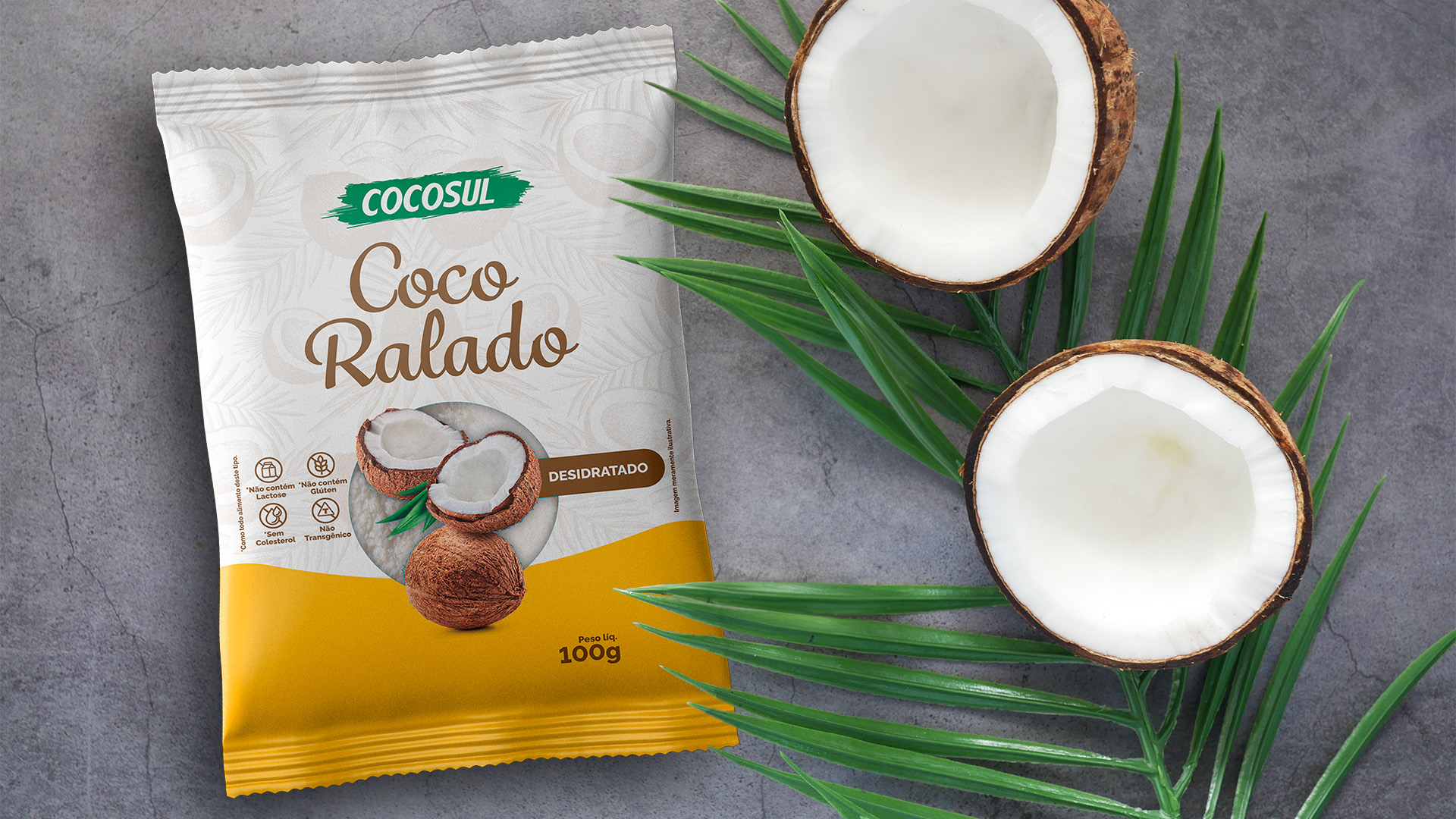
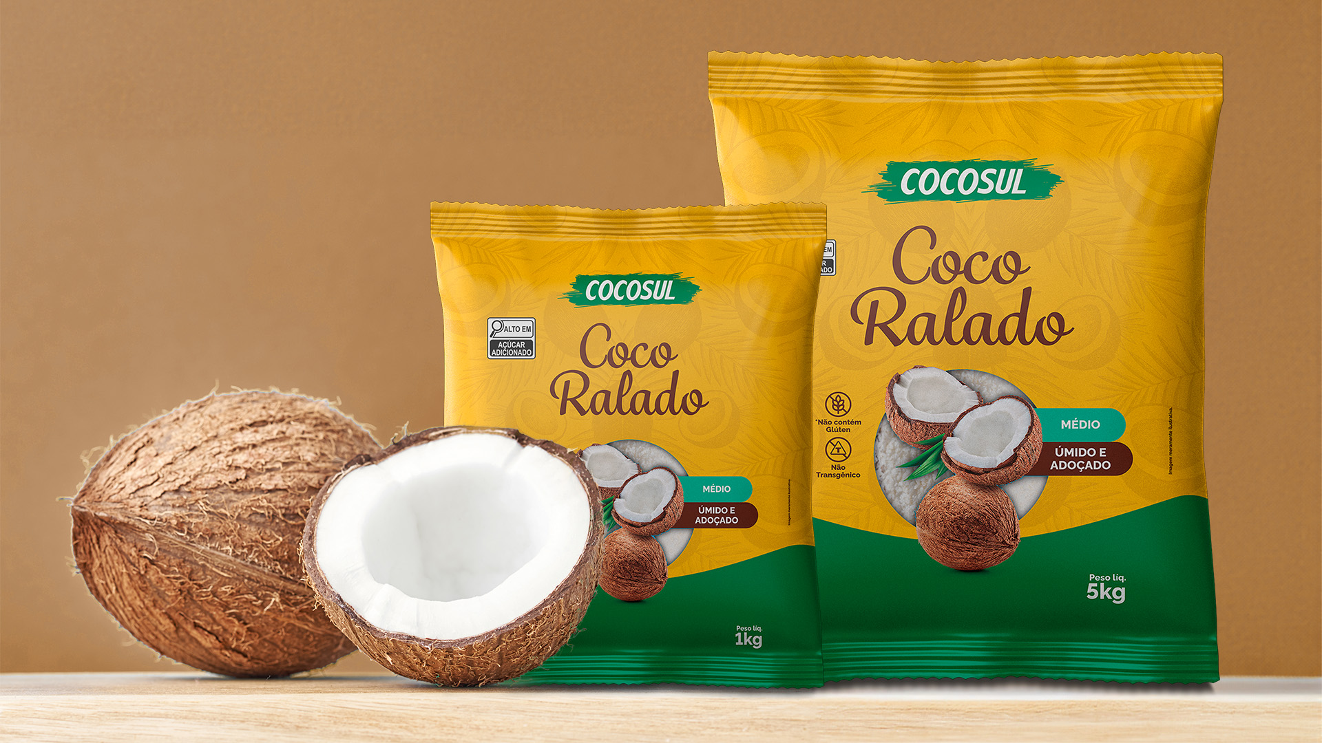
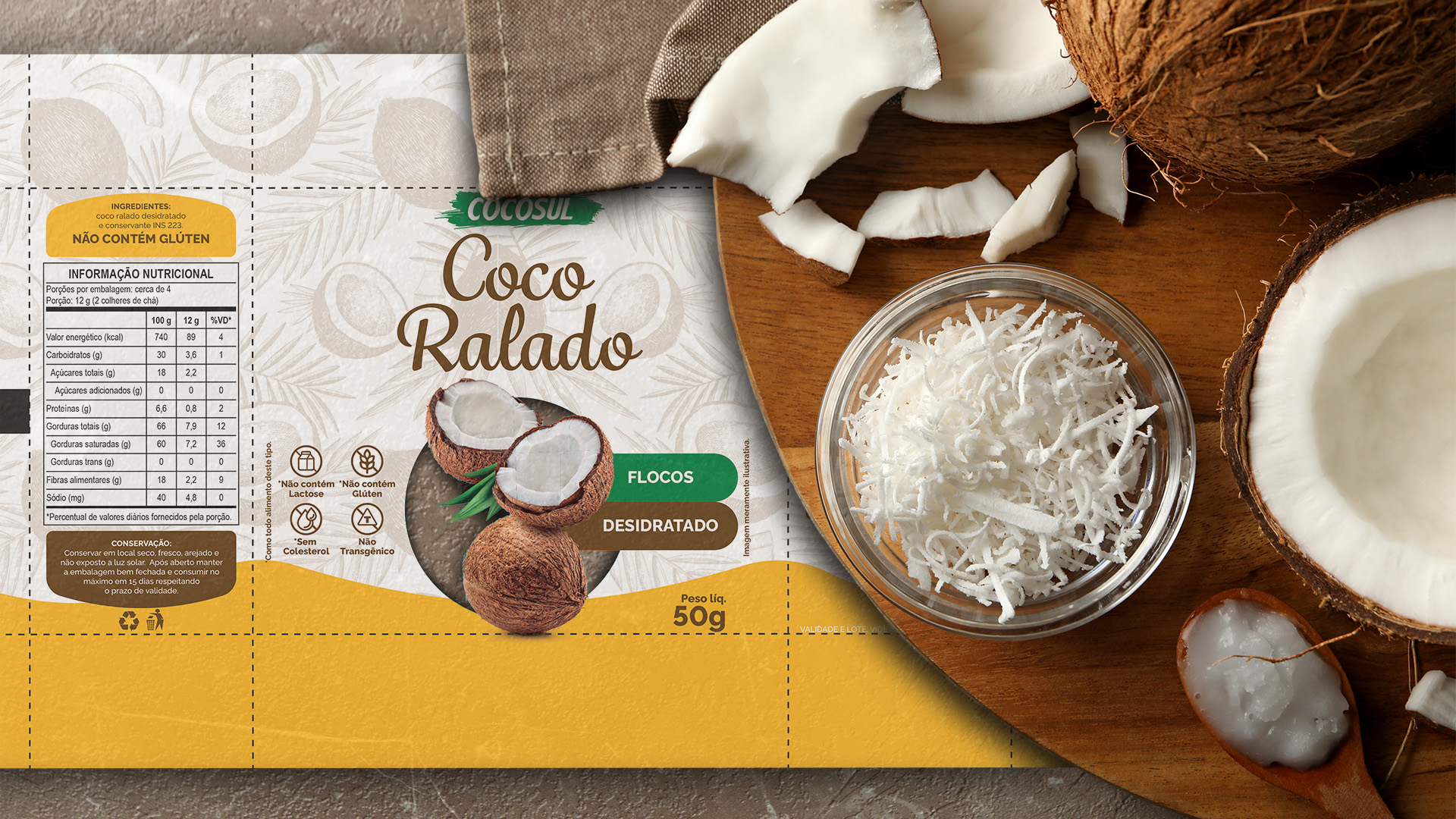
Research into both domestic competitors and international benchmarks revealed key visual cues in the category — particularly the use of color and natural imagery. These insights guided the visual strategy: warm tones and green for the “moist and sweetened” variant, and a cleaner, lighter look for the “dehydrated” version. Both designs feature detailed coconut illustrations that support product recognition and help establish a sense of freshness and natural origin.
The packaging also emphasizes Cocosul’s unique positioning: based in the south of Brazil (Londrina/PR), but sourcing directly from its own coconut plantations in the north, ensuring control and quality across the entire supply chain.
The result is a packaging system that effectively introduces the brand to a new audience, conveying reliability, freshness, and tradition through carefully crafted visuals — a confident step forward as Cocosul expands its presence in Brazilian retail.