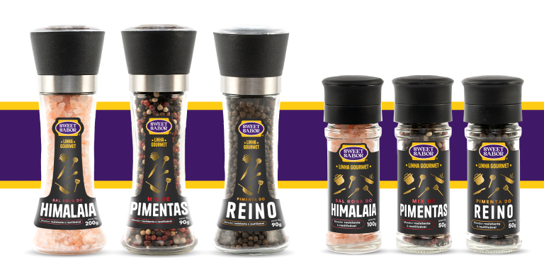
Sweet Sabor presented us with the challenge of creating packaging for their premium line of seasonings. Seeking to align the product quality with the packaging visuals, the choice of colors played a fundamental role. Black, predominant in the layout, was selected for its association with elegance, modernity, and minimalism, creating a solid and refined base.
To complement black, colors with a metallic finish were used, such as gold, silver, and copper, adding a touch of luxury and distinction to the design. This contrast between black and metallic tones offers a visually striking balance, attracting a target audience of demanding consumers. The use of these elements suggests not only the premium value of the products but also the exquisite taste experience they provide, aligning perfectly with the gourmet universe.
In addition to the aesthetic appeal, the packaging design was conceived to stand out on the shelves, combining style and functionality. The materials and finishes were carefully chosen to ensure that the visual identity conveyed a clear message of superior quality, while protecting the contents and ensuring practicality for the end consumer.


