

no° | Ice Cream Packaging Turns Flavor Ratios into a Visual Identity
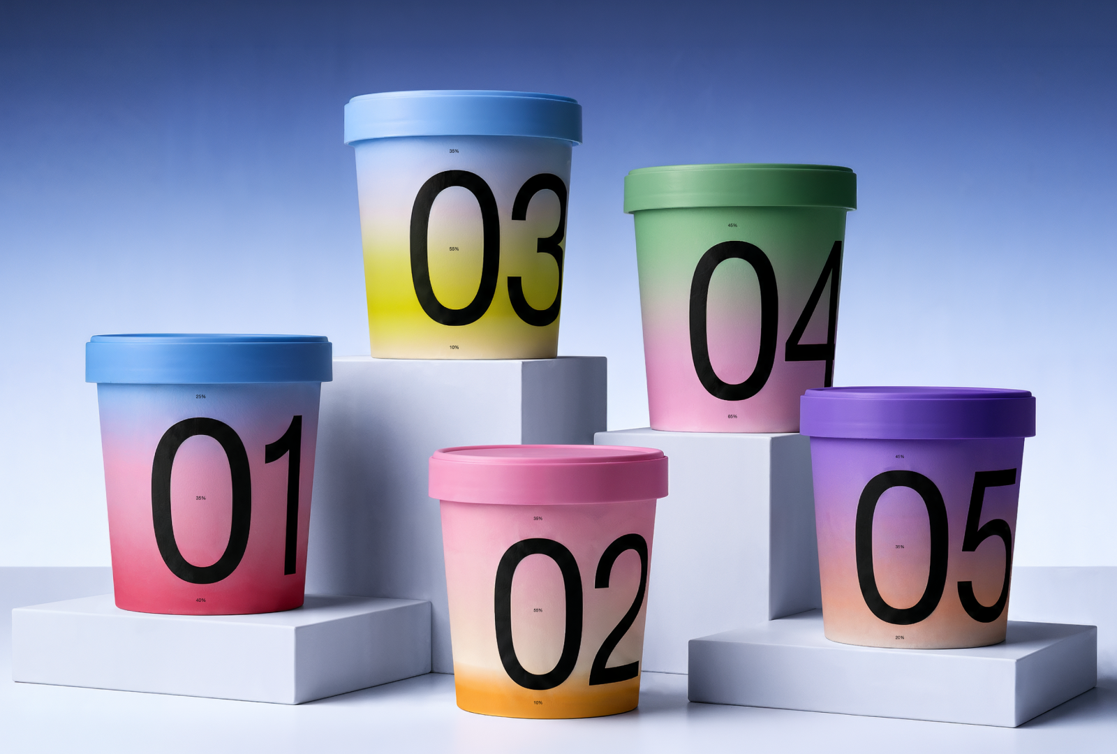
Designed as a composition, NO. transforms layered ice cream into a visual identity where the product itself becomes the main design language. Instead of relying on illustrations or decorative graphics, the packaging visualizes the actual structure of the ice cream, turning flavor composition into a clear and memorable system.
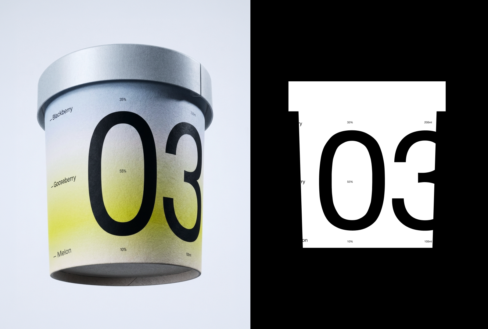
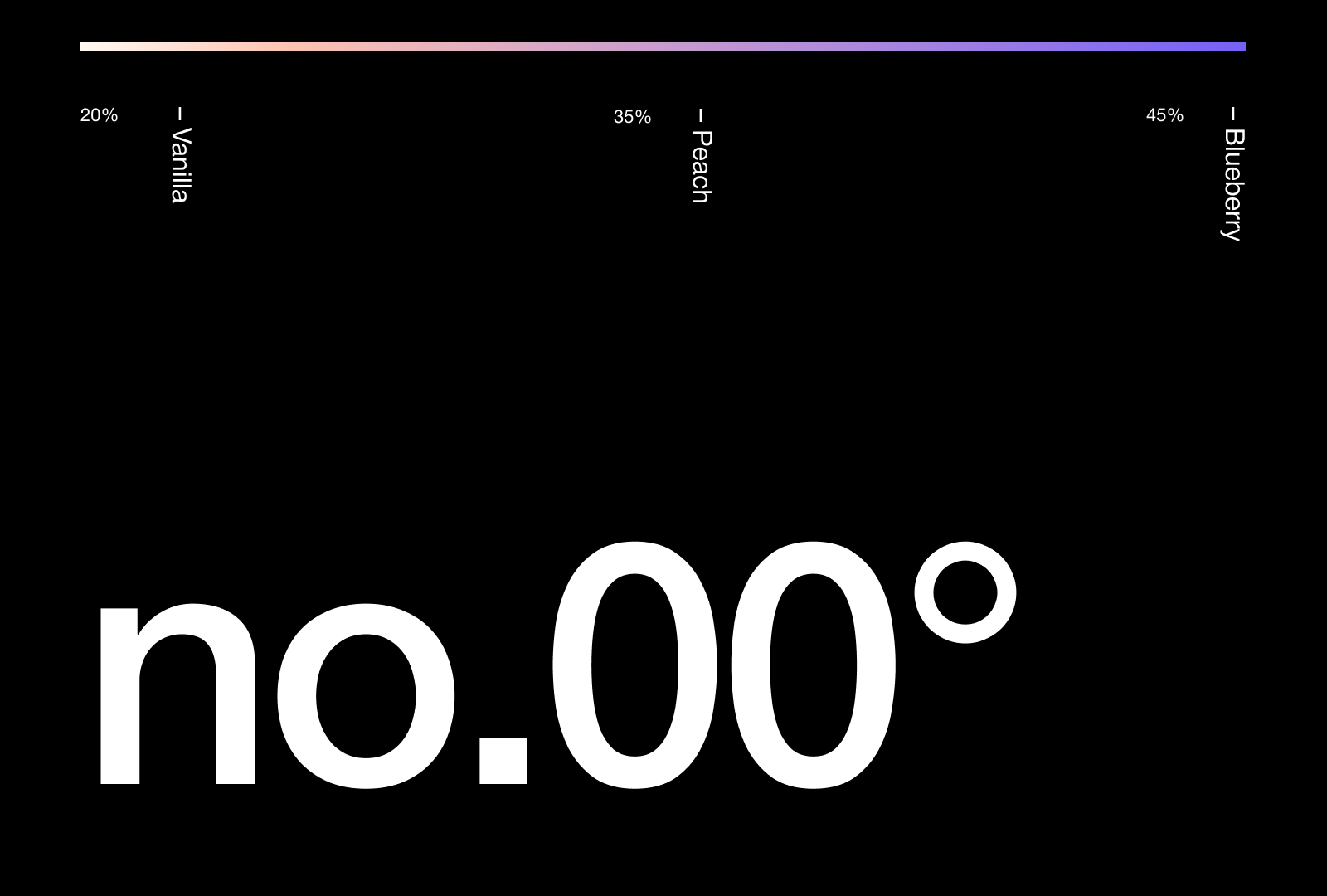
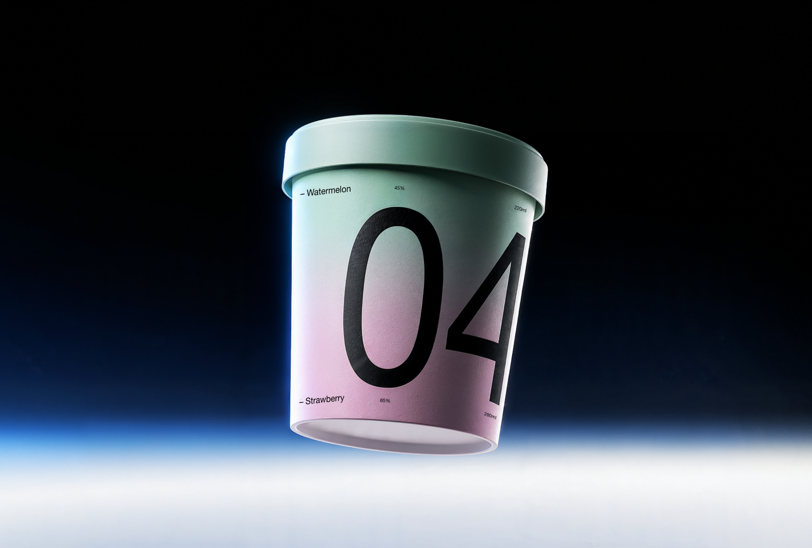
Each gradient band represents one real ingredient, while the printed percentages reveal its exact proportion inside every bucket. The result is a package that communicates the product honestly and directly, allowing consumers to understand the flavor blend before opening it. Every visual decision is based on the recipe itself, making the packaging an extension of the product rather than an additional layer placed on top of it.
The design system is intentionally minimal. By reducing visual noise, the colorful gradients become the primary identifier across the entire product range. Different flavor combinations naturally generate different compositions, creating a flexible identity that can easily expand without losing consistency.
Layer System
Every gradient corresponds to a single flavor. Together, the layers build a visual representation of the ice cream, allowing each ingredient to remain visible while contributing to the complete composition.
Flavor Ratio
The percentages communicate the exact balance between ingredients. Instead of simply listing flavors, the package explains how they interact, giving customers a more transparent understanding of every recipe.
Every flavor has its place.
By translating product composition into a visual language, NO. demonstrates how packaging can become both an information system and a memorable brand identity. The design removes unnecessary elements and lets the product speak through color, proportion and structure, creating a packaging experience that is as honest as the ice cream itself.





 Eclectic M
 Katya Slobodskaia
 Евгения Береснева
 CreativeWise
 宏洛图品牌设计HONGLT
 erandy
 Abbas Sayyed
 Ollie
Ollie Moço Wine Branding
 khadijaaljifri
 Abdulrahman Taha
 Juana Sarabia
 Modern Theory
 Mohammed Nasr Sharfi
 Oksana
 Minim Brand Design
 Asmaa Mohamed
 Aidearte
 Navy Creative
 GIRAFA STUDIO
 Tia Nguyen
 Logoclub99