

Jaguar de Oro: A Bottle Born from Myth
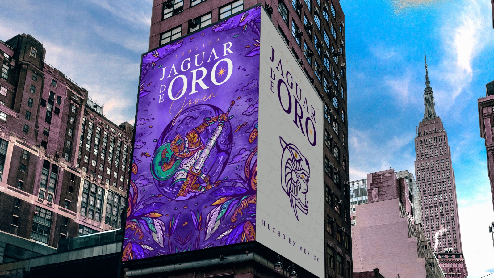
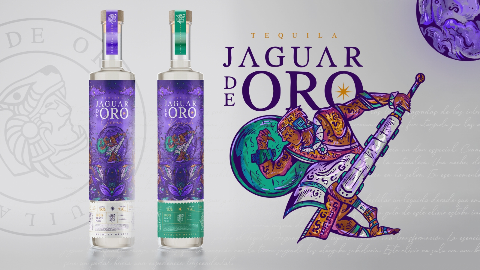
Jaguar de Oro enters a category saturated with agave imagery, Jalisco landscapes, and traditional references, yet chooses a different starting point: Mesoamerican mythology. The opportunity was to build a recognizable territory before the consumer even reached the liquid. A jaguar warrior, a ceremonial knife, and the idea of an elixir born from piercing the heart of a blue agave establish a distinctive narrative charged with strength, wisdom, and spiritual depth.
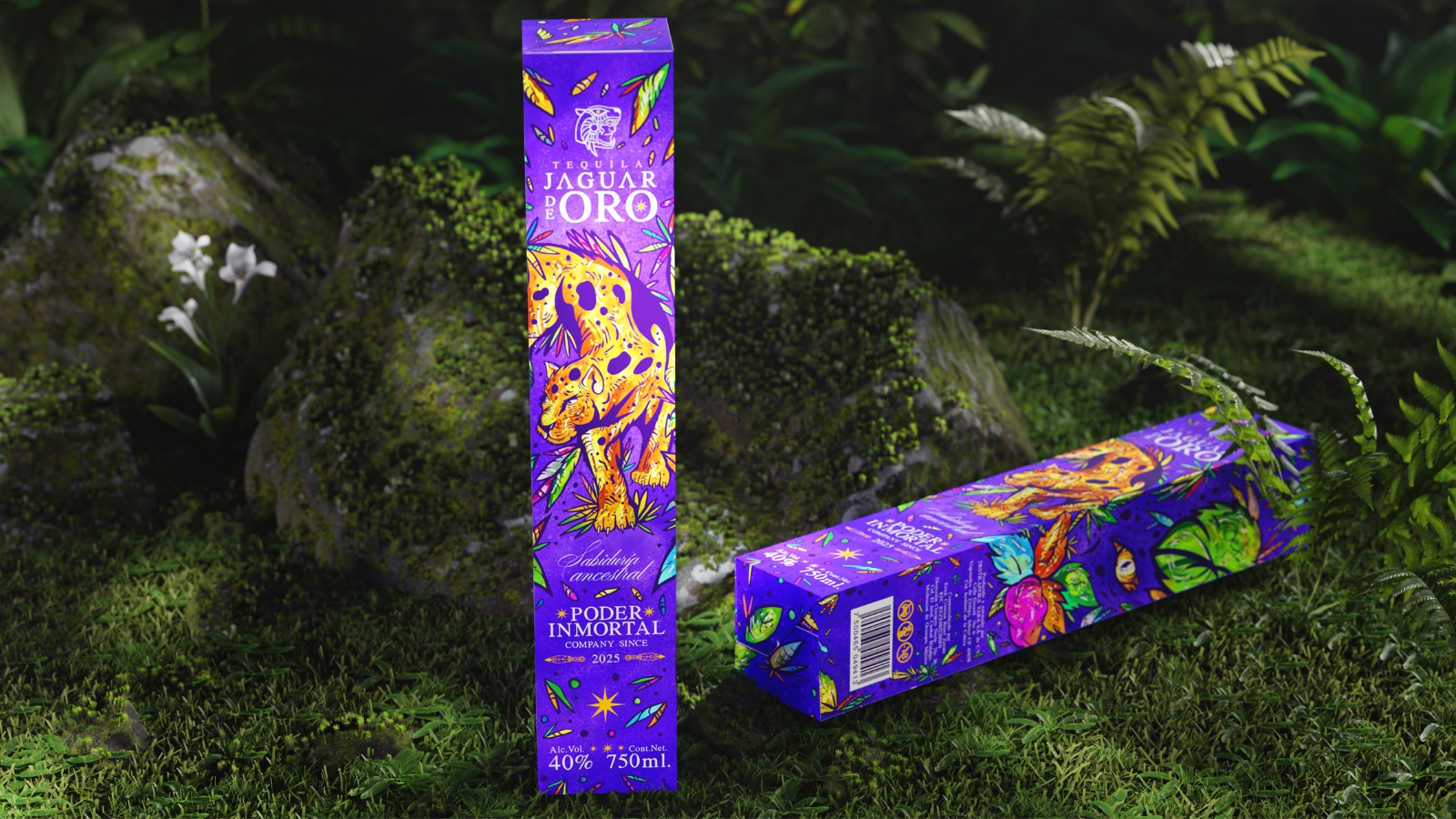
The strategy developed with Carreto Concepts Design Studio turns that legend into brand architecture. The warrior and the jaguar function as central assets; the color palette translates ideas of strength, mysticism, purity, and agility, while the label is divided into two levels so the illustration can coexist with technical information without losing visual impact. Storytelling moves beyond the verbal narrative and begins to physically organize the packaging itself.
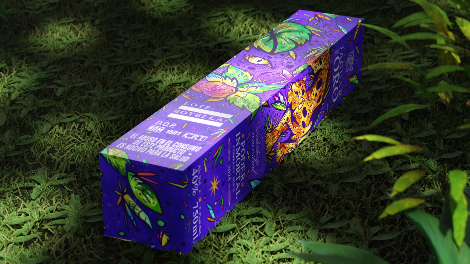
Illustration plays a decisive role. The bottle becomes a narrative surface that invites the viewer to explore, discover details, and reconstruct the story through symbols. Branding, illustration, and packaging design operate as one structure, creating an artisanal and collectible perception capable of extending into new applications without weakening the visual universe.
This is where the project’s commercial value becomes evident. Jaguar de Oro gains a visual reason to be remembered within a category where origin stories often sound similar. Mythology creates differentiation; packaging makes it tangible. Each bottle carries a fragment of the story and turns identity into an active part of the drinking experience, giving the brand a territory that can grow without relying on generic tequila codes.




 Alessandro Ammaturo
 Amblr Studio
 vladlenalevit
 Sis Tsarukyan
 monther al omari
 alchimistestudioParis
 designsbysukaina
 About House of Ta
 Amjad Battal
 UPRISE
 Maruf Nishat
 Dozen Agency
 neo creative studio
 Muhammad Tawfeeq
 Stefano Bracci
 Widakk Design
 Studio Garces
 宏洛图品牌设计HONGLT
 DN Designs
 BoldCrest
 Oksana