

Vego: De una marca histórica a un icono contemporáneo
Vego faced a complex challenge: updating a brand with more than six decades of history for consumers who now associate plant-based beverages with wellness, sustainability, and lifestyle. The identity needed to connect with new habits without diluting the legacy built since 1960. The project approached this tension as an opportunity to transform a historic brand into a contemporary, approachable system designed for growth.
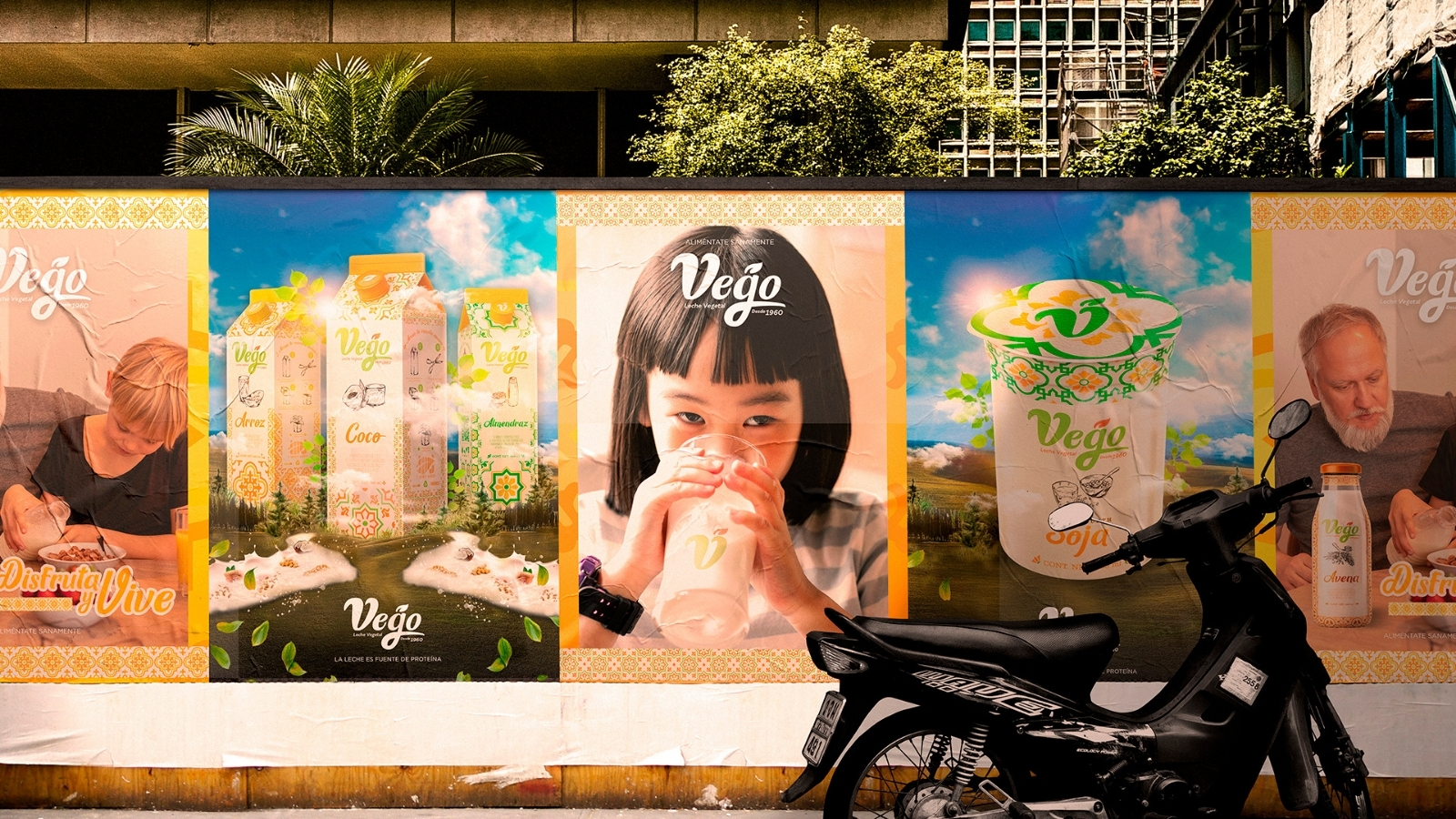
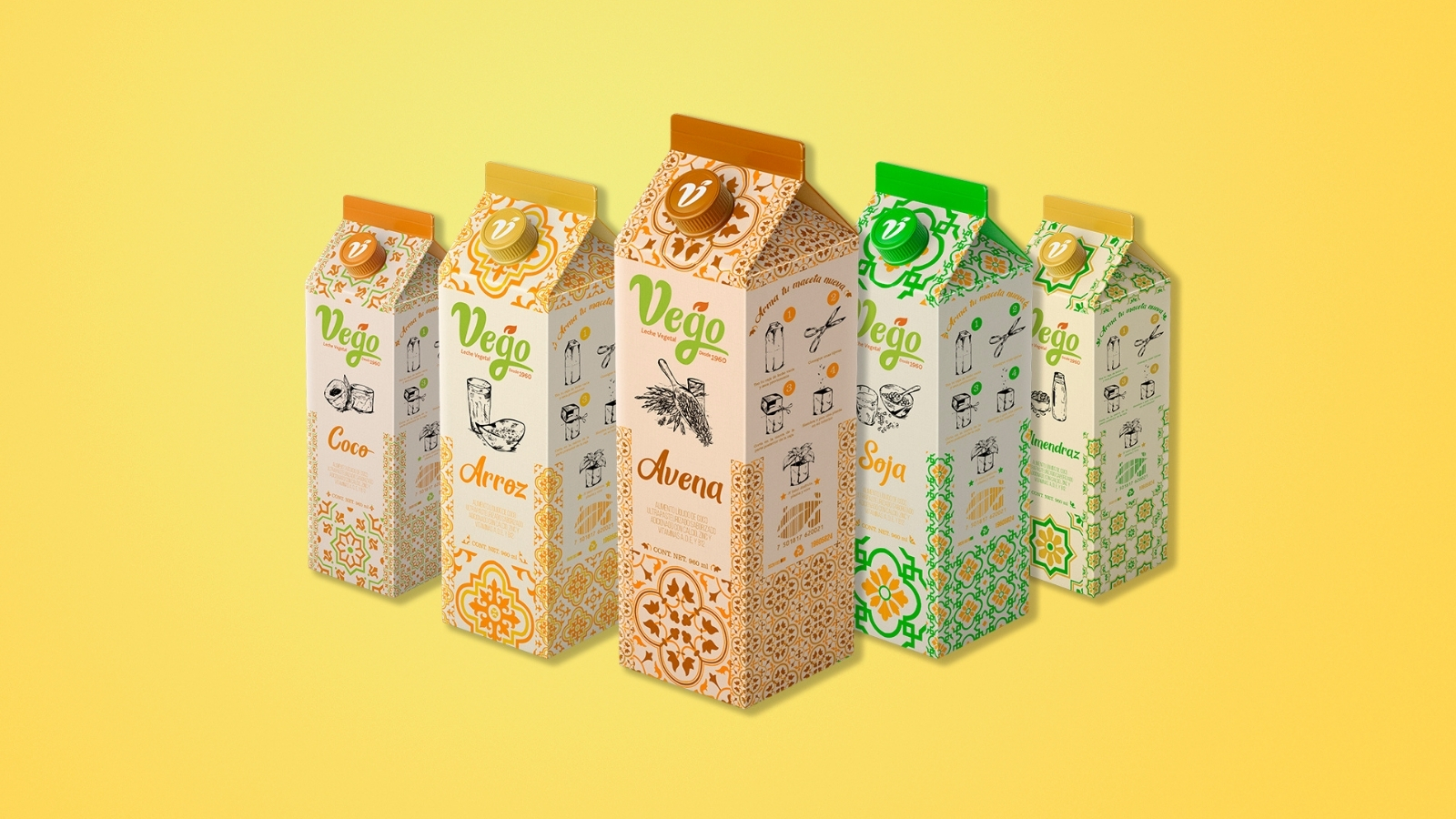
The visual strategy found inspiration in Mexican craftsmanship. Organic colors, patterns, textures, and illustrations build a warm and recognizable identity that avoids the graphic uniformity often seen across the category. Coconut, rice, oat, soy, and almond are distinguished through specific color codes and compositions, while a shared architecture keeps the entire family cohesive. This logic allows Vego to work consistently across Tetra Pak cartons, bottles, cups, and future portfolio extensions.
Sustainability also becomes part of the brand experience. The system proposes reusing the Tetra Pak container as a planter once the product has been consumed, integrating instructions directly into the packaging and turning recycling into a tangible interaction with the consumer. The identity also extends across transportation, uniforms, reusable bags, outdoor advertising, photography, and digital content, maintaining a common language at every touchpoint.
Developed with Carreto Concepts Design Studio, the project brings together brand strategy, branding, packaging, illustration, and creative direction to give Vego a structure capable of evolving alongside the business. The result preserves recognition, introduces new cultural codes, and turns sustainability into an active part of the positioning. A brand born in 1960 can still feel relevant when its history finds a visual form designed for the present.


 Derrick Lin
 Biaa
Biaa Petitmoulin Studio
 White Bear Studio
 Eva Chistyakova
 monther al omari
 Atipus
 alchimistestudioParis
 oneandother
 bloomburo
 helocrene
 Shapers Studio
 Denver Design
 Aidearte
 andrew.huerta
 softmachine
 airobtq
 Buzz & Co.
 Ruby
Ruby themythographer
 IDNB Inc.
 viktorflr
 Zenpack