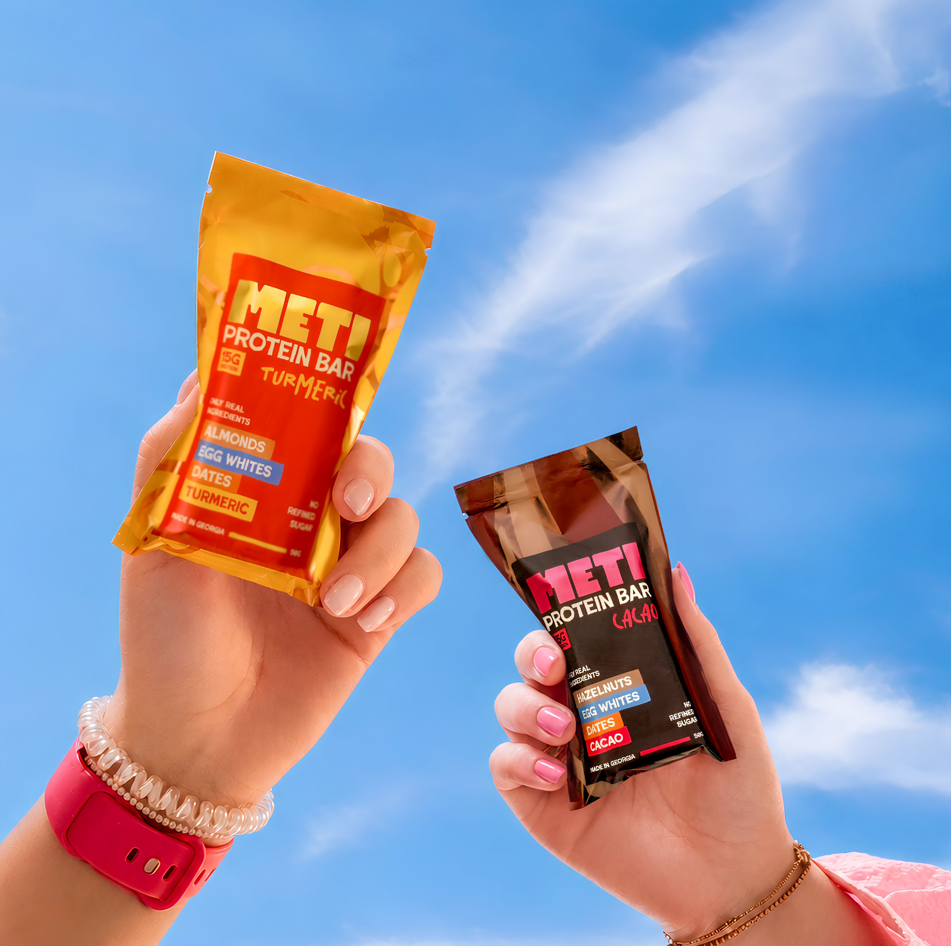

METI is a protein bar brand created in Georgia (country), offering a convenient way to add protein to an active everyday life. The brand name comes from the Georgian word for “more” – more protein, more energy, more possibilities.
The challenge was to create a protein bar that felt like more than a typical sports nutrition product. We wanted METI to be approachable, contemporary and appealing beyond the usual fitness audience, while still communicating its nutritional value clearly.
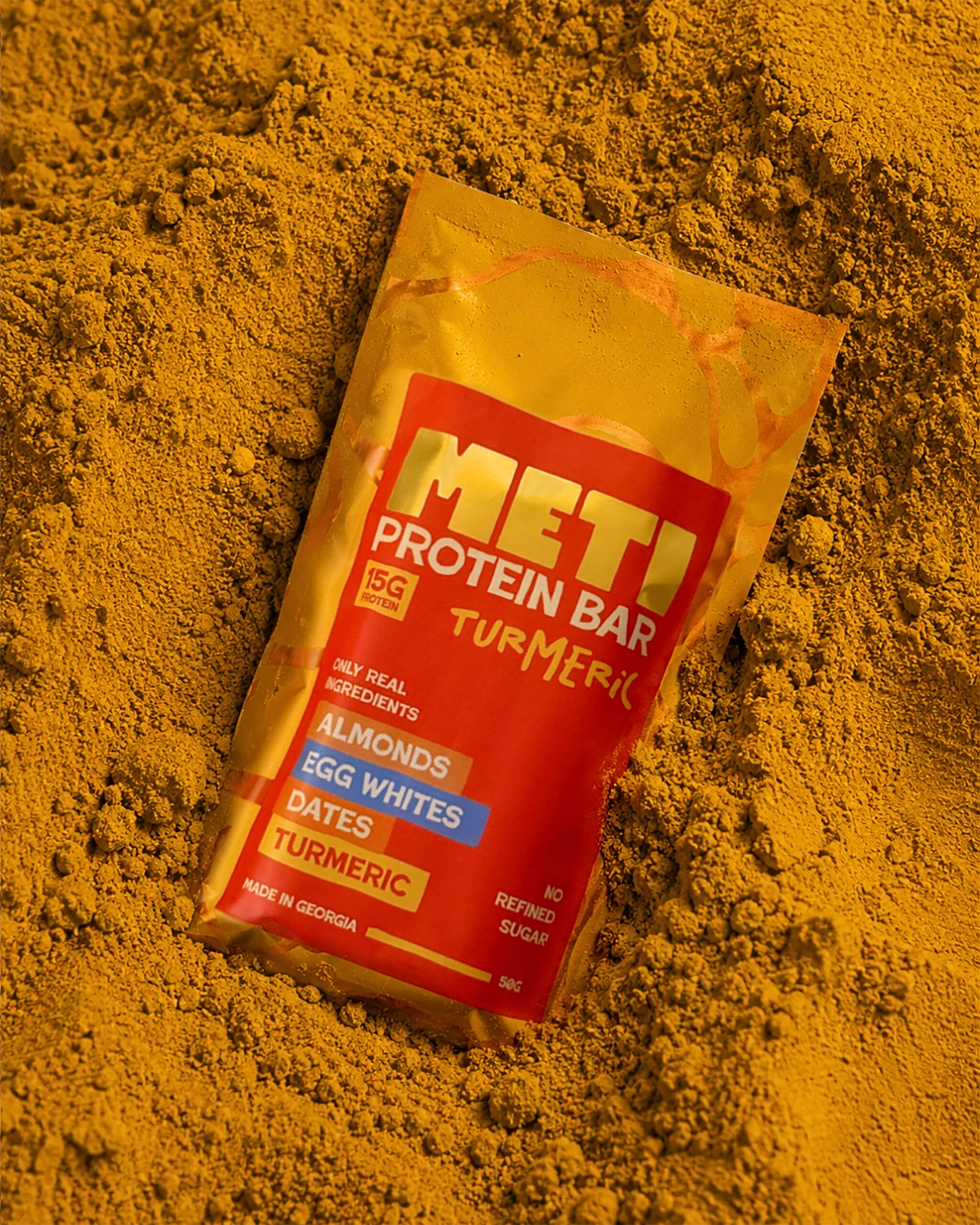
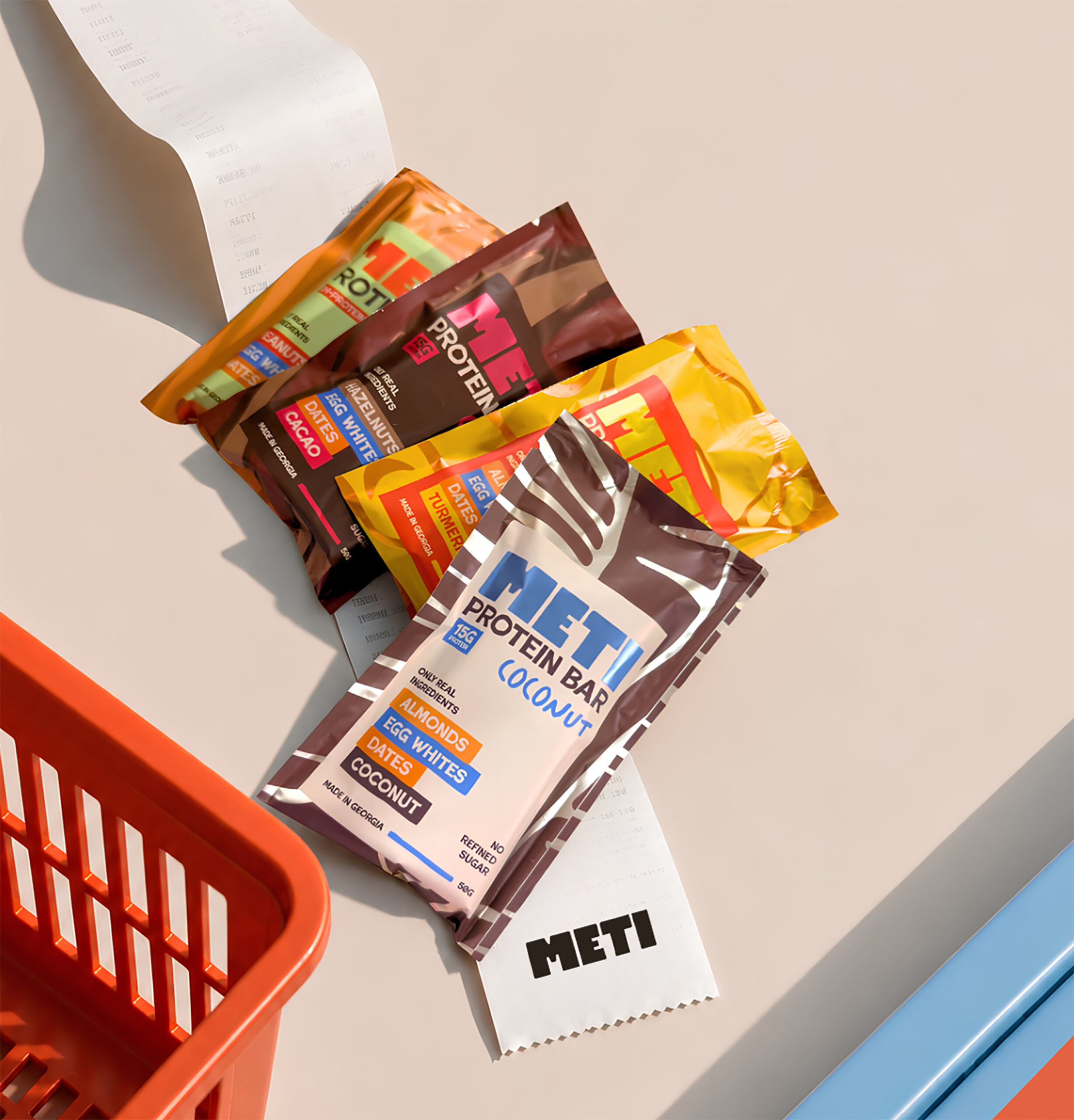
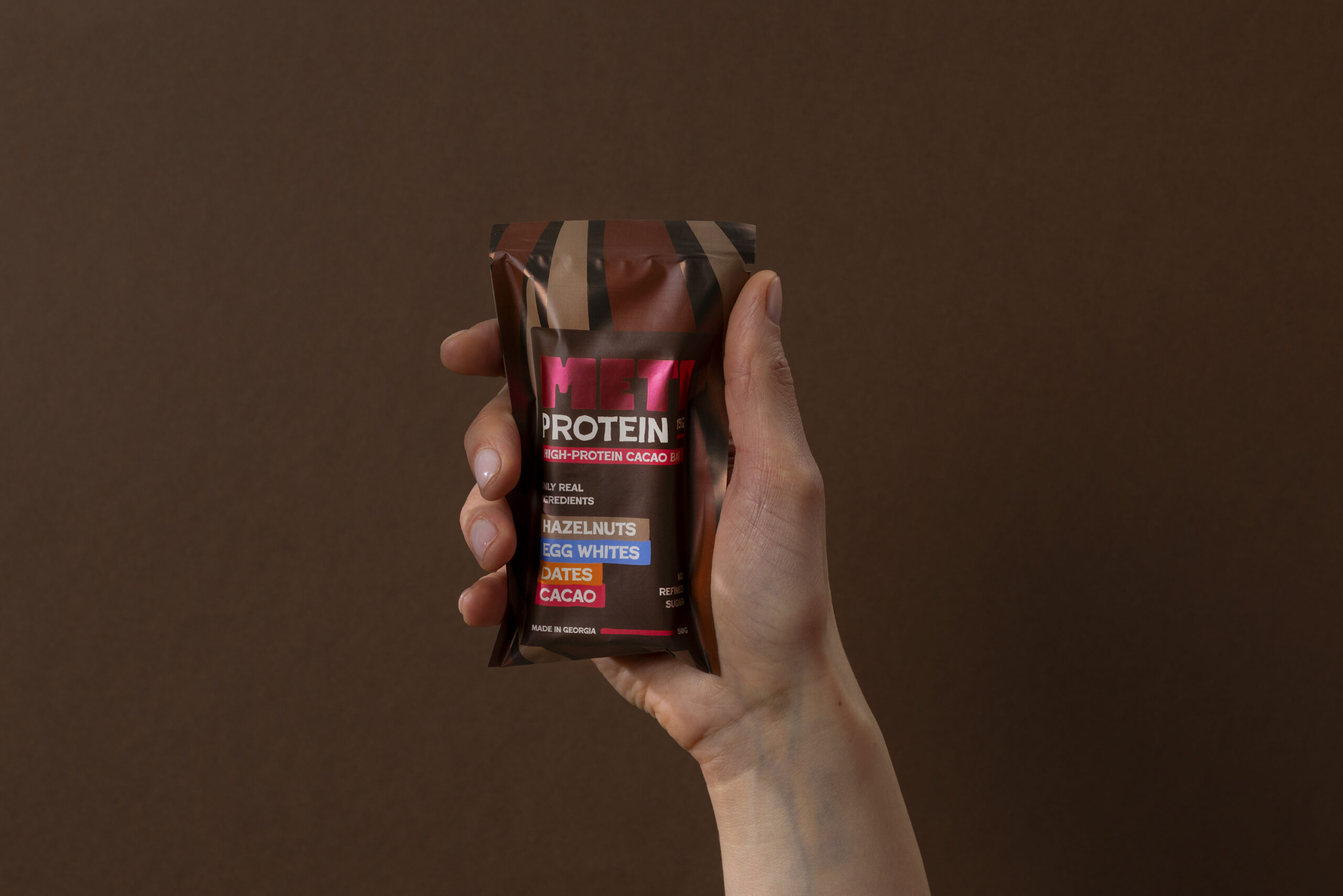
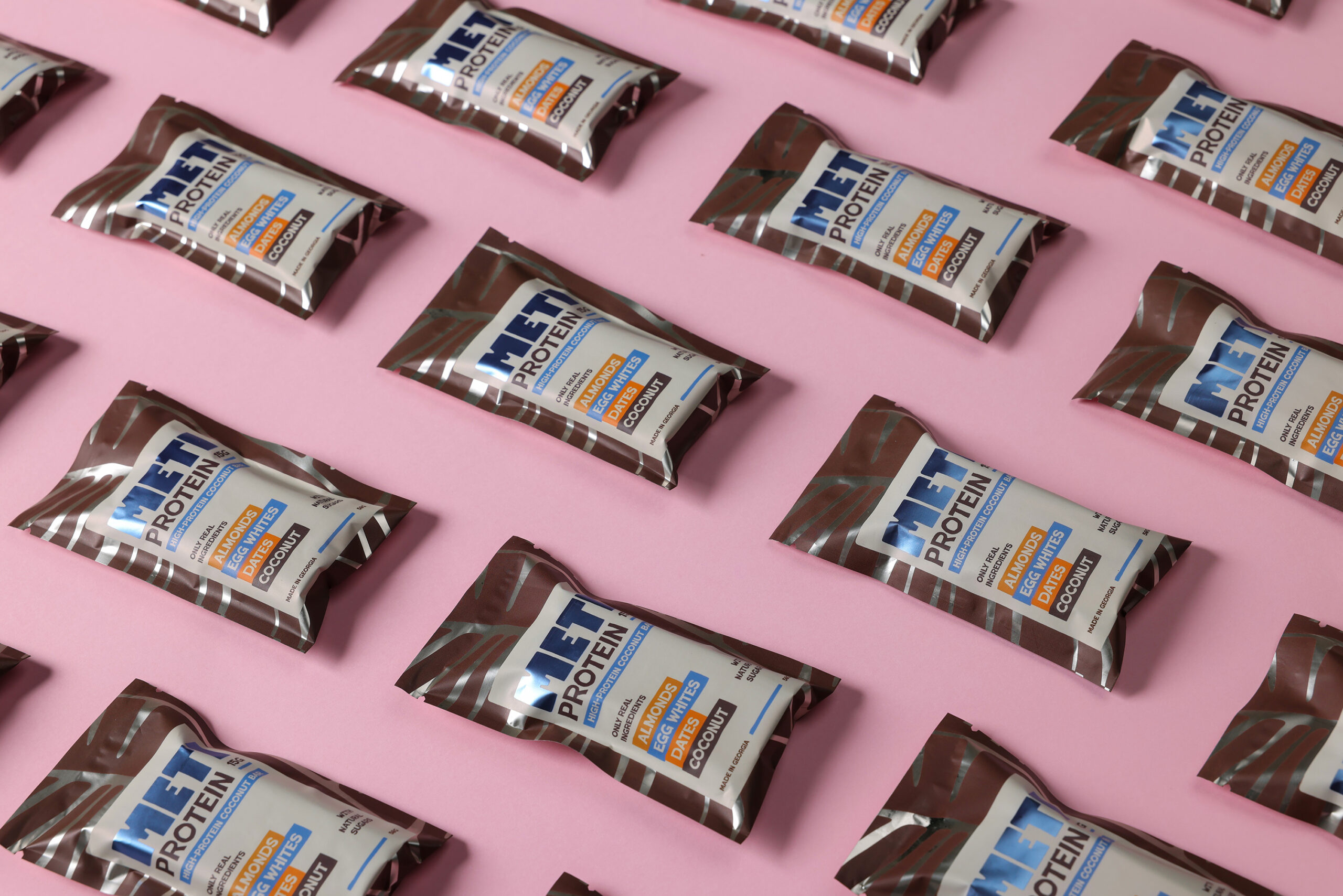
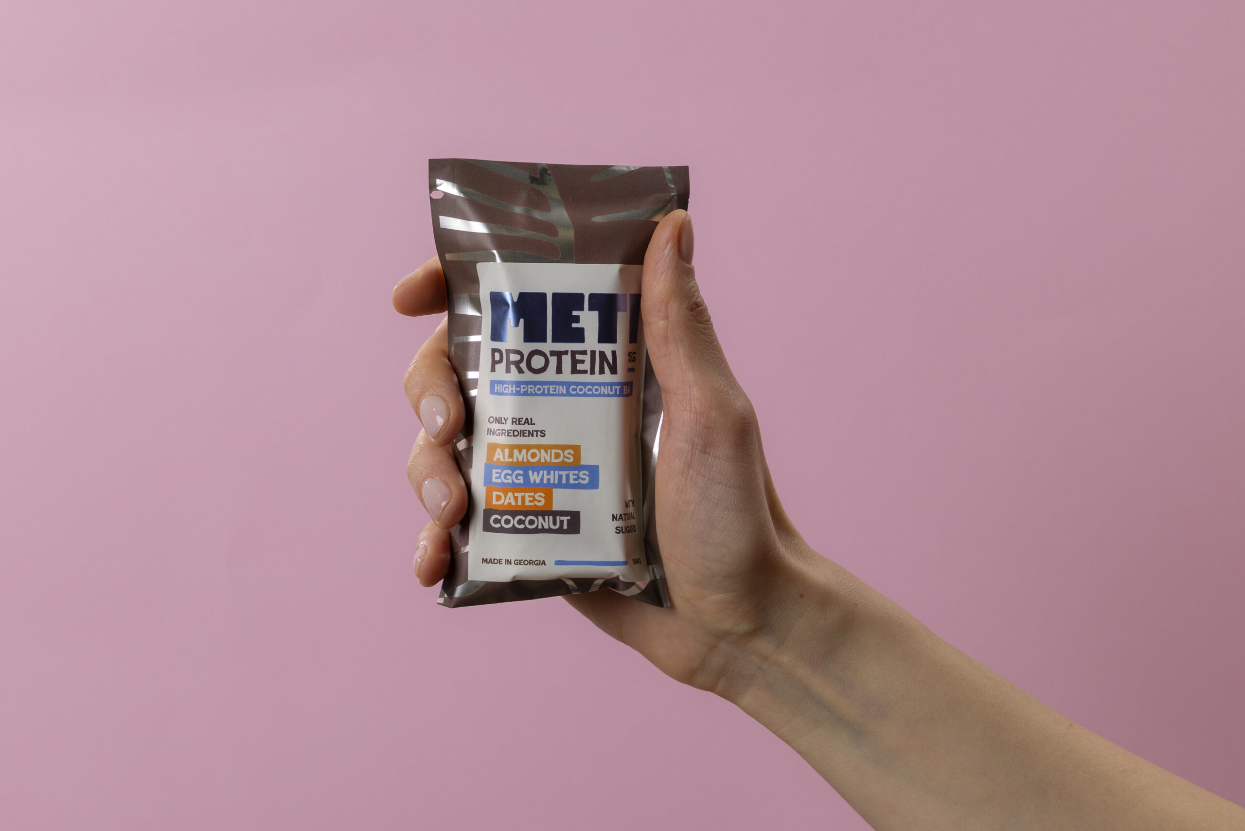
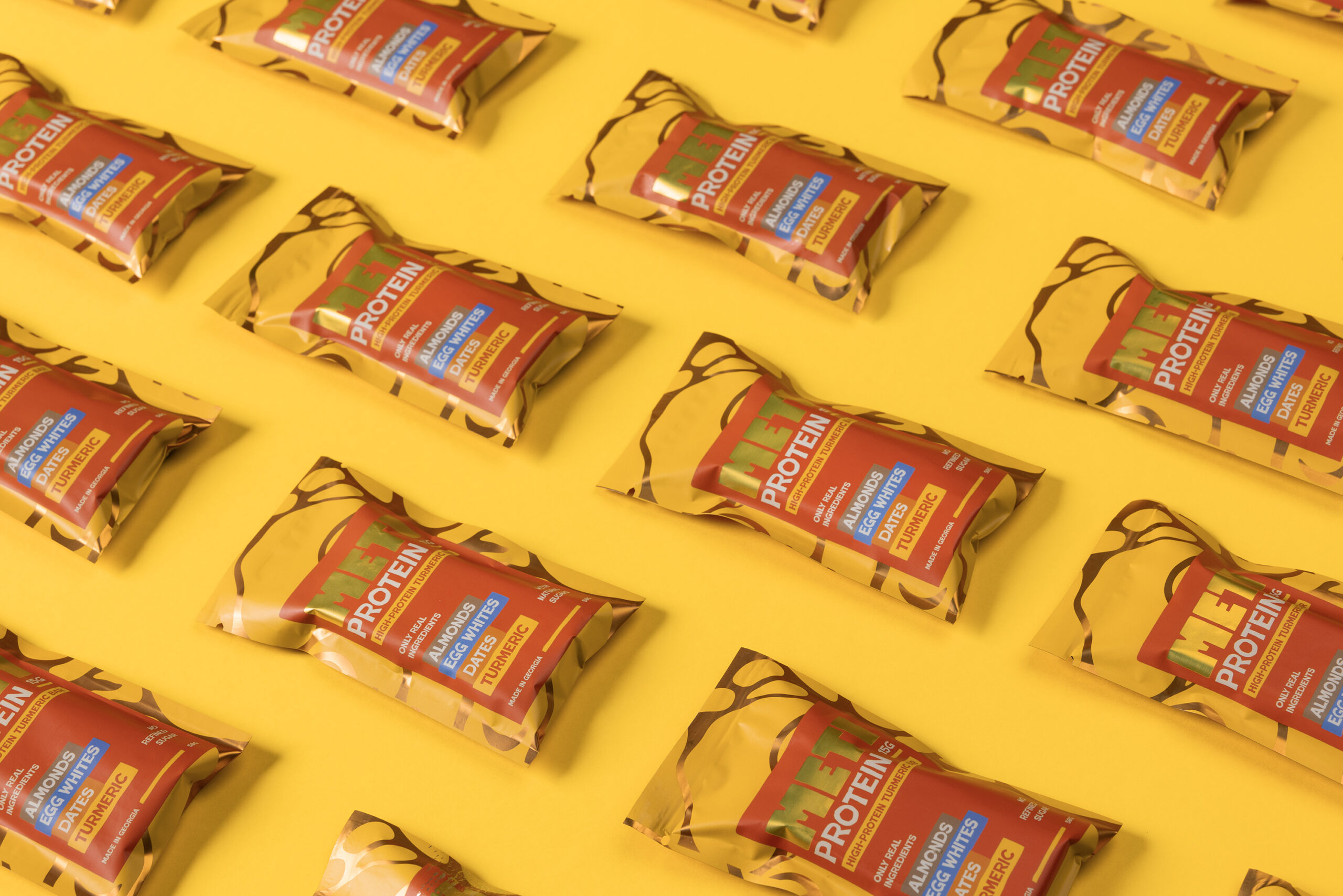
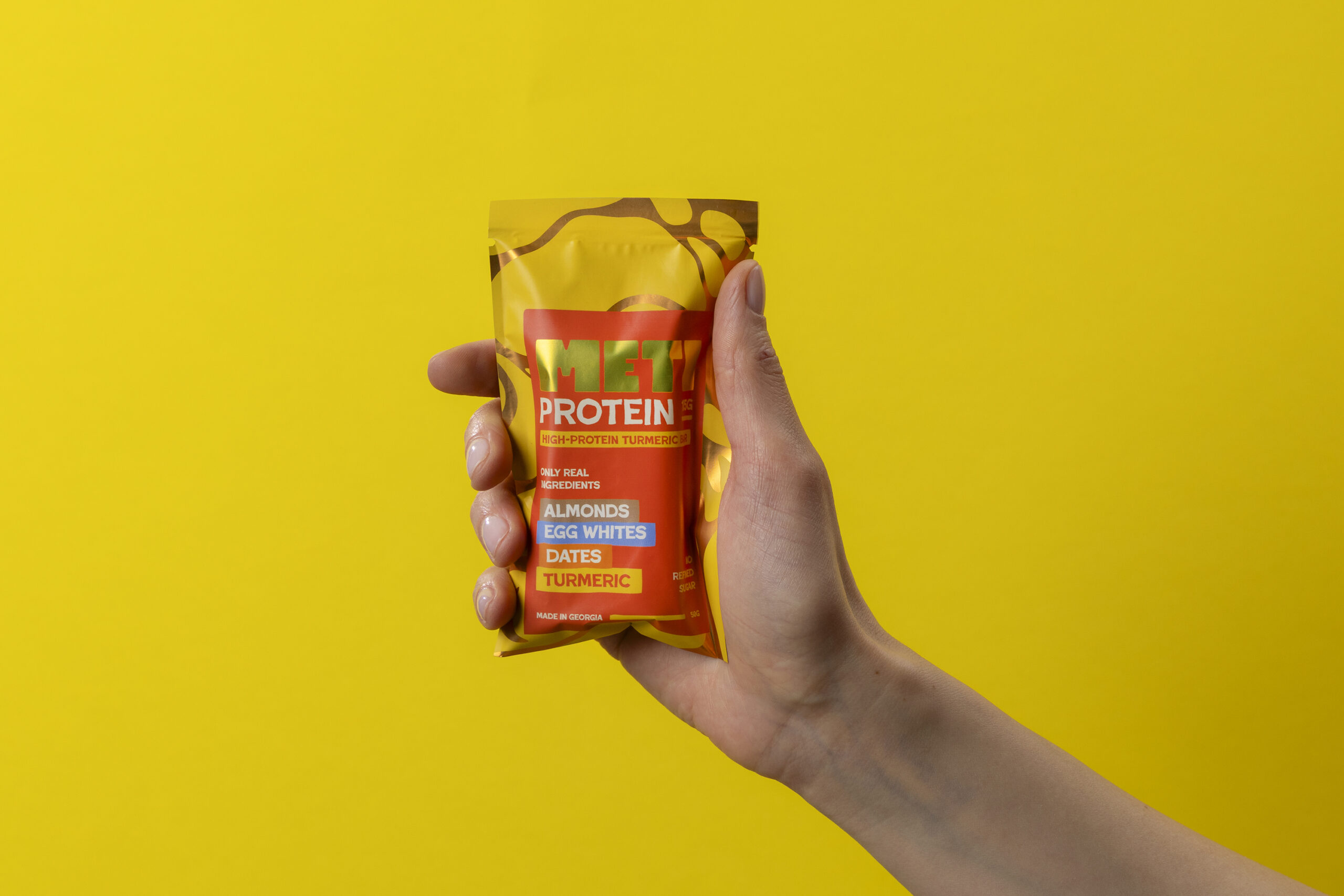
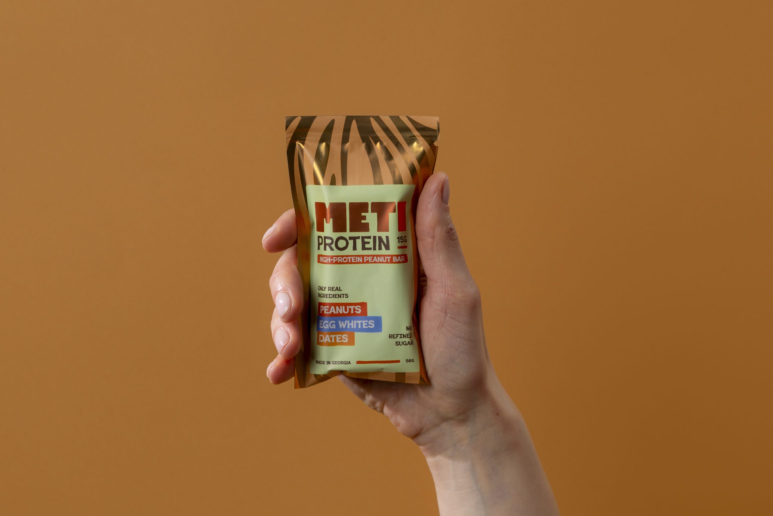
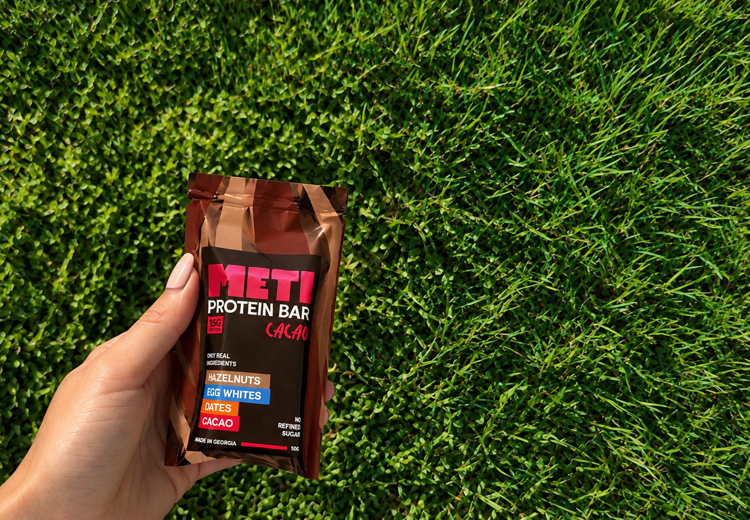
The visual identity is built around a bold, custom wordmark, expressive typography and a bright, contrasting colour system. The name became the main visual element, with its full, tasty letterforms giving the brand a strong and friendly character.
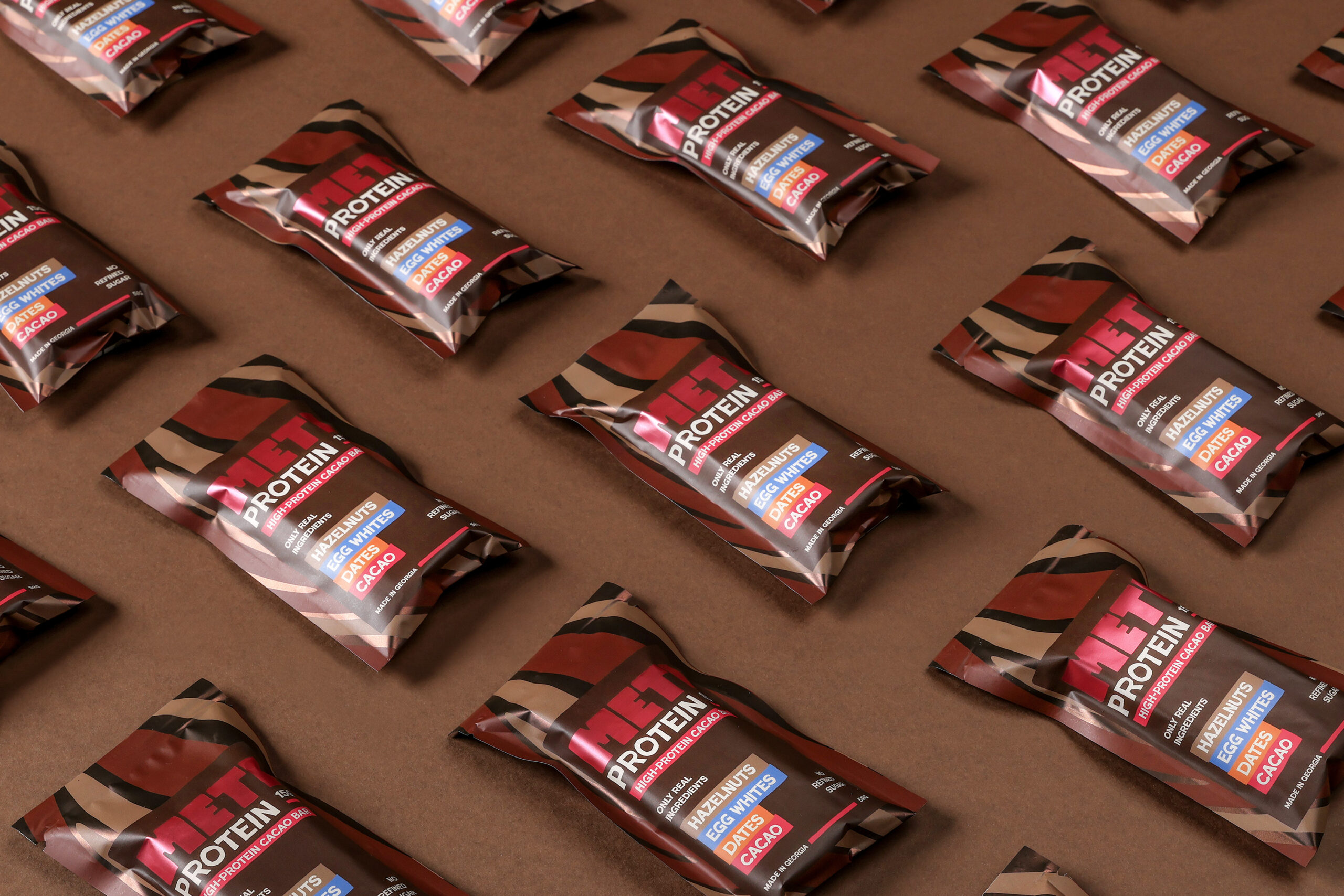
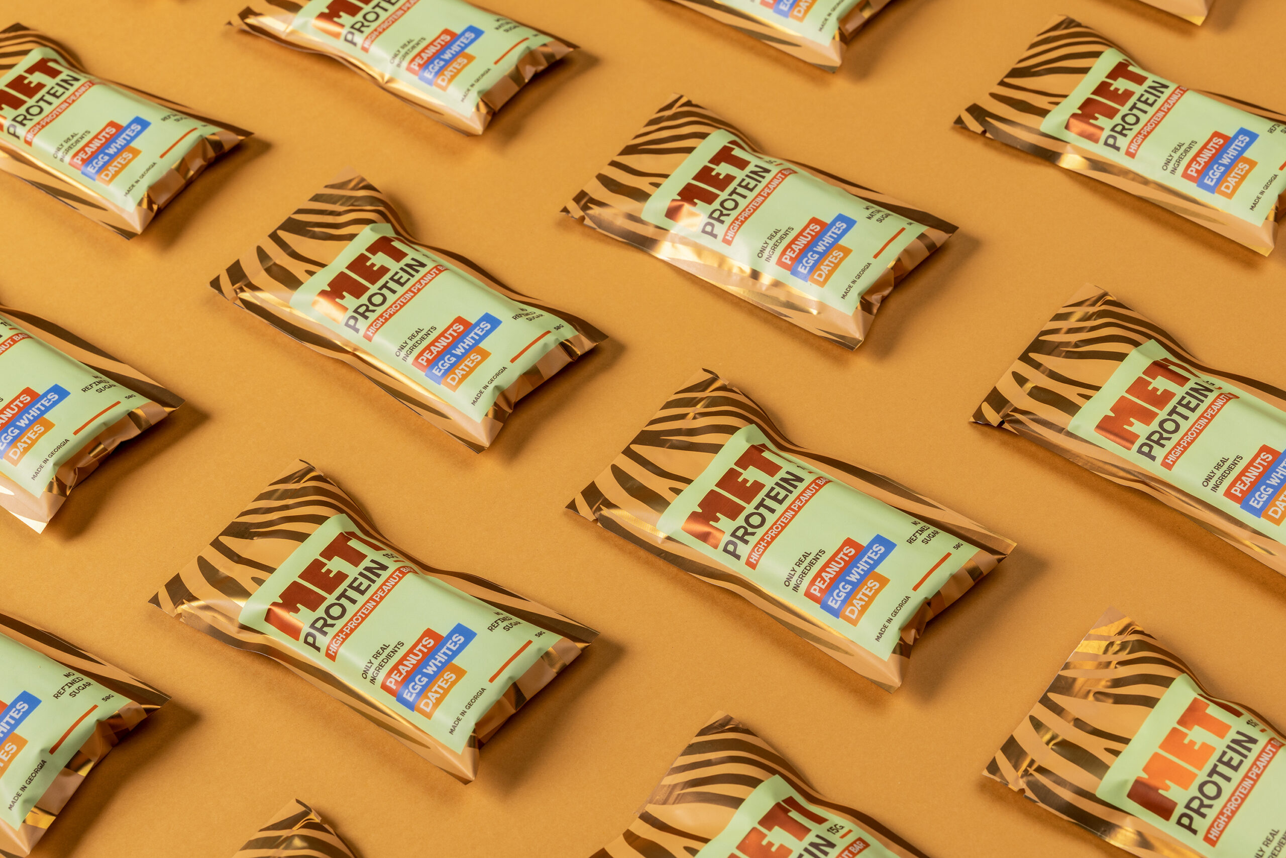
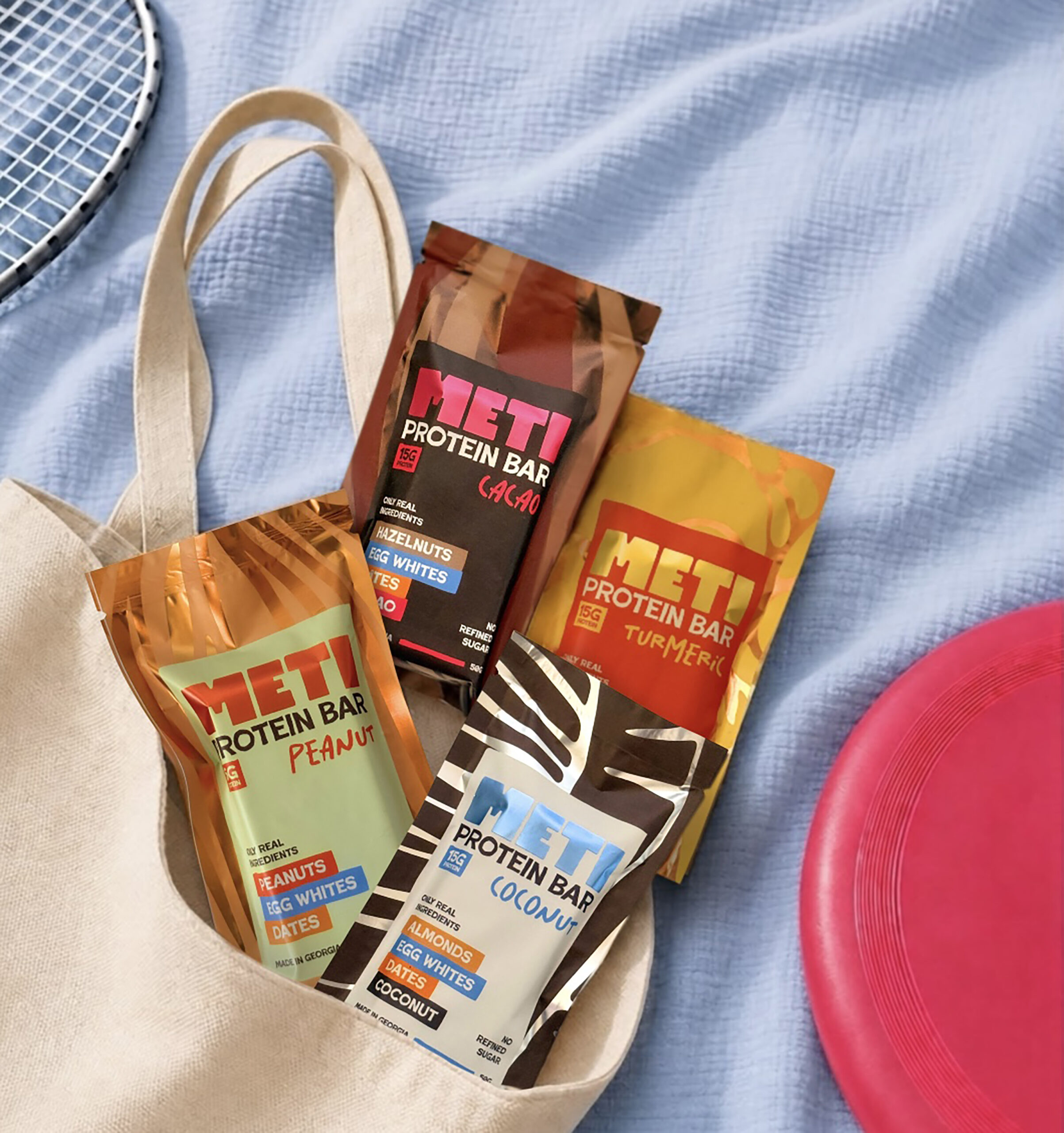
The colours and organic shapes create a playful, recognisable identity while helping the flavour stand out on the shelf. The packaging uses a clear hierarchy to communicate the product, protein content and ingredients at a glance.
The result is a packaging system that combines strong shelf presence with a friendly, accessible personality. It moves away from the typical protein bar aesthetic and gives METI a visual language that feels more like a contemporary food brand than a sports supplement.
Designed by Sophio Chkhenkeli.
Brand: METI.
 Jaehee Ha
 Intertype Studio
 Yosuke Inui
 Aadarsh Jain
 Norma
 aseelstudio
 Luna West
 Eva Chistyakova
 vostorge
 alchimistestudioParis
 lettera7
 killeridea
 leekyeongyeob
 vitoramockup
 Akshay 11
 Deeez Studio
 Oksana
 M&A CREATIVE AGENCY
 宏洛图品牌设计HONGLT
 mattdoyledesign