

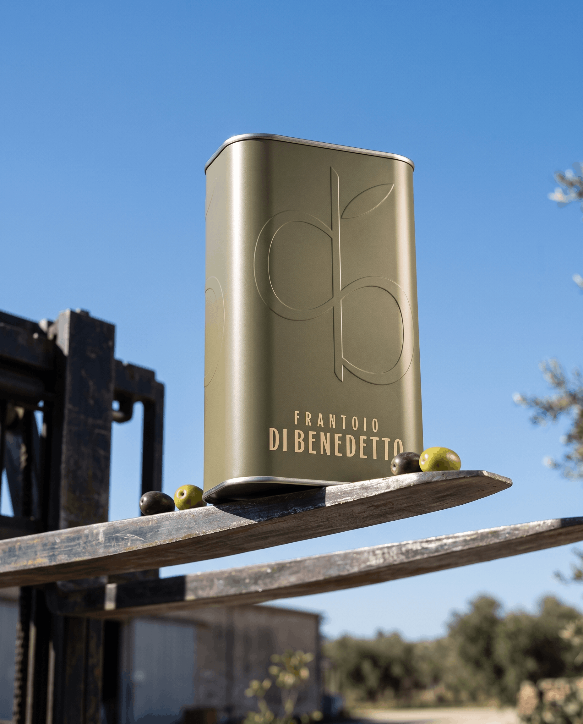
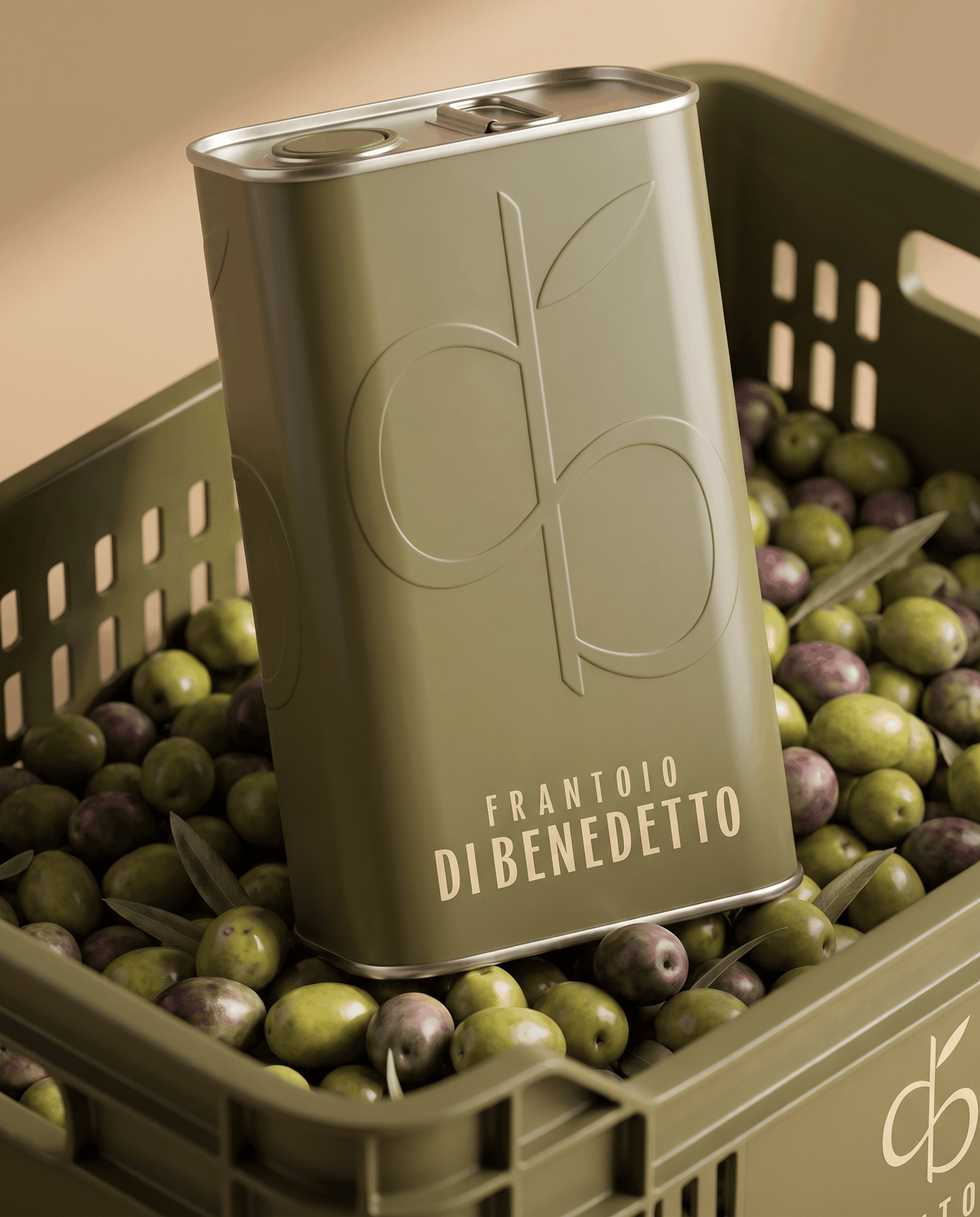
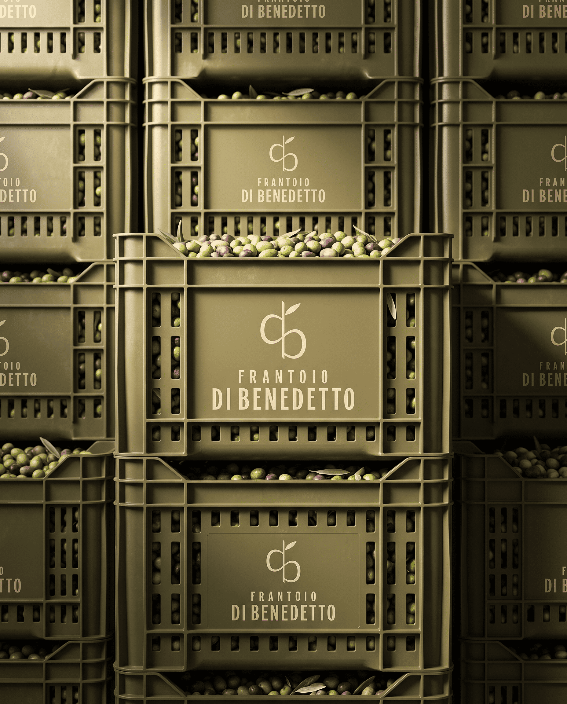
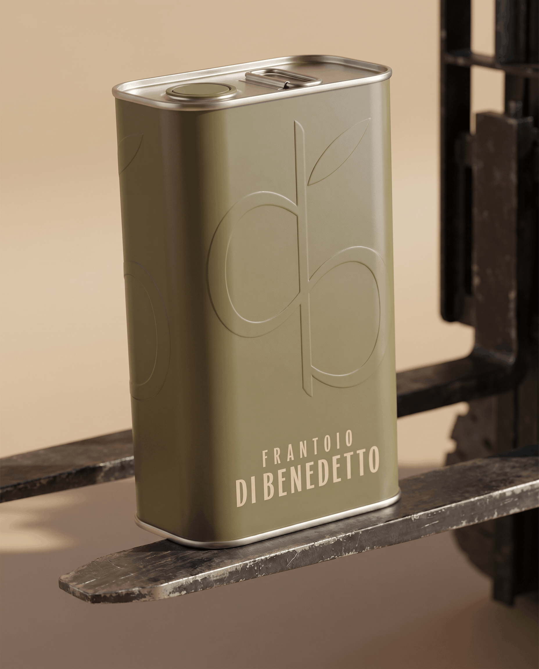
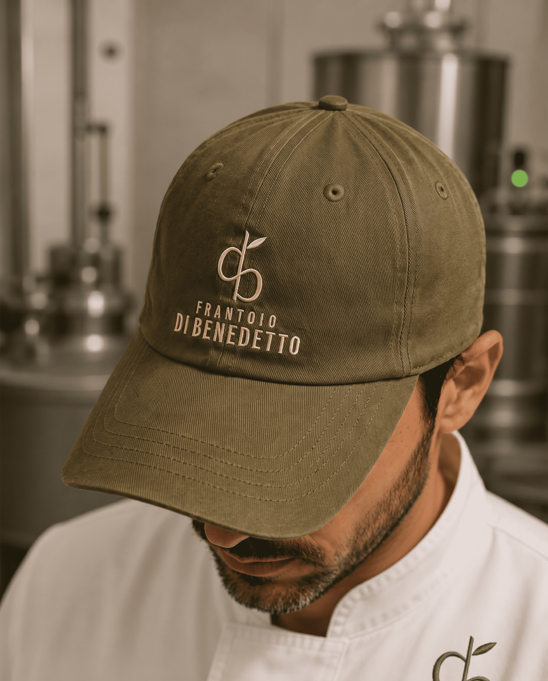
Frantoio Di Benedetto’s packaging brings together name, nature and transformation. The opposing initials “d” and “b” form a symbol that incorporates an olive branch and evokes a milling blade. Enlarged and embossed tone on tone on the tin, the symbol emerges through light, giving the concept a tactile expression. Olive green, a discreet beige wordmark and balanced proportions create a minimal, distinctive packaging identity.
 ANONIMA/
 Armoder Arte y Diseño
 eimanbeh
 Biaa
 Hartson Creative
 Karen Danielyan
 AUN BRANDS
 Studio Zak
 Hey Joe Studio
 Blue.labs
 Jasmine Tsan
 Atiq Alam
 Modern Theory
 Tancybox
 Artrime Graphic Design
 WhiteWarblerCo
 Simple Studio
 M&A CREATIVE AGENCY
 monther al omari
 Husain Studio
 JDO
 INTSIGN
 Agence des Coteaux
 Yaniv Vaknin