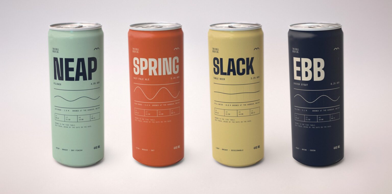

Tin Gull Beer Co. is a studio concept by Lampra: a fictional harbor brewery that releases a new beer most months and can’t afford to redesign a can every time.
CONCEPT
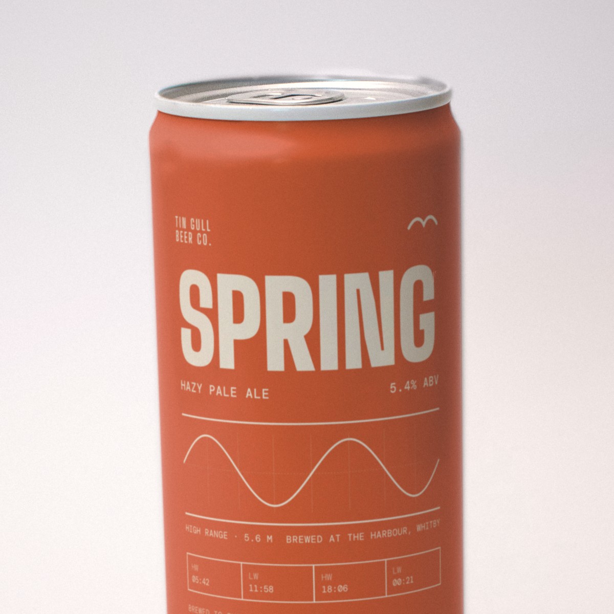
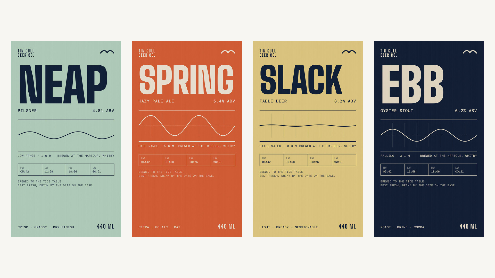
Every beer is named after a tide: Neap, Spring, Slack and Ebb. The label reads like a tide table. A fixed grid carries the beer’s name, a tide curve drawn for that name and a strip of high and low water times.
SOLUTION
One template does all the work. The grid, type and layout never move; only the color, the curve and the copy change. A new release takes an afternoon instead of a week, and the range still reads as one brewery on the shelf.
TECHNIQUE
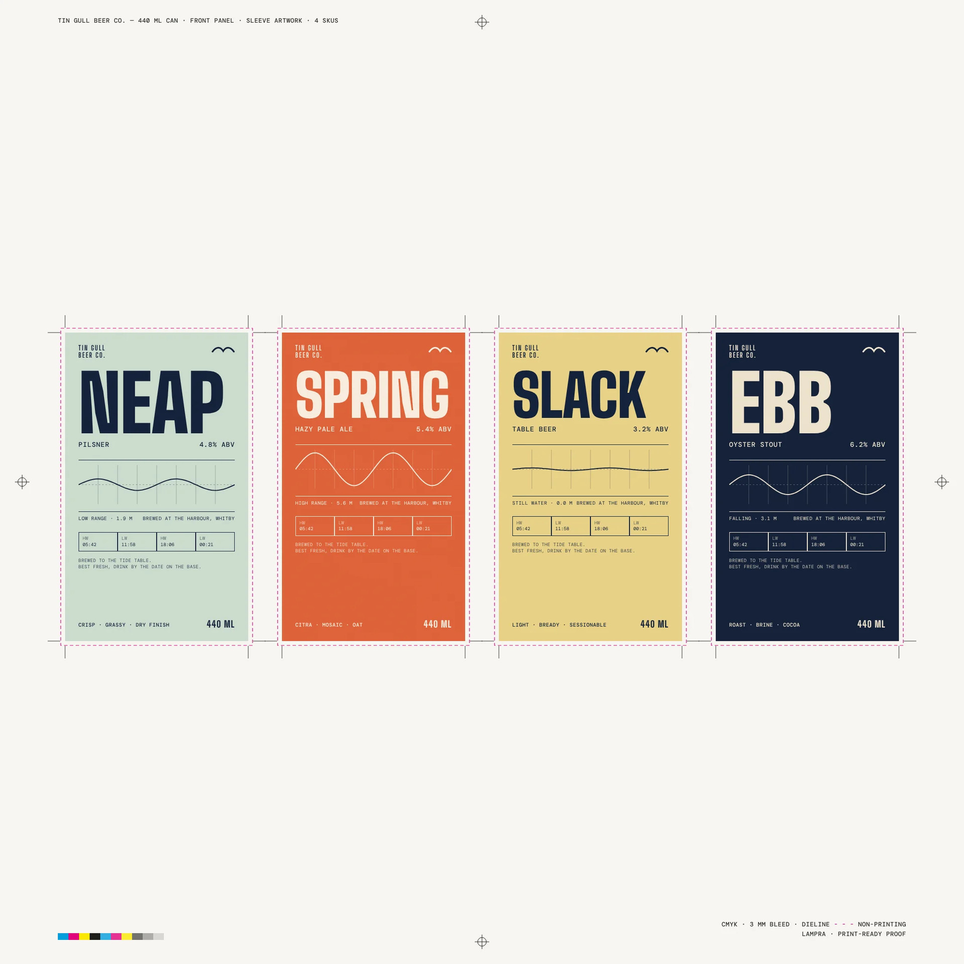
A tall condensed sans for the names, a monospaced face for the data, and a single line drawing for each tide. The four front panels are built on a 440 ml can sleeve template with 3 mm bleed and shown here on a print-ready proof sheet.
ABOUT THE IMAGES
Tin Gull is not a real brewery and these cans have not been printed. The can images are a licensed stock photo of a real blank can with our label art wrapped onto it; the flat labels and the proof sheet are the actual design files.
 butterflyhunters
 monther al omari
 Asprey Creative
 About House of Ta
 Up-Brands
 KJS CRAFT
 hello ocean
 PG Branding
 CF Napa Brand Design
 booouuuche
 Hyejung Choi
 Abbydraw Designs Unique Conceptual Branding & Packaging Designing Ideas
 Hollóka Grafikai Műhely / Graphic Design Studio
 Minim Brand Design
 saerom81
 YNL
 bilel tkouri
 vitoramockup
 Sanavala
 www.branding.uz
 alchimistestudioParis
 Estudio Argo
 Modern Theory
 Ohmybrand