

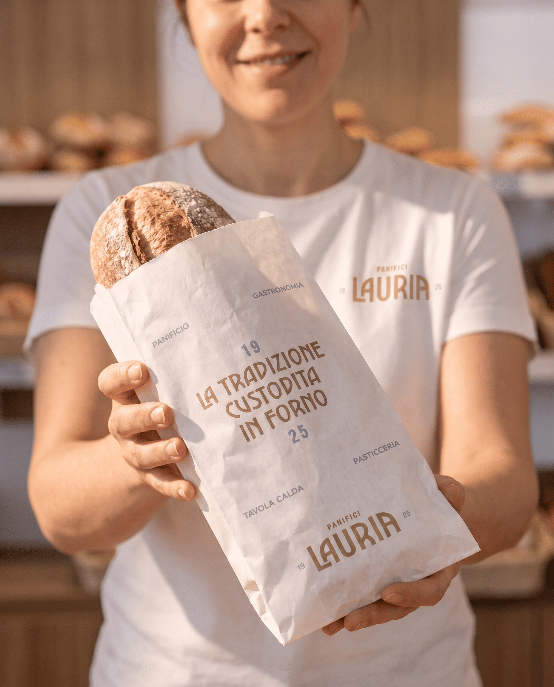
Since 1925, Panifici Lauria has been a family story, passed down through generations alongside its bread and pastries. The branding and packaging project gives this heritage a fresh image, preserving classic elegance through a contemporary visual language.
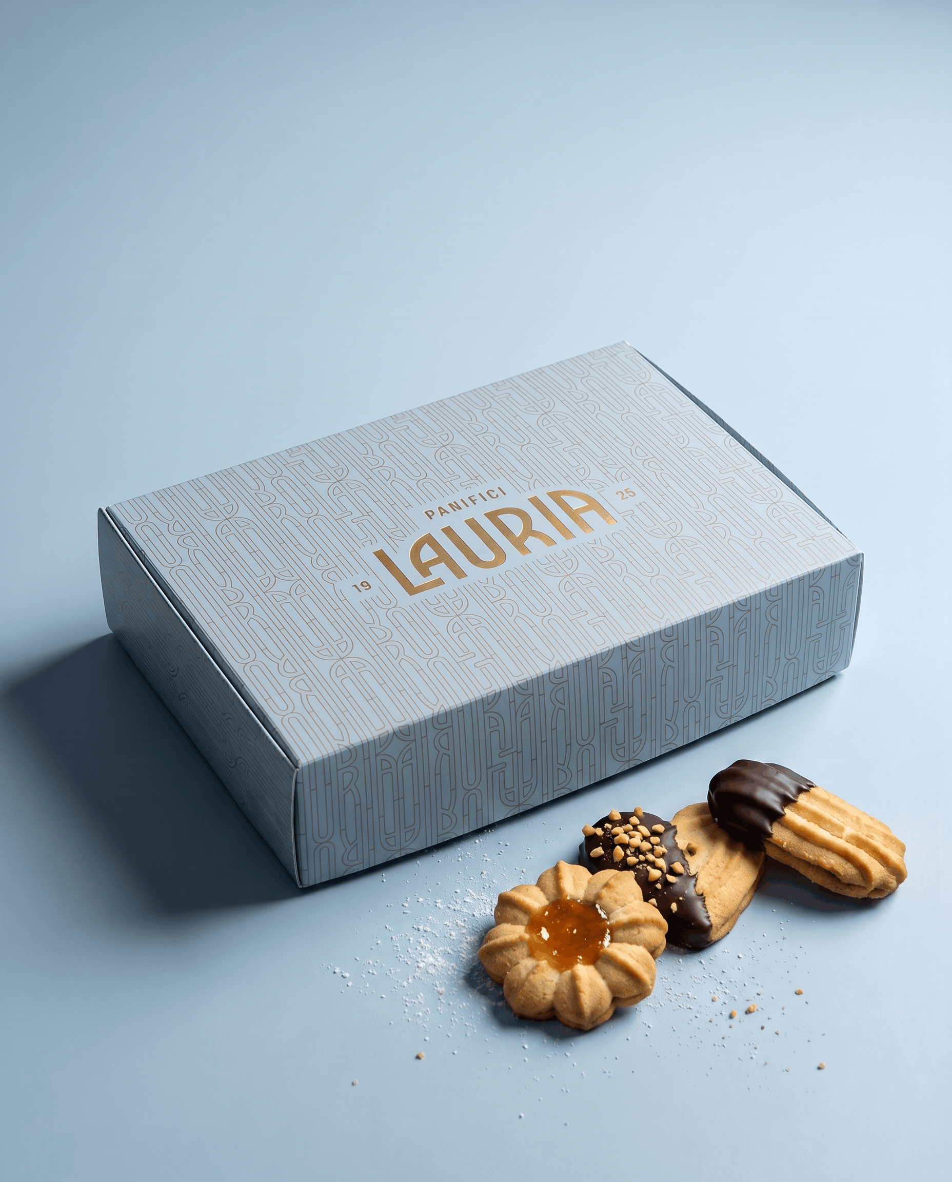
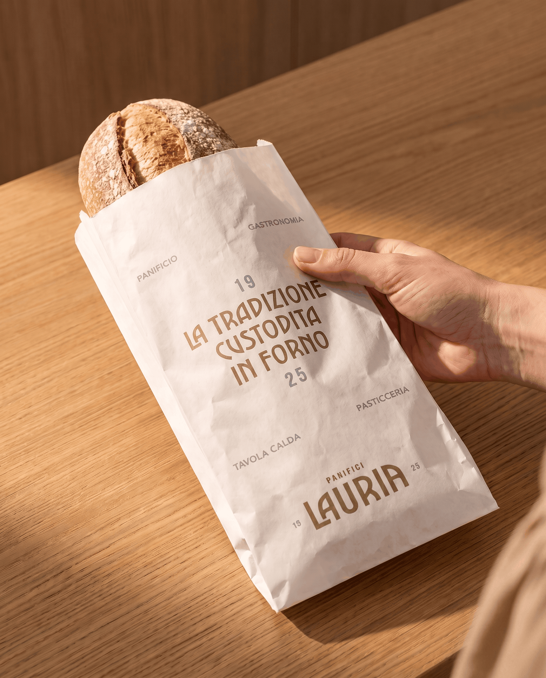
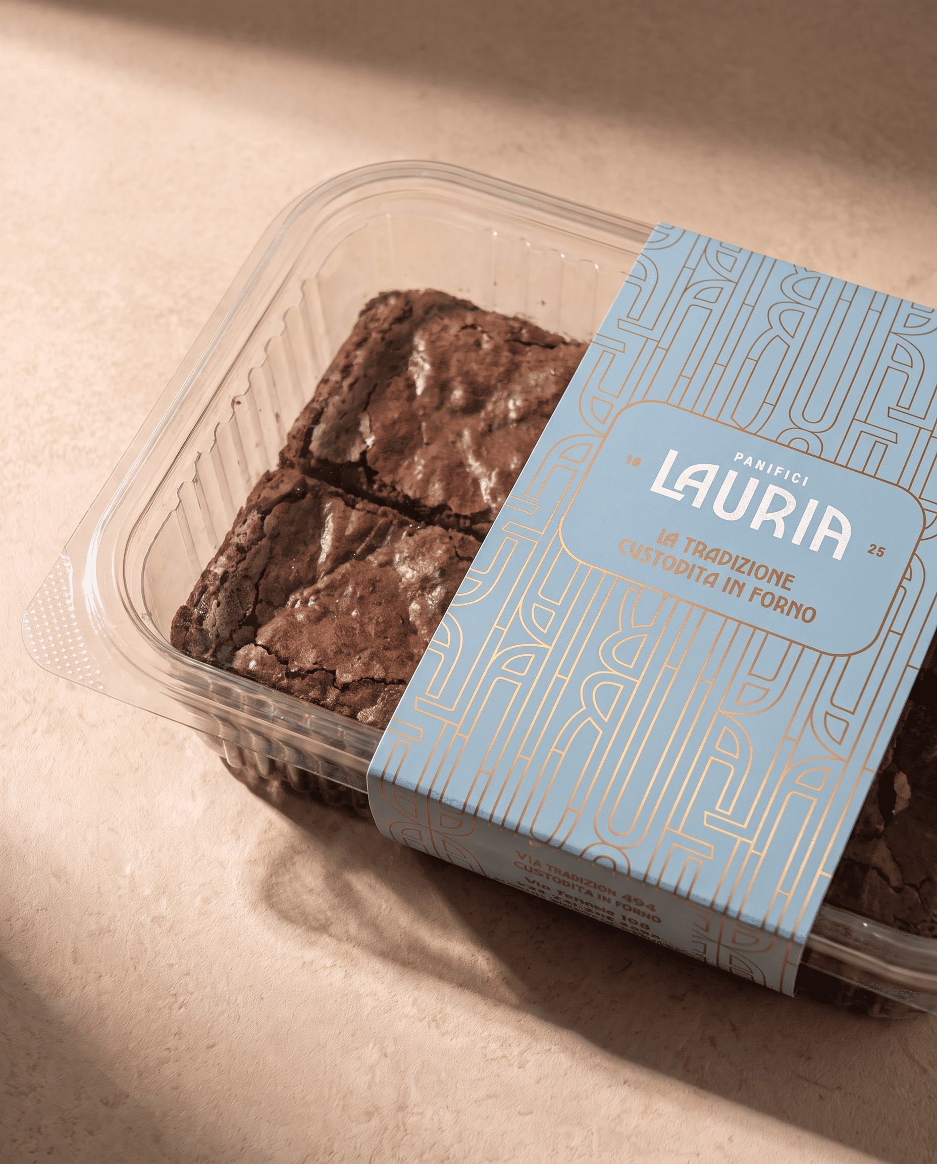
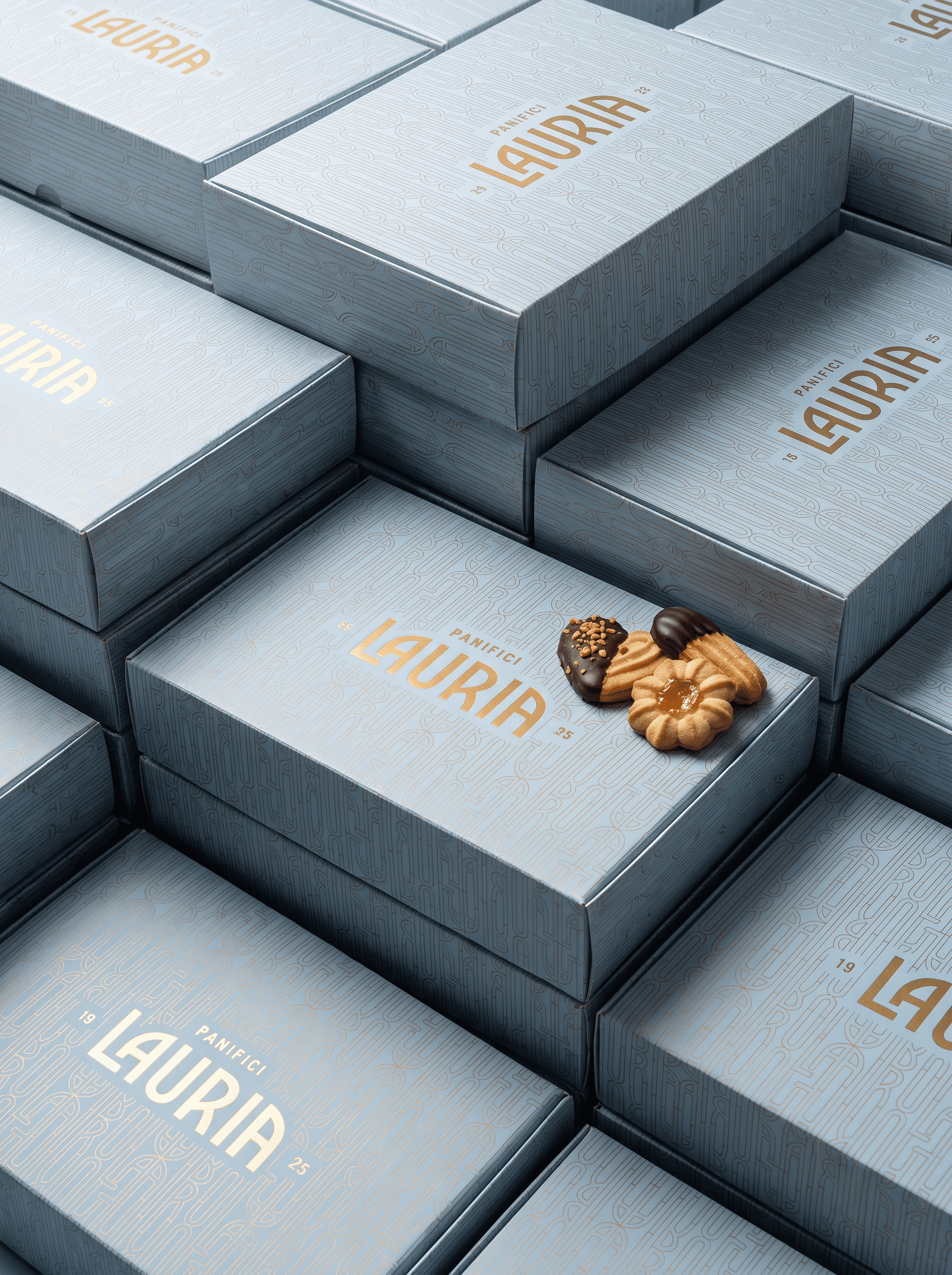
Colour provides the first cue: white is reserved for the bread range, while powder blue identifies the sweets. Two backgrounds represent two sides of the bakery’s offering, instantly recognisable both on the counter and in customers’ hands. Beige and gold complete the palette, adding warmth and a precious touch.
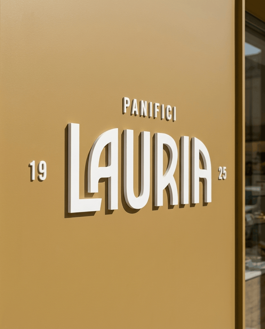
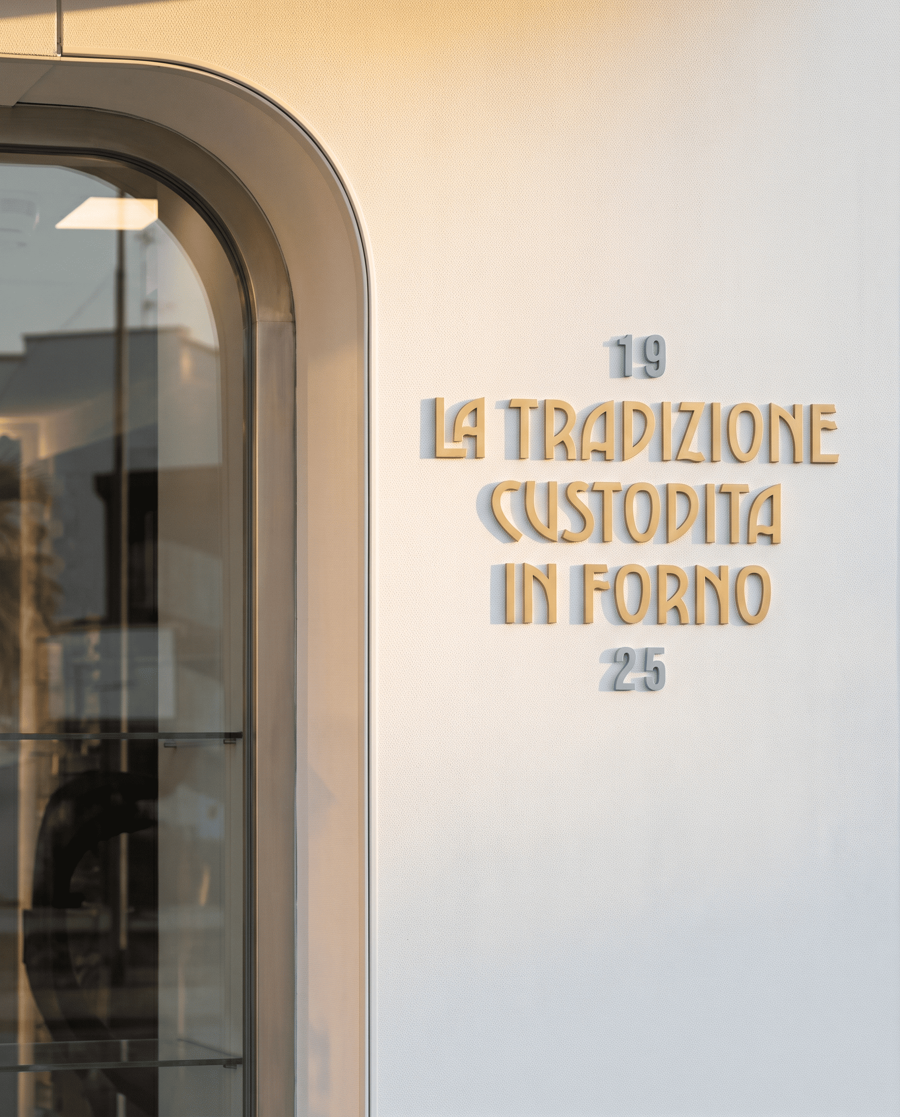
The packaging begins with custom typography: elongated letterforms combine crisp geometry, curves and distinctive cuts, recalling shop signs of the past. Rendered in gold, the wordmark gives each pack a recognisable presence.
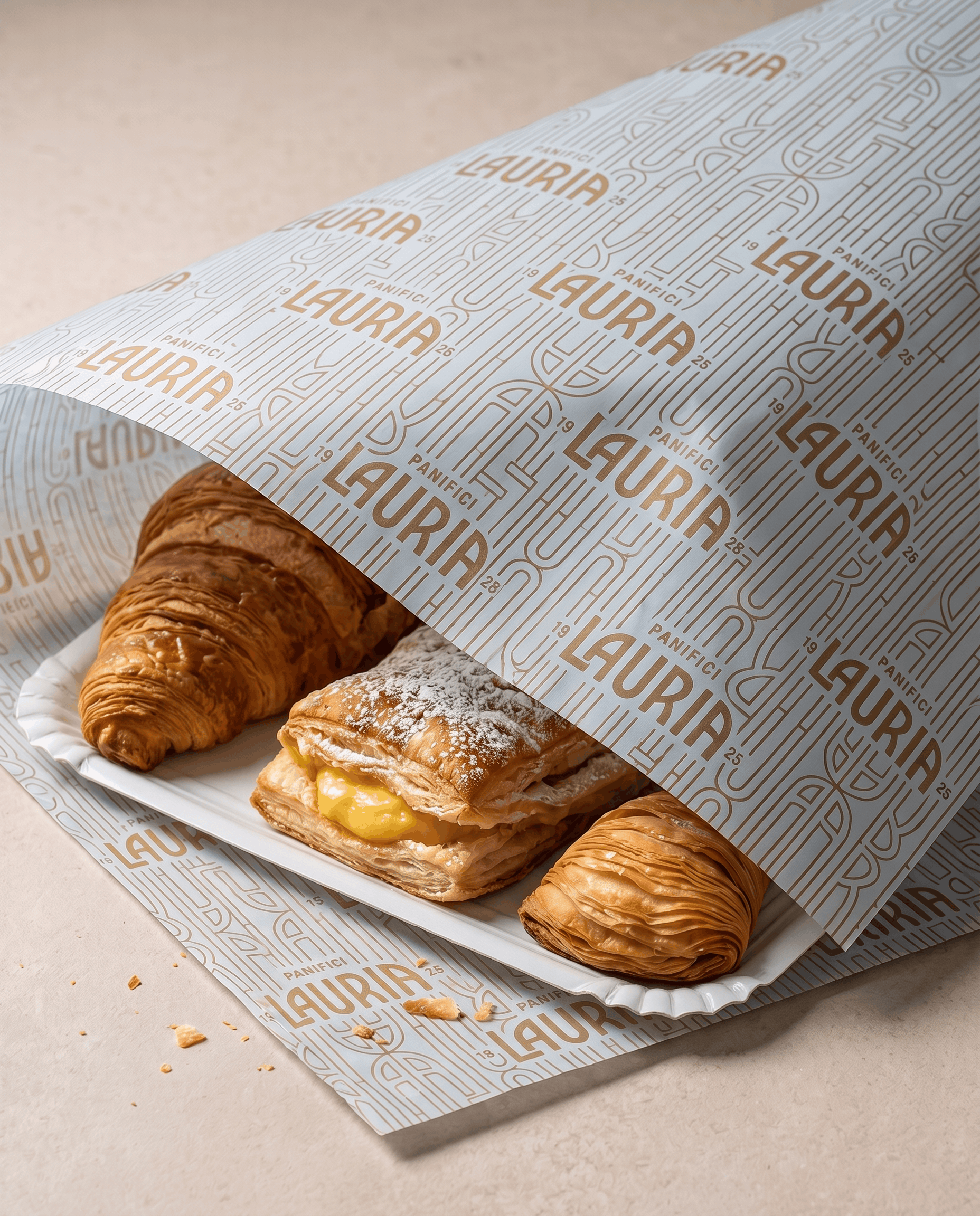
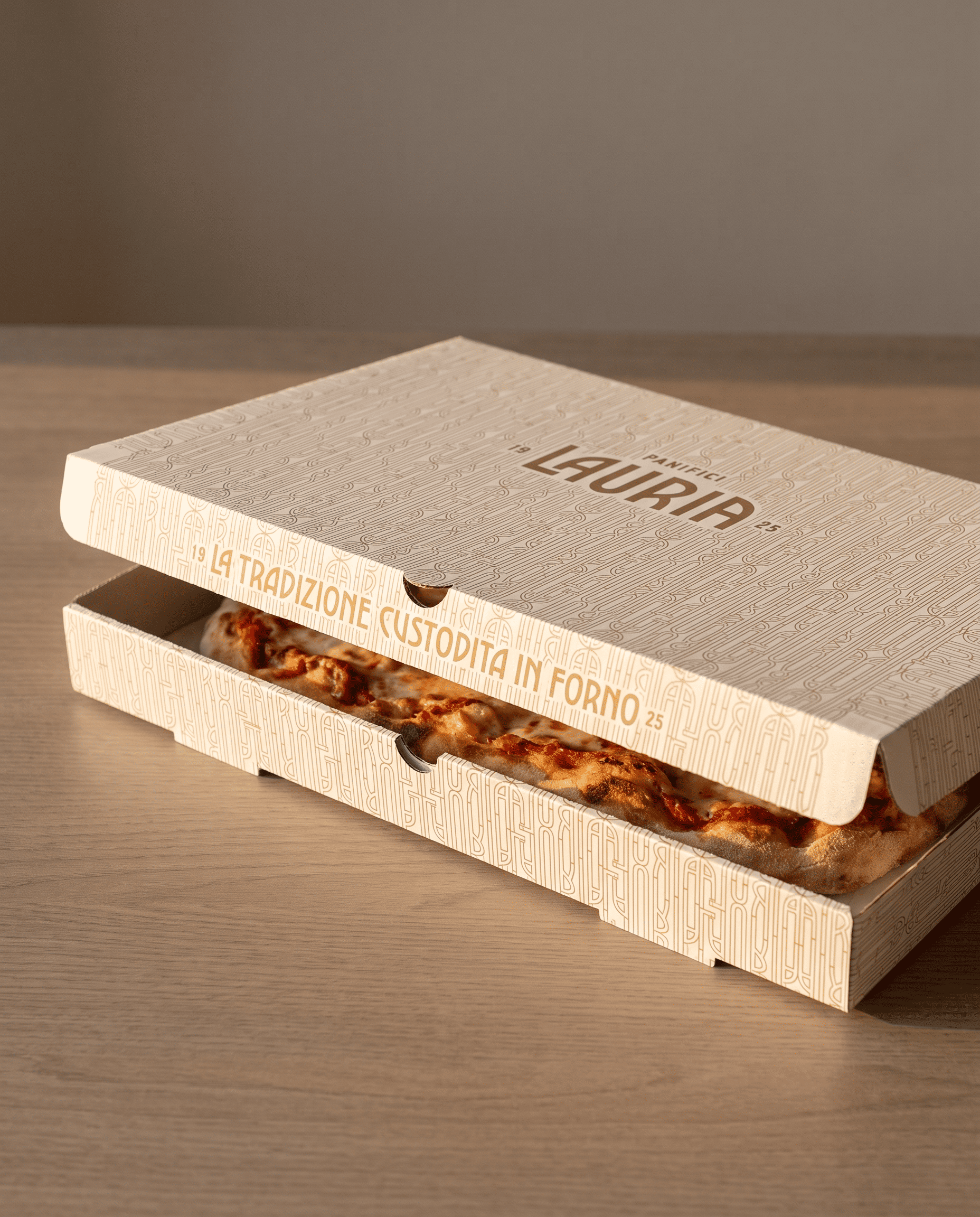
Repeating the wordmark creates a modular pattern that covers boxes, bags, wrapping papers and textiles. On gift packaging, the pattern appears in fine, tone-on-tone lines, allowing gold to become the precious accent. The same graphic motif extends beyond the bakery, appearing even on company vehicles.
From bread bags to gift boxes, colours, letterforms and patterns express a consistent identity while preserving the familiarity of a family name.
 Otherness
 Alena Chemodurova
 Estudio Argo
 Pomodoro Design Office
 amandacoppeti
 Rabia zouina
 VANESA GARCÍA ESTUDIO
 anima
 Radar Agency
 Aadarsh Jain
 M&A CREATIVE AGENCY
 Valérie Colace
 Antonia Skaraki
 Aurora Baréalisse
 Artrime Graphic Design
 Just Design
 ANONIMA/
 Armoder Arte y Diseño
 eimanbeh
 Biaa
 Hartson Creative
 Karen Danielyan
 AUN BRANDS
 Studio Zak
 Hey Joe Studio