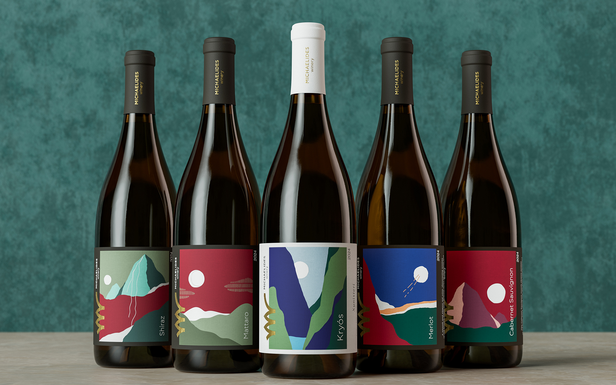

A Landscape in Wine
Logo, Brand Identity and Wine Collection for Michaelides WInery, in Kylani region, Cyprus.
The Michaelides Winery logo is inspired by the stem of the vine, organically forming both the M and W, while also subtly referencing a corkscrew. A simple, distinctive symbol that connects the winery to its craft, nature and identity.
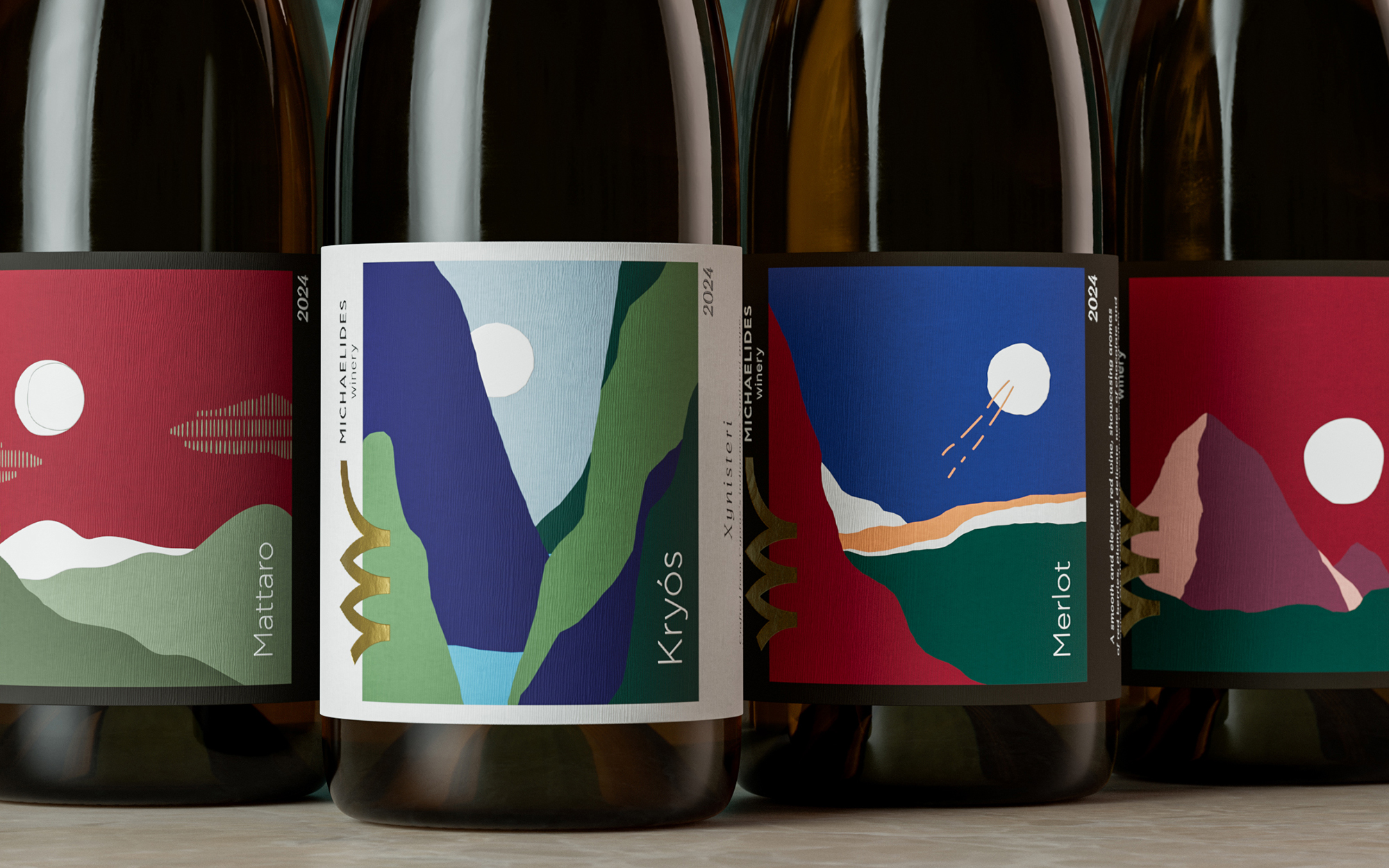
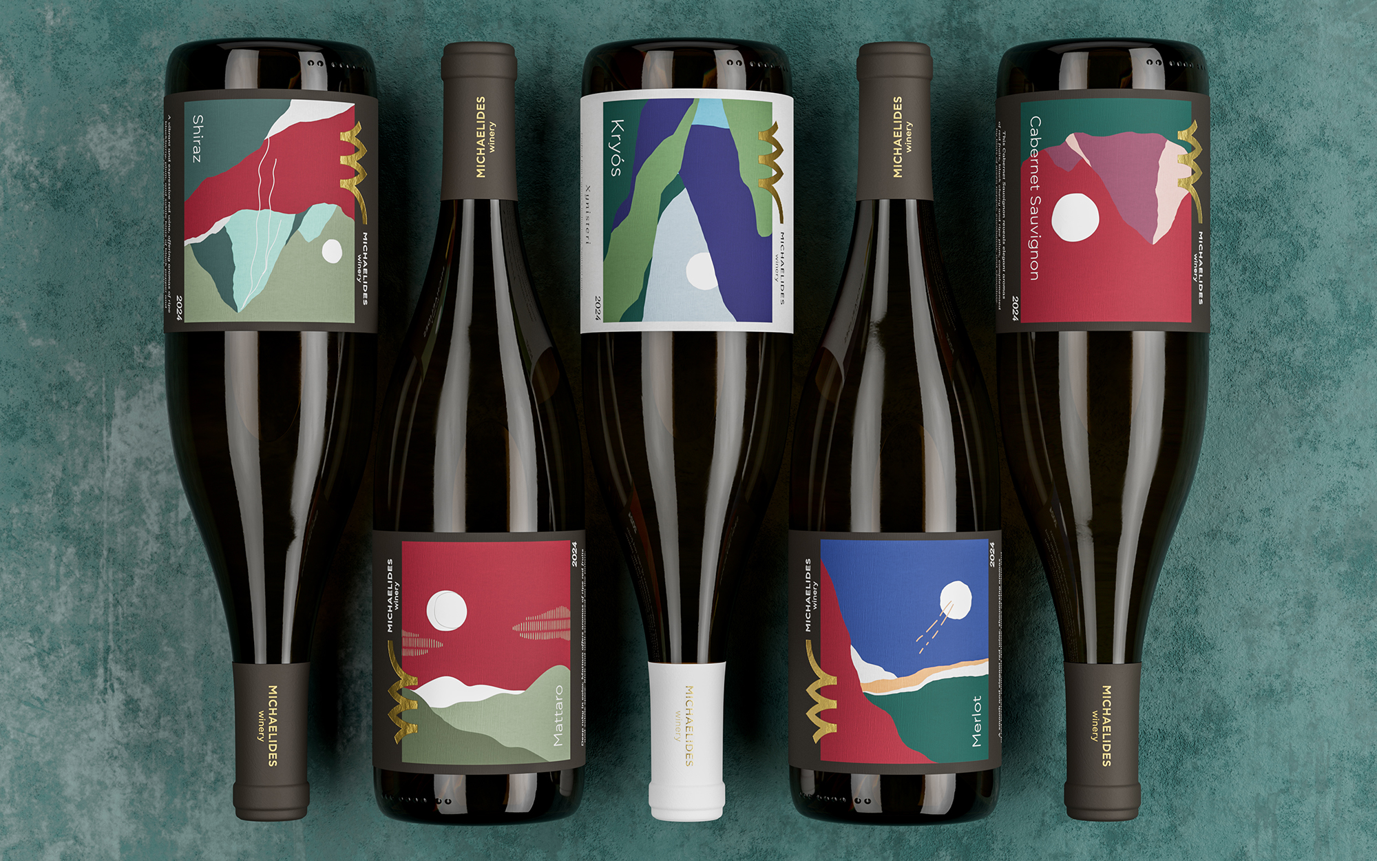
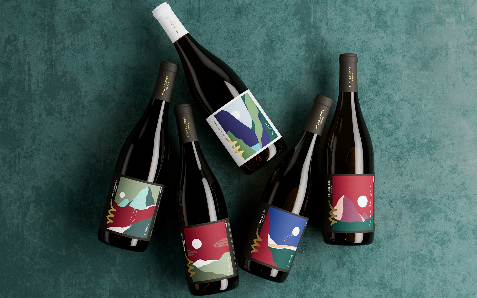
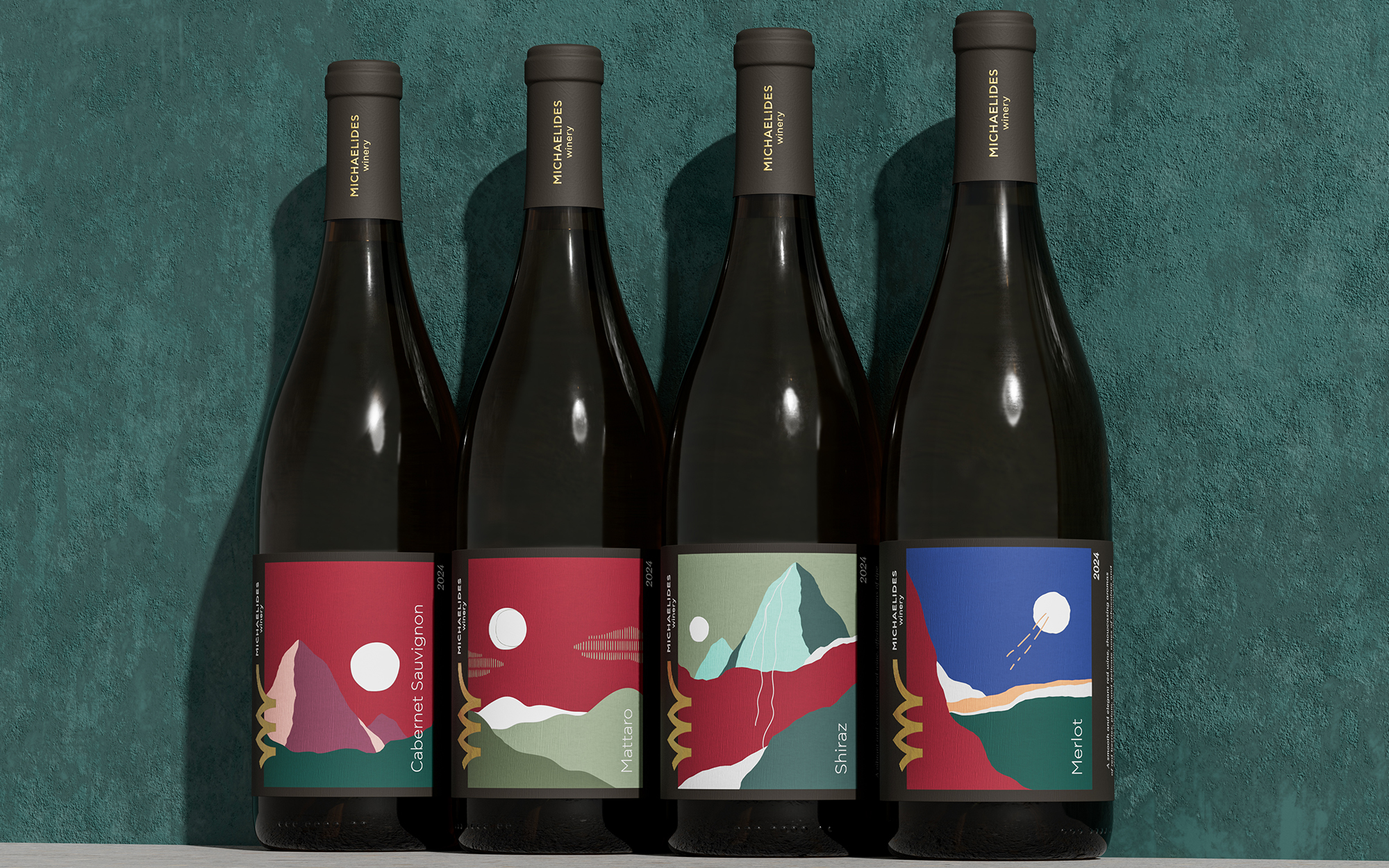
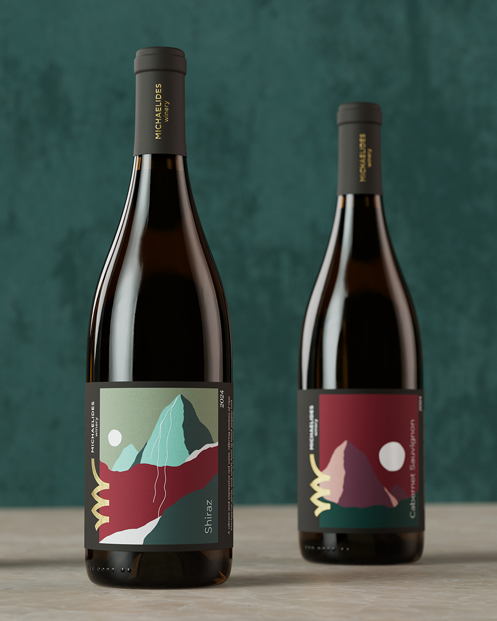
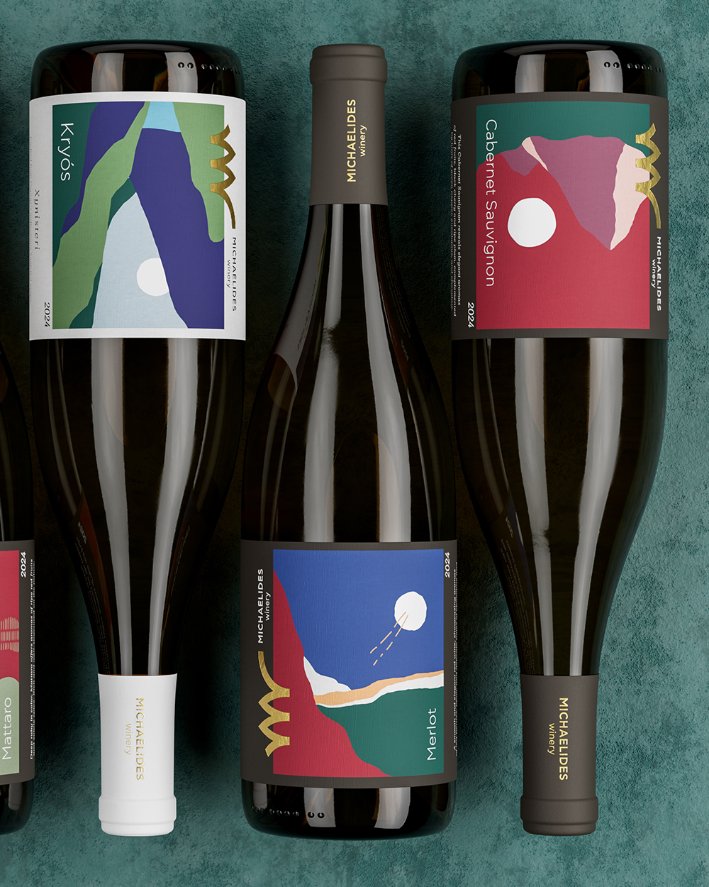
The wine labels extend the same visual language through abstracted landscapes inspired by the winery and the surrounding Kylani region of Cyprus.
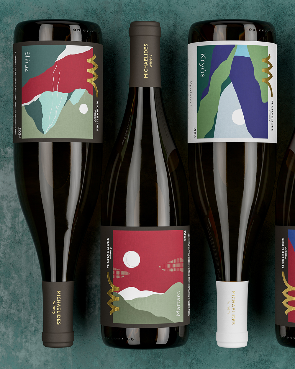
Each composition is built like a paper collage, combining bold, vibrant colours inspired by the character of each wine with a recurring sun placed differently within the landscape.
The result is a collection that balances creativity and sophistication, expressive and contemporary, yet refined and distinctive rather than mass-market or overly playful.
A contemporary expression of Cyprus: vibrant, distinctive and crafted with sophistication.
More of the project here:
https://sophiag.com/work/michaelides-winery/
Curator’s Insight
The sun is the quiet system running through this range. It stays a flat white disc on every label, but its treatment changes: a pale, moon-like circle in the cool Kryós sky, a thin offset outline on one of the reds, and short orange dashes trailing across the Merlot, which makes it read closer to a comet. That ambiguity between day and night lets each palette set its own mood without extra graphics. The label stock does similar work, with light textured paper for the white wine and dark bands framing the reds, so the range sorts itself at a glance on shelf. Vertical type along the edges keeps the illustration uninterrupted.
 Sophiagdotcom
 VERONIKA KISELEVA
 al margen
 Jasgul
 Abhijith Madhu
 mariee
 Modern Theory
 Tancybox
 WINK®DESIGN
 impprintz
 Chainhouse
 rufydesign
 White Candy Design
 Just Design
 alchimistestudioParis
 bmd group
 Laurie Offer
 medok4r
 Nouna design
 CreativeWise
 ANNA ONISHCHENKO
 Denomination
 VANESA GARCÍA ESTUDIO
 Julia Persuk