Lolo Loka by Airy Food – Nate De coco beverage
Lolo Loka
A playful world of flavours, colour and character.
Project Overview
Lolo Loka is a Nata de Coco beverage range by AIRY Food, designed to bring a refreshing, playful and youthful personality to the beverage category.
The creative challenge was to develop a packaging identity that could communicate multiple flavours while maintaining a strong and recognisable brand presence across the entire product range.
Our approach was to create a visual language that feels energetic, approachable and instantly recognisable, using expressive typography, vibrant colours and playful ingredient illustrations.
The Design Concept
At the heart of the design is a bold and distinctive typographic treatment of the name “LOLO LOKA”. The rounded, oversized lettering gives the brand a fun and friendly personality, making it the primary visual anchor across every bottle.
The supporting graphics incorporate fruit illustrations, playful nata de coco cube elements, energetic brush strokes and colourful accents. Together, these elements create a lively visual experience that communicates the product’s refreshing and flavourful character.
A Colour-Coded Flavour System
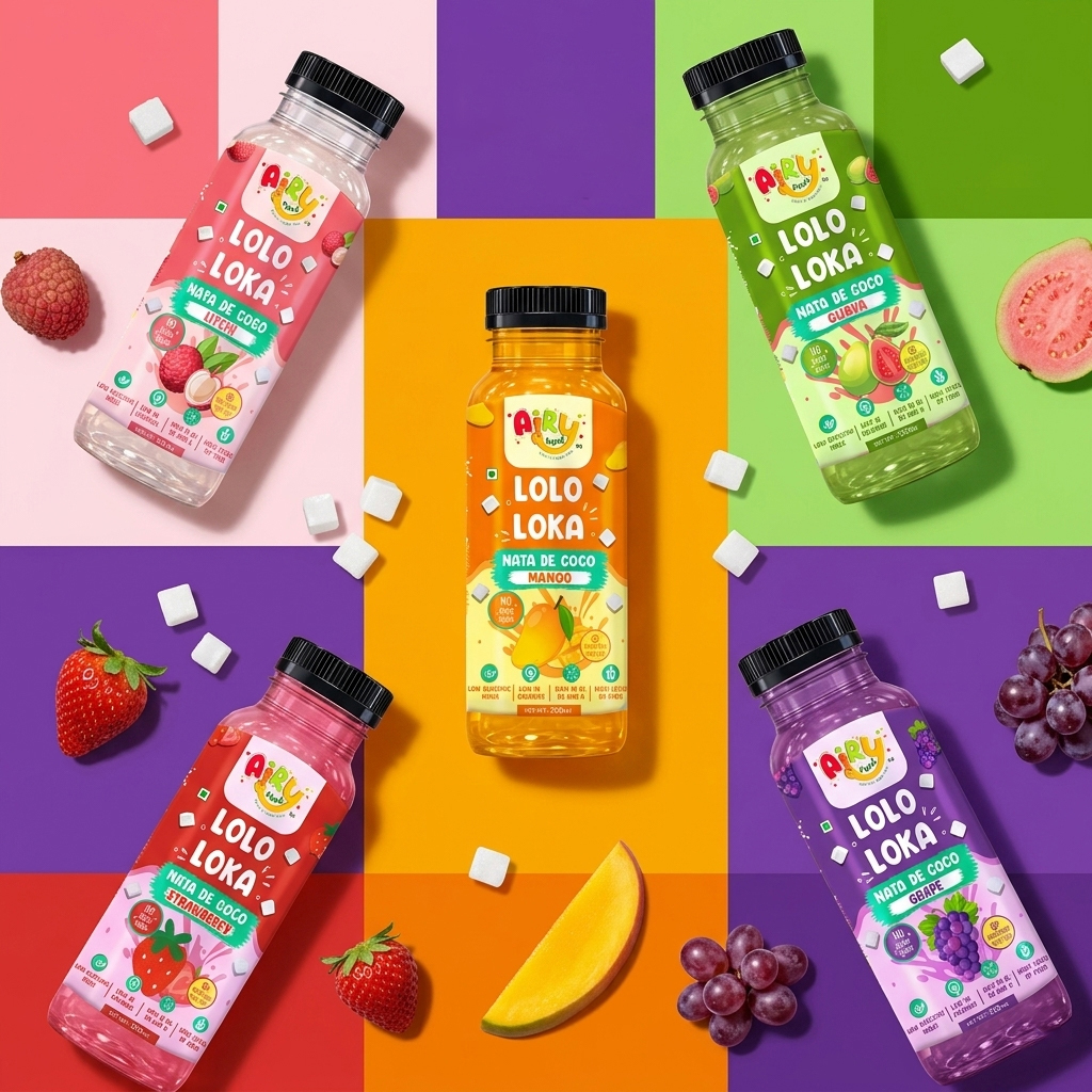
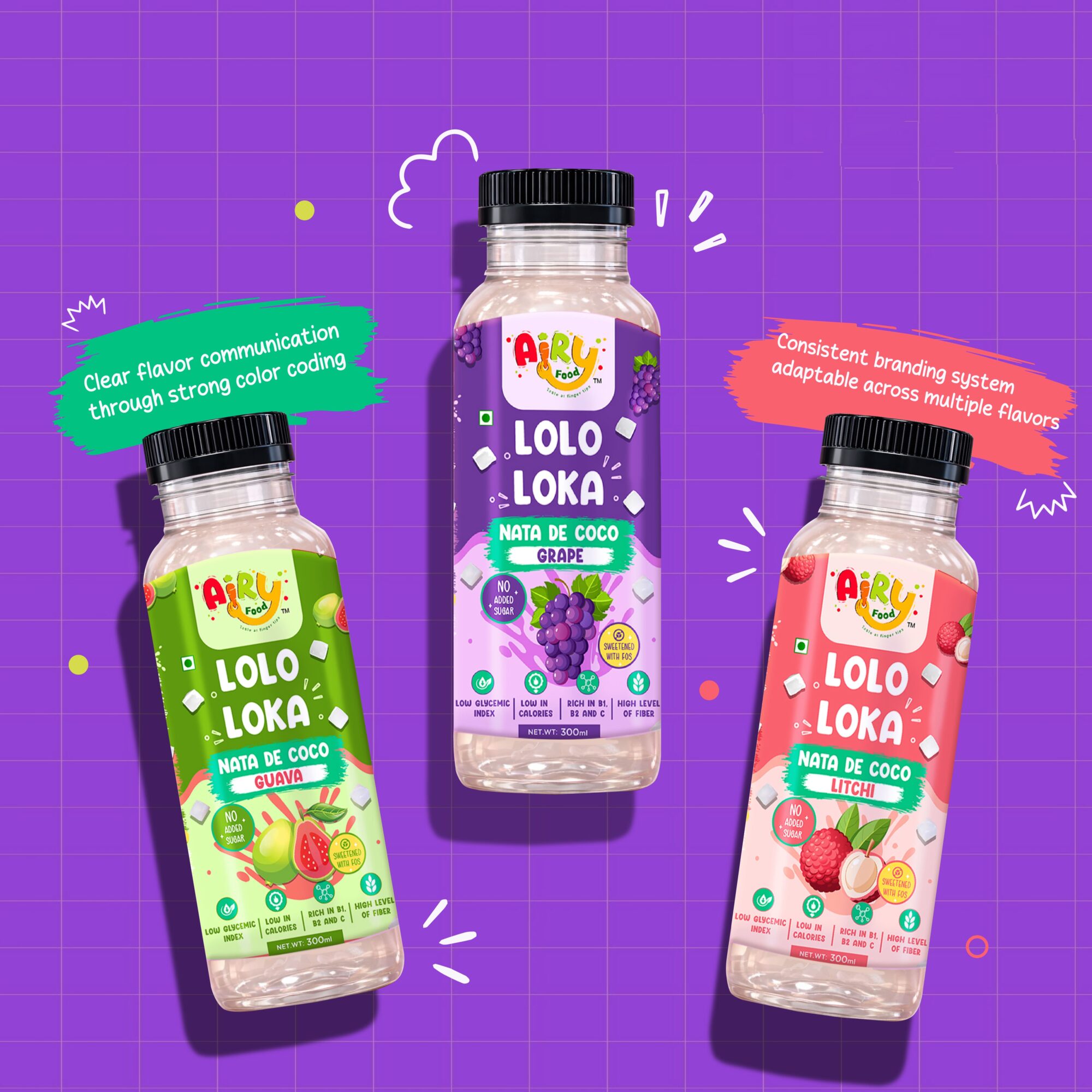
One of the key design decisions was to give every flavour its own distinct colour identity.
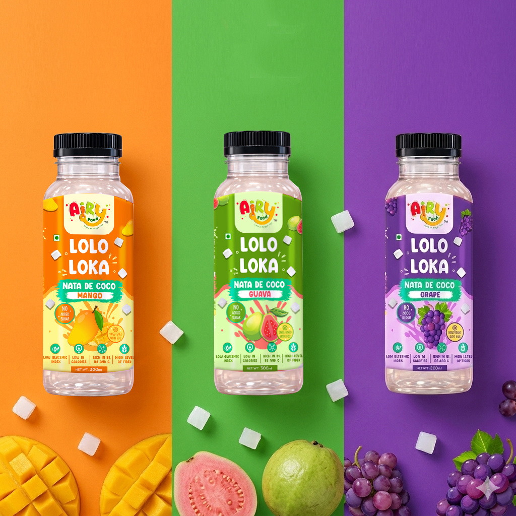
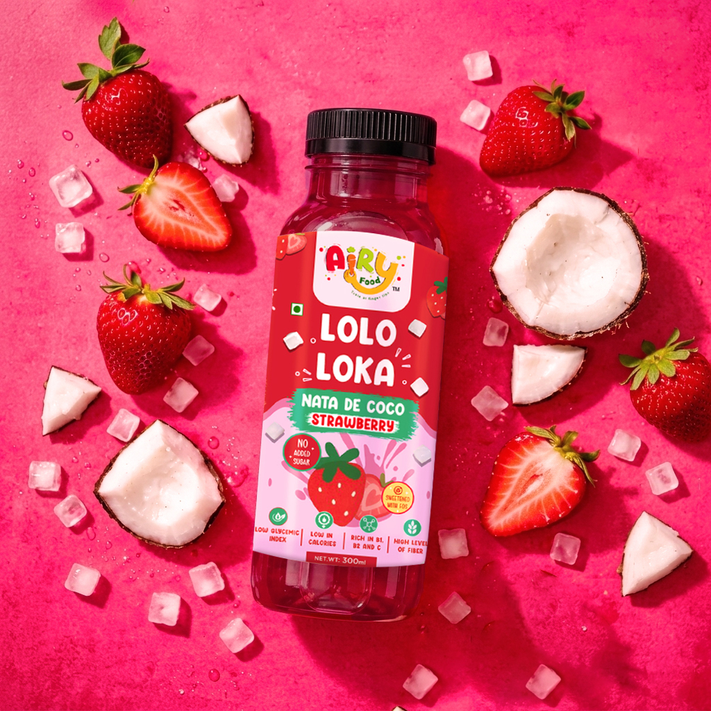
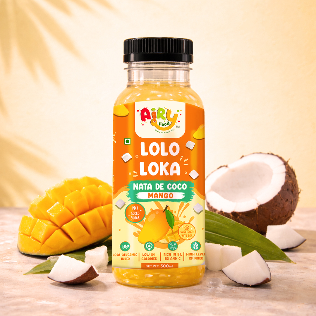
Guava takes on fresh green tones, Grape is expressed through rich purples, Lychee uses refreshing pink and coral shades, Mango brings vibrant orange and yellow, while Strawberry introduces a bold fruity red.
This colour-coded system makes flavour identification intuitive while ensuring that all variants remain visually connected through consistent branding, typography and layout.
Consistency Across the Range
Although each flavour has its own personality, the packaging follows a unified design structure. The AIRY Food logo, LOLO LOKA typography, product naming, ingredient illustrations and nutritional communication are consistently positioned across the range.
This creates a scalable packaging system that allows new flavours to be introduced without losing brand recognition.
The Visual Language
The overall aesthetic is intentionally playful and contemporary. Rather than following conventional beverage packaging layouts, the design uses expressive graphics, bold typography and vibrant colour combinations to create a distinctive shelf presence.
The accompanying product visuals extend this personality through colourful backdrops, fresh fruit styling, ice elements and ingredient-led compositions.
The Outcome
A vibrant and adaptable beverage packaging system that gives Lolo Loka a recognisable identity across multiple flavours.
The project brings together playful design, clear flavour communication and consistent brand architecture to create a packaging range that feels fresh, expressive and full of character.


Comments
0 commentsLog in to comment or submit projects