

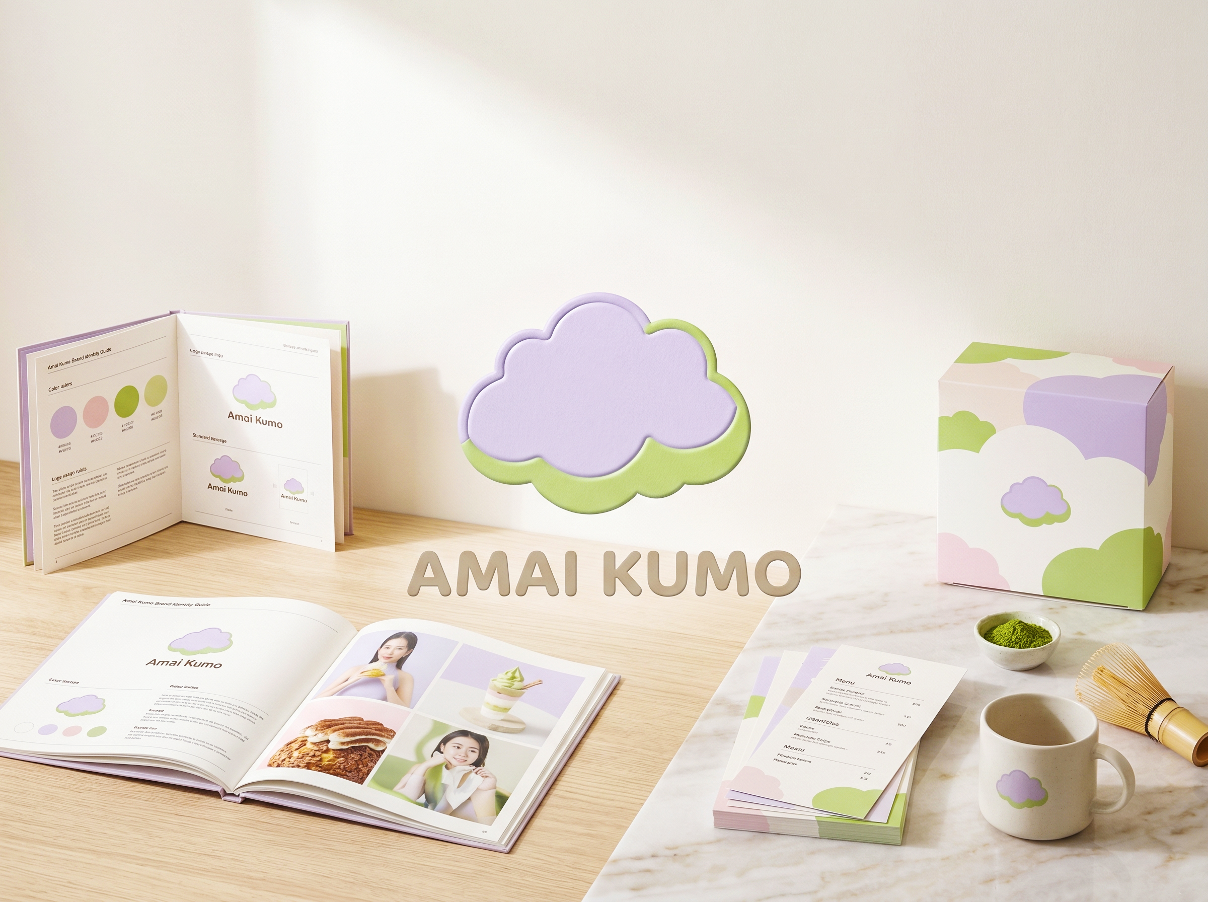
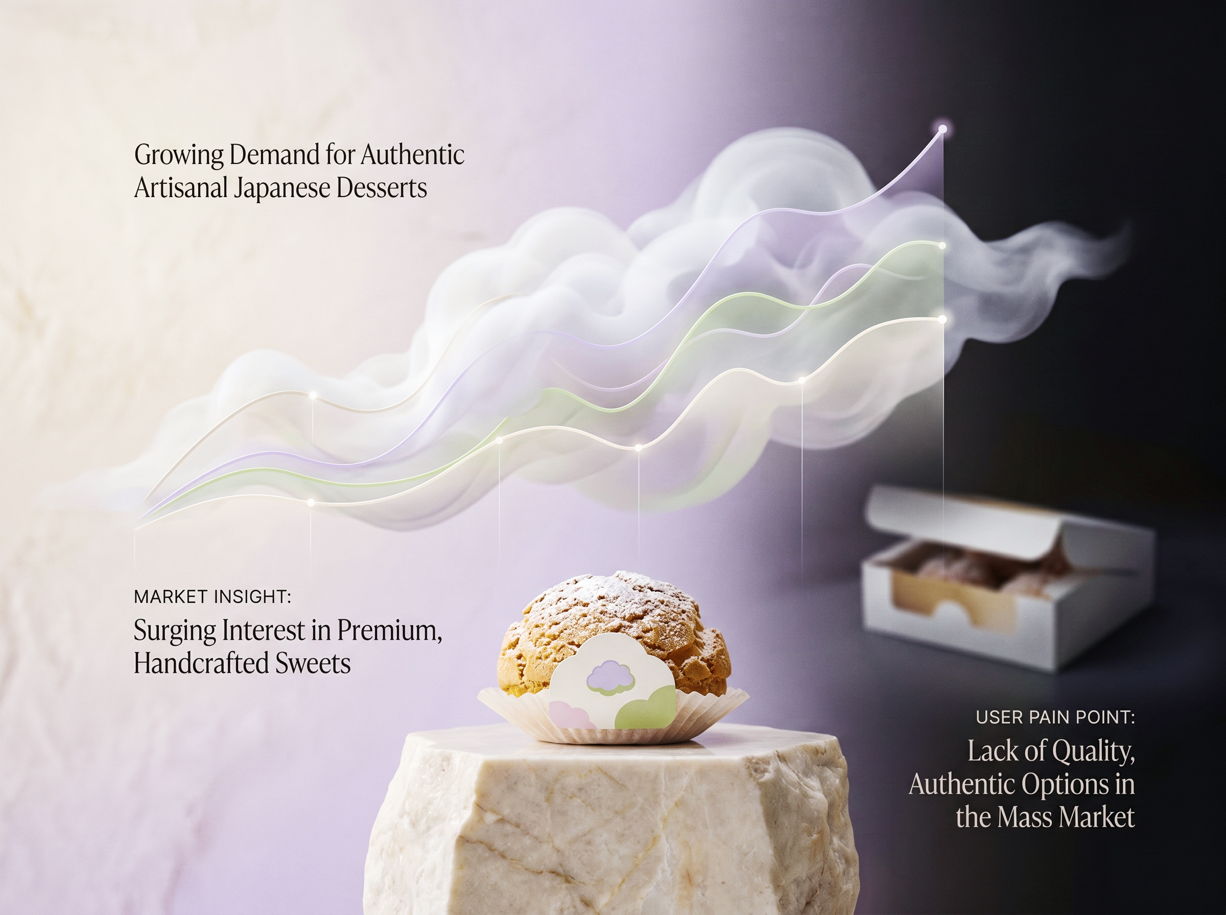
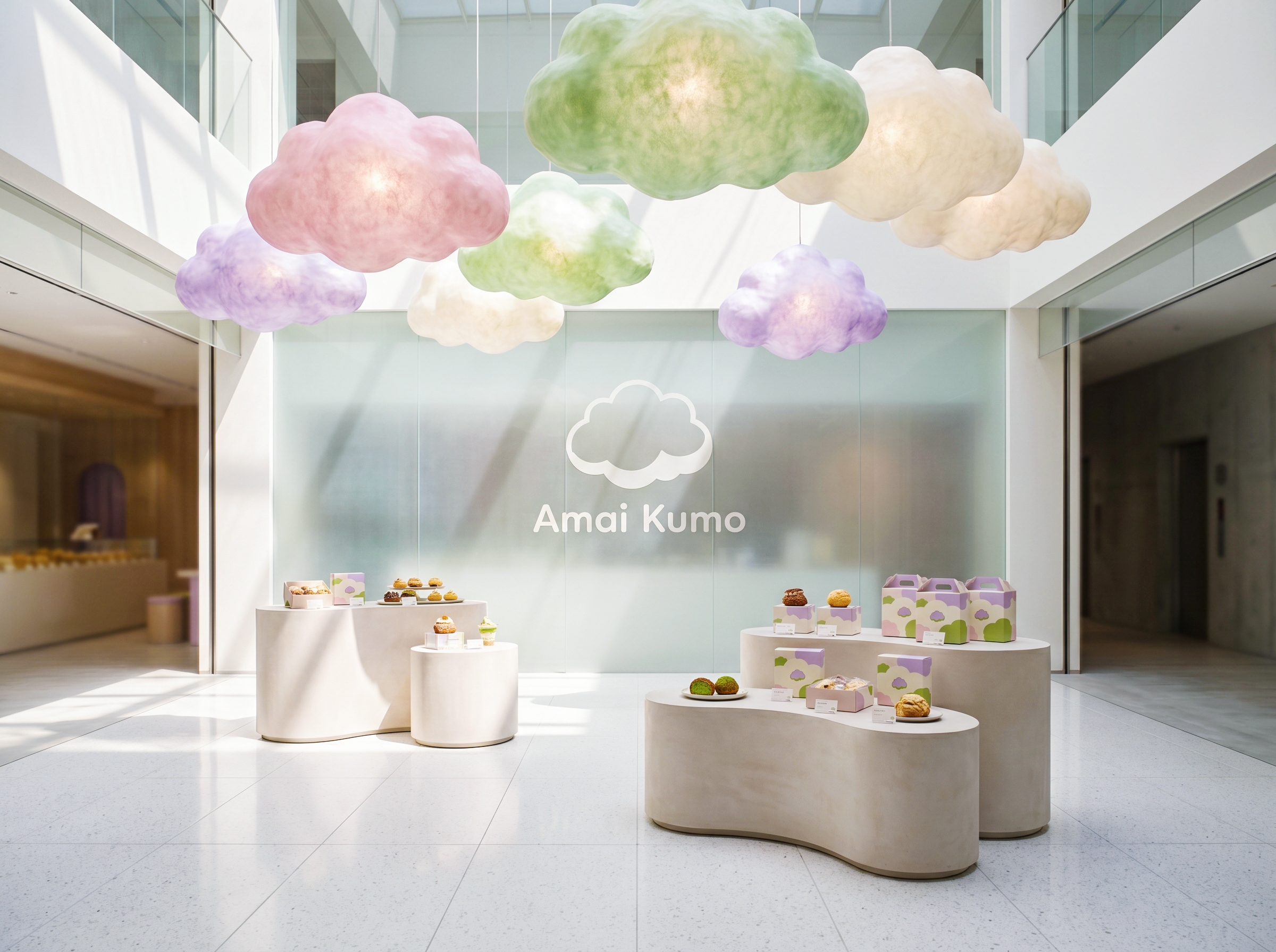
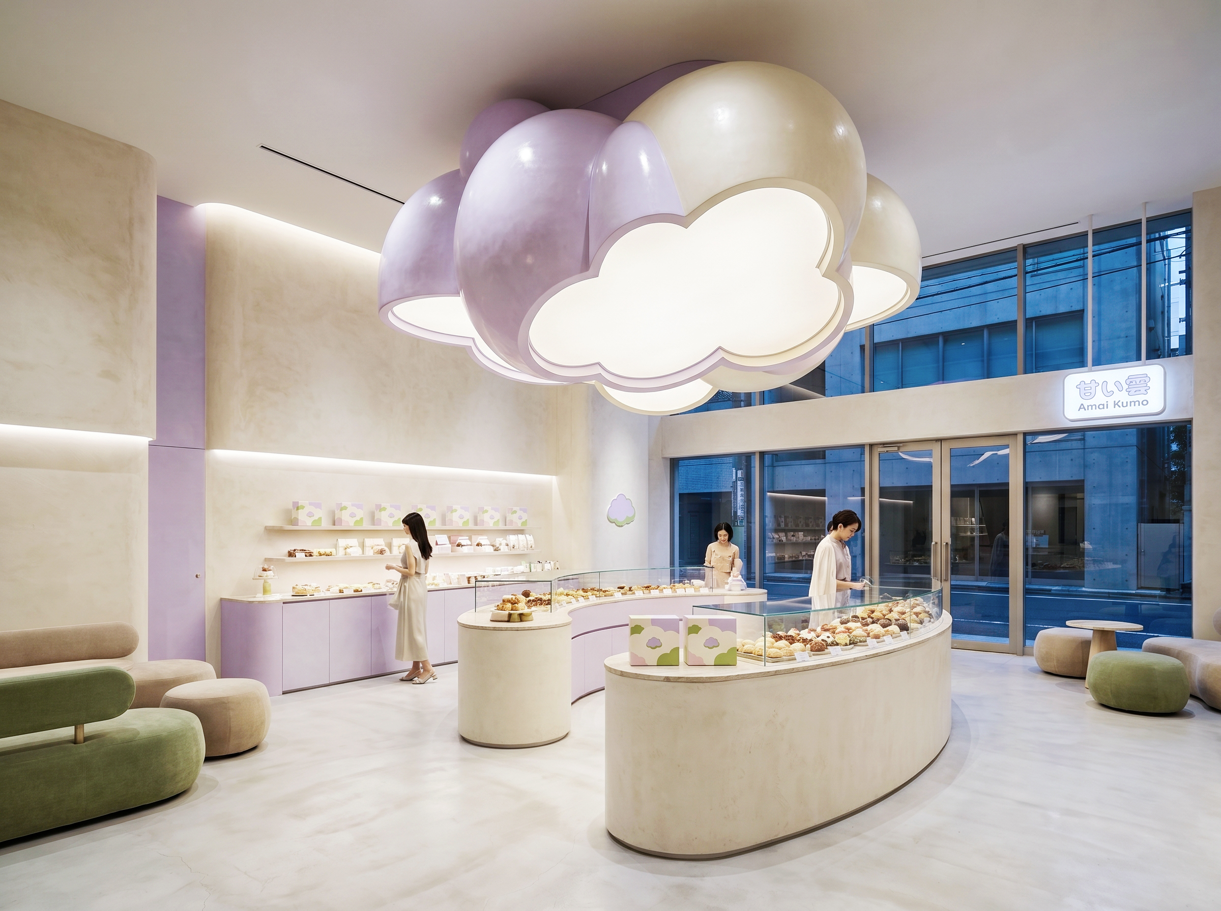
AMAI KUMO is a Japanese-inspired pâtisserie specialising in artisanal cream puffs and premium soft-serve, built on the philosophy of cloud-like texture. The packaging had to make that lightness visible before anyone takes a bite.
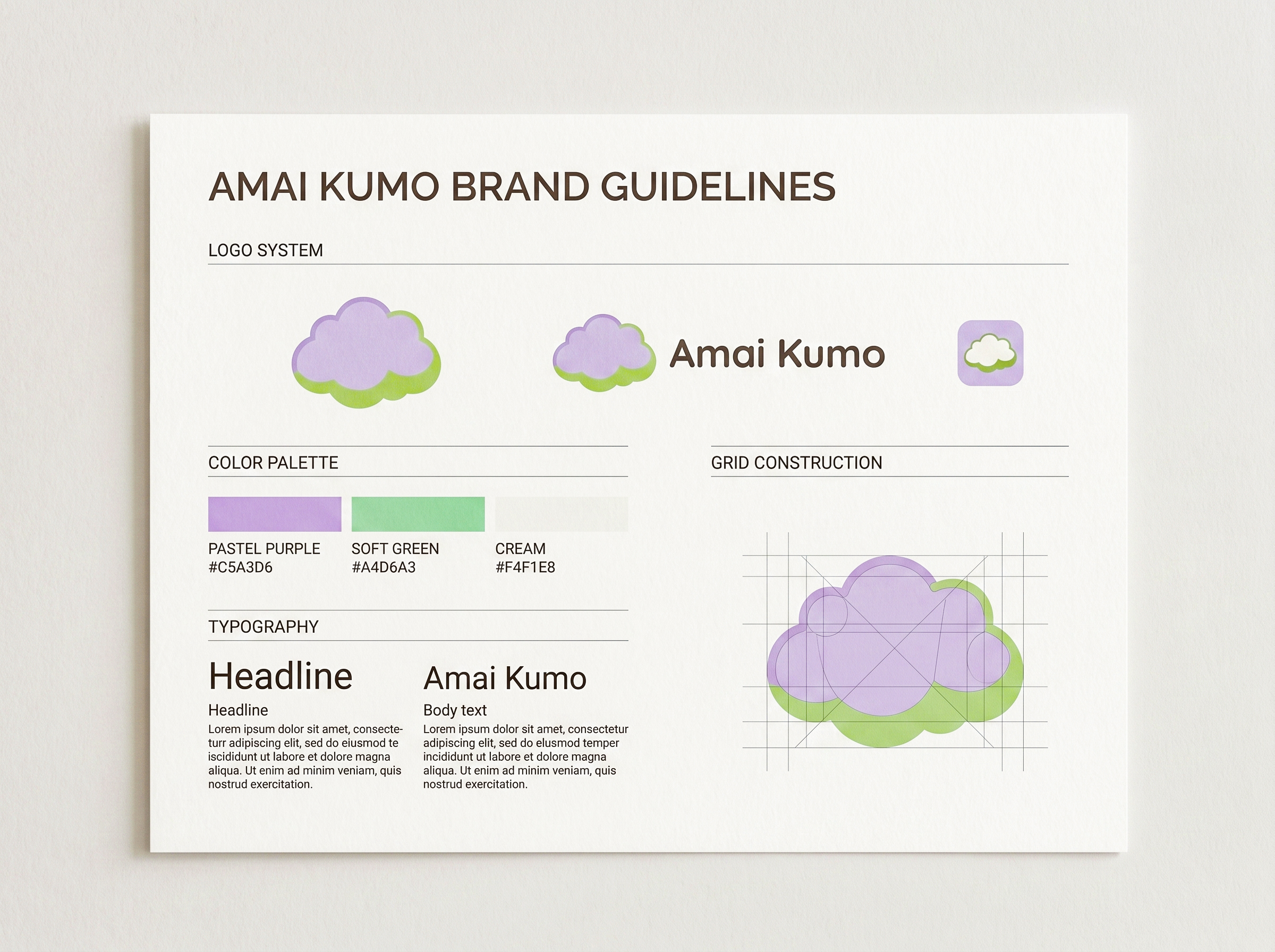
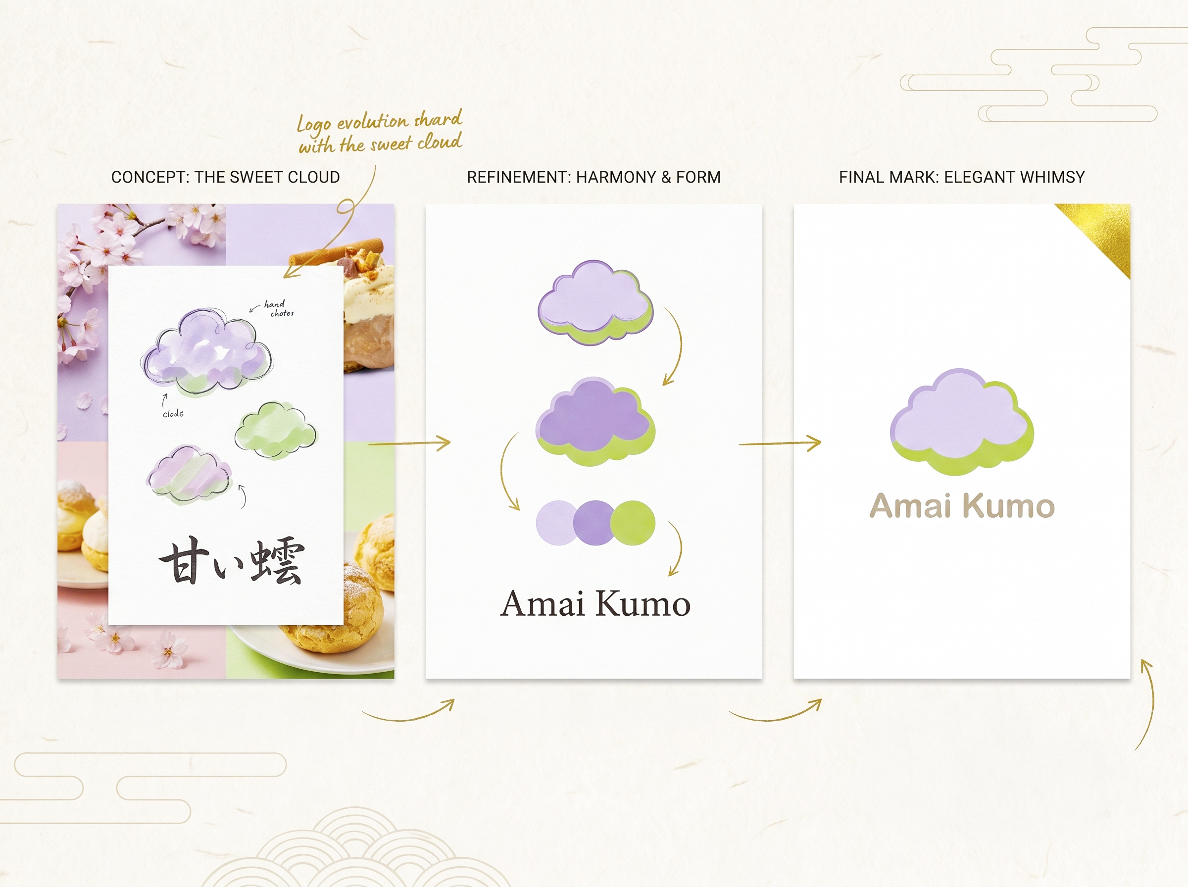
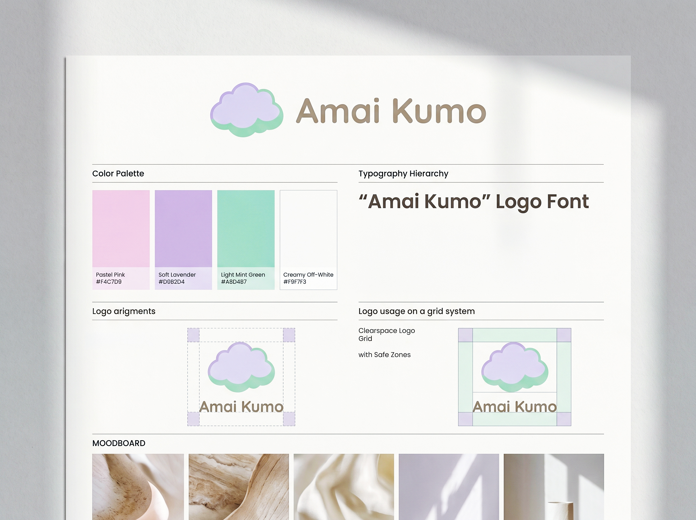
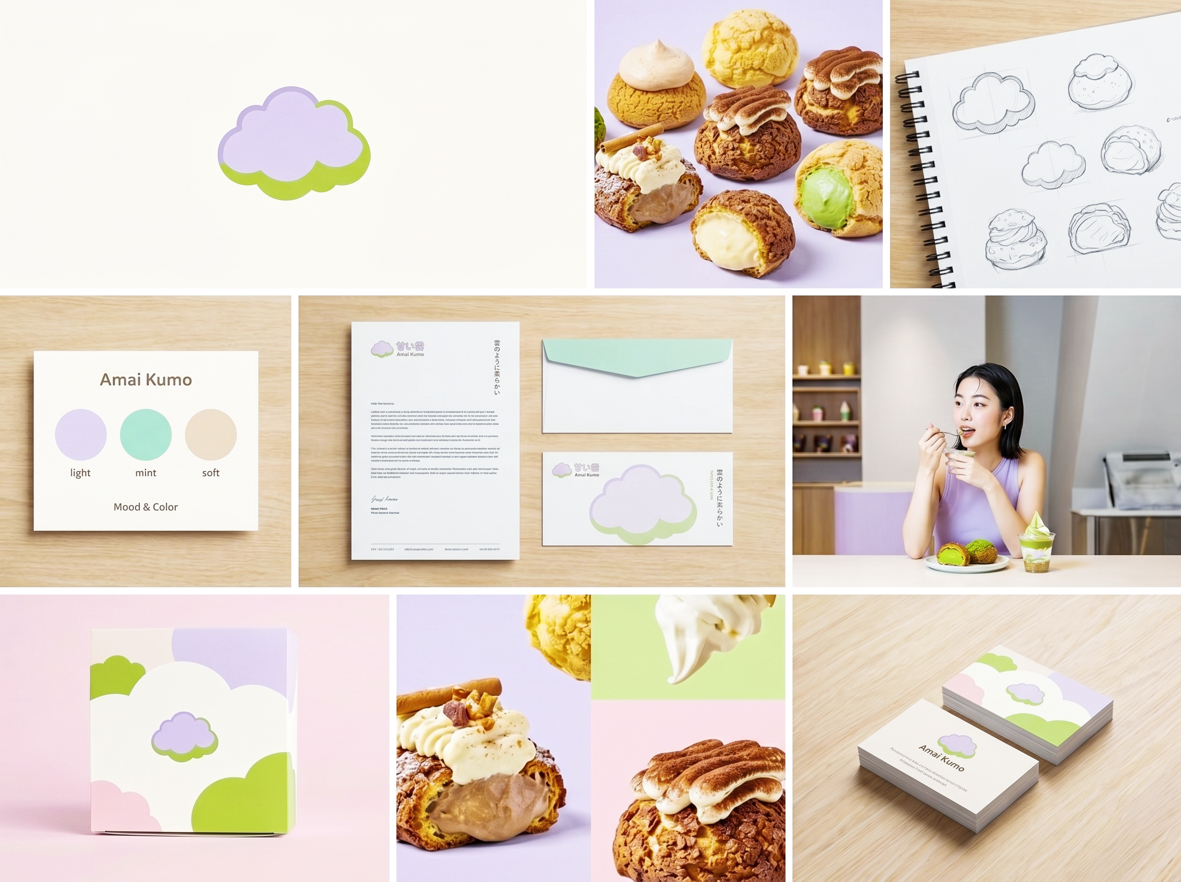
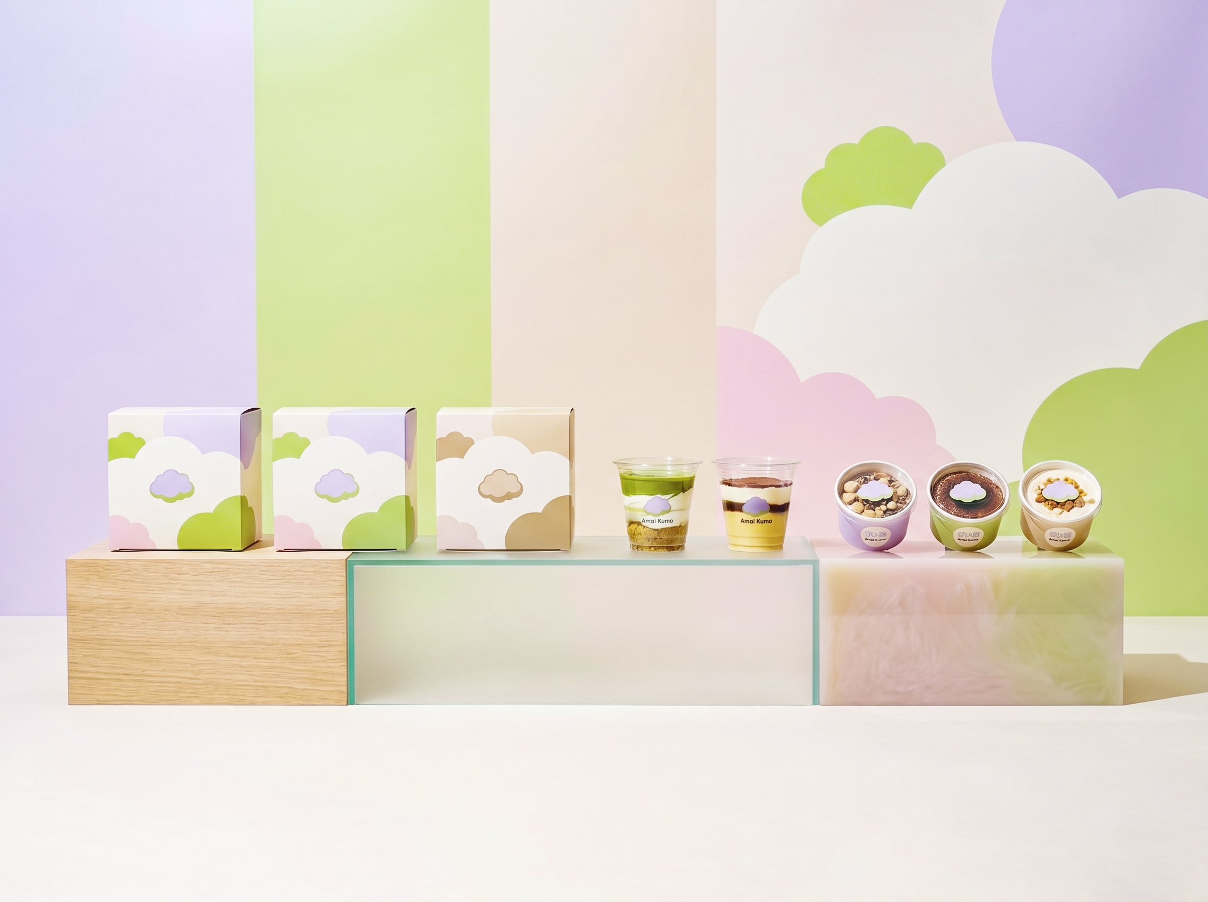
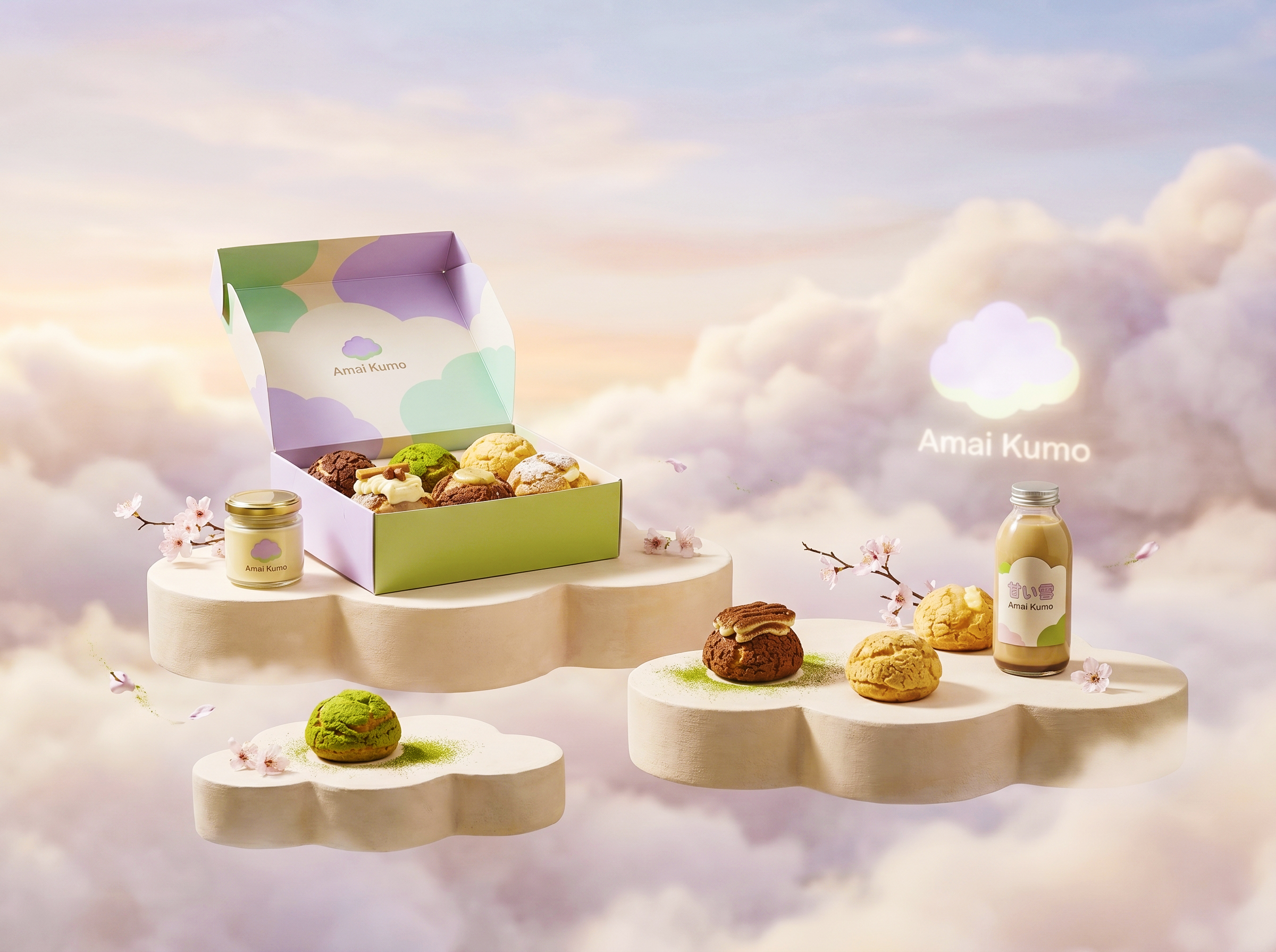
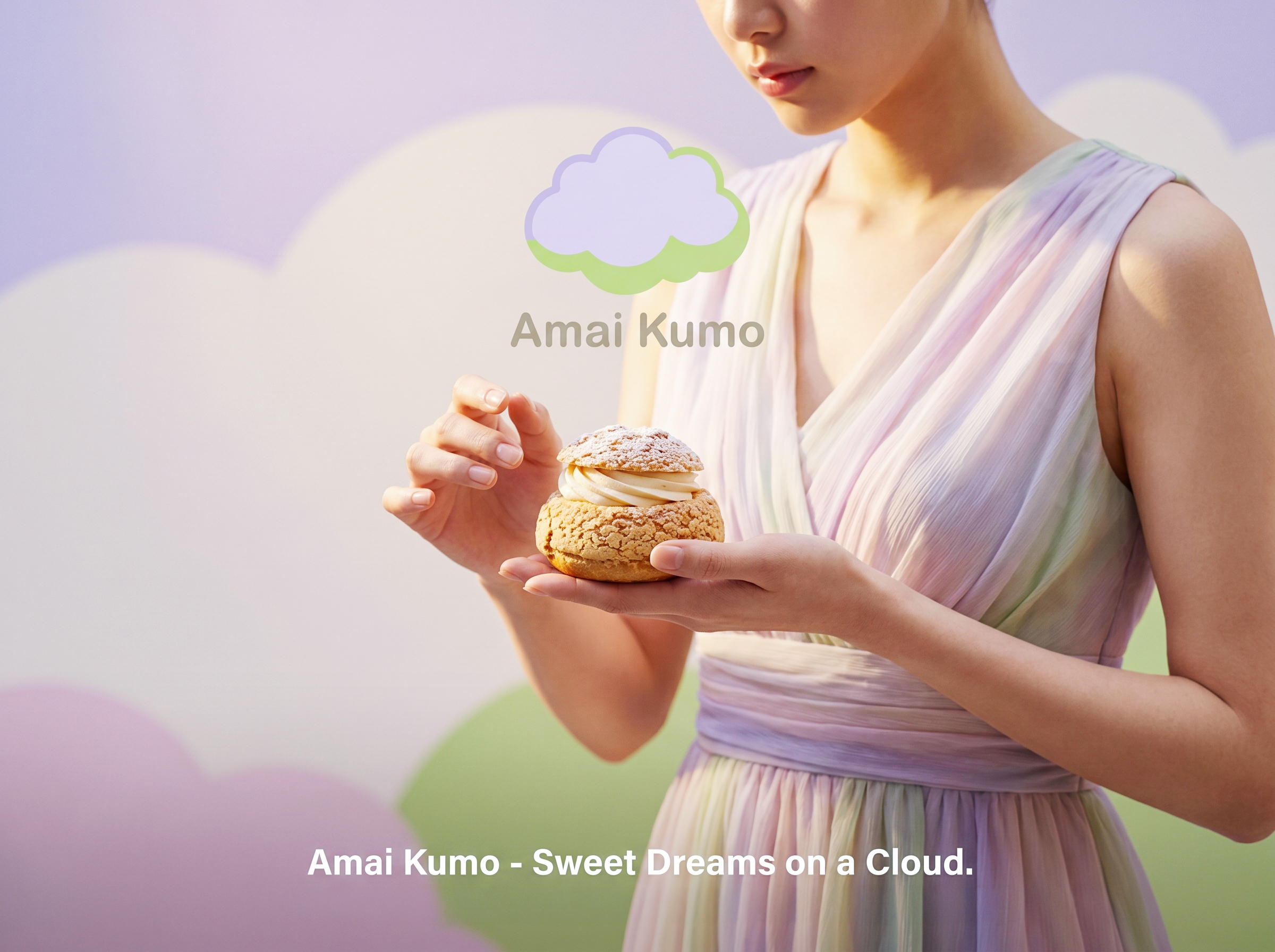
The identity centres on a layered cloud icon with an offset shadow, a direct reference to the multiple textures inside a perfect choux: crisp shell, airy pastry, flowing cream. The palette stays deliberately narrow and high in clarity: lilac for sweetness, matcha green for the organic note, and warm cream for the puff itself. Typography pairs a clean sans-serif with Japanese kanji, keeping the brand internationally modern without erasing its heritage.
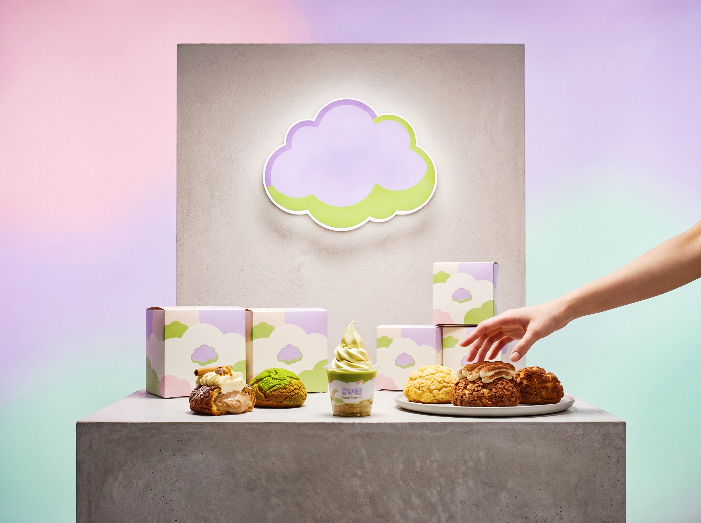
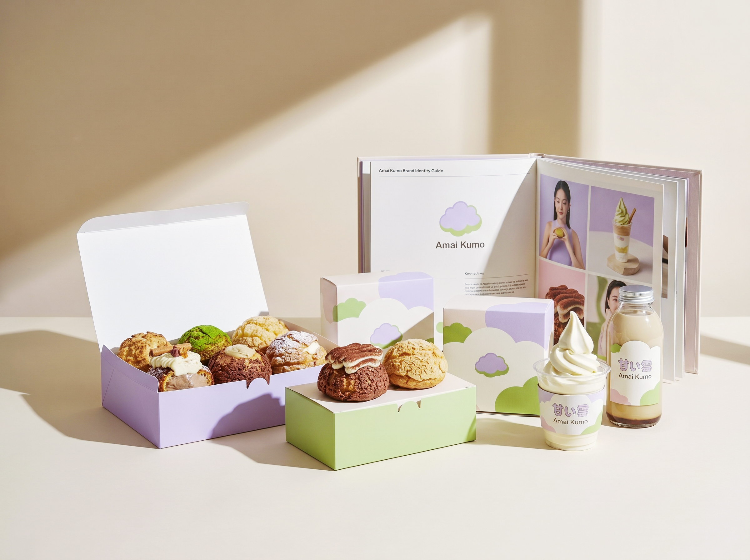
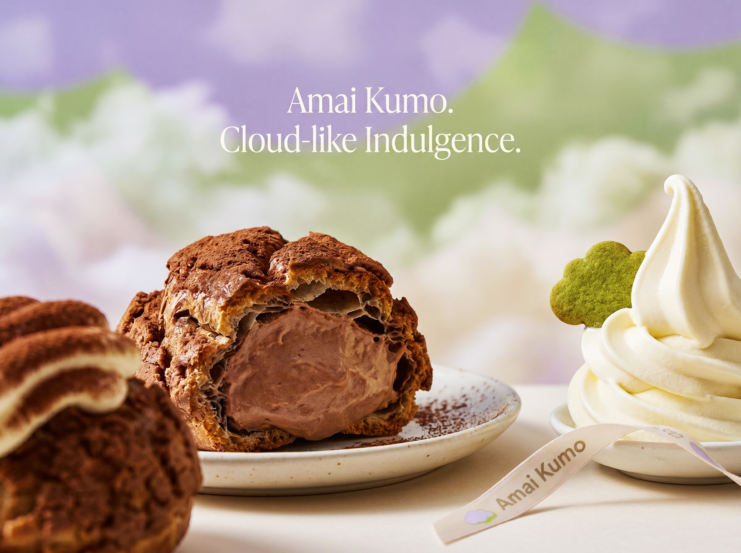
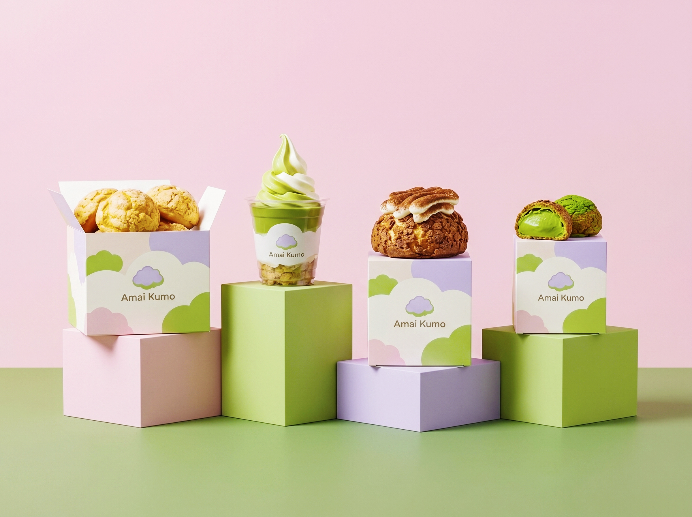
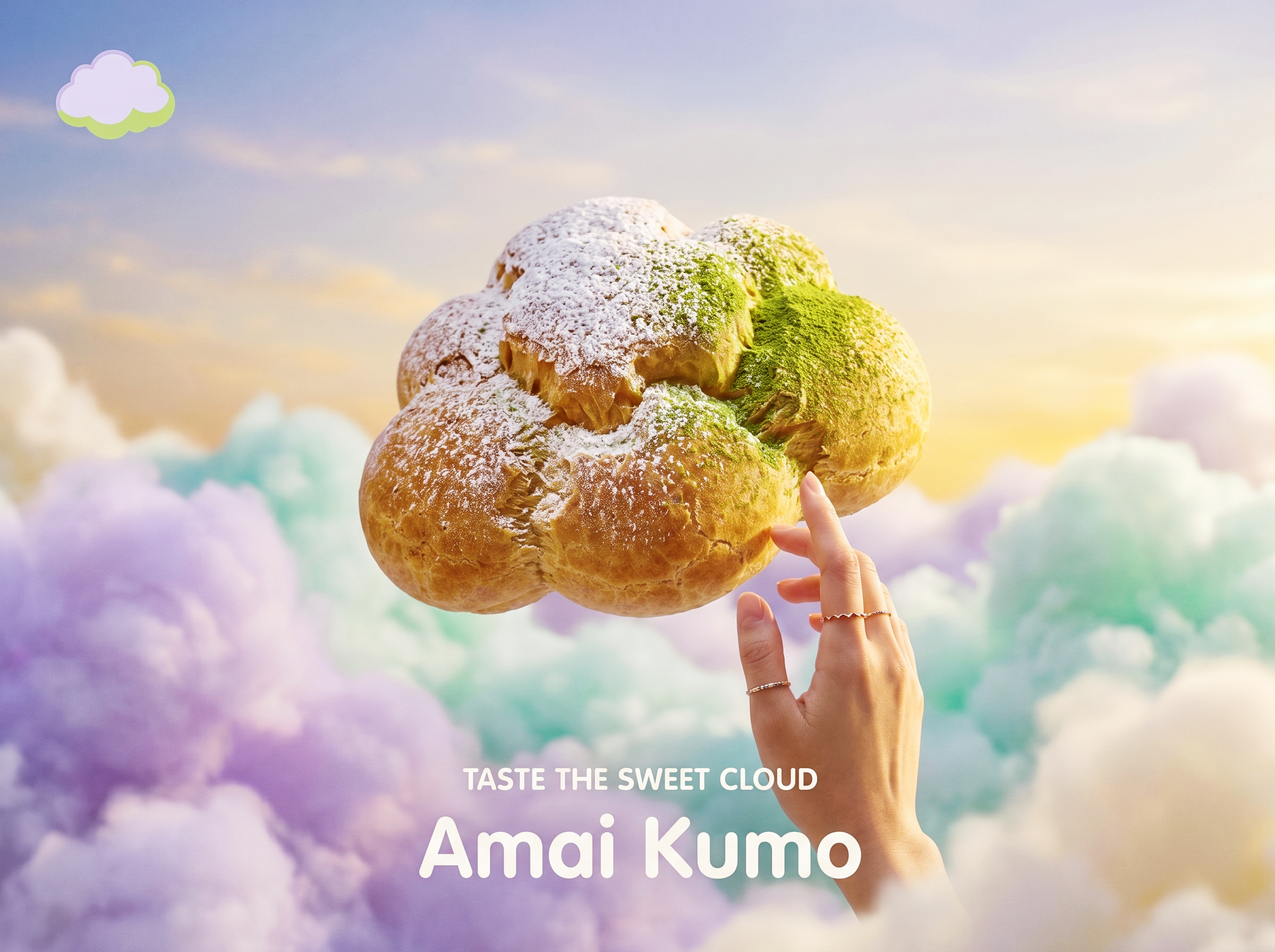
The packaging translates this into bold lavender and green colour blocks on square gift boxes, so the cloud motif carries the brand outside the store. Photography focuses on the contrast between the crisp shell and the smooth, flowing filling. The result is packaging that treats dessert as a piece of edible design rather than a bakery product.
Designed by Up-Brands Design Agency, based in the Greater Bay Area, China.

 Derrick Lin
 Sophiagdotcom
 Sofia Nikishina
 studionerius
 monther al omari
 Monroe
 KateChachava
 Snob Duck
 宏洛图品牌设计HONGLT
 Studio Six F
 Just Design
 New Century Design
 VIEWPOINT
 Abbydraw Designs Unique Conceptual Branding & Packaging Designing Ideas
 BexNelson
 Vladimir Shmoylov
 Kris
 Agence des Coteaux
 Julia M.
 Rabia zouina
 www.branding.uz
 Diego Alves do Amaral
 studioaslihan
 Minim Brand Design