

IL NIDO
A place of goodness
Il Nido was developed to build a new brand identity starting from a complete repositioning of the existing system.
The project begins with the definition of a packaging system, with the aim of translating the brand positioning into a clear, recognizable, and shelf-consistent visual language.
The name “Il Nido” summarizes the new approach: an identity built around care, warmth, and quality, also reinforced by the physical context of the company, located in a former nursery school.
SOLUTION
Developed with Andrea Castelletti Studio (creative direction), the project builds a packaging system as the main tool for brand identity.
A competitive analysis guided the definition of a visual language that is both distinctive and immediate, designed to ensure strong recognition within the food sector.
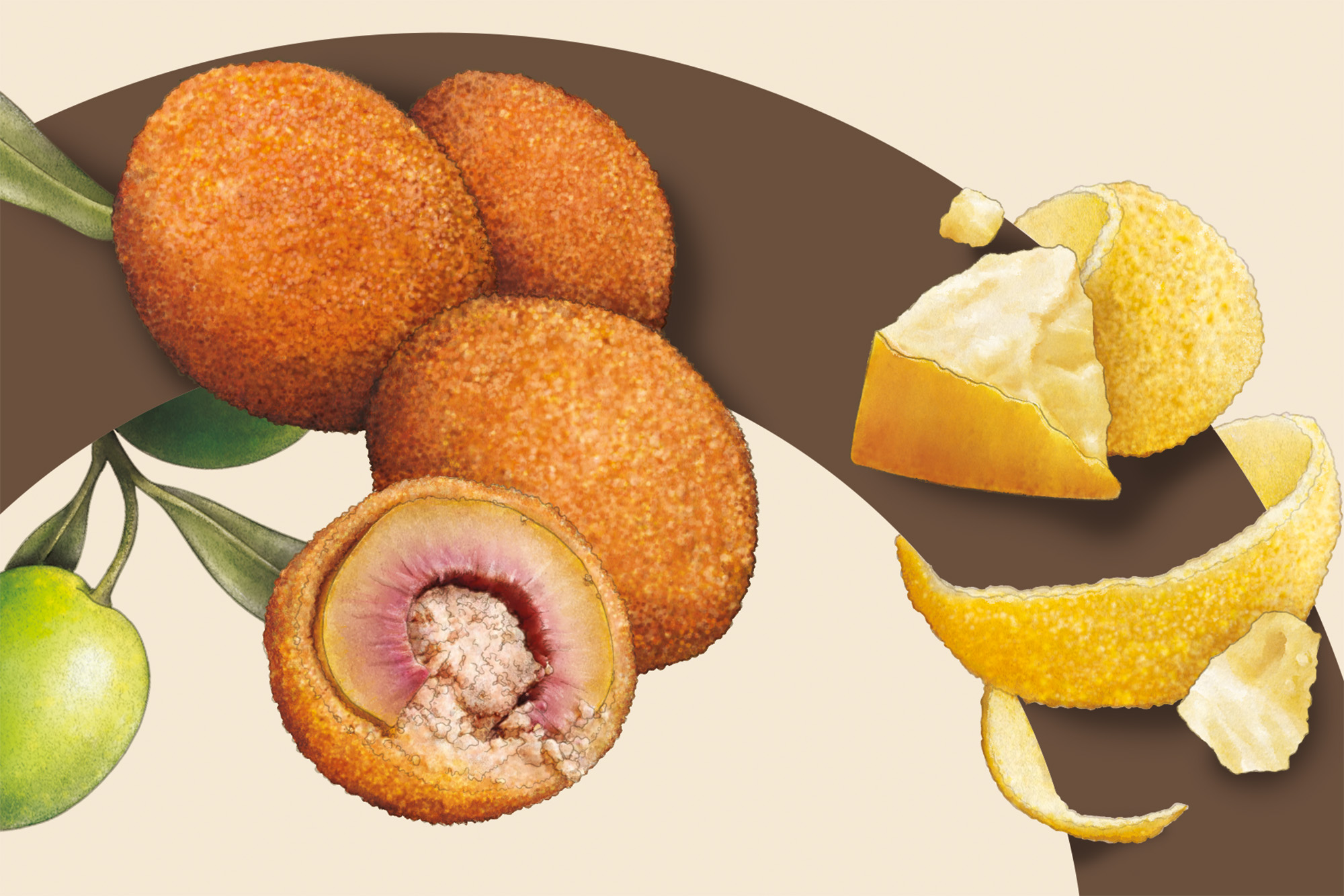
The system is supported by an illustration language developed by Claudia Bartoli, introducing a narrative layer aligned with the brand positioning.
The packaging becomes an integrated communication system, where product and visual identity coincide.
RESULT
The result is a packaging system that translates the project into a clear and immediately readable identity.
Il Nido positions itself as a recognizable and consistent brand within its category, communicating quality and closeness through a simple and direct visual language.




 Andrea Del Prete
 Le Studio G
 Julia M.
 eliza
eliza B&WGraphicLab
 Opime Studio
 monther al omari
 Akim Melnik Design Studio
 Oksana
 vitoramockup
 Studio Wrapd.
 CJMartins
 Carreto Concepts Design Studio
 LogoSayLove
 Koolbrand
 Jeremiah Haastrup
 Creative Branding Agency
 Expand Buzz
 estudioe
 Heramb Arora