Rebranding of ZAVOD COFFEE, the coffee roaster
ZAVOD COFFEE is a roasting company based in Moscow. The team consists of 13 people; each of them has at least ten years of experience in the coffee industry. The company buys green beans, roasts them, and delivers them to end customers: restaurants, coffee shops, and ordinary people. We formulated the brand platform and positioning, developed the identity, packaging design, and corporate font.
Most companies in the industry have no clear positioning, with rare exceptions. At the same time, it is the positioning that allows the client to understand how this company differs from others — in each of its actions, in each solution, and each product?
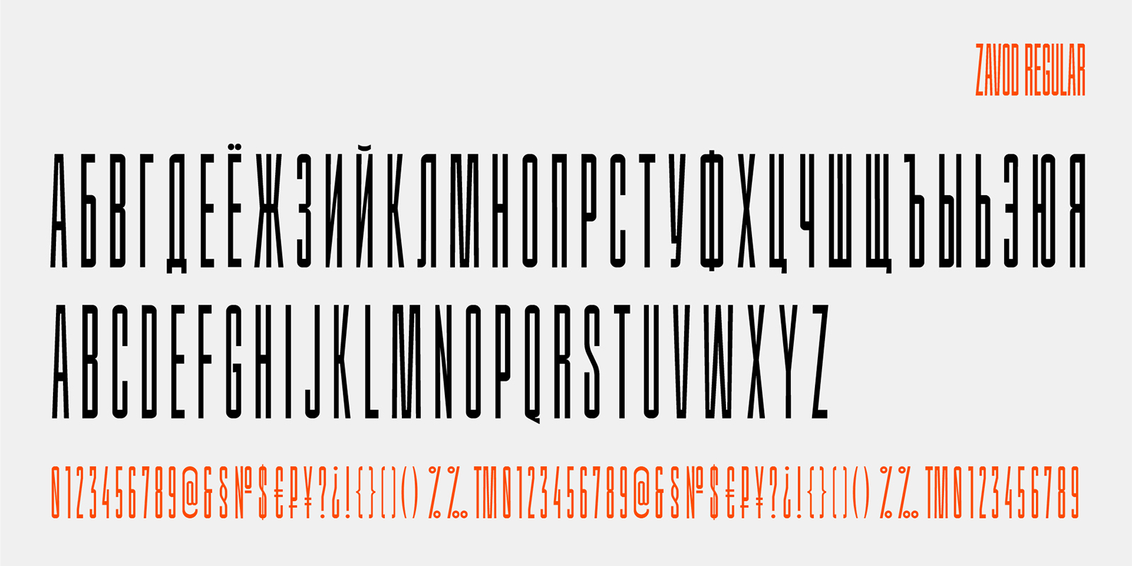
Positioning of ZAVOD COFFEE is fine coffee production. A stable product, stable and big company, reliable processes, large product selection, high-quality coffee, balanced technologies. The corporate identity is based on industrial aesthetics: bright orange color, catchy “factory” font, and bold typography.
Positioning
The research and analysis phase showed that most companies in the industry do not have a clear positioning, with rare exceptions. At the same time, it is the positioning that allows the client to understand how this company differs from others — in each of its actions, in each solution, and each product?
Positioning of ZAVOD COFFEE is fine coffee production.
‘Fine commercial’ is an existing term in the coffee industry. Not the ‘specialty’ yet, but this is surely coffee of excellent quality — delicious, popular, and commercially successful. It is the word ‘fine’ that defines the new commercial coffee as a coffee of a special kind.
The word ‘production’ adds the image of a factory, large-scale manufacture to the brand’s portrait. A factory means a well-established process that neither fails nor stops. It means proven technologies, approaches, and techniques. It means constant growth and development.
FINE COFFEE PRODUCTION means the production of excellent coffee: a stable product, stable and big company, reliable processes, large product selection, high-quality coffee, balanced technologies.
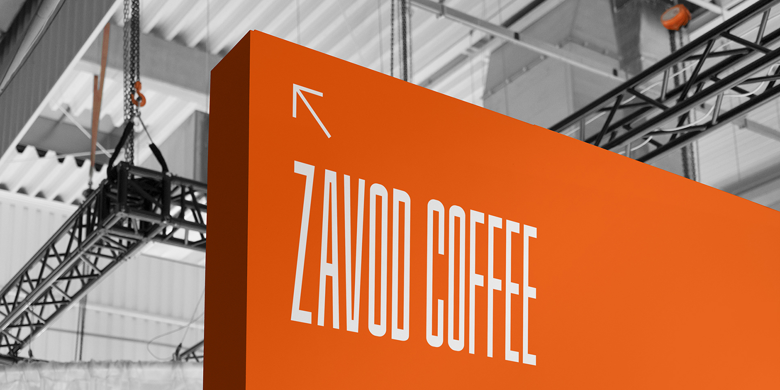
Corporate Identity
The corporate identity is based on industrial aesthetics, the main dominants of which are color and typography.
Orange is the color of molten metal and burning furnaces; it is bright, active, and energetic.
The new brand logo is close to the factory aesthetics, similar to an industrial marking or pictogram.
Industrial aesthetics is also embodied in the outsized, elongated shape of letters. Such an inscription becomes the key graphic element on the pack.
The Zavod Regular font is a unique typeface designed especially for Zavod Coffee.
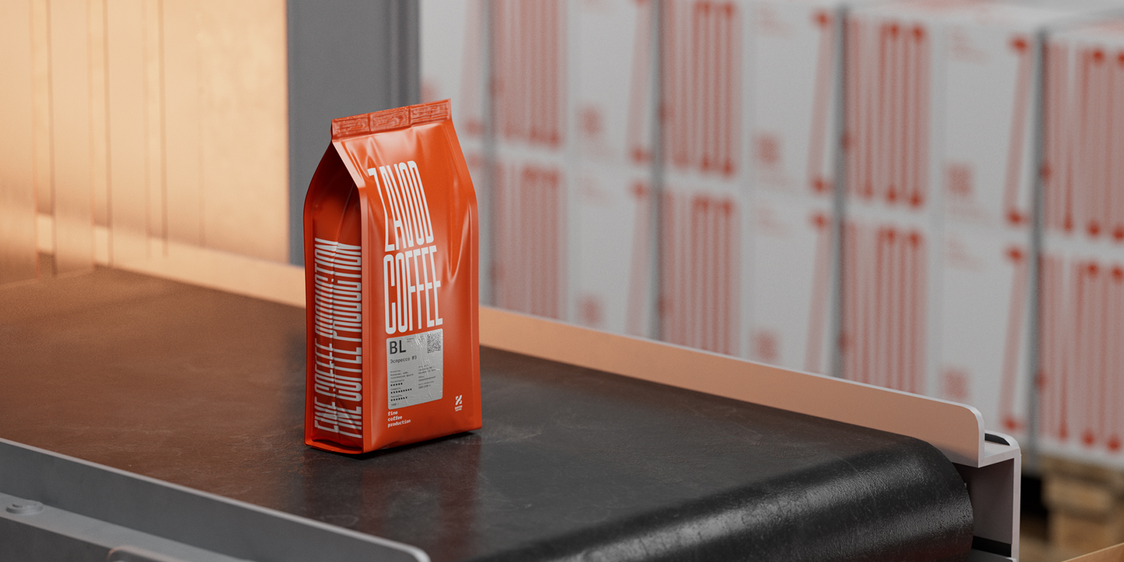
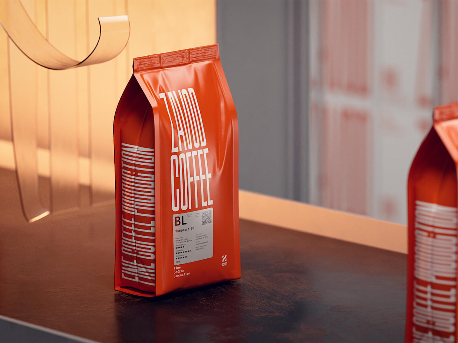
Packaging
The concept does not need additional decorative elements due to the bright typography. The main graphic accents of the pack are inscriptions and text information.
Label
The main task of the label is to be informative, to tell about the coffee inside the pack in an understandable, clear, and aesthetic way.
All parameters of a particular bean are indicated on the label in separate cells, as if on a factory form or diagram.
This approach helps the customer quickly find the right block: the roast profile, rating, or flavor descriptors.