Oren’s Coffee is a distinctly New York institution, and proudly so. We redesigned their brand to be at once modern and nostalgic.
To get here, we first delved into what it is to embody the city. Time and time again, we came back to the dual notions of finding your place and beginning conversations. For a sense of place, if you’re looking for your destination in NY, you follow the subway signs. There is a saying: “Looking for the subway? Follow the signs!” And so, the subway became our muse. We began to look at vintage mapping and the subway structure as a whole. The logo design is inspired by Massimo Vignelli’s 1972 New York Subway map. Vignelli wanted to make using the subway as seamless as possible, a process he called going from “dot to dot”; knowing where you are and where you want to go. Oren’s Coffee NYC then becomes the path and destination.
From here, we crafted a visual design that is at once a smile, a face, a conversation and, taken in a different light, it is the sign that leads you to the path of the place you can stop for a moment. Find a conversation, begin your day, and be a part of this unlimited city.
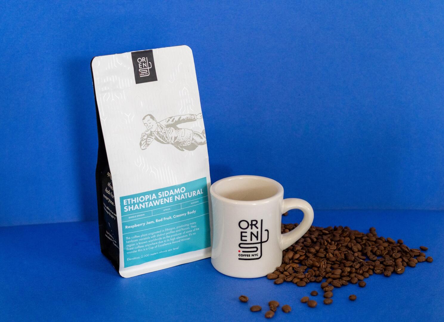
With a strong identity in place and sales increasing, we then designed a delightful e-commerce experience, including an updated website, striking new packaging, and an array of shipping materials. We looked to old New York for visual cues—from subway wayfinding to art deco patterning—to highlight the quality and history of this iconic brand.