Materia Prima is a farm-to-farm micro-roastery rooted in community, cultivating authentic Italian coffee culture from their homestead in Georgia.
The sky is the limit when two dreamers with culinary backgrounds set their sights on coffee. To ground us, we began by identifying the core values of this new roastery. From their roots in Italian farms to their coffee-growing partners to their own homestead in Georgia, Materia Prima celebrates the connection to the raw materials that go into our work: sun, water, love, family, and ritual.
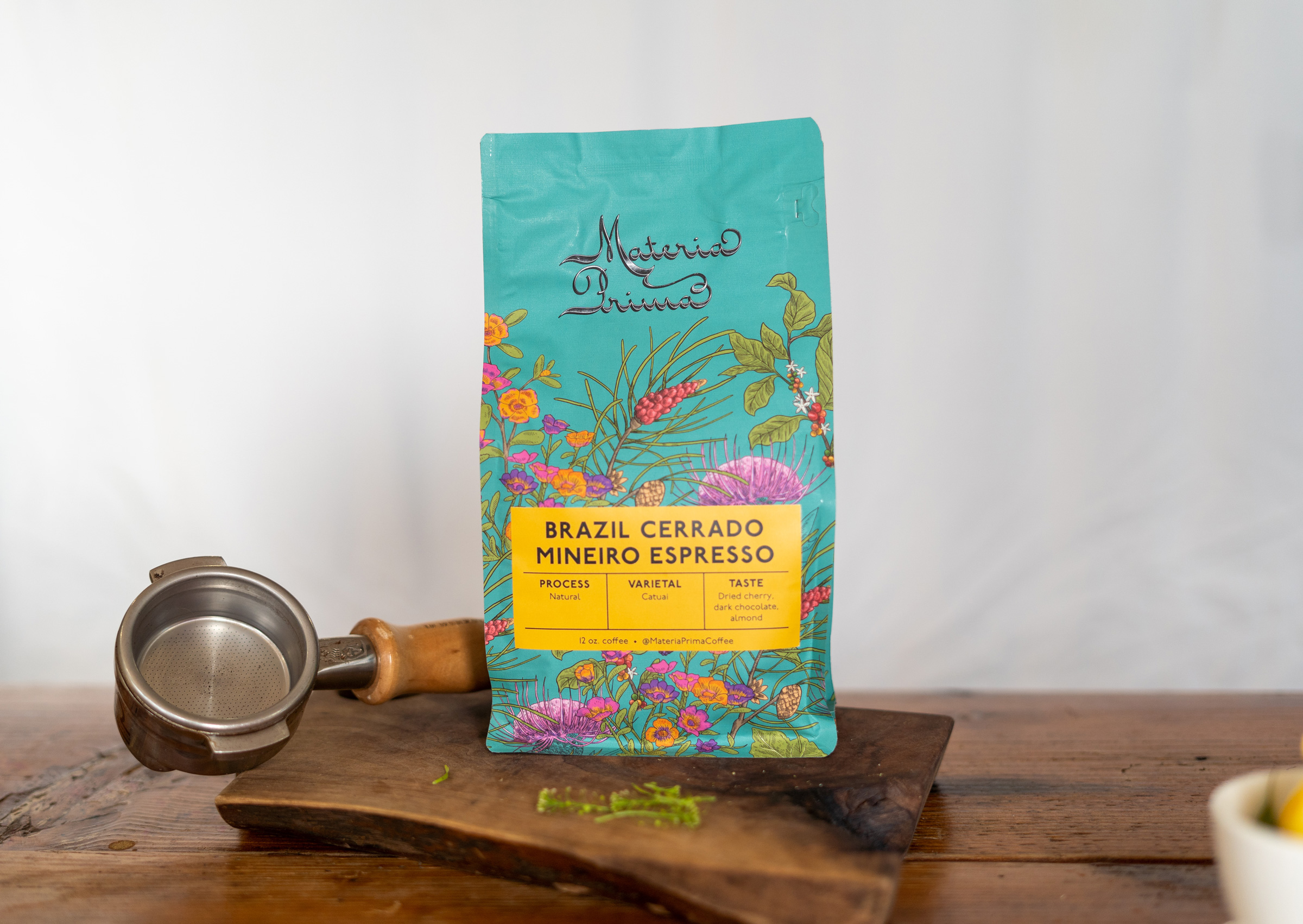
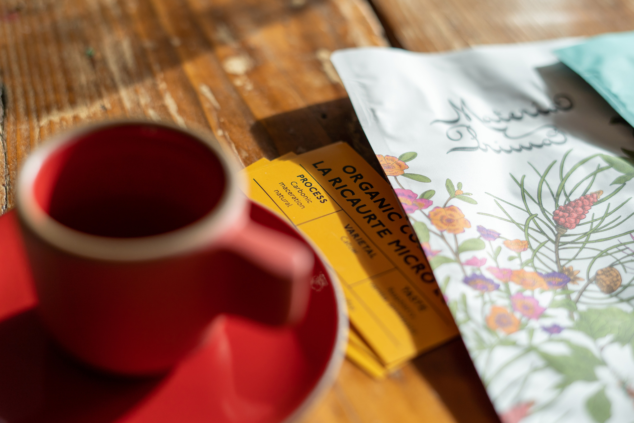
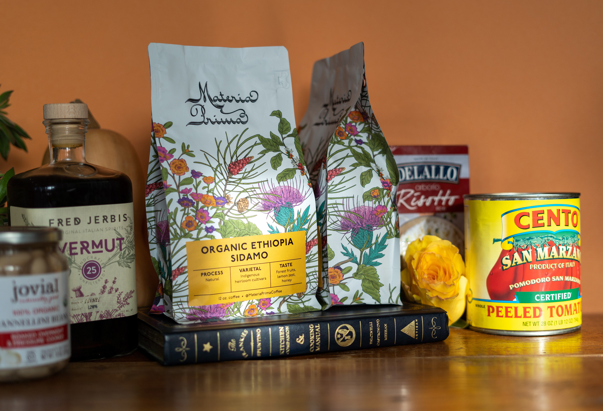
Their logo is an elegant, flowing type paired with detailed, organic patterning. Colors and illustrations are drawn from botanicals found when growing coffee as well as farms in Italy and Georgia. The hand-drawn Materia Prima illustrations bring a human touch to the brand, showcasing the connection to the land and farms as well as the culmination into true Italian coffee.
From packaging and website to social media plan and newsletters, it was important that, as a brand rooted in Italian culture, Materia Prima could sit well among contemporaries while still standing out with their own point of view.
“Our packaging is beautifully illustrated and designed. It illustrates our love of the land. It is colorful and vibrant, sophisticated but approachable.” -Luca & Rachel of Materia Prima Coffee in Chickamauga, GA.