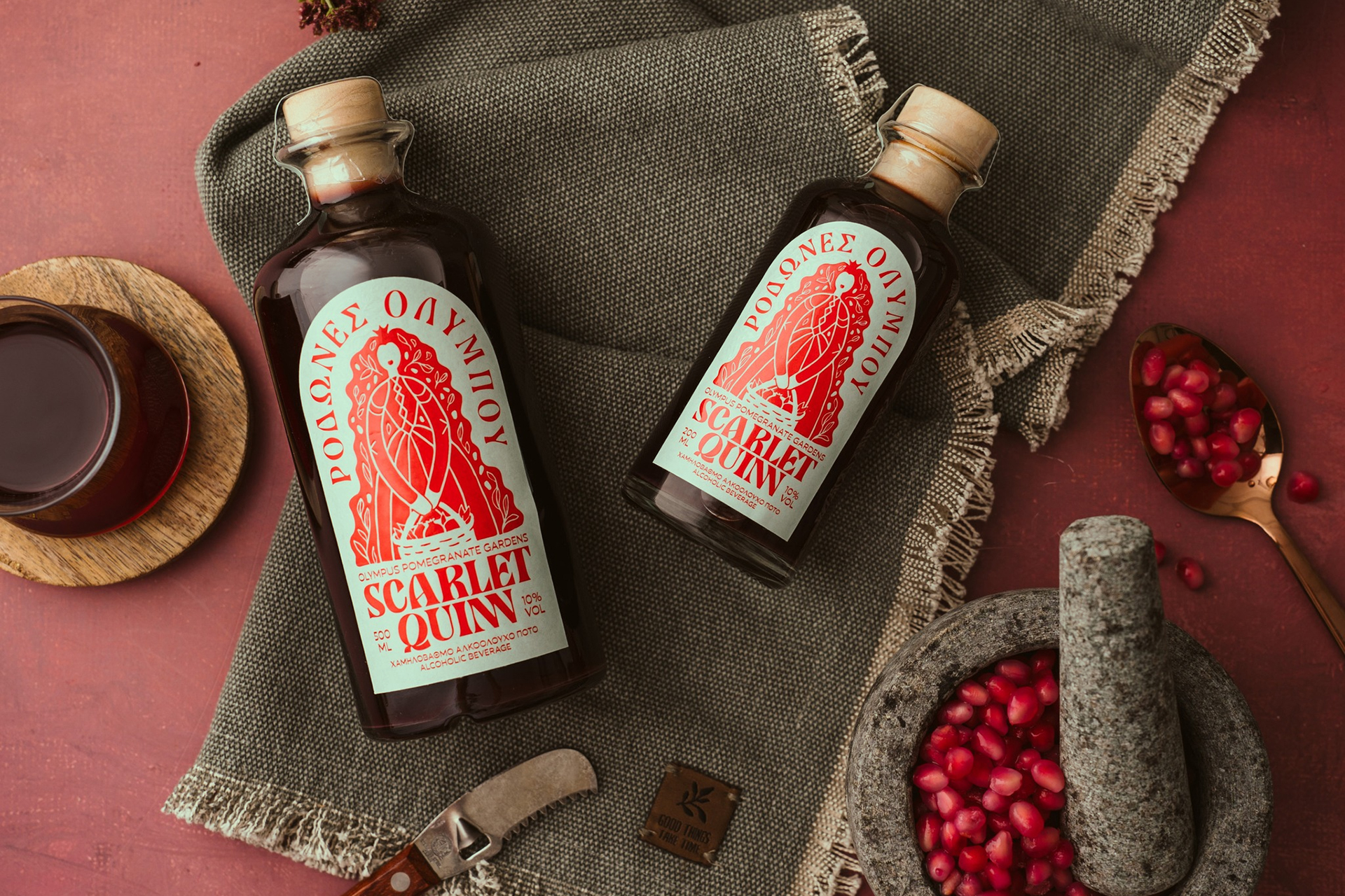
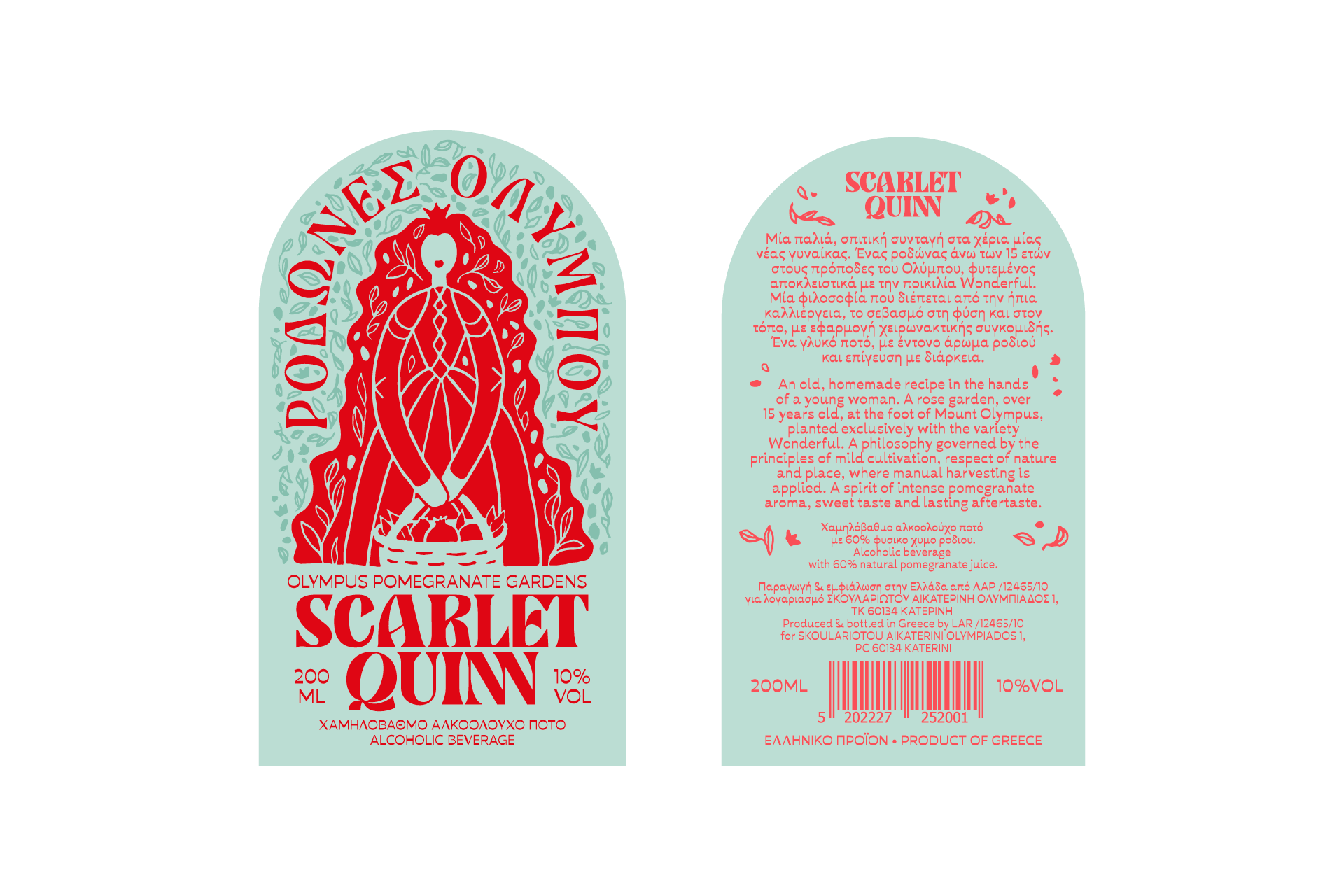
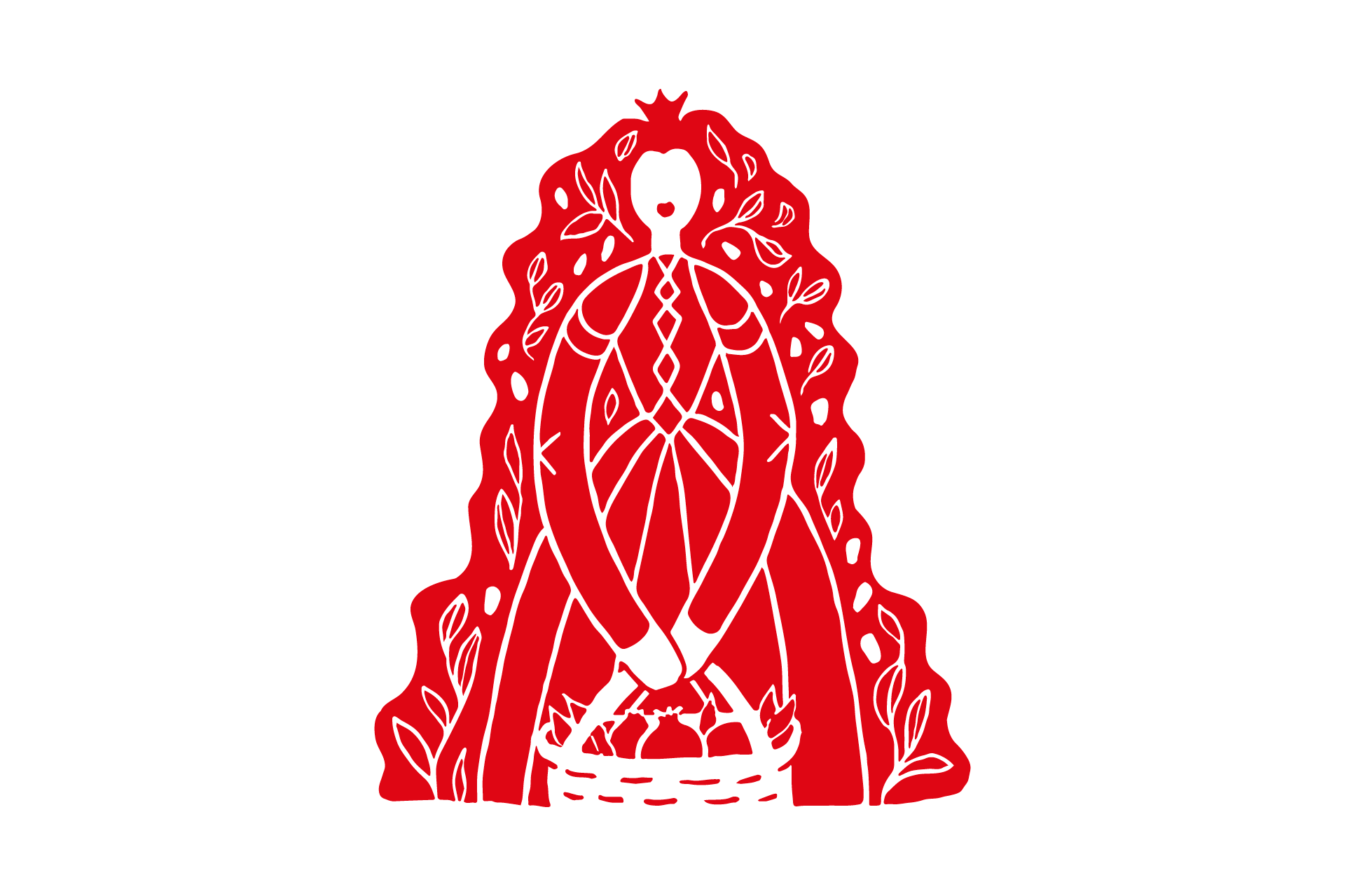
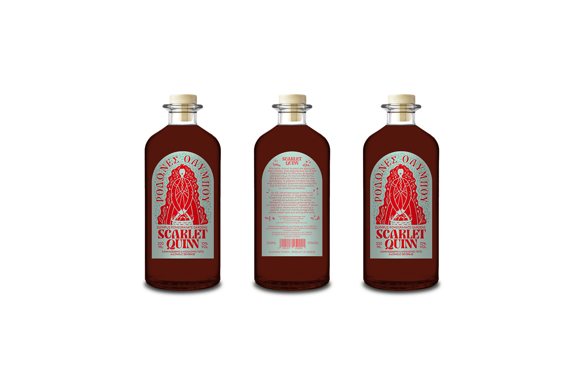
The Scarlet Quinn packaging was designed for 200ml and 500ml bottles, capturing the uniqueness of an artisanal beverage inspired by the pomegranate itself. The name Scarlet derives from the deep red hue of the fruit, while Quinn evokes a noble yet grounded figure—the imagined “owner” of the pomegranate orchards.
The label strikes a balance between tradition and modernity, blending hand-drawn illustration, distinctive typography, and a bold, pop-inspired color palette. The bottle and typography were carefully selected to reflect a subtle retro aesthetic, enhancing a sense of nostalgia and authenticity, linking the drink to both heritage and a contemporary, playful perspective.
The result is a design that radiates the warmth of the handmade, while remaining bold and distinctive.