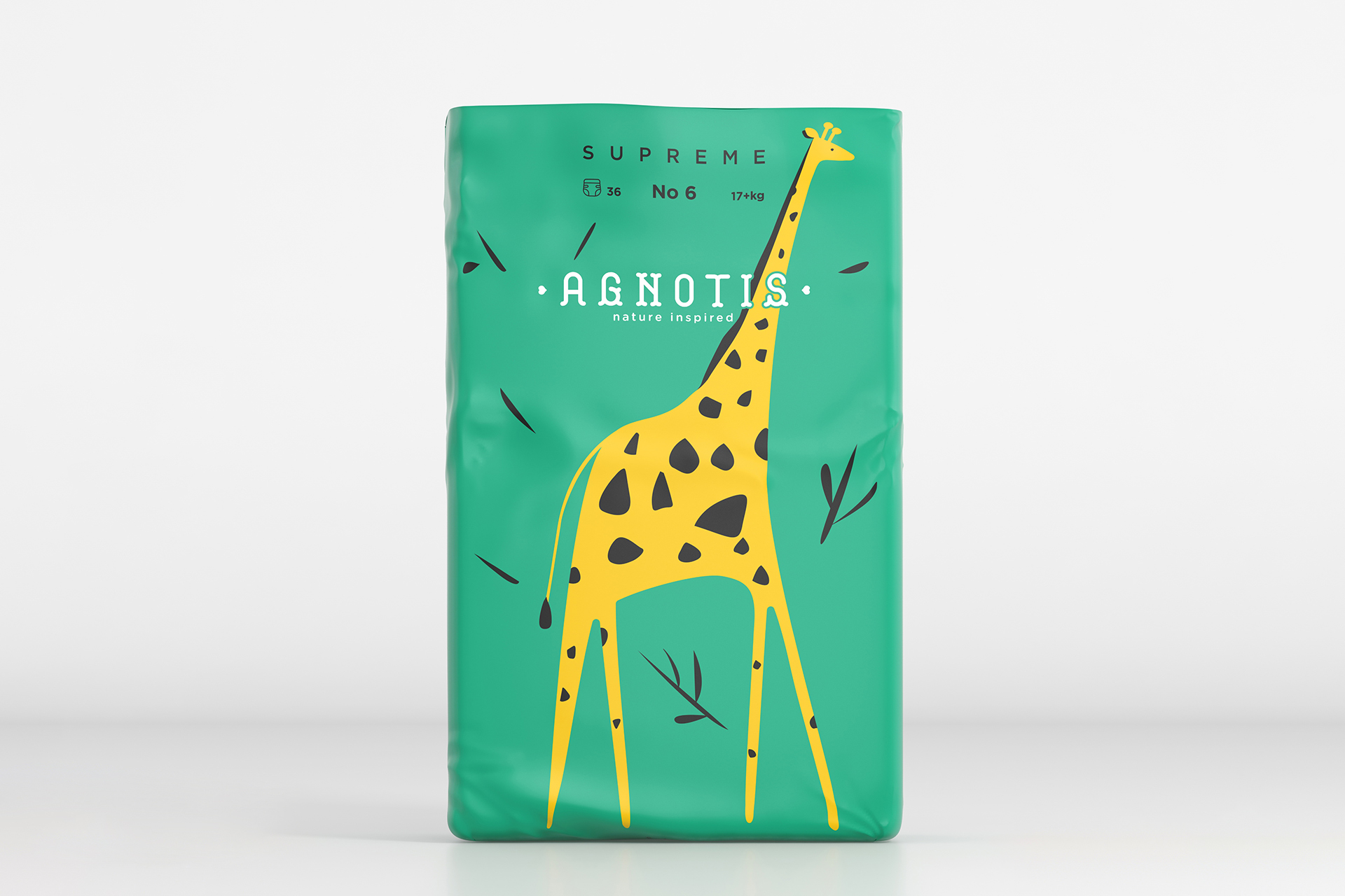
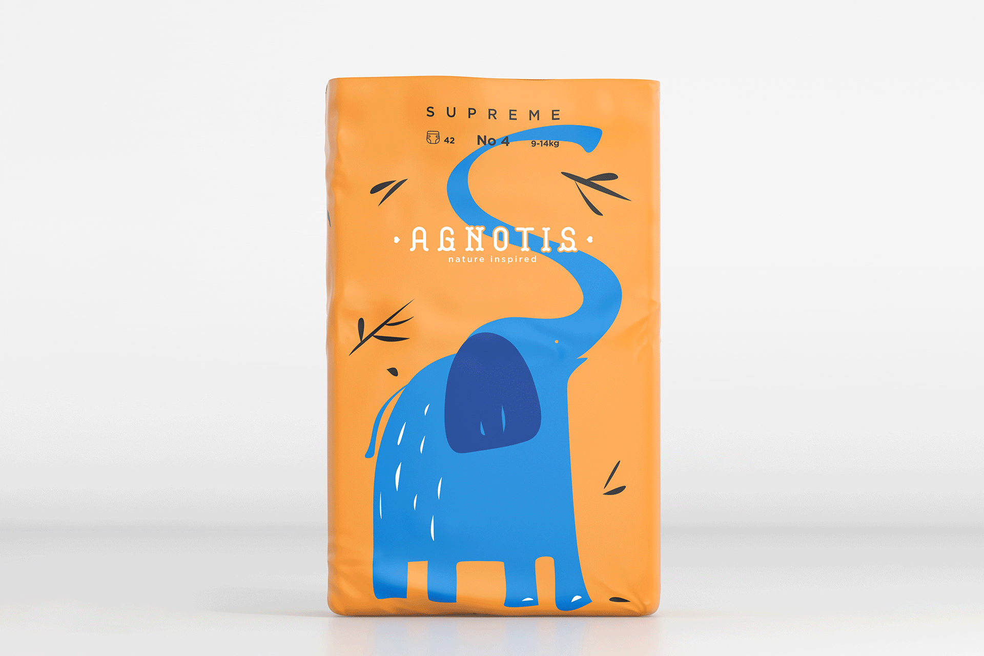
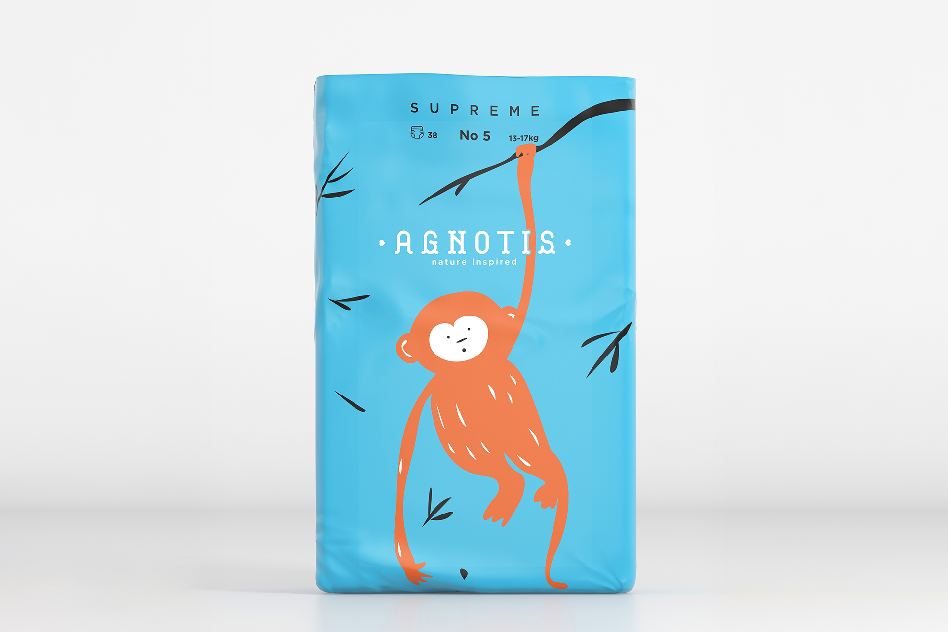
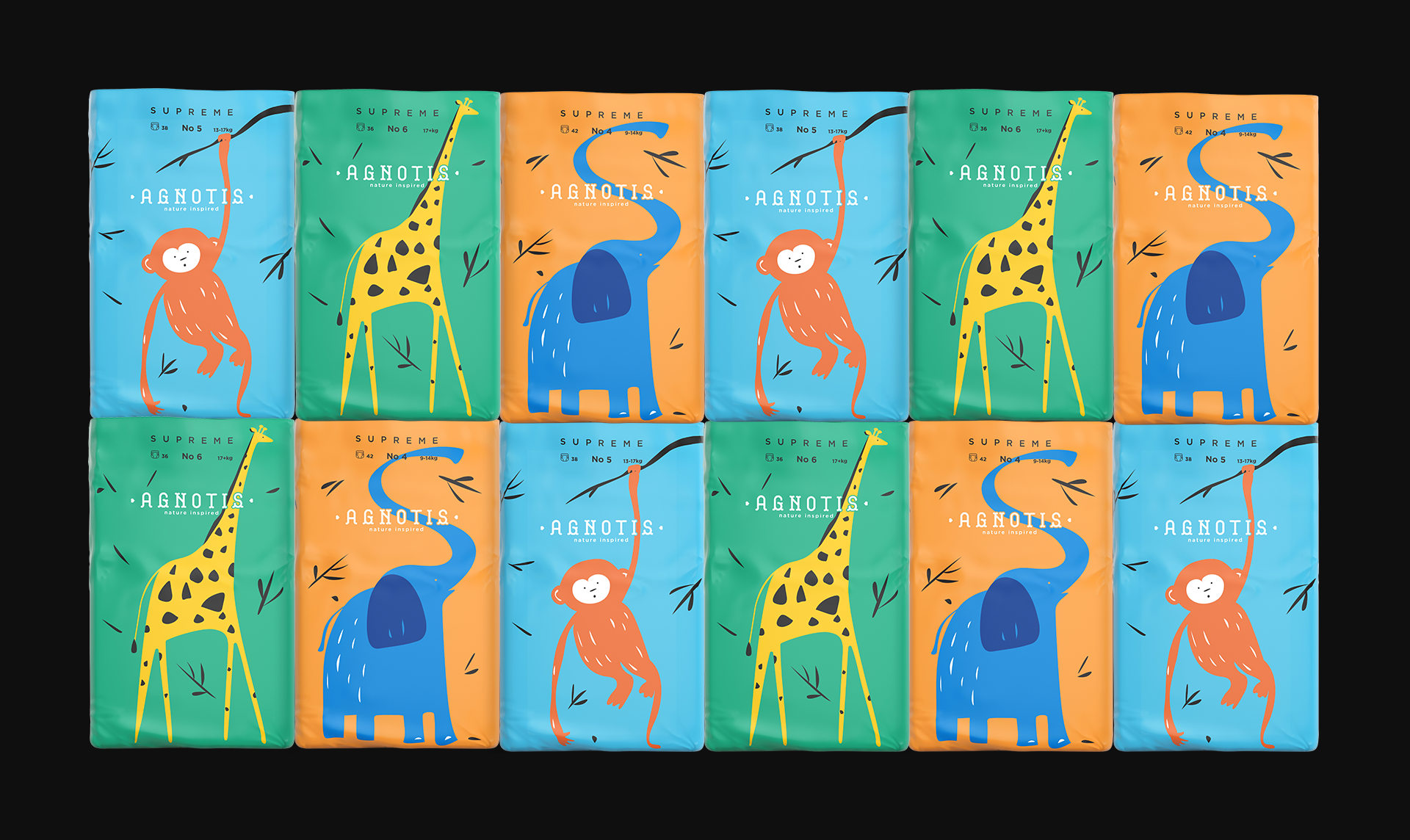
The Agnotis Supreme series stands out with its bold color palette, creating a strong visual impact on the shelf. The vibrant colors, inspired by childhood innocence and joy, immediately catch the eye and differentiate the diapers from the competition. Each shade has been carefully chosen to convey purity, protection, and softness, reflecting the brand’s core values.
The typography is clean and legible, reinforcing parents’ trust in the product’s quality. The overall packaging aesthetic combines freshness with functionality, offering a modern and approachable profile.
The minimal approach to the packaging design embodies the essence of “supreme,” emphasizing clarity and simplicity. By removing unnecessary elements, the design enhances the sense of superiority, allowing the colors and typography to communicate the product’s value more directly without overwhelming the visual field.