Bloom-Shine-Joy
In Greek mythology, the Graces (Harites) were the goddesses of charm, beauty, nature, human creativity, and fertility. Simplicity and clarity of the branding image was the key element of the design.
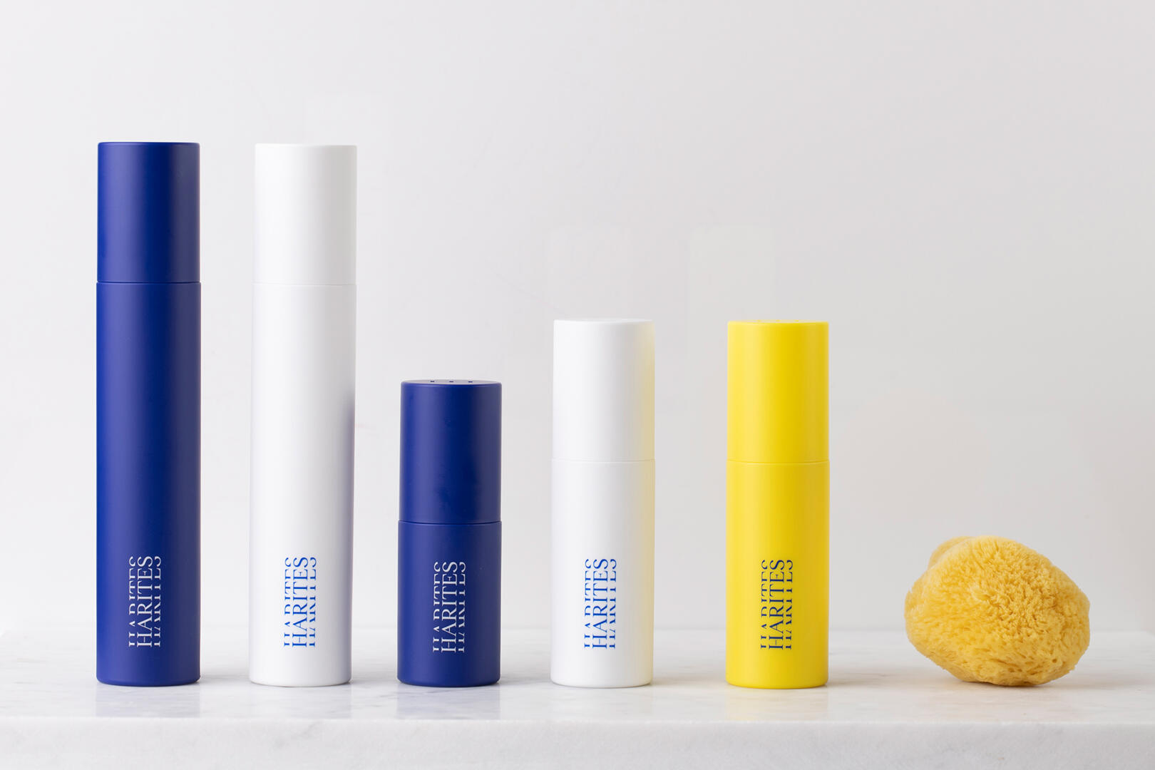
The three Graces of Raphael formed the design canvas of the identity. The line-up and position of the Graces on the tableau defined the overall design line (one central figure and two on a secondary level). The brandmark combines the monogram of the title and the number (3) in Latin script. The color palette in primary colors reinforces the company’s vision which is the “basic”, the “essential” and the “necessary”.
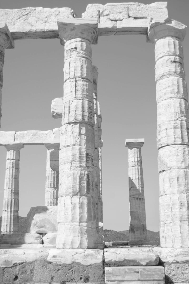
Packages are a combination of classical geometry and modern functionality. Geometric lines and harmonic proportions form the basis of the design, symbolizing our aesthetic inspiration from the ancient columns of Greek temples. In addition, the company’s brand mark is incorporated into the packaging design, adding an extra layer to the aesthetics.
Curator’s Insight:
The packaging design combines classical geometry and modern functionality, creating a harmonious balance between form and function. The geometric lines and proportions remind me of the ancient Greek temples, which are a source of inspiration for many artists and designers. The brand mark is also subtly incorporated into the packaging design, adding a touch of flair and sophistication.
It’s a great example of how to use mythology and history to create a timeless and elegant design.