Background:
The Grape Collective is a Swedish wine company that was founded to bring playfulness and joy into a conservative and pretentious category. Wine should be enjoyed by all people and not just judged by some. The content and design of the products is the company’s primary communication channel.
The name and label of each product must describe the wine, break with the competitors’ wine aesthetics, support the sellers with arguments and at the same time entertain the consumer.
Brief:
Relate to The Grape Collective’s product philosophy and create concepts, names and graphics for a neutral Spanish red wine. The wine is neither strong nor light, rough or sweet. It is not unique in any way but still tasty.
Solution:
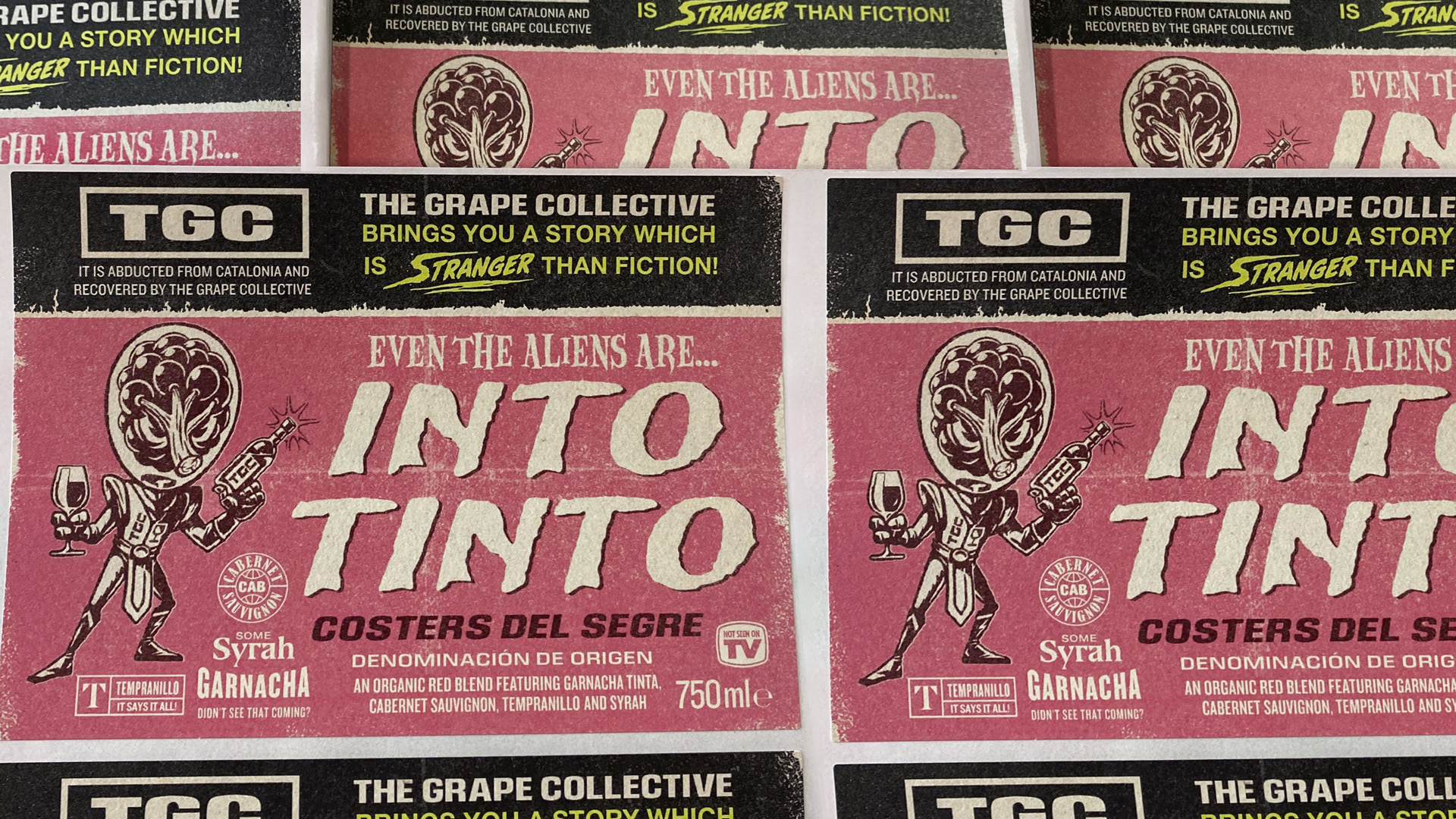
The Spanish translation for red wine is “Vino Tinto”, a name that is commonly known by most Swedish wine consumers.”Into Tinto” became a play with letters and words, creating a name that was easy to remember, was visually powerful and had the potential to build a larger concept on. A neutral wine is usually seen as negative among wine connoisseurs, we saw it in a different way: As this red wine is neither too heavy nor too light, it appeals to a larger target group.
In fact, most people like Tinto, from average Joes to royalties and everything in between (mods, rockers, bodybuilders and news anchors).
This wine is definitely something that you can agree upon. To prove our point, we applied our thesis together to an extremely small and picky target group on the label: visitors from outer space with heads made of grapes.
If even these aliens are into Tinto, tell me who isn’t into Tinto?