Seasonly is a clean, natural and vegan skincare brand known for offering personalized products.
The brand wanted to diversify and launch its own range of skincare products. The challenge was to design a specific identity for this new range in such a way that it would be different from personalized products while respecting the brand’s codes: logo, minimalist design, pastel colors and standard packaging.
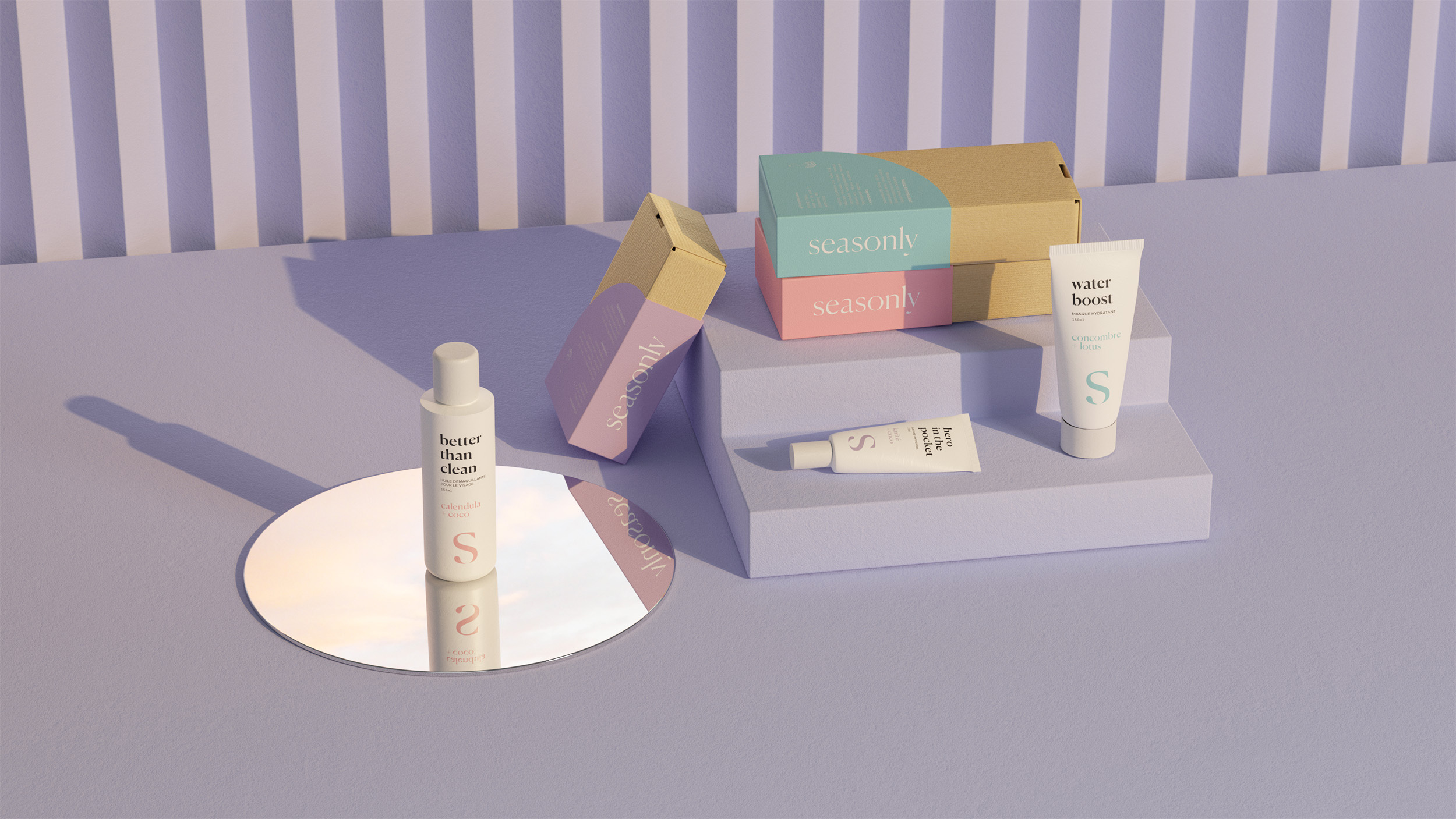
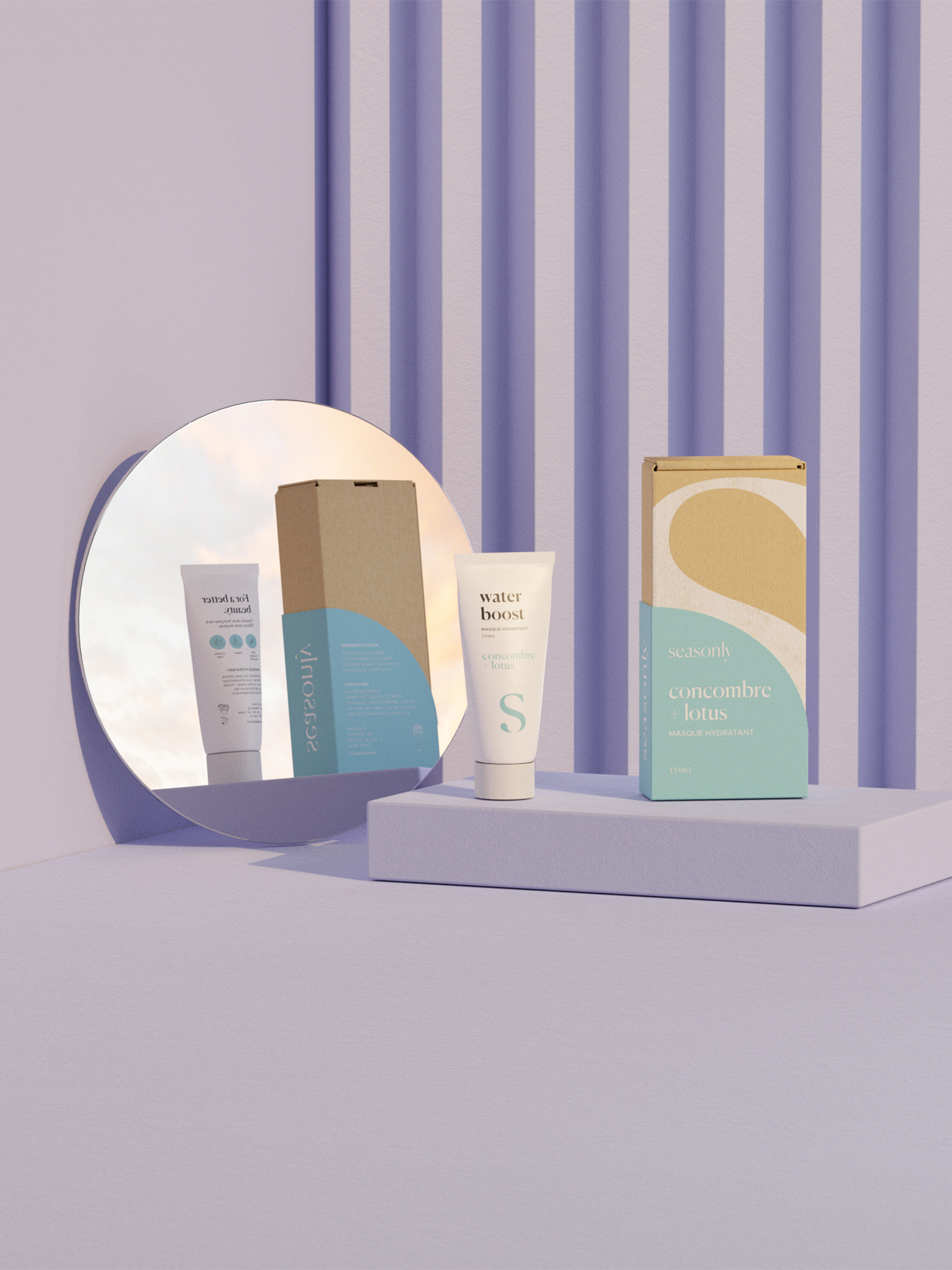
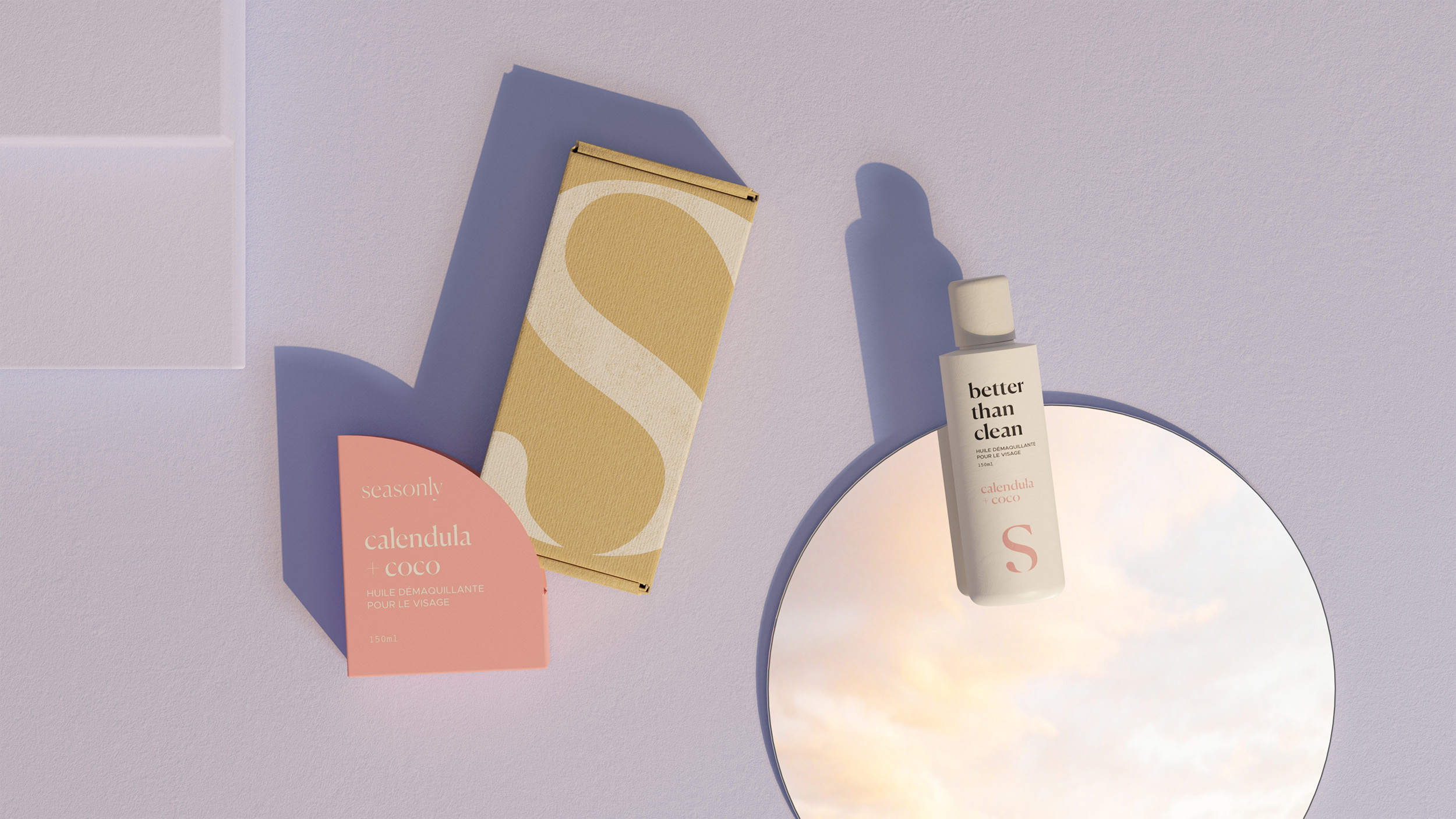
About the secondary packaging, the logo has been enlarged in order to fully dress the box and make it a strong graphic element as an emblem. A half-moon shaped case was designed to soften the visual aspect of the box and bring fantasy to a standard packaging. This half-moon shape also allows to see the logo differently. When the box is in the case, the logo is seen as a soft and abstract shape. Once the case is removed, the logo becomes clearly visible. Pastel and fresh colors have been chosen to respect the identity of the brand while differentiating this range from other products offered.
Concerning the primary packaging, it was decided to make a sober design in order to emphasize the information such as the ingredients and the name. The color is used by touch to highlight the ingredients of the product and the logo while reminding the color of the case.
For the staging of products, it was decided to use a monochrome decor from a pastel color often used by the brand in its communication: purple. An embossed background was used to bring contrast to the images. The light is solar to bring warmth and softness. Shadows are sharp and strong to bring strength and depth to the visuals. Concerning the set design elements, the products are put on bases in order to star them. The use of round mirrors reveals an aerial and soft environment while showing the back of the products.