background
In 2015, Sipwise entered the burgeoning health drinks market with What If!, a functional beverage made with natural ingredients like green tea and herb extracts. Sipwise approached us to redesign the identity and packaging for What if! for better response from consumers.
strategy
Our diagnosis of What If observed that the pack failed to focus on any of the beverage’s best features. Each variant offers many, and unfamiliar natural ingredients — and flavours in addition. Apart from Green Tea, consumers would be unable to mentally slot the drink as an answer to a need. The name What if is enigmatic, suggestive of an unburdened mind, open to possibilities. But it was not clear which of the product’s properties led to that state of mind and body. Thus the challenge became to not just convey its many functional features, which lower stress, balance pH, hydrate and promote antioxidant effects, but crucially, to connect them a state of mind. That would give meaning to What if and justify its overarching proposition of ‘possibilities’.
design
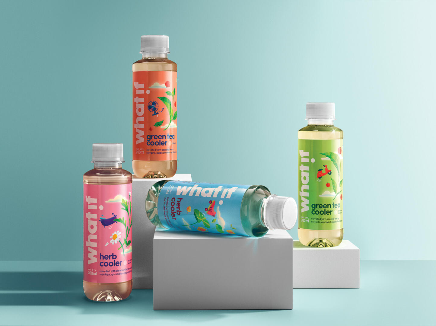
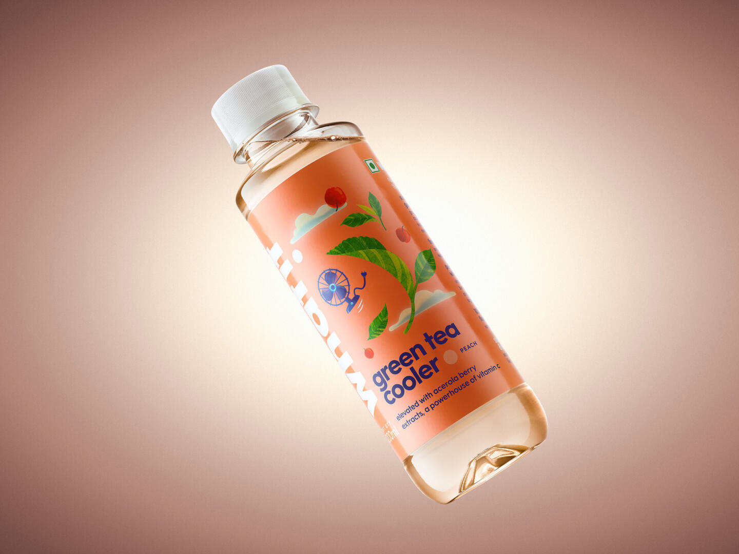
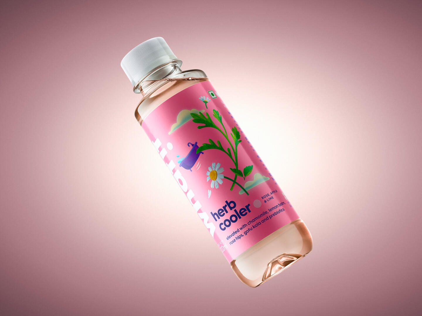
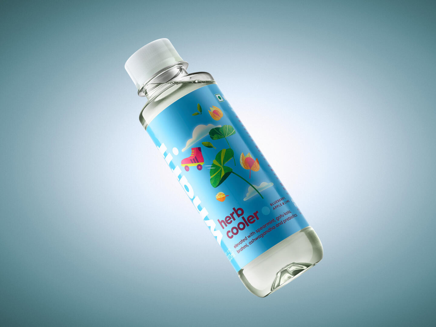
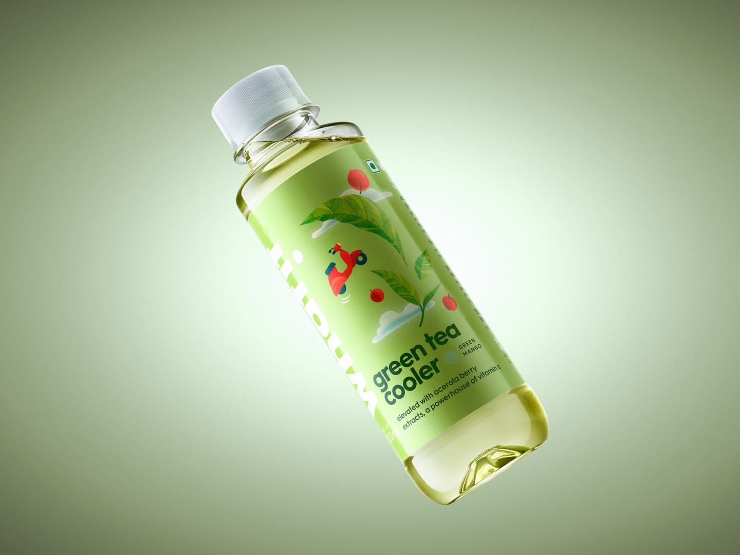
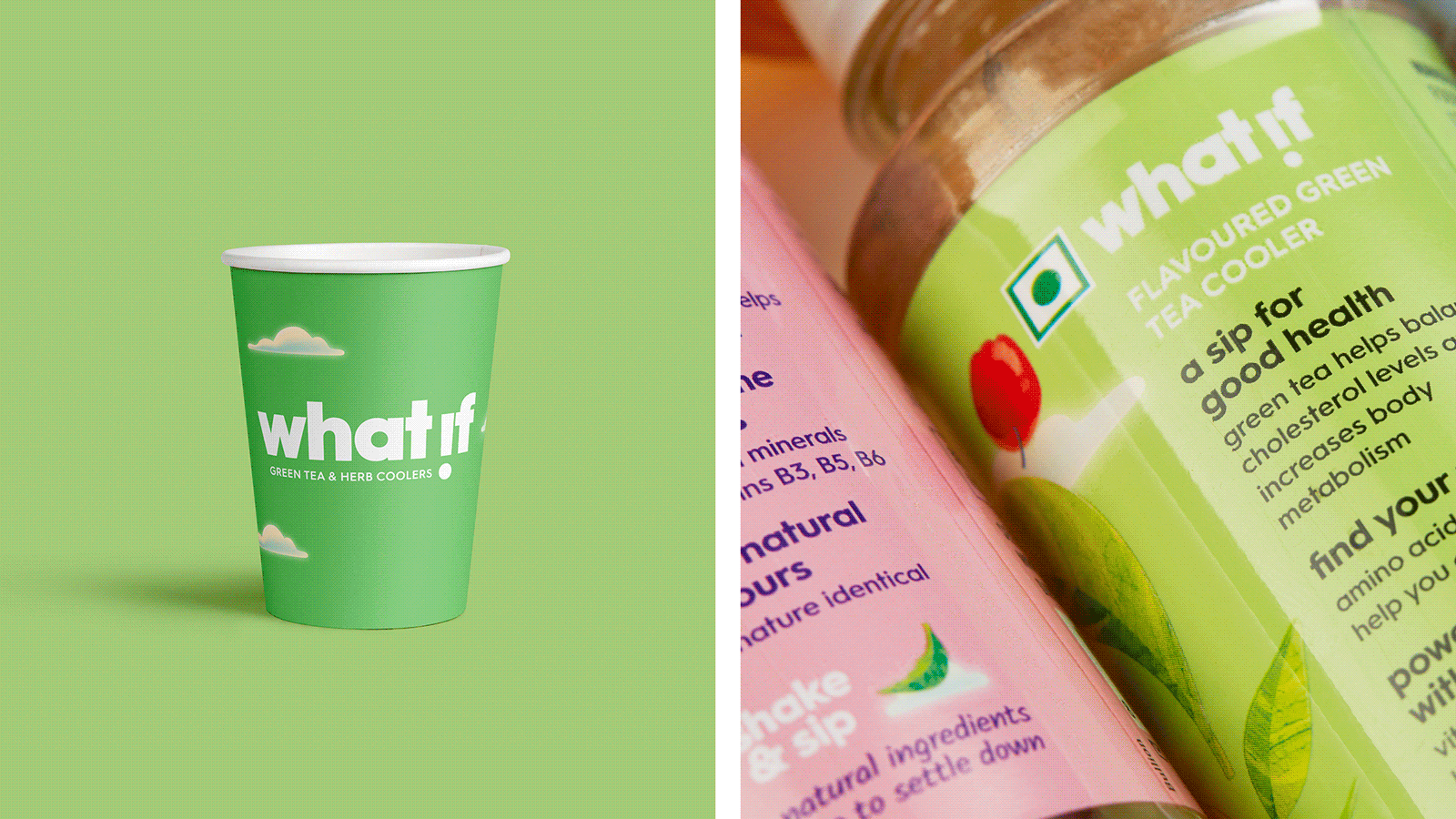
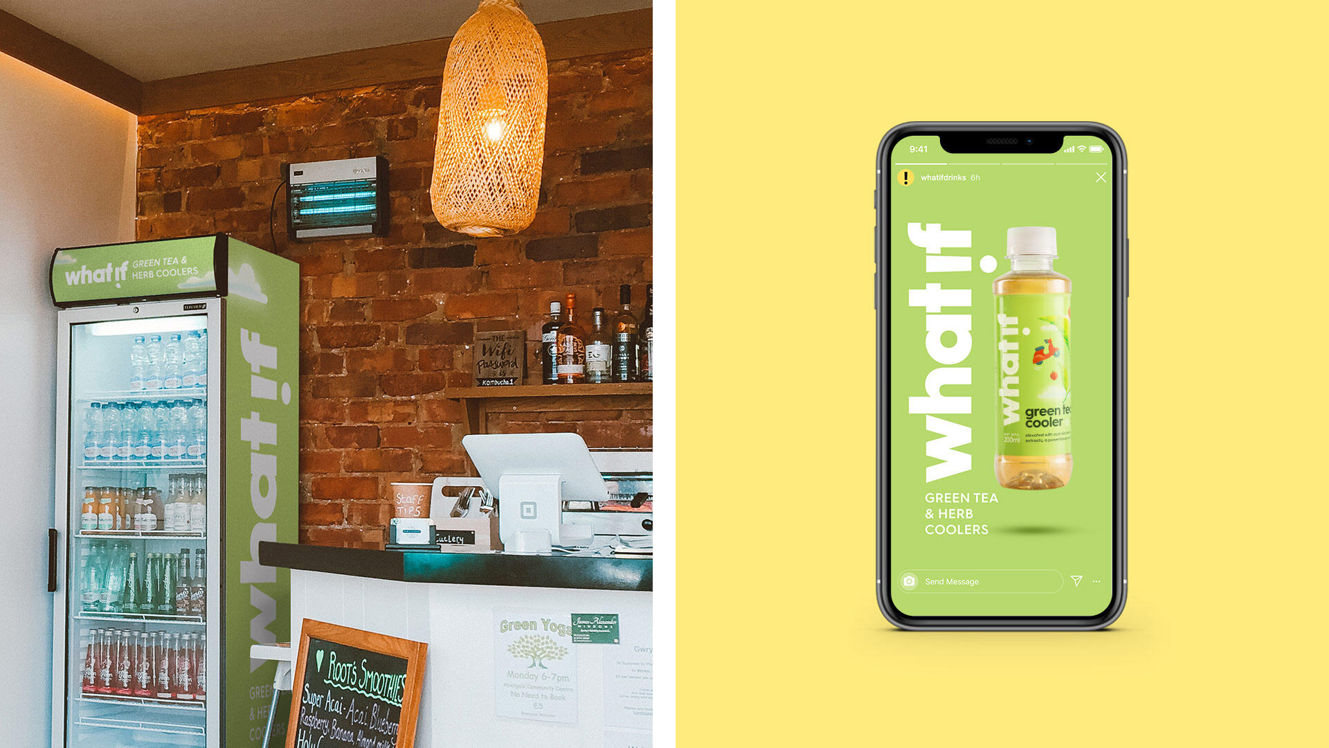
We reimagined What if as a calming contrast in an intense segment dominated by overtly ‘healthy’ or ‘energizing’ drinks. The design delivers a humorous, fantastical depiction of this state of mind and body: ingredients magically causing the mind to float above everyday stress. The light-hearted picturing of relaxation, weightlessness, even levity takes the weight off the expected rational conversation on ingredient benefits. It hints that the experience of drinking What If! is as important to the state of mind as antioxidants or vitamins. This playfully quaint mood is created with illustrations of herbs floating up to the clouds alongside everyday objects. Simultaneously it showcases the key herbal ingredients, memorably signalling “herb cooler”, thus answering the basic “What is it?” question. The term “cooler” was also emphasised. The redesigned logo embeds an exclamation in an inverted ‘i’ while the copy labels the herbs as ‘elevating’. Soft and airy colours, a far cry from the vibrant palette of energy drinks complete the picture. The primary colour of the label marks the variants, keeping the shelf visually organised.
impact
The redesign successfully distances What if from the category competition, allowing it to carve a niche for itself. The world created by the pack stands to be exploited in other media as an ownable asset in its own right.