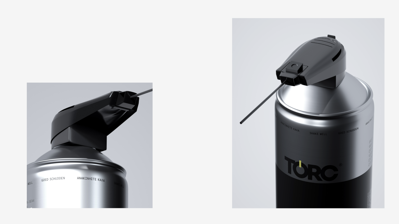
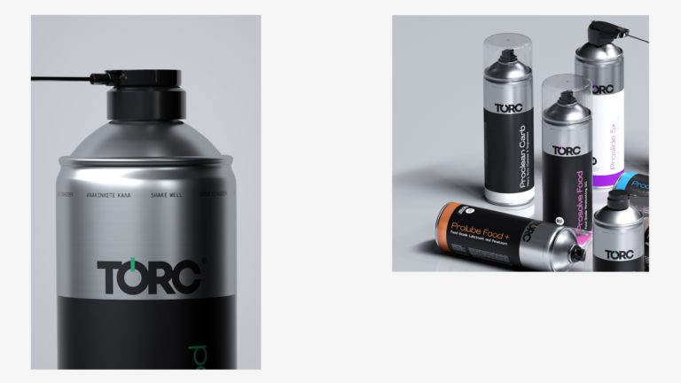
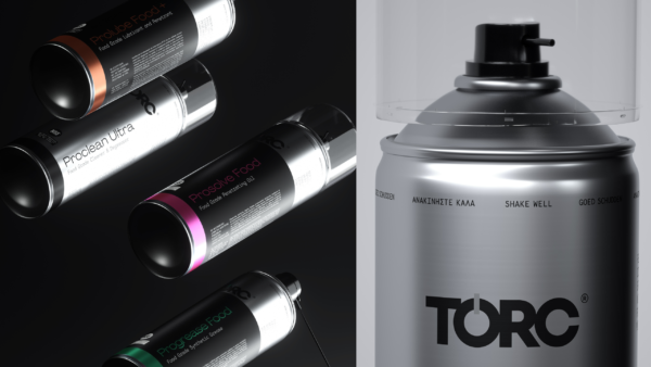
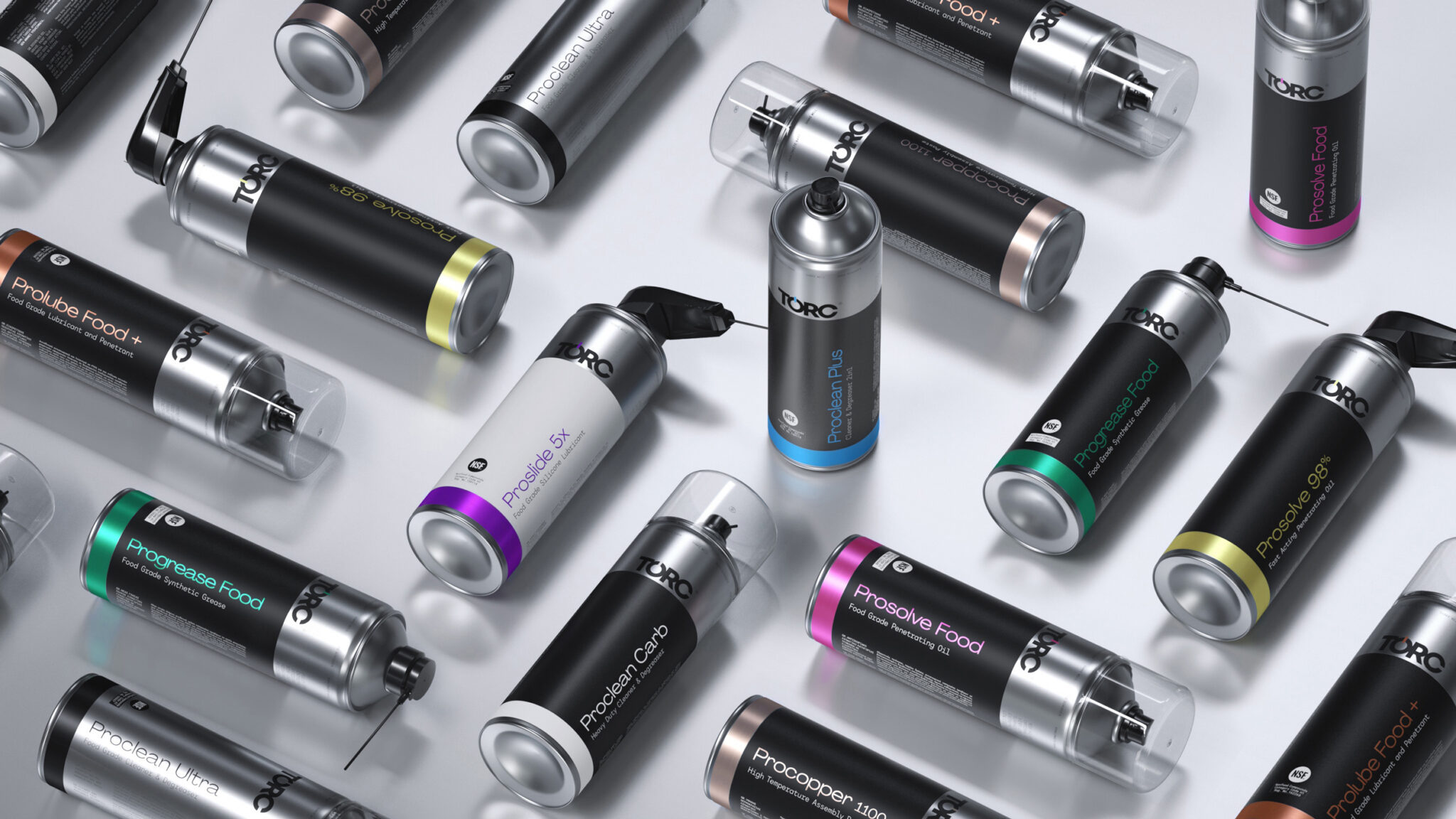
The design of TORC packaging embodies a refined fusion of technology and aesthetics. Each package is meticulously crafted with attention to detail to showcase the value and excellence of the products.
For the logo design, we employed a strict geometric typeface with bold weight, imparting a sense of prestige and reliability to the TORC brand, highlighting the extensive expertise in industrial machinery lubrication and maintenance. Drawing inspiration from the concept of torque, which also serves as the source of product name, we incorporated it into the logo as a circular element, establishing recognition and symbolizing authenticity.
The dominant metallic textures in the packaging design reflect a sense of high quality and precision that is inherent in the engineering of these exceptional products. The aluminum character of the packaging mirrors the brand’s commitment to quality and durability, while the intricate detailing unveils the craftsmanship and precision embedded in each item.
The color contrasts and palette choices utilized in the design create a clear visual coding system that is easily understandable and recognizable in the challenging environment of industrial machinery. The selection of metallic and industrial hues establishes a symbolic connection to the industrial sector, reinforcing the professional and trustworthy profile of the TORC brand.


