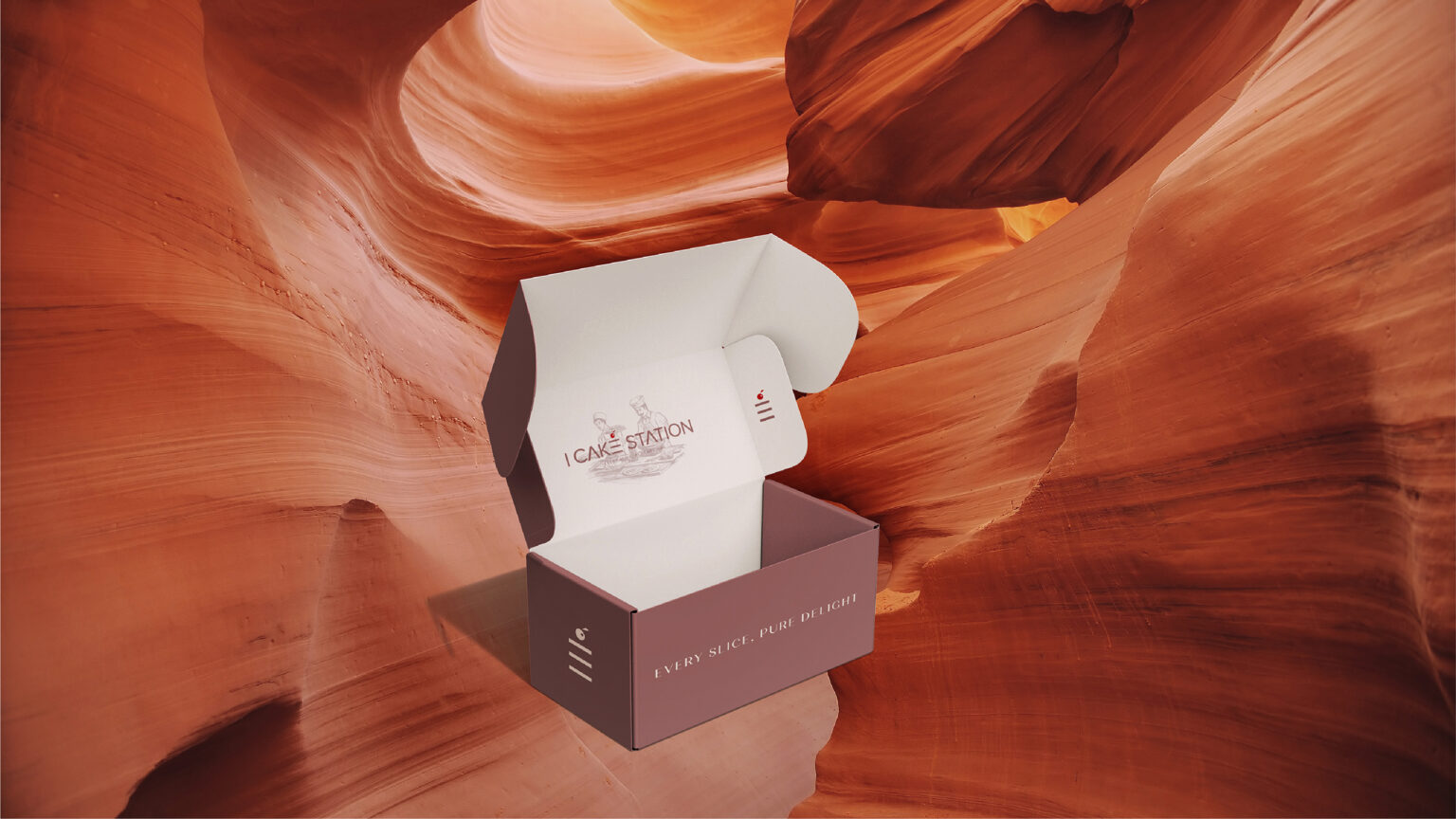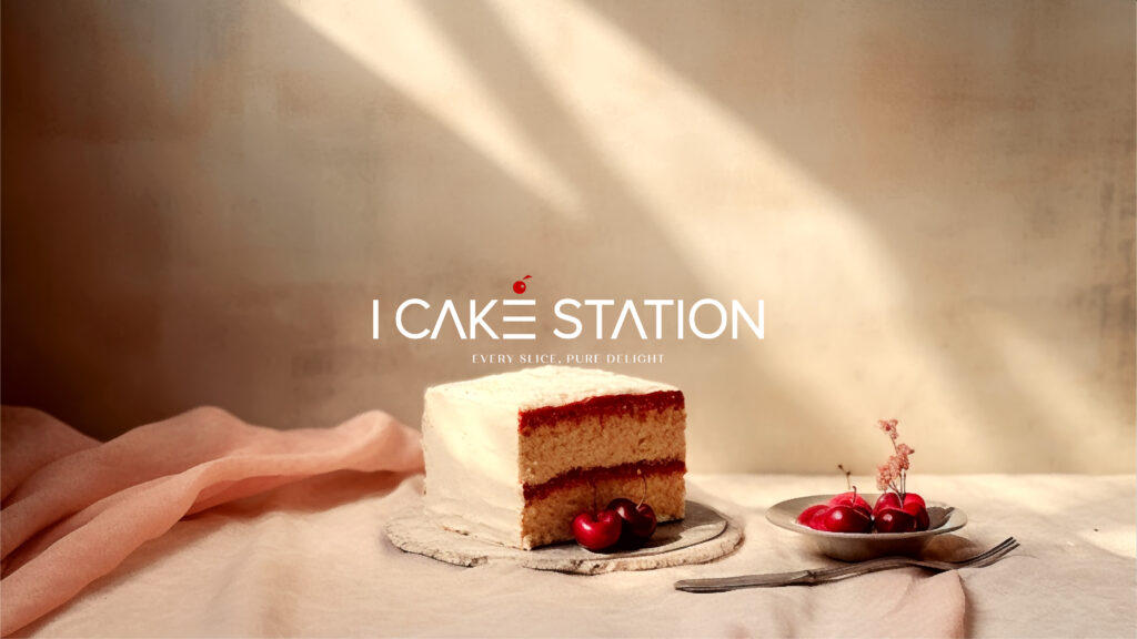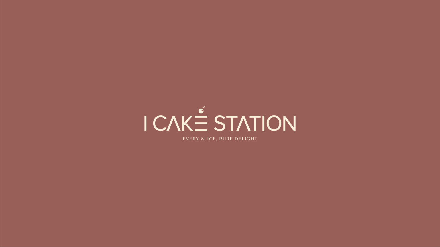
The logo of I CAKE STATIONS, a distinguished cake brand based in Oman, is a visual symphony that harmoniously blends elegance, innovation, and delectable delight. Crafted to evoke a sense of wonder and sophistication, this logo encapsulates the essence of the brand’s commitment to delivering exceptional confectionery experiences. To add an element of playfulness and imagination, a small, stylised cake cherry with whimsical elements is positioned to the side of the cake. This playful touch not only adds charm to the logo but also signifies the brand’s commitment to innovation and creativity in cake design. It serves as a reminder that I CAKE STATIONS is not just a destination for cakes but a journey into a world of tasteful artistry.
The logo’s color palette is a splendid fusion of whisperings red and soft pastels, creating a mesmerizing visual impact. The dominant gold hue conveys a sense of luxury, echoing the brand’s dedication to crafting cakes of unparalleled quality. Complementing this opulent shade are delicate pastels, such as whisperings red and soothing creams, which infuse a touch of warmth and creativity into the logo. At the core of the logo, a captivating depiction of a multi-tiered cake takes center stage. This cake is a true work of art, intricately adorned with intricate sugar detailing that reflects the skill and artistry that goes into each creation at I CAKE STATIONS. The cake exudes a sense of grandeur and celebration, inviting viewers to embark on a journey of taste and elegance.
Beneath the cake, the brand name “I CAKE STATIONS” is elegantly rendered in a sophisticated font. The typography combines refined letterforms with subtle embellishments that mirror the intricate detailing of the cakes themselves. The choice of font radiates an air of creativity and approachability, underscoring the brand’s commitment to making every occasion a memorable one.
As a distinctive touch, delicate swirls and flourishes gently weave around the cake and brand name. These embellishments symbolize the brand’s dedication to turning ordinary moments into extraordinary celebrations. They also evoke a sense of movement and dynamism, capturing the excitement and anticipation that comes with enjoying a cake from I CAKE STATIONS.
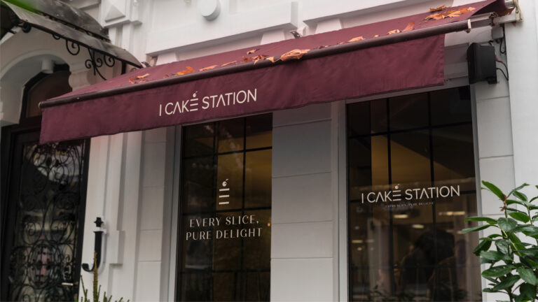
In totality, the logo of I CAKE STATIONS is an embodiment of elegance and delight. It encapsulates the brand’s dedication to crafting cakes that are not only visually stunning but also carry the essence of celebration and joy. Whether featured on packaging, marketing materials, or storefronts, this logo serves as a beacon that beckons individuals to experience the exquisite journey of flavours and elegance that I CAKE STATIONS has to offer.