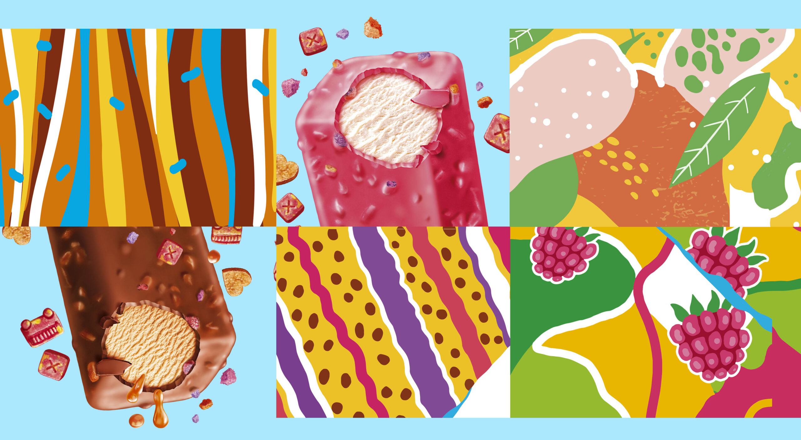
In this project, we partnered with our clients at Saratov Holod Plus in the creation of a vibrant packaging design for the new seasonal line of Morozilla ice cream products. We have designed the trademark as an ice font, which gives a sense of cooling. Given the creative freedom we were working with we conceptualized several ideas that would make the packaging stand out.
The wide arrangement of colors used perfectly complimented the main ideas behind Ice cream and its refreshing effect, with the “I’m cool” text at the front of the packaging being added to even further capture the refreshing yet vibrant feeling of enjoying Morozilla ice cream. In addition, each colour scheme was chosen based on the wide range of ice cream flavors, from shades of brown, orange and yellow suited to the caramel flavor to the bright and calming colors of green, pink and blue which were chosen for the fruitier flavors such as blackberry and mango. Finally, the bitemark effect which was a feature commonly found on the traditional shaped ice cream cones was also added in order to symbolize the irresistible urge to immediately bite into the ice cream.