THE STORY
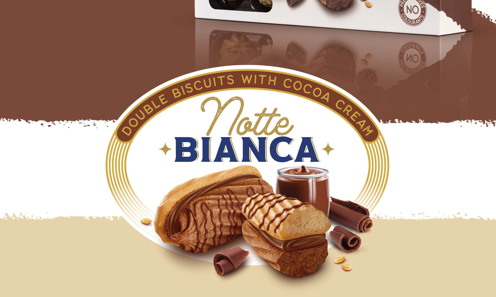
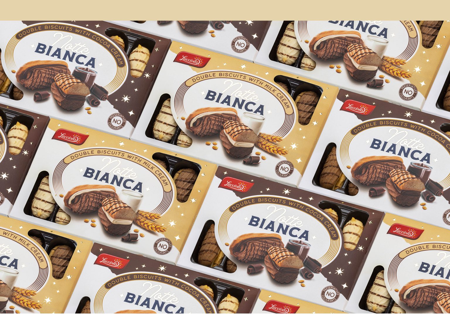
We The phenomenon of “white nights” is an exotic phenomenon that is observed in very few places in the world. The unusualness and play on words inspired our team for this project. For the client – the company “Svetlina”, we did the naming and design of a new trademark, as well as the design of a series of two packages.
THE NAMING
At Modern World Studio, we have long been looking for a metaphor that is multi-meaningful and at the same time tells about the product itself. It was important that the name and the design of the packaging corresponded. Our concept turned out to work. We bet on contrasts – light and dark, day and night, white and black, milk and chocolate. Thus, Notte Bianka – “White Night” was born. We chose the Italian language for the brand to show that the biscuits are refined, made in the Italian style with a gourmet twist.
THE SOLUTION
The look of the packaging is in a laconic style and reflects the new name Notte Bianka. We paid special attention to the precise retouching and to the food area – it is large enough, and the product looks very tempting and appetizing. We left an opening-window – when the customer sees what is in the box, his trust in the brand grows. We added gold elements to complete the attractive packaging design.
Our final work meets all category rules. We chose a well-readable brand name based on an impactful associative reference. We have created a clearly defined food area that reflects the idea of contrasts – the white night. With the naming and design, we reinforced the feeling of refined packaging of a quality and recognizable product.