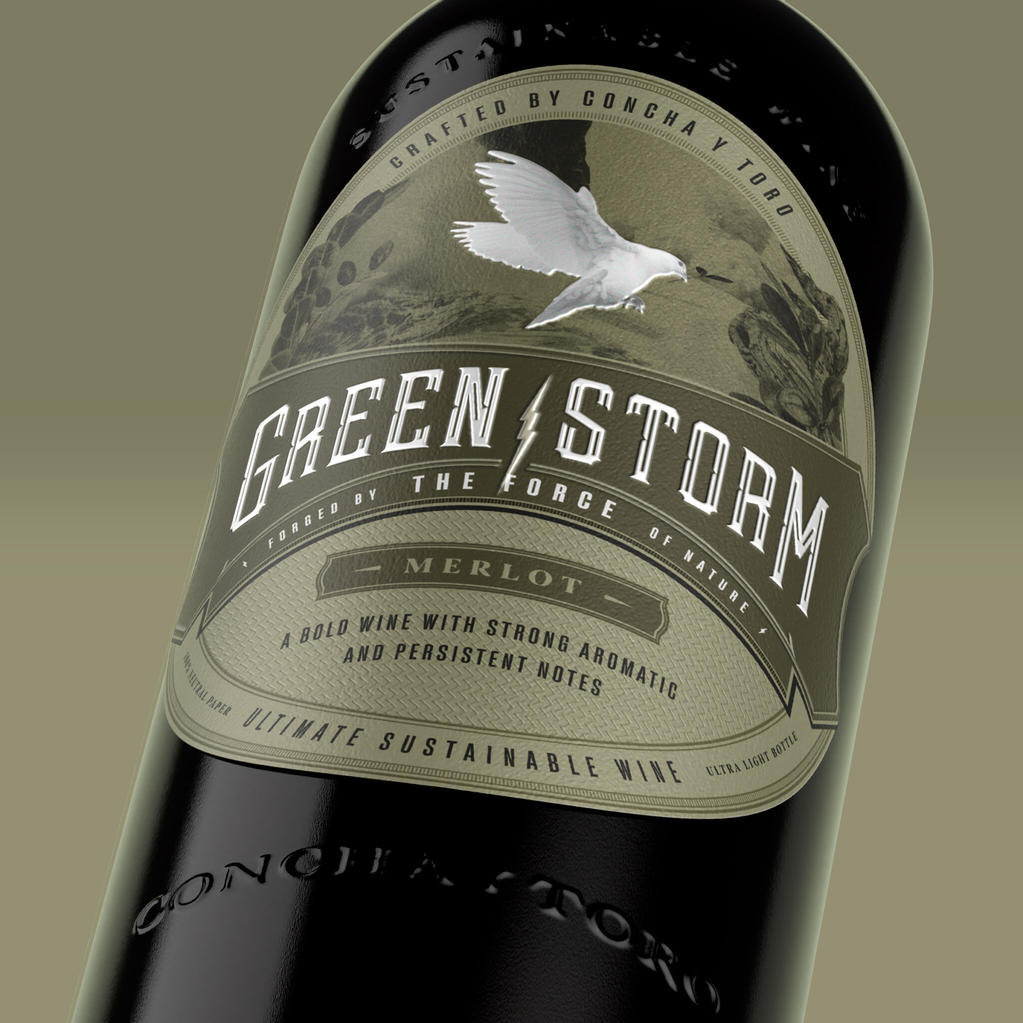
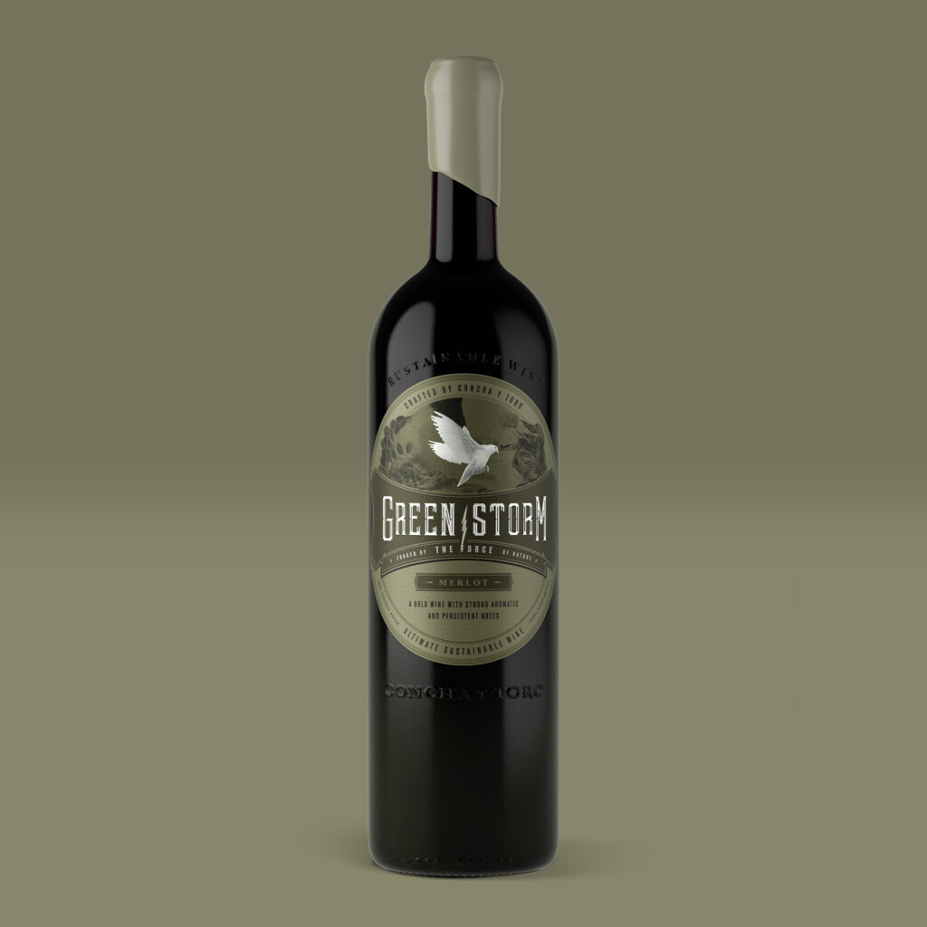
Green Storm is a purely conceptual wine brand created by Concha y Toro. This initiative consisted of establishing a 100% sustainable design solution that included an appropriate and meaningful name, capable of offering a new circular approach for super premium wine production, and aiming to establish a brand that is firmly sustained in a competitive and ever-growing market.
We knew that we would need to create a brand and adopt a symbolic or mythological narrative, highlighting its significance beyond a literal event to inspire, motivate, and implement solutions for the environmental crisis. The Great Flood was considered a story that represents rebirth, purification, or even a metaphor for chaos and renovation; an allegory for the need to take care of our environment and the importance of human responsibility toward the Earth and its diversity.
A bold and determined structure consistent with this narrative was developed, which involves significantly reducing the use of design resources on the label, giving a sensation of more austere exclusivity. The Display Serif typeface was used for the brand, inspired by Victorian fonts. Given the large number of times the logo is printed, white text was used to limit ink use, offering a series of secondary benefits for the company.
The result is a 100% recycled label produced using grape pomace, recycled pulp, and virgin fibers on a Bordeaux-style wine bottle with 100% PCR Wild Glass and a heritage finish.


