

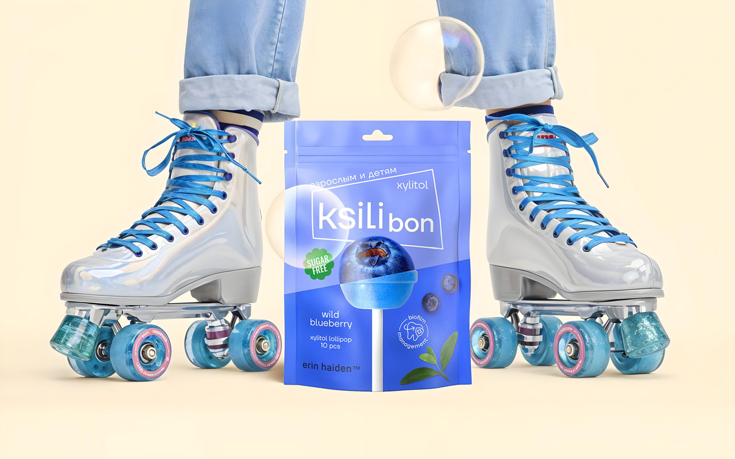
Ksilibon is a young dynamic brand of dental-friendly sweets based on xylitol. The brand is aimed to a lay dental hygiene care-conscious audience. With Ksilibon you don’t have to choose between delicious or healthy. You will get both! At once 🙂
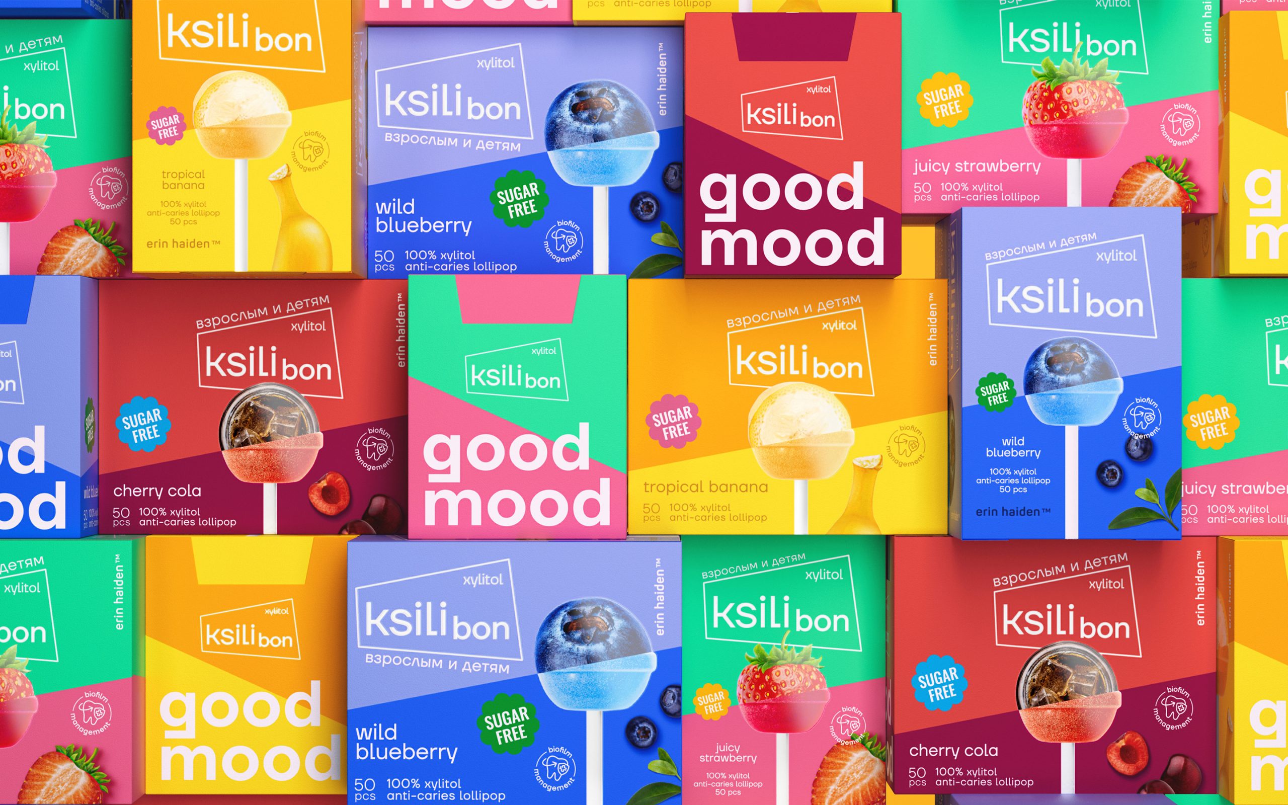
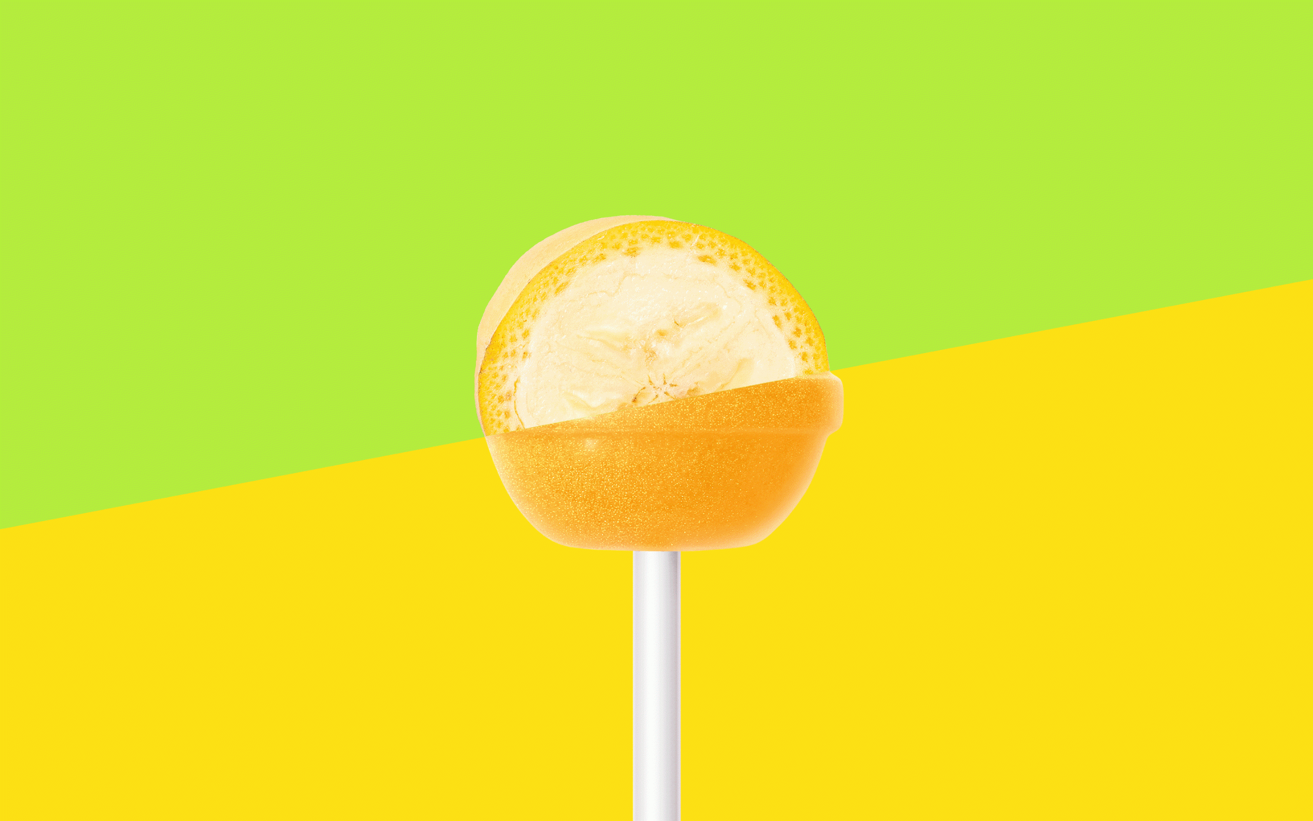
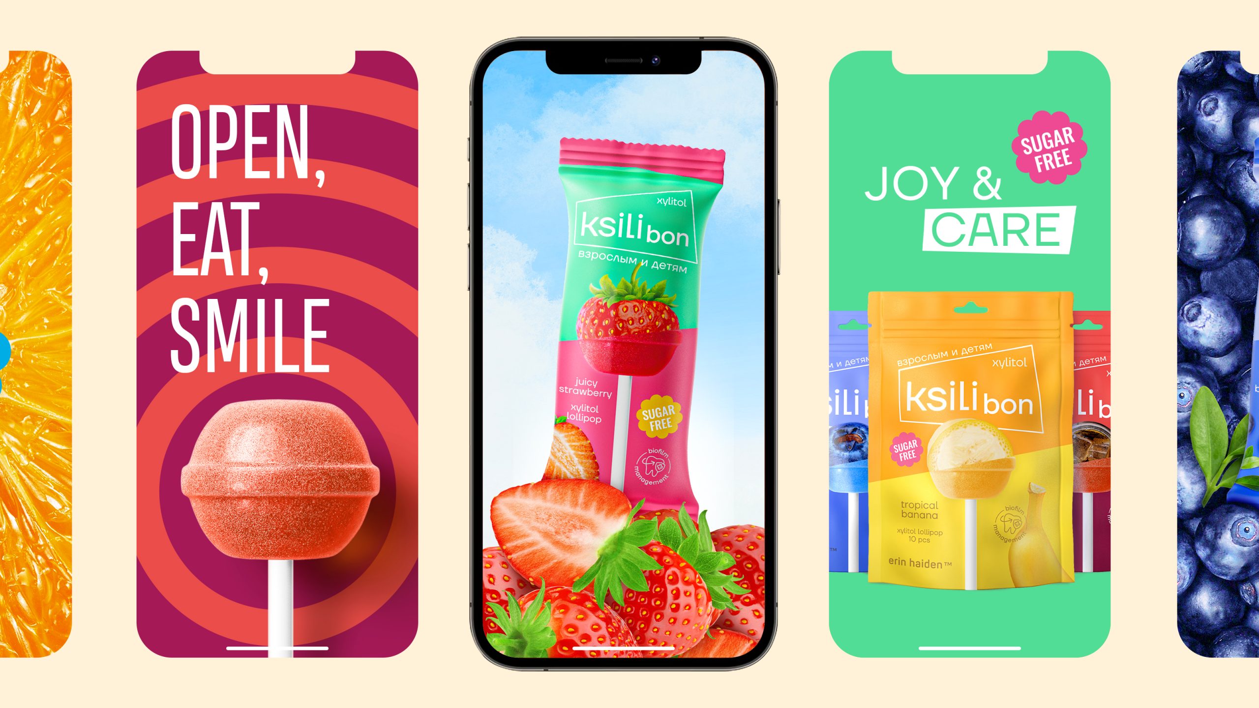
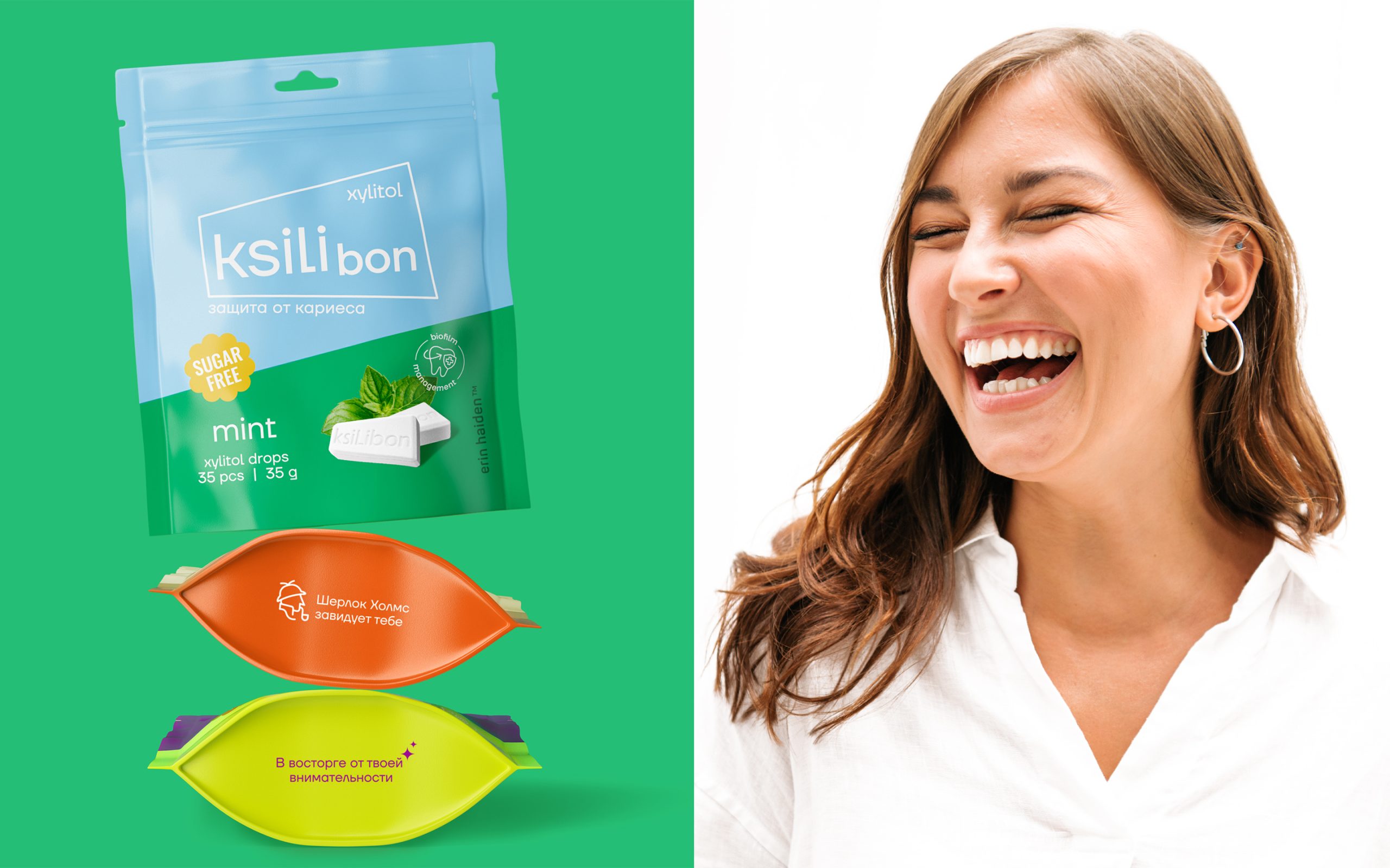
The goal of the rebranding is to lower the «entry threshold» and to change the consumers’ stereotype that dental care is always difficult, cold and tedious, and sweets are only for kids. The catchy diagonal division in design became the main trait of the identity. This feature perfectly harmonizes with the form of logo and conveys a sense of the brand’s dynamics and energy. Bright colors enhanced the emotional coloring of the product and made it less «childish». Food zones continue to develop the idea of division with diagonal by showing the product and its taste together.
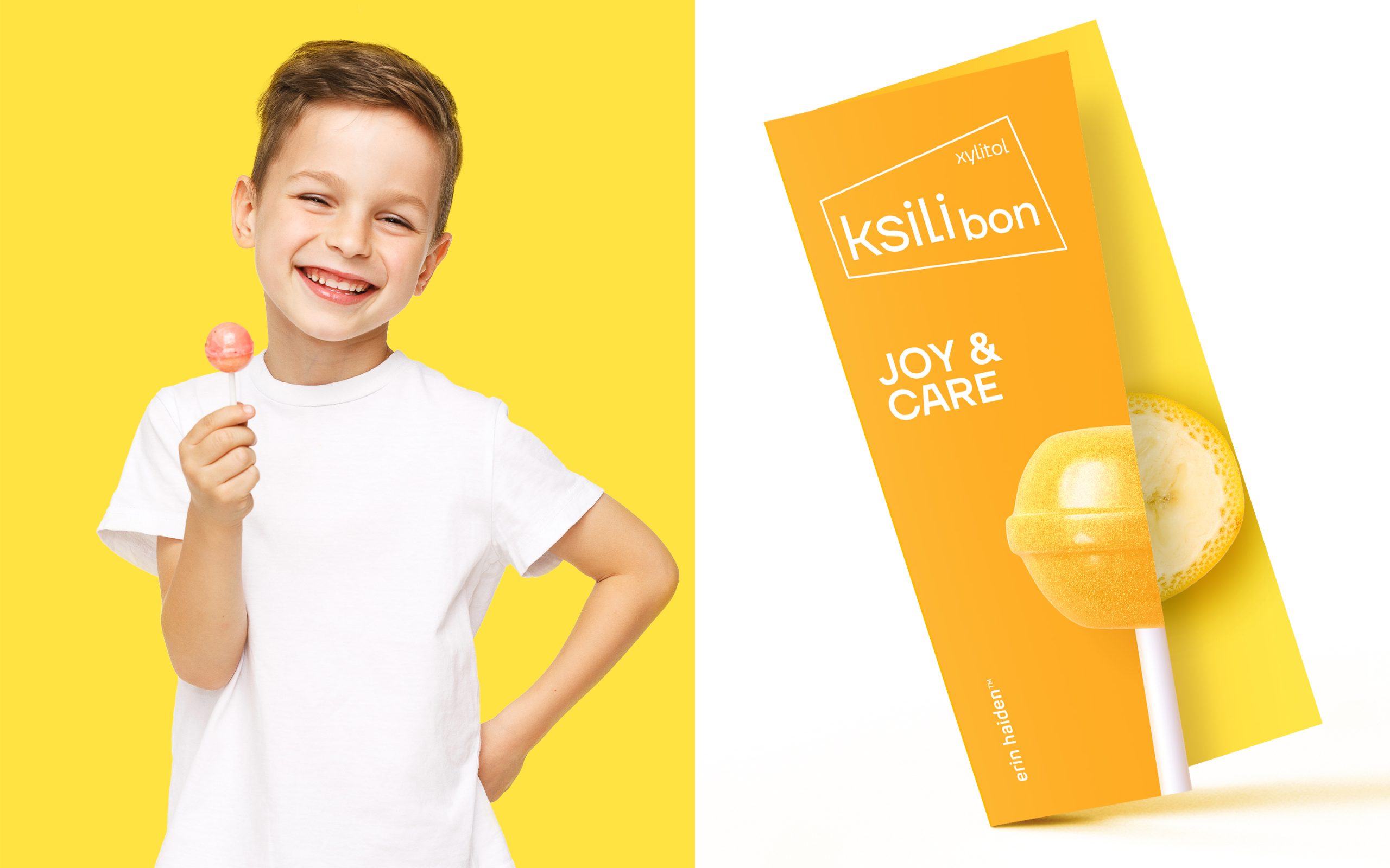
Richness, energy, lively emotions are supported by slogans: «joy and care», «good mood», «Open. Eat. Smile». Such forms were deliberately chosen to be short and glib, consisting of simple recognizable words. Working on typography became one of the main attributes of identity: slogans often include a product or an image of a fruit. And there are hidden joking bonus phrases for the most curious on the lower parts of the packages: «Hooray, you found me!», «Delighted for your attentiveness», «Sherlock Holmes is jealous of you ☺». All this makes the brand talking and friendly and creates real relationships with the consumer.




 United Creatives Studio
 Kingdom & Sparrow
 Anastasia Bakhmatskaya
 CreativeWise
 Great and Golden
 Ximena Ureta Design Studio.
 Sorted Branding
 Lisa Sirbaugh Creative
 vitoramockup
 YQIAN
YQIAN Navegante
 Anastasia Cherepanova | xtramez
 Polaris Designs
 pavlyai
 Milena Kocharyan
 monther al omari
 Mohamed sherif midoo
 DESIGN CONCEPTS
 mmdesign
 markcreativestudio
 Rosario Lo Iacono