
Fruzie — a fresh take on ice cream
It may seem that everything in the world of ice cream has already been decided: the logo, the food zone, flying fruit, milky splashes. But in such a familiar category, it becomes especially interesting to find a new move — not by breaking the existing logic, but simply by looking at the product differently.
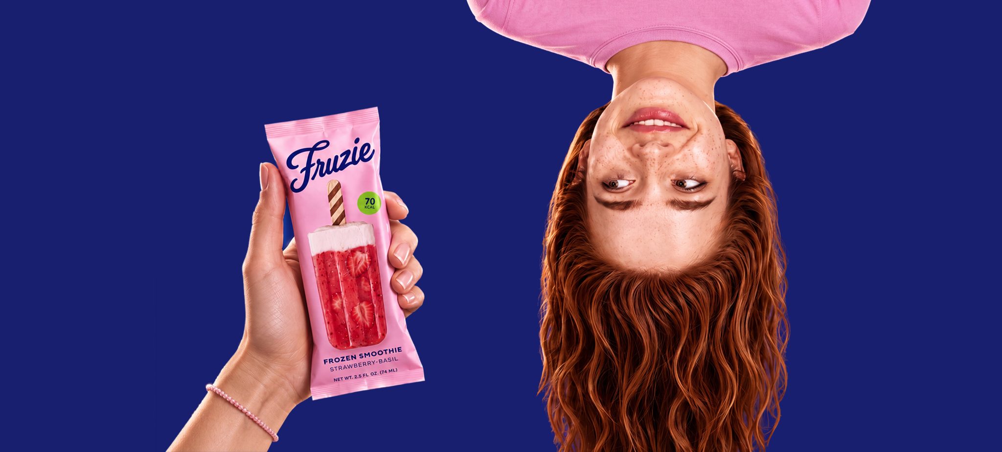
The main idea behind Fruzie is a shift in perspective.
When turned upside down, the food zone starts to read as a smoothie cup: the white upper part becomes the air at the rim of the glass, the fruit mass becomes the drink, and the wooden stick becomes a straw. This one simple move explains the key idea: Fruzie is not just another ice cream, but a frozen smoothie. This logic became the foundation of the visual system: soft natural backgrounds, clean composition, a sense of freshness, lightness, and a simple ingredient list.
Fruzie offers a new way to look at a familiar product — without a revolution, but with a clear design gesture.
Packaging identity is too often reduced to a logo and color. Fruzie had a more ambitious task: to create packaging that remains recognizable even without the logo.
The answer was the food zone.
Turning it upside down communicates the product’s key feature, sets it apart from competitors, and avoids overloading the packaging with details. In an overcrowded category, people buy not only a function, but a feeling: freshness, lightness, natural taste, self-care, and the mood of summer.
This is how the food zone stops being just an image of the product and becomes a feel zone — a space through which not only the taste is read, but also the mood and idea of the brand.
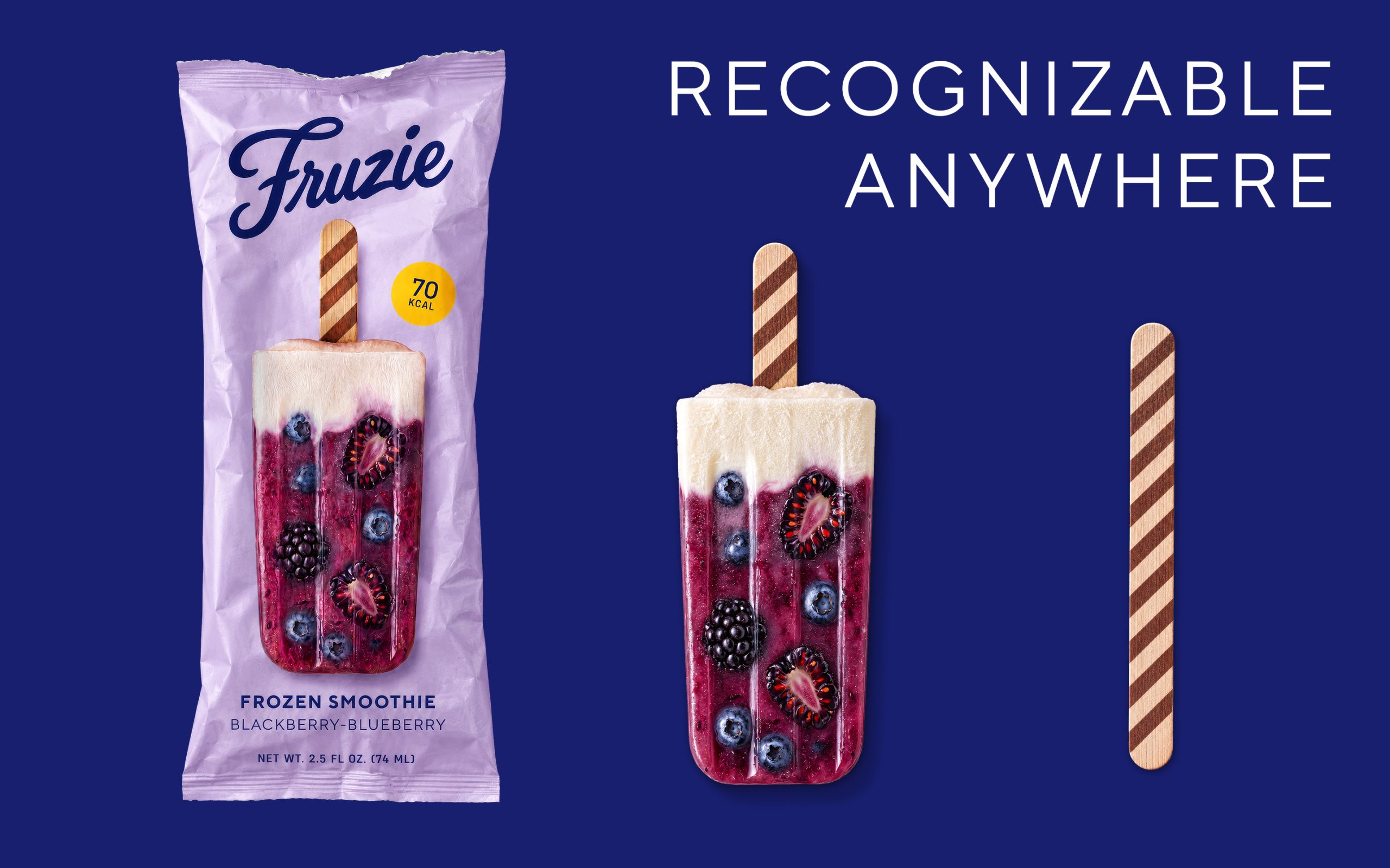
Fruzie remains recognizable not only on the shelf. Even after the packaging is removed. Even after the ice cream is gone.
Usually, the wooden stick is a utilitarian detail — at best, a place for a logo. In Fruzie, it became part of the identity.
The diagonal burned-in stripes resemble a cocktail straw and continue the frozen smoothie idea. The stick becomes a small brand carrier that holds the concept even after the product disappears.
This principle recalls the legend of the Coca-Cola bottle: its shape had to remain recognizable even from a shard. For Fruzie, the stick became that “shard.”
Because sometimes the smallest detail makes all the difference. Especially when you look at it from a different angle.




 Biaa
Biaa Petitmoulin Studio
 White Bear Studio
 Eva Chistyakova
 monther al omari
 Atipus
 alchimistestudioParis
 oneandother
 bloomburo
 helocrene
 Shapers Studio
 Denver Design
 Aidearte
 andrew.huerta
 softmachine
 airobtq
 Buzz & Co.
 Ruby
Ruby themythographer
 IDNB Inc.
 viktorflr
 Zenpack
 Wessam Hussien