

O3-Coutings has set the task to develop a brand of affordable home care products called M2 (“square meter”), which initially includes a line of home paints and detergents.
We conducted a study and identified the core of the target audience, which is based on representatives of generation Y, as well as transitional groups X-Y, Y-Z. The brand’s audience appreciates originality (“not like everyone else”, but at the same time “being on trend”), awareness of everything (responsible consumption (in relation to oneself and the environment), social and environmental responsibility, healthy lifestyle), mobility (delivery, 24/7 availability, on-the-go shopping in one click). M2 products share the values of the target audience and are ready to offer:
- Modern, simple design that takes no time to understand;
- rationality/accessibility;
- ready-made universal solutions.
Based on our research, we have developed a brand platform for home products that includes values, character, brand benefits, RTB, and tone of communication.
Constant changes in the world affect different areas of a person’s life, including his consumer habits: excessive consumption is replaced in favor of an informed choice. Sharing modern values, the M2 brand strives to provide its customers with safe, environmentally friendly and at the same time reliable, high-quality and affordable products for the home.
The M2 brand will become more than just a reliable assistant in the repair and cleaning of your home. It is designed to inspire change, energize and create creativity, and create a cozy, stylish and clean home. M2 products are a successful solution “squared”, because the emotional investment in home improvement surpasses the material one.
The brand’s photo style regulates the subject of photographic materials, as well as the tone (positive and bright, stylish, emotional and international).
Environmental friendliness, as one of the main values of the brand, is reflected in the palette of paints, which has natural natural colors and their corresponding names. The colors are divided into five groups, conveying the character of the M2 brand. A balanced palette inspired by nature itself will bring comfort to any interior. The colors of the company’s palette are well combined with each other.
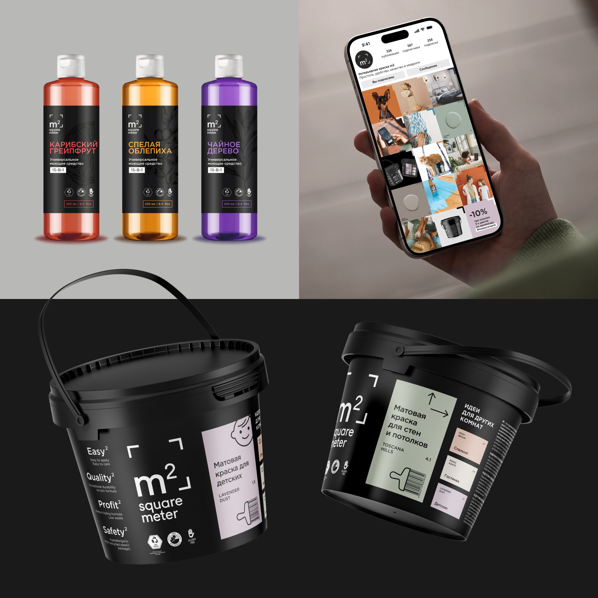
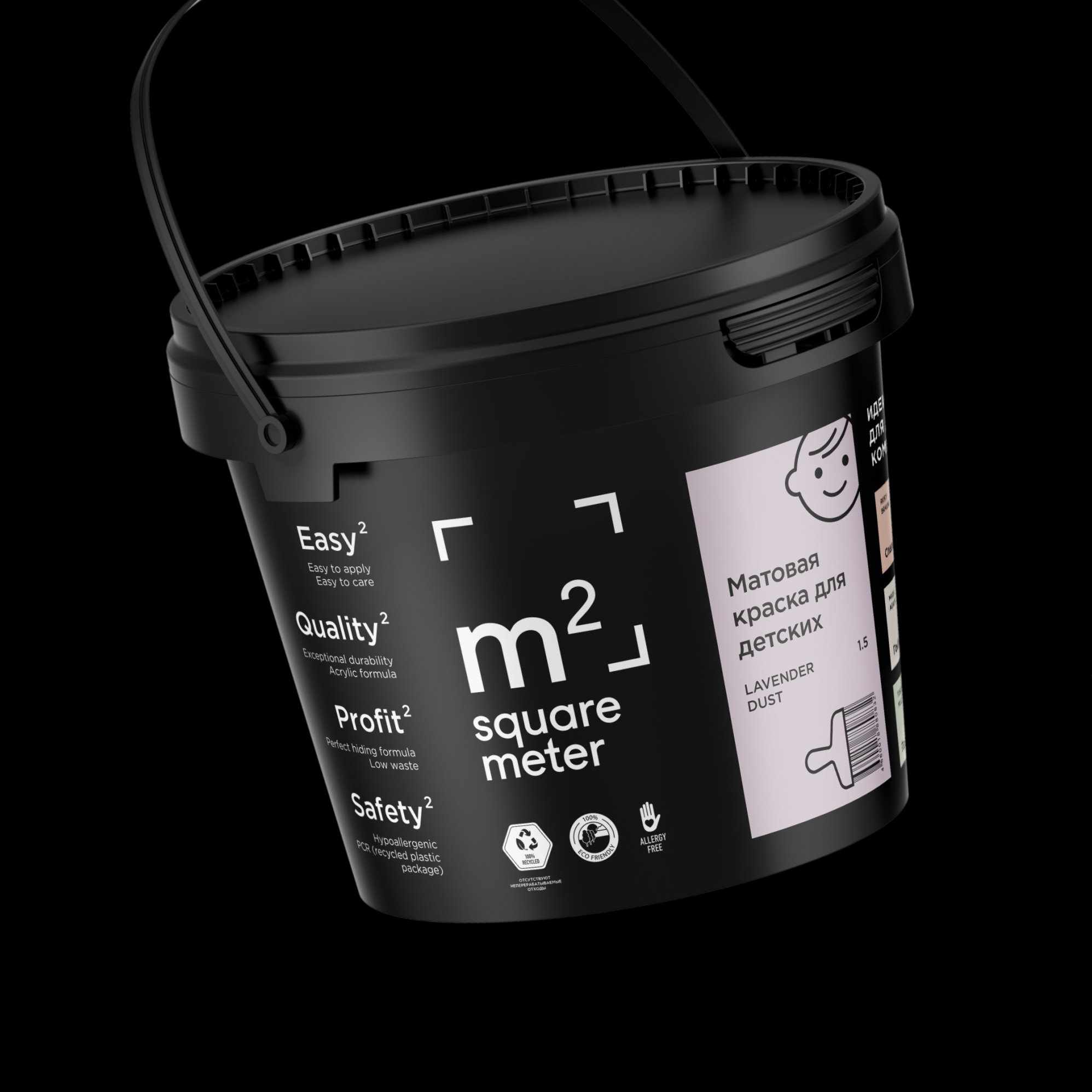
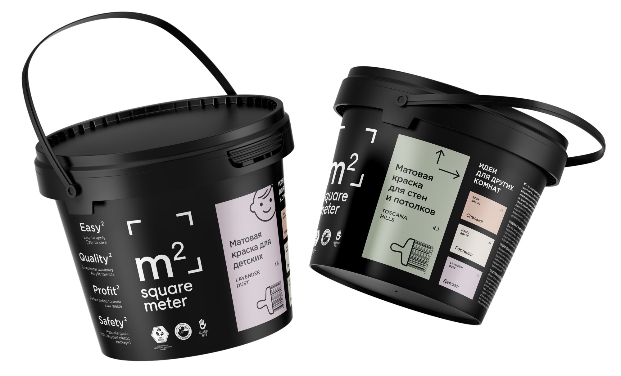
As the background color for the brand’s entire packaging line, we chose black, which makes the colors from the brand’s palette look the most advantageous. Black is not often found in paint design and stands out well against the white background of marketplaces and store shelves. There is a contrasting brand logo on the packaging, symbolizing a square meter, corners, and a room.
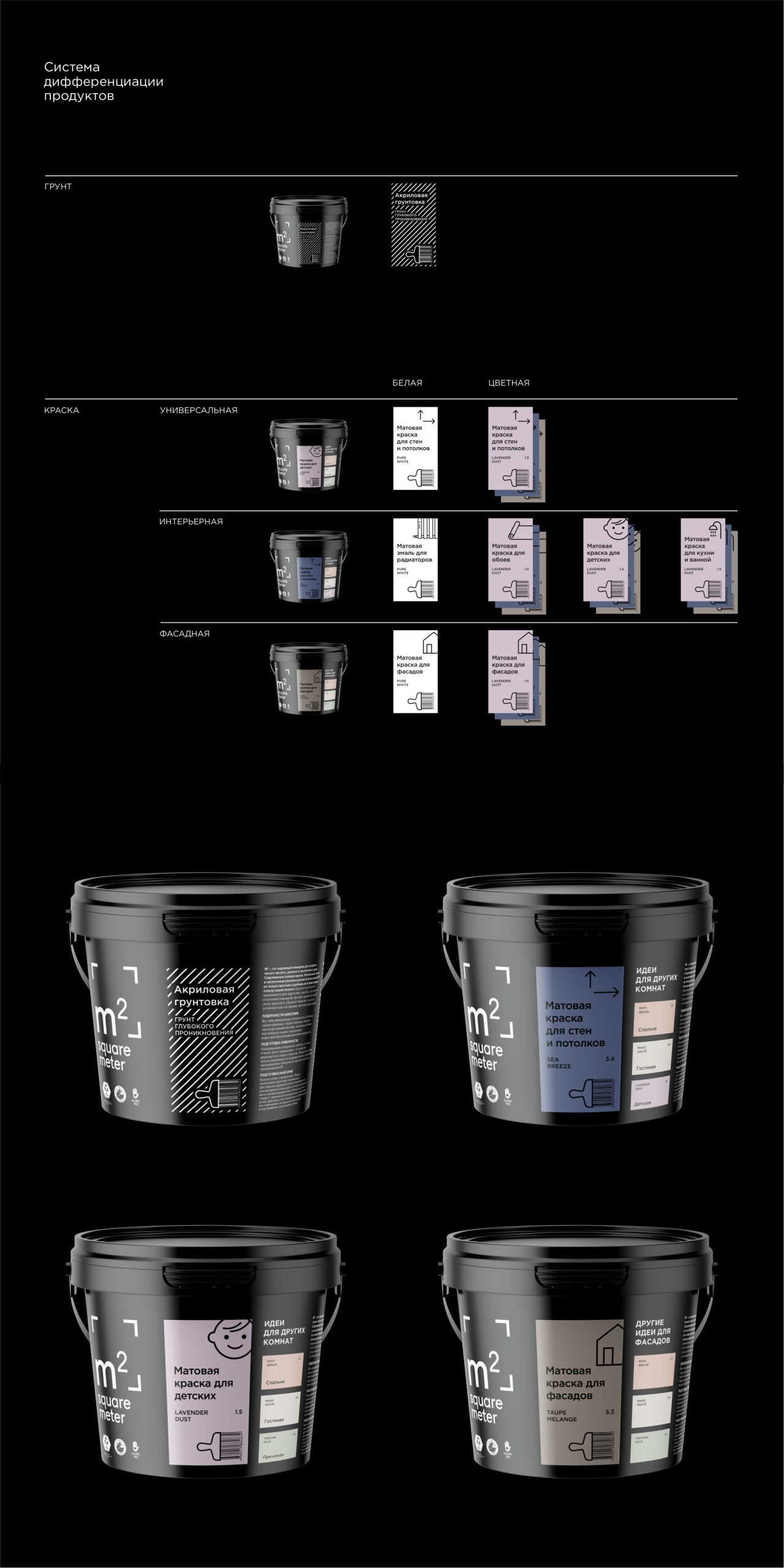
The information on the paint can is divided into several blocks: a logo with advantages “squared”, text information (features, how to use, composition, etc.) and a block about the product. M2 paints are produced with tinting at the factory and do not require time for a painful choice. A person always has the opportunity to choose a color for another room, because alternative ideas are presented next to the main color.
We have developed a matrix of product categories with a color differentiation system. Specialized products are marked with informative graphics with a large color fragment with inspiring names that we also came up with. The exception is an acrylic primer with a striped pattern, symbolizing surface preparation.
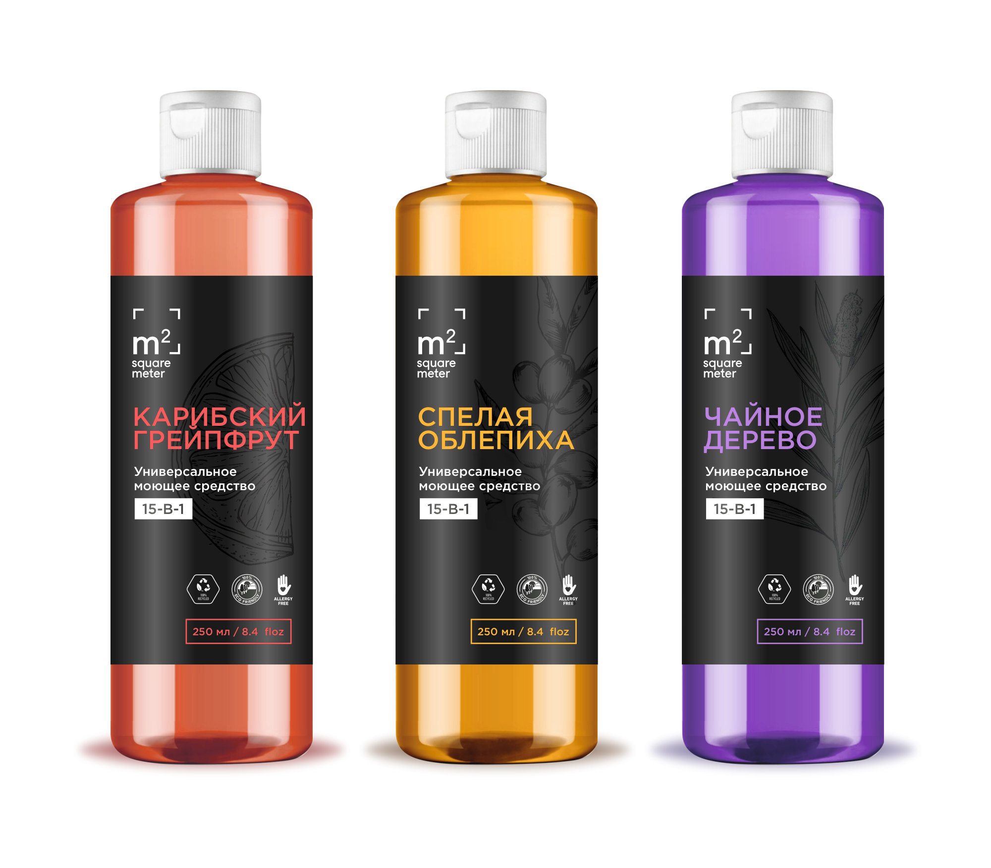
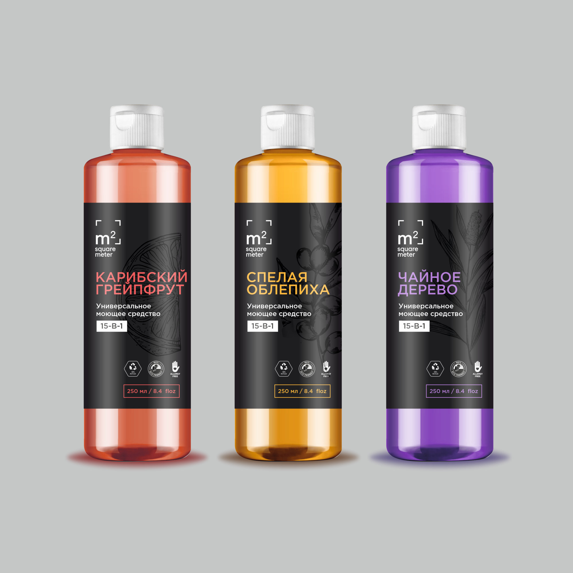
Detergent design develops the theme of interior paint packaging design. The difficulty of the task was to create an image of a universal detergent, because M2 15-in-1 can be used both as hand soap and bath foam; to wash the floor, country paths, car; to wash and so on. The label design demonstrates the optimal balance between cosmetics and household products.
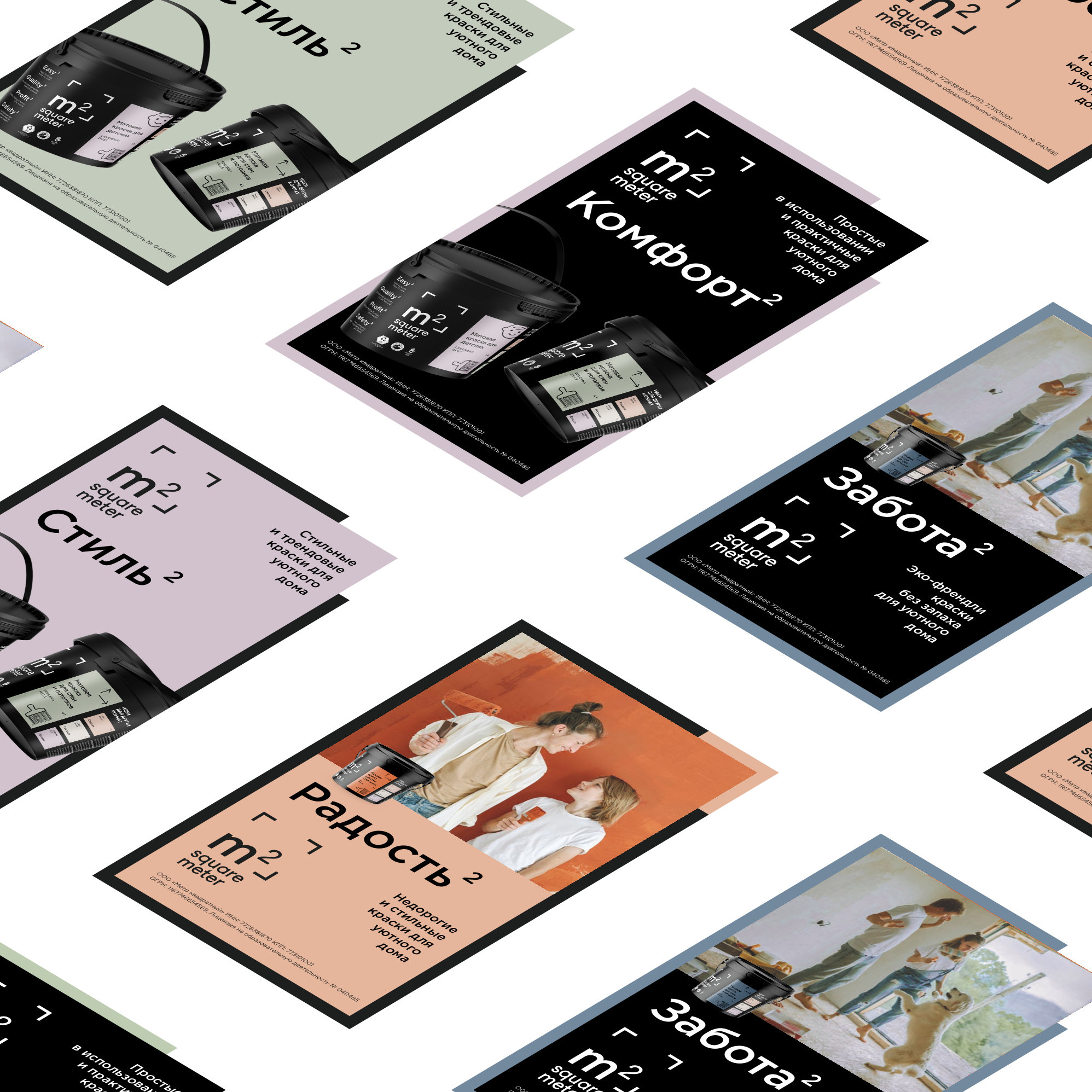
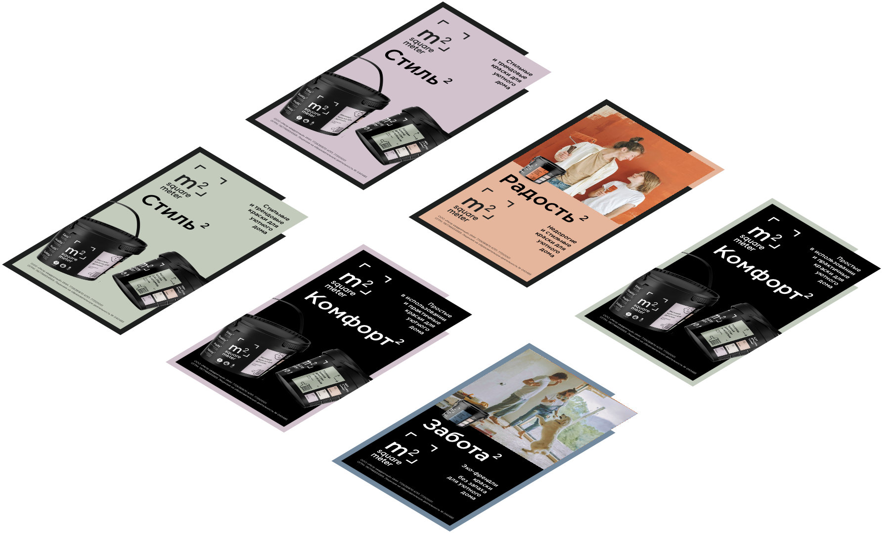
The design of communication paints develops the theme of a square meter, corners, and a room from a logo. One of the corners is red and attracts attention.
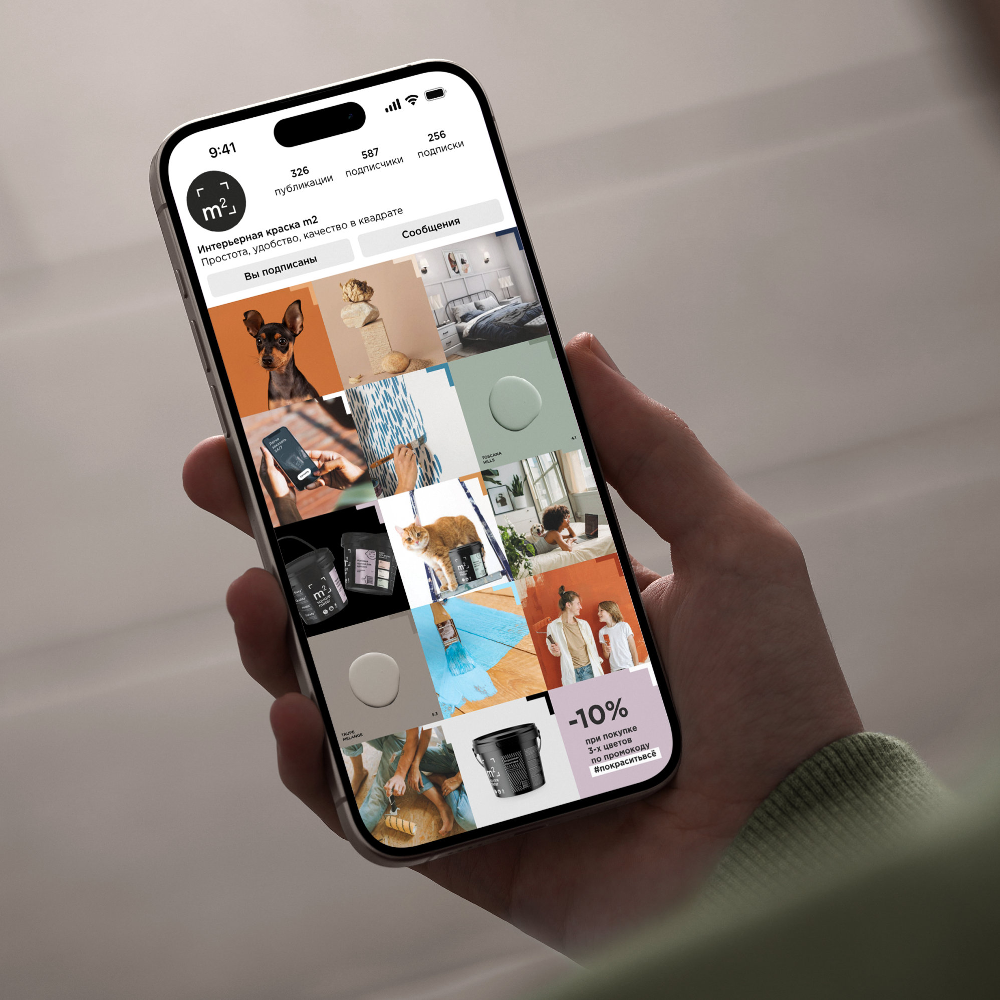
The contrasting corner is present in all promotional materials, including the social media feed. The colors of the paints can be announced using photographs of still lifes, plants, ekibans and other natural materials with a range close to the color of the M2 palette.
The brand’s visual platform has become part of a full-fledged brandbook of M2 products. The book includes basic elements of corporate identity, such as fonts, a corporate palette of paints, a logo, a photo style; a product matrix with a product differentiation system for paints and detergents; a style of communication materials; renderers for demonstrating a palette of paints and interiors, and so on.

 softmachine
 monther al omari
 alchimistestudioParis
 airobtq
 Buzz & Co.
 Ruby
Ruby themythographer
 IDNB Inc.
 viktorflr
 Zenpack
 Wessam Hussien
 samarabdelmonem
 StudioMordius
 Polaris Designs
 Atiq Alam
 duha mohamed
 HassanEtman22
 agarcia studio
 Wynand88
 Eva Chistyakova
 Maria Bukhtilova