

ABOUT
OG Hard Seltzer is a ready-to-drink alcoholic beverage brand created for a new generation of consumers who want a lighter, cleaner alternative to traditional alcohol. Launched by 4 Brothers Craft Spirits, the brand enters India’s fast-evolving RTD category with a clear promise—zero sugar, zero gluten, and full flavour, without the heaviness or guilt usually associated with alcoholic drinks.
Founder Ajay Chandwani approached Creative Branding Agency with the intent to build a bold, lifestyle-driven brand that could resonate with young, urban audiences while remaining accessible and affordable. The challenge was to design a visual identity and packaging system that felt fresh, modern, and social-first, yet strong enough to hold its own on crowded retail shelves and bar displays.
The packaging needed to feel light and refreshing at first glance, communicate functional benefits instantly, and scale seamlessly across multiple flavours without losing brand recall.
SOLUTION
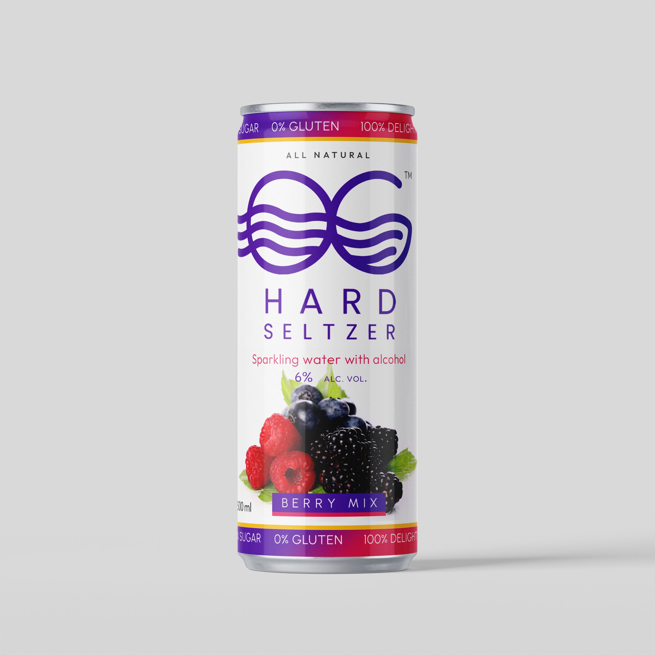
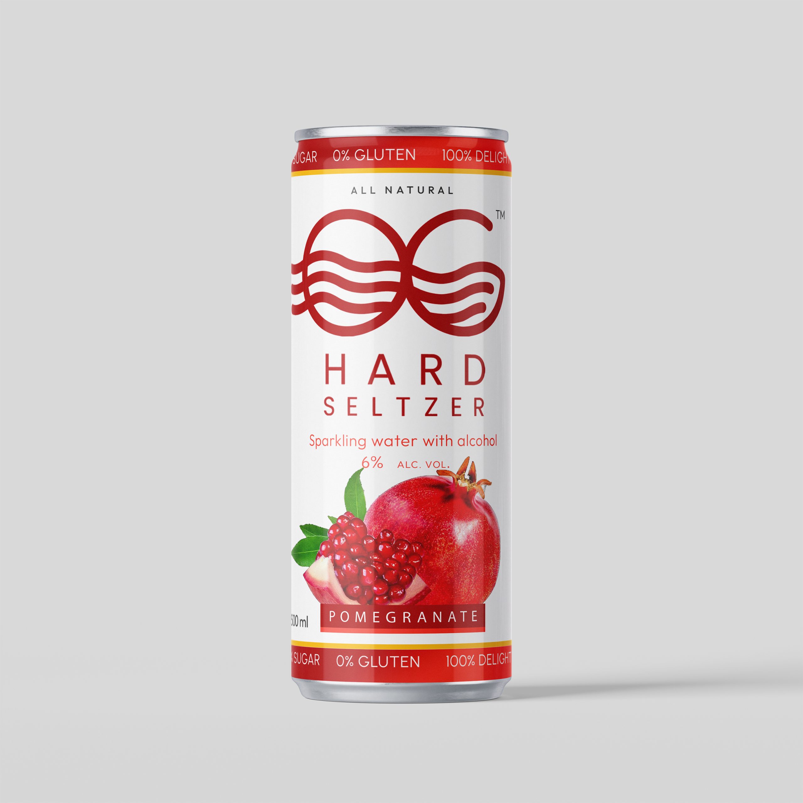
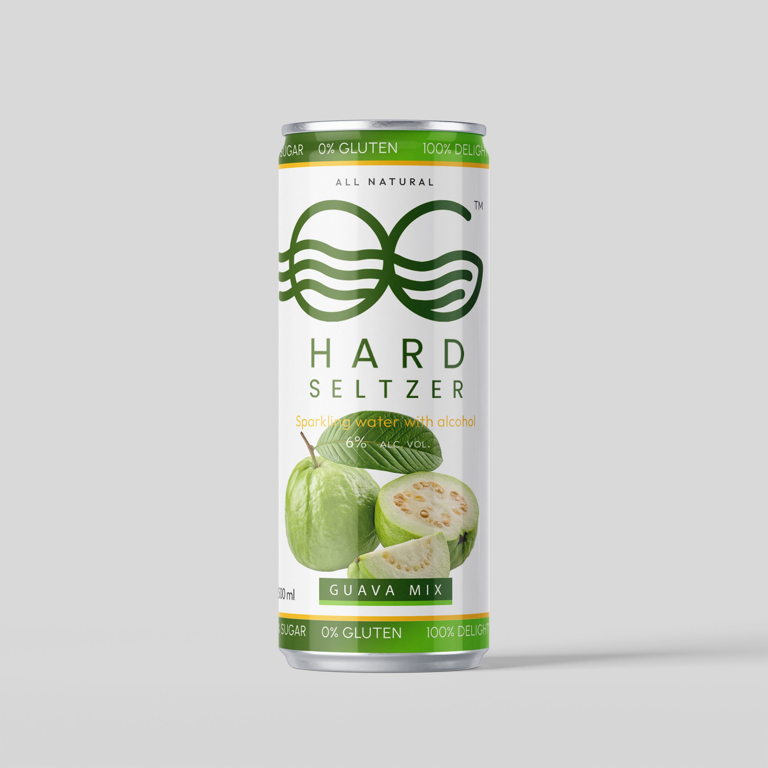
The packaging design was anchored around clarity and minimalism, allowing the product to feel clean, contemporary, and easy to understand. A white base was used as the primary canvas to signal purity and lightness, while a bold, symmetrical graphic mark became the visual anchor—instantly recognisable and adaptable across formats and variants.
Each flavour variant is defined through a distinct colour band and fruit illustration system. Berry Mix, Pomegranate, and Guava Mix are differentiated through vibrant yet controlled colour palettes that reflect natural freshness rather than artificial intensity. This approach enables quick flavour recognition while maintaining a unified brand presence across the range.
Functional cues such as zero sugar, zero gluten, alcohol percentage, and “all natural” positioning are integrated into the can through a clear, linear hierarchy. These details are placed to be legible at a glance, supporting quick decision-making in both retail and on-premise environments.
Typography remains clean and confident, avoiding visual clutter and reinforcing a lifestyle-led tone rather than a loud, party-centric aesthetic. The slim can format further enhances the premium-affordable perception, making the product feel contemporary, portable, and social-media friendly.
RESULT
The final packaging system positions OG Hard Seltzer as a confident entrant in India’s growing RTD segment—modern, approachable, and visually distinct without trying too hard. The restrained design language allows the brand to stand out through simplicity, while the colour-led variant system ensures clarity and scalability.
OG Hard Seltzer successfully balances lifestyle appeal with functional transparency, making it equally suited for retail shelves, house parties, bars, and social settings. The result is a shelf-ready, youth-forward brand that feels current, flexible, and built for long-term growth—giving 4 Brothers Craft Spirits a strong foundation to expand within the hard seltzer and RTD beverage space.
PROJECT DETAILS
Brand: OG Hard Seltzer
Category: Ready-to-Drink Alcoholic Beverage / Hard Seltzer
Designed By: Creative Branding Agency (CBA™)
Scope: Brand identity design, packaging design, variant colour system
 Eva Chistyakova
 vostorge
 alchimistestudioParis
 lettera7
 killeridea
 leekyeongyeob
 vitoramockup
 Akshay 11
 Deeez Studio
 Oksana
 M&A CREATIVE AGENCY
 宏洛图品牌设计HONGLT
 mattdoyledesign
 Up-Brands
 Semenova Ekaterina
 Valérie Colace
 Rosario Lo Iacono
 maud de pourpre
 Firstrein