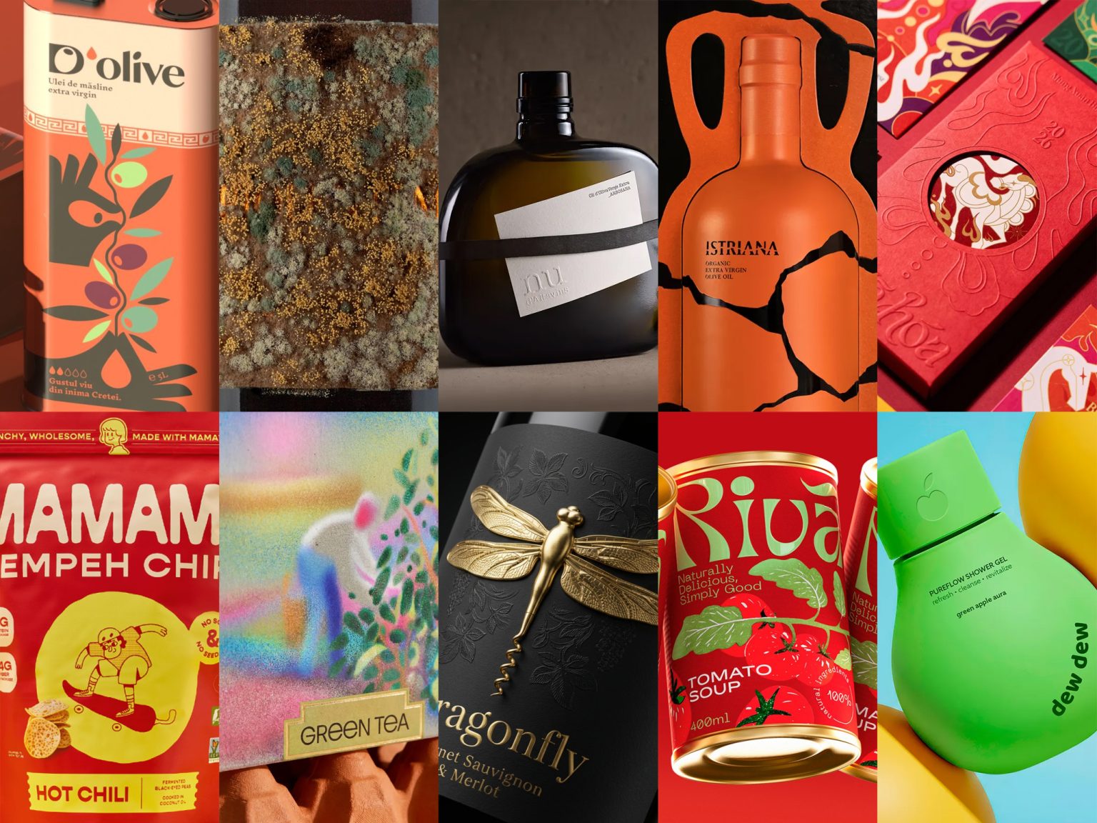

Welcome to Issue #140 of Packaging of the World. This issue highlights ten packaging projects that stand out for their clear ideas, creativity, and smart branding. Each design shows how strong thinking and careful design can shape a product’s visual identity.
These projects are already getting attention on social media. Follow us on Instagram, Facebook, and Pinterest to stay updated with the latest packaging trends and creative work.
Have a packaging project you’re proud of? We welcome submissions from designers, studios, and brands around the world. Whether it’s your first submission or not, simply sign in or create an account to share your work with our global community.

Nu designed by Bulldog Studio
The design of Nu is built around the idea of purity and minimalism. Inspired by the Catalan word for “naked,” the concept strips the packaging down to its most essential form. The organic-shaped glass bottle is left completely clean, with no labels or decorative elements attached to its surface, allowing the olive oil itself to become the visual focus. This deliberate absence of graphic noise reinforces the brand’s message of authenticity and first-press quality, presenting the product in its most honest and natural state while creating a strikingly refined shelf presence.

Riva designed by Alice Macarova
Riva’s identity and packaging design embraces bold simplicity to create strong shelf impact. A saturated red backdrop dominates the visual language, instantly drawing attention while reinforcing the product’s tomato base. Oversized, flowing typography forms the core of the brand expression, giving the packaging a lively and contemporary character. Illustrated tomatoes with leafy greens introduce a sense of freshness that softens the graphic intensity. Paired with gold can tops that add a subtle premium touch, the overall concept balances energy, clarity, and memorability, positioning Riva as a modern, visually distinctive pantry brand.

TEORA – Contemporary Tea Packaging Concept by Nadaalaboudi
This conceptual tea packaging explores packaging as a visual design object rather than just a container. The identity is built around a contemporary pointillism-inspired illustration style, where images emerge through layered color particles instead of sharp outlines, creating a calm and atmospheric visual language. Each tea variety—green, black, and mint—is expressed through distinct color moods while maintaining a unified brand system. The minimal square structure allows the illustrations to take center stage, while matte textured paper enhances tactility, reinforcing the refined and collectible nature of the overall design concept.

Mã Hoá 2026 designed by Ngoc Linh Graphic Design
“Mã Hoá” is a red envelope design project created to celebrate Vietnam’s Lunar New Year 2026 through a contemporary cultural lens. The concept centers on the Horse, the zodiac symbol of the year, interpreted through a bold visual language inspired by Vietnamese folk art. Expressive typography and symbolic forms transform the horse into a dynamic graphic emblem that represents movement, renewal, and prosperity. A vibrant color palette drawn from nature reflects the rhythm of the seasons, while the overall design system blends tradition with modern expression, turning each envelope into a striking carrier of fortune and festive identity.
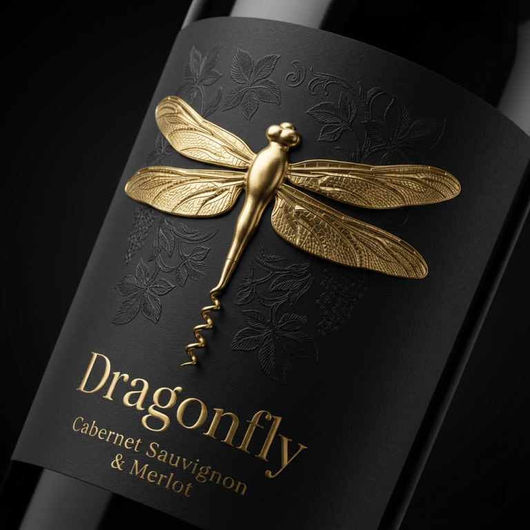
Dragonfly Wine designed by Packagenius Design Studio
Dragonfly Wine’s rebranding centers on transforming the dragonfly symbol into both a visual and functional design element. The icon is stylized so that its tail forms the shape of a corkscrew, turning the brand mark into a meaningful part of the wine-opening ritual. This approach connects identity with user interaction, making the symbol more than just decoration. The label design keeps a restrained visual language, pairing a matte black surface with a sculptural gold dragonfly emblem. Subtle botanical textures add depth without distraction, creating a refined concept where symbolism, elegance, and functionality come together to define the brand.

D’olive designed by VRLN
D’olive is an olive oil brand built around authenticity and transparency, expressed through a clear and confident visual identity. The logotype is designed to communicate honesty and traceability, reflecting the brand’s commitment to openly sharing the origin, producers, and varieties behind each batch. The packaging system brings unity across multiple formats, from large tins to smaller bottles, while allowing different flavor profiles to be clearly distinguished. With a clean and structured design approach, the brand emphasizes clarity, provenance, and a vivid Mediterranean character rooted in the olive groves of Crete.

Istriana designed by Studio Tumpic/Prenc
E Pluribus Unum’s Istriana olive oil packaging brings history and authenticity to the forefront. Inspired by the Roman amphorae once used in Istria, the design evokes the region’s centuries-old olive oil tradition. The bottle artwork reflects re-assembled clay fragments, symbolizing the revival of Istria’s heritage and quality. A warm terracotta hue, drawn directly from local soil, connects the product visually to its origin, while the overall packaging balances historical reference with modern clarity, presenting the olive oil as both a premium product and a meaningful continuation of Istria’s storied past.

Piquentum Wine designed by Studio Sonda
Piquentum Brut Nature turns its label into a proof of authenticity. Committed to 100% organic production, the brand avoids artificial sugar and yeasts, letting fermentation happen naturally. Instead of discarding sediment from secondary fermentation, Piquentum uses it to create the label itself—literally made by the wine. The result is a dynamic, evolving surface that develops over time, reflecting the wine’s natural process and story. With a minimalist yet concept-driven design, the label becomes both a visual manifesto and a tactile experience for sommeliers, merging craft, transparency, and storytelling while fully complying with food-contact regulations.

Dewdew shower gel designed by Lana B
Dewdew shower gel uses playful, colorful packaging to capture freshness and energy. The design pairs soft, rounded bottles with a minimalist approach, letting bold hues and subtle fruit embossing on the cap communicate each scent’s personality. Clean lines and vibrant colors create a modern, eye-catching presence on shelves, while the tactile details and expressive palette convey fun, daily self-care. The overall identity balances simplicity with character, turning a routine product into a visually engaging and memorable shower experience.

Mamame Chips designed by Steven Roberts
Mamame tempeh chips feature a playful, approachable brand refresh that brings tradition into a modern context. The new identity includes a friendly mama mascot, lively illustrations, and a clean, organic visual system that reflects the warmth and authenticity of homemade recipes. Fun shapes and flowing lines give the packaging personality without overwhelming simplicity, making the plant-based snacks feel both inviting and genuine. Every element—from logo to illustration—works together to communicate Mamame’s mission: tasty, approachable tempeh snacks rooted in family tradition.
 Eva Chistyakova
 Puigdemont Roca
 marianaaworks
 bloomburo
 andreamarinnn
 Alina
Alina Saadmost
 Bruhken
 Maruf Nishat
 Richest Branding Pvt. Ltd.
 Sophiagdotcom
 saifullahmaslool
 Up-Brands
 Atiq Alam
 daniitenaa
 artworkbysofia
 monther al omari
 Valérie Colace
 Tianqii
 Anum
Anum anisameur
 tauqueer
 SOT B&D
 Palashcc
 Biaa
Biaa