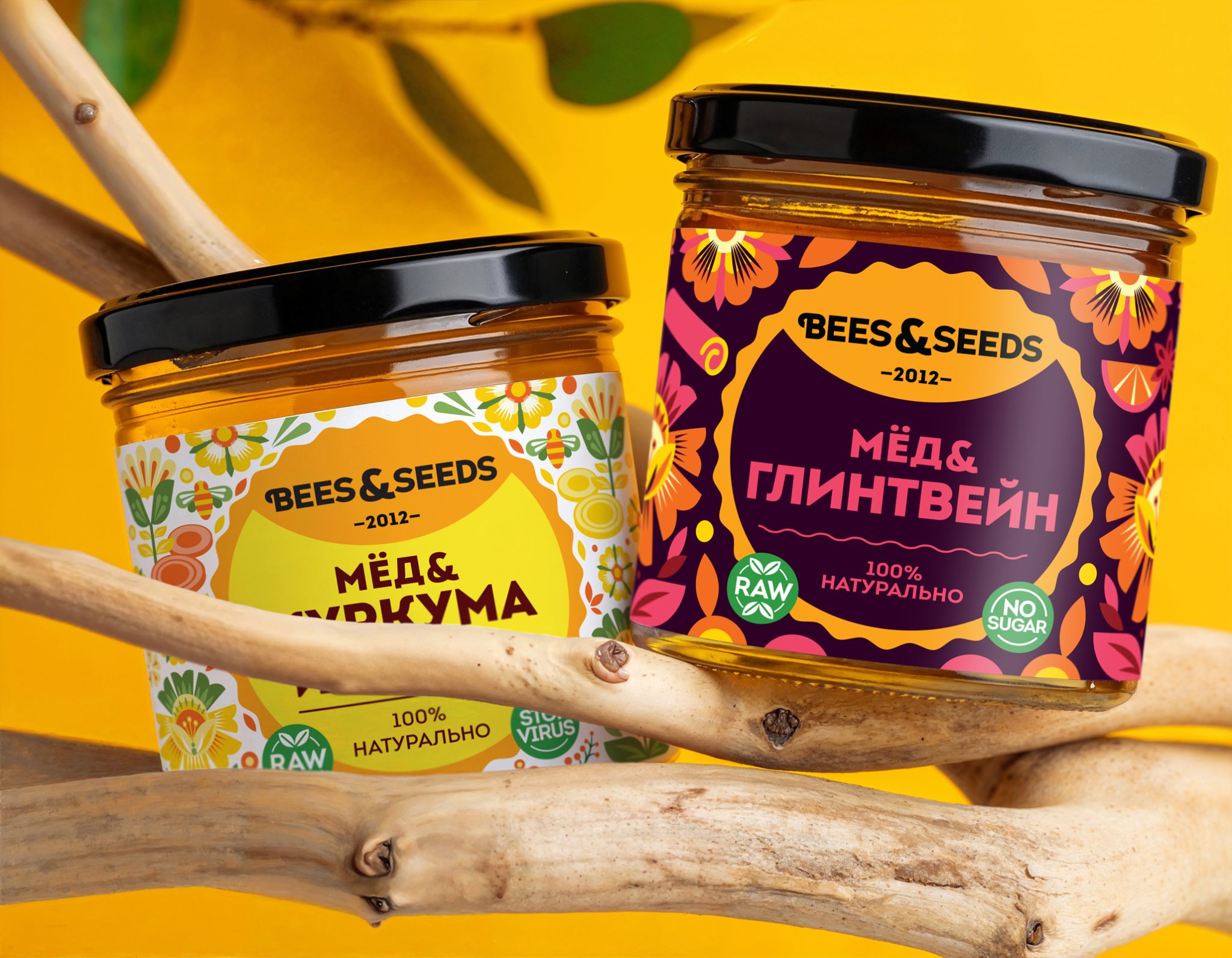

Bees & Seeds: Natural honey since 2012. Experts in honey with healthy and delicious natural additives.
The brand creates “urban superfoods”- bringing nature into the city. It offers a healthy alternative to traditional desserts, perfectly fitting the rhythm of modern life.
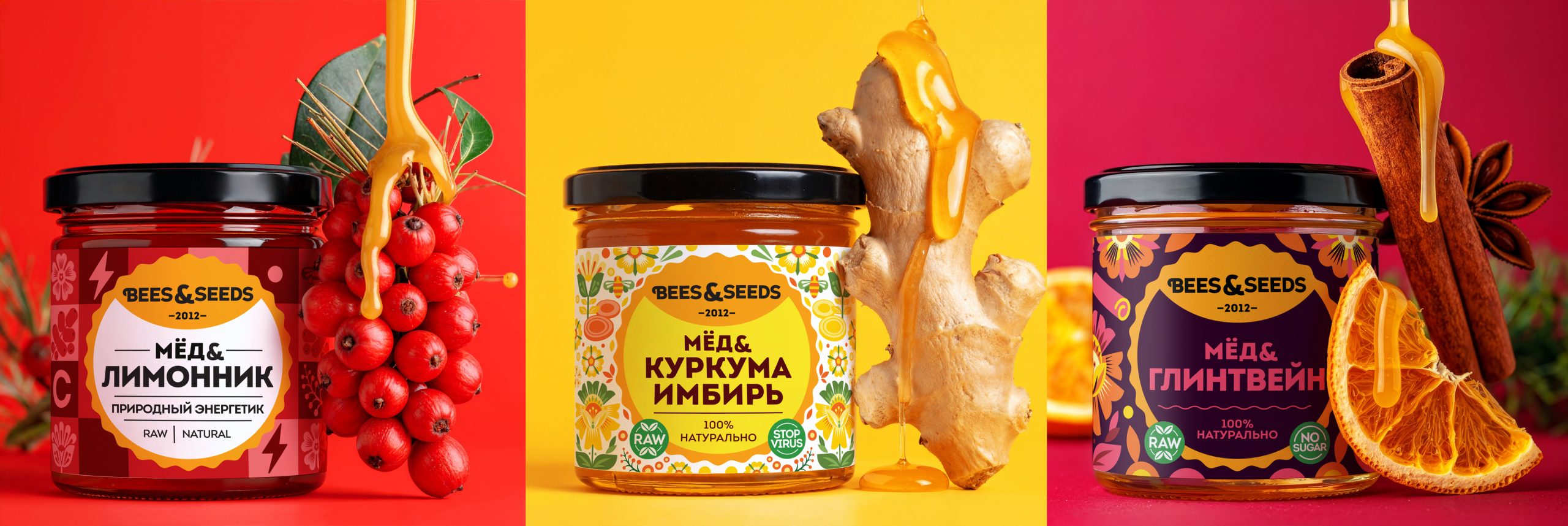
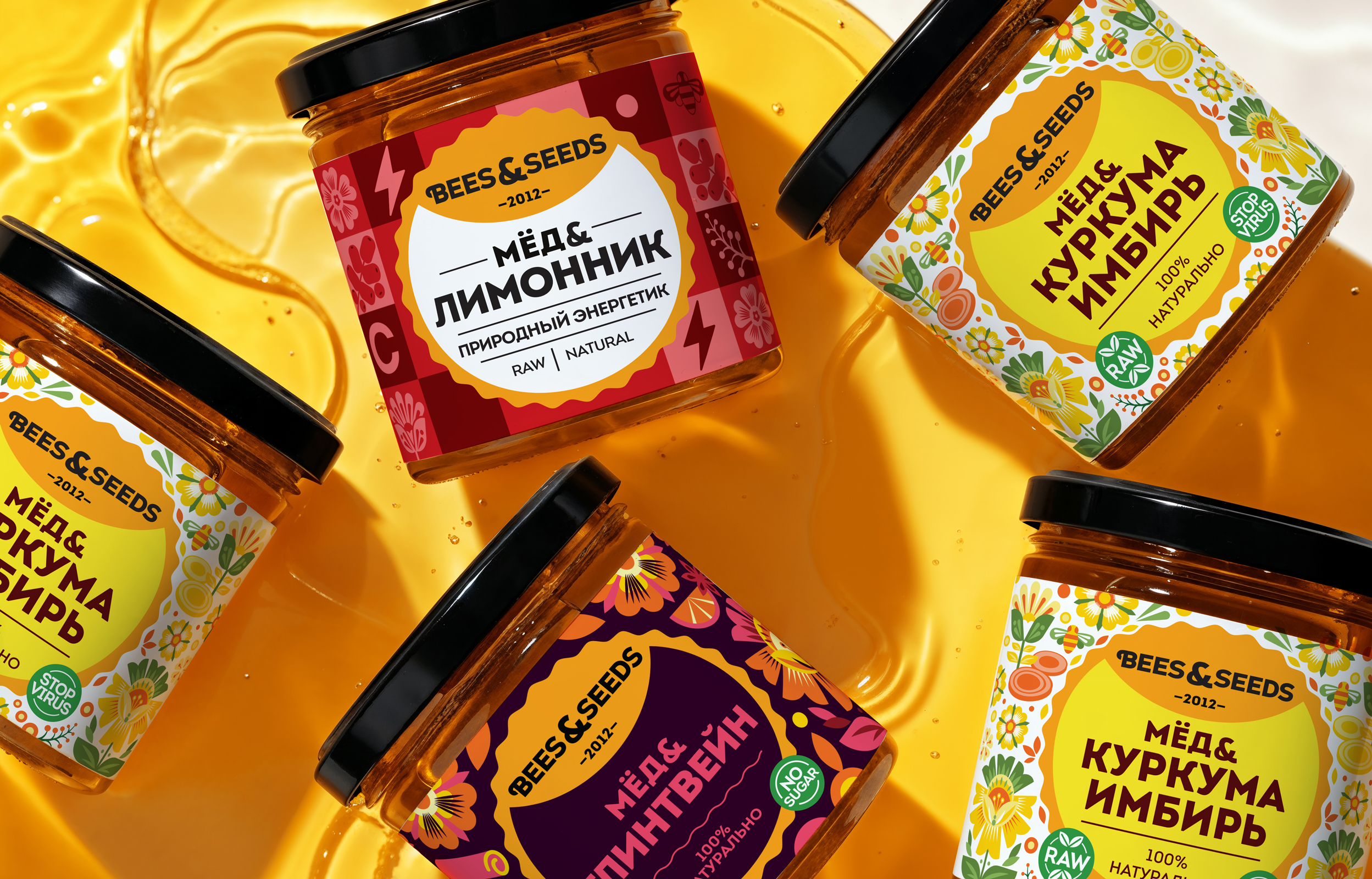
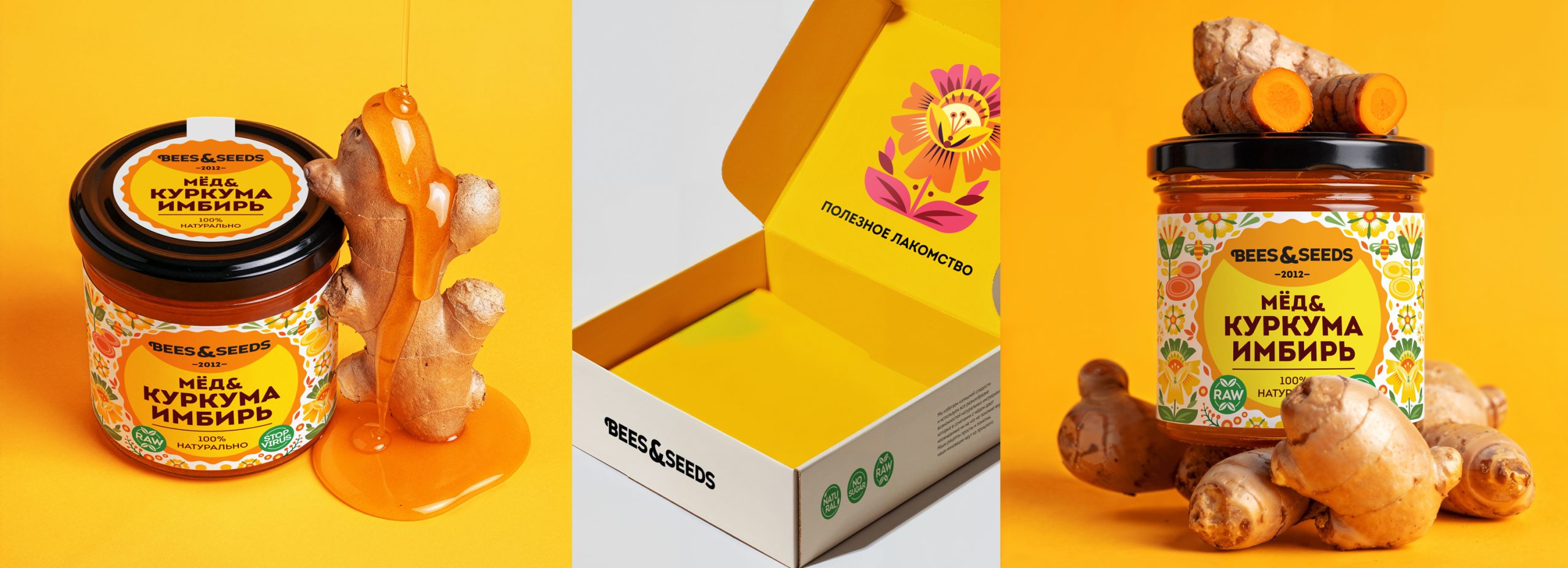
My primary task was to organize the extensive product range into three distinct lines. I developed a systematic design language that clearly separates products by their benefit, while maintaining a unified brand identity.
The new structure consists of:Health: Honey combined with natural ingredients for wellness and prevention.
Function: “Urban superfoods” designed for specific body functions, such as natural energy boosters.Taste: Gourmet honey blends created for pure enjoyment, featuring unique flavors like Mulled Wine or Chocolate.
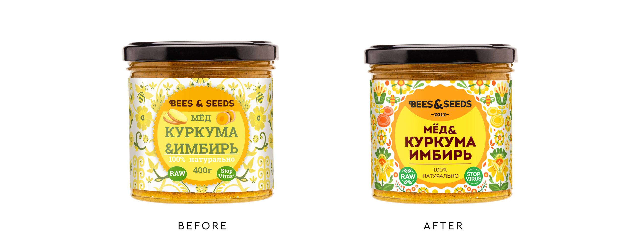
The client opted for the most recognizable concept to avoid drastic changes. We focused on polishing the existing brand image to make it look fresh while keeping its core stability intact.
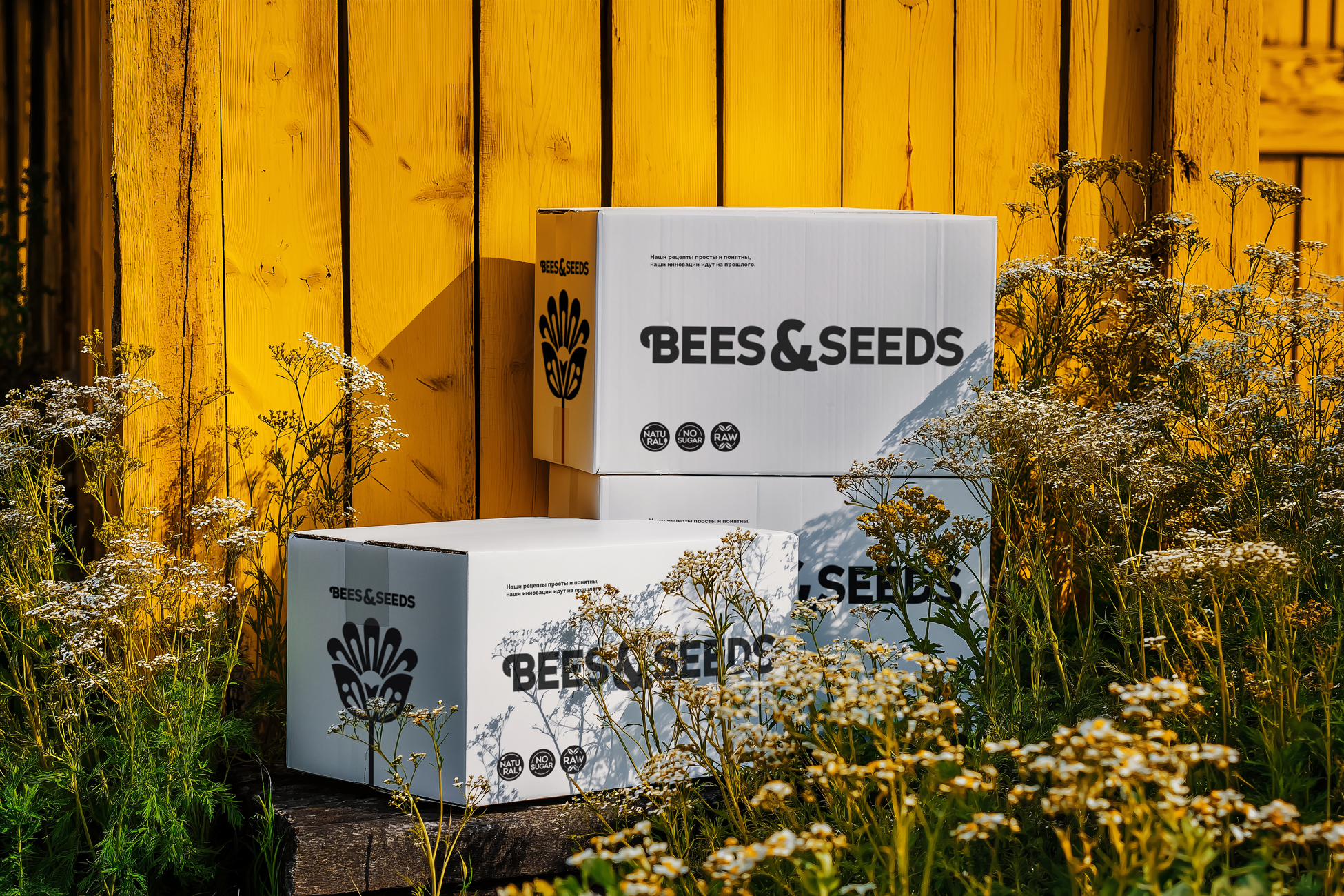
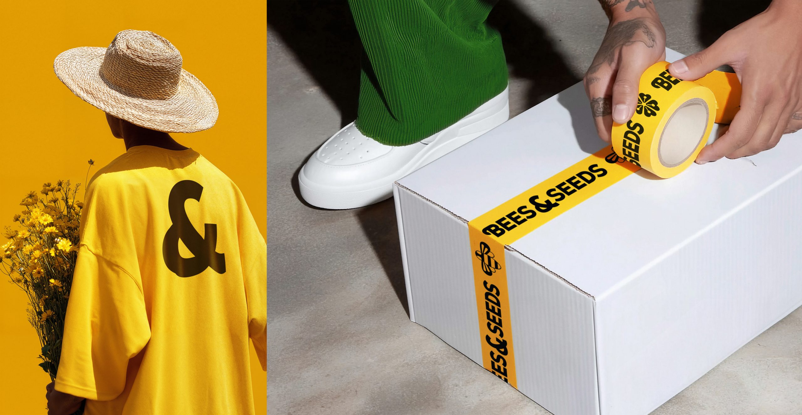
I refined the core brand elements: updated the brand-shape, colors, and typography. The logo was adjusted to be larger and more visible, with a more defined brand zone. Additionally, the signature pattern was simplified and modernized for a cleaner, more contemporary look.
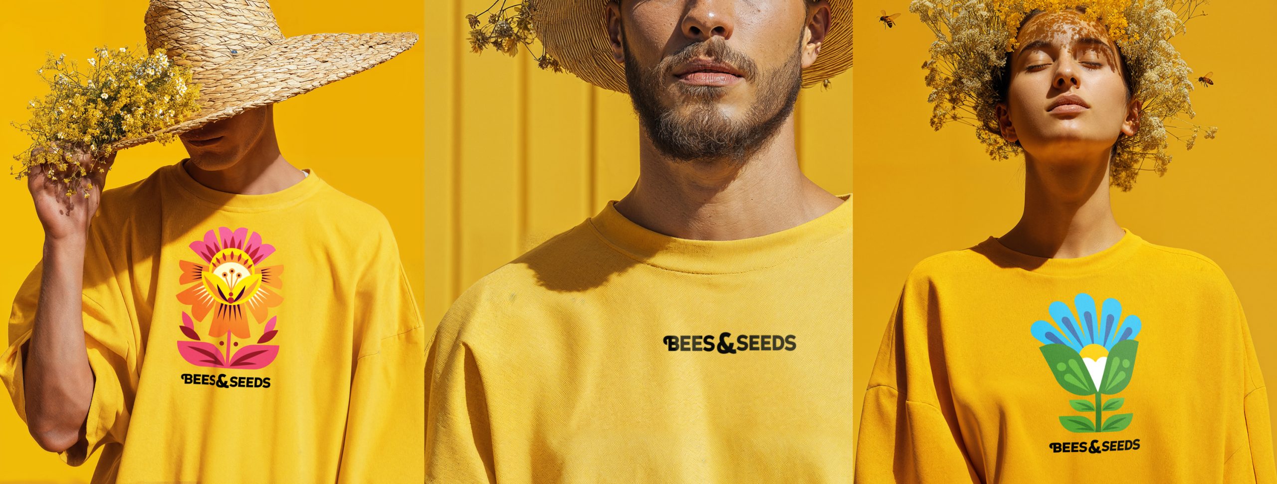
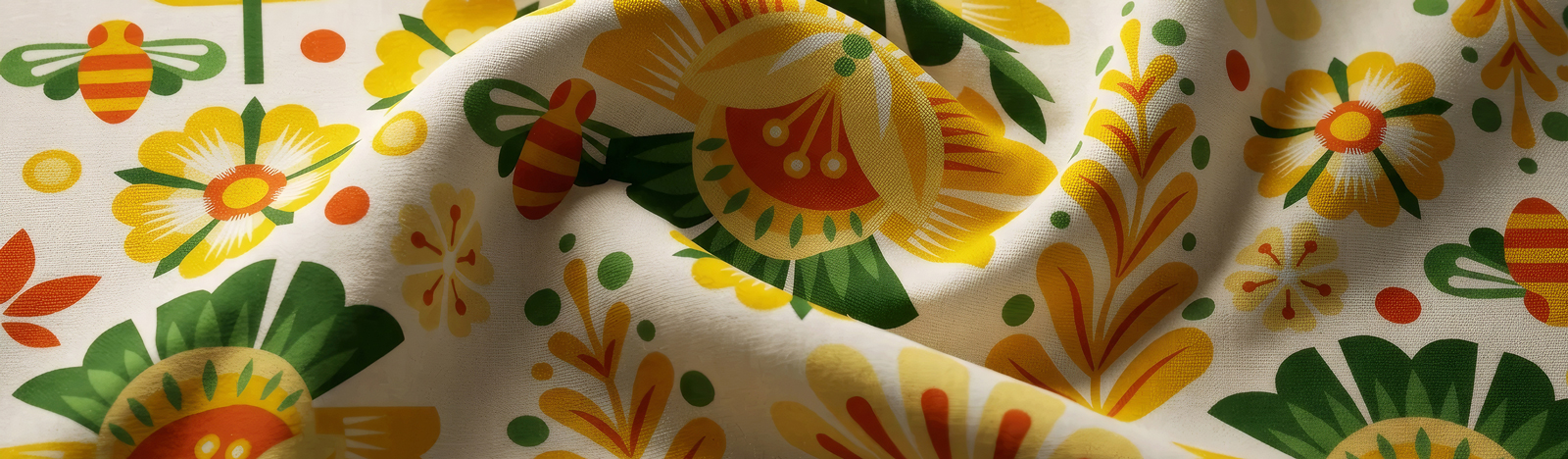
The new pattern is now simpler and more recognizable. Its clean graphic elements work perfectly for branding, from merchandise to various marketing materials, ensuring a consistent look across all touchpoints.


 Derrick Lin
 Biaa
Biaa Petitmoulin Studio
 White Bear Studio
 Eva Chistyakova
 monther al omari
 Atipus
 alchimistestudioParis
 oneandother
 bloomburo
 helocrene
 Shapers Studio
 Denver Design
 Aidearte
 andrew.huerta
 softmachine
 airobtq
 Buzz & Co.
 Ruby
Ruby themythographer
 IDNB Inc.
 viktorflr
 Zenpack