Visual concept for the skincare brand – «etr껫etrê» is a new skincare brand that brings an intelligent approach to age-conscious beauty.
The name, inspired by the French verb «être» (to be), carries a sense of calm confidence and European elegance. It’s not about looking younger — it’s about being in harmony with yourself.
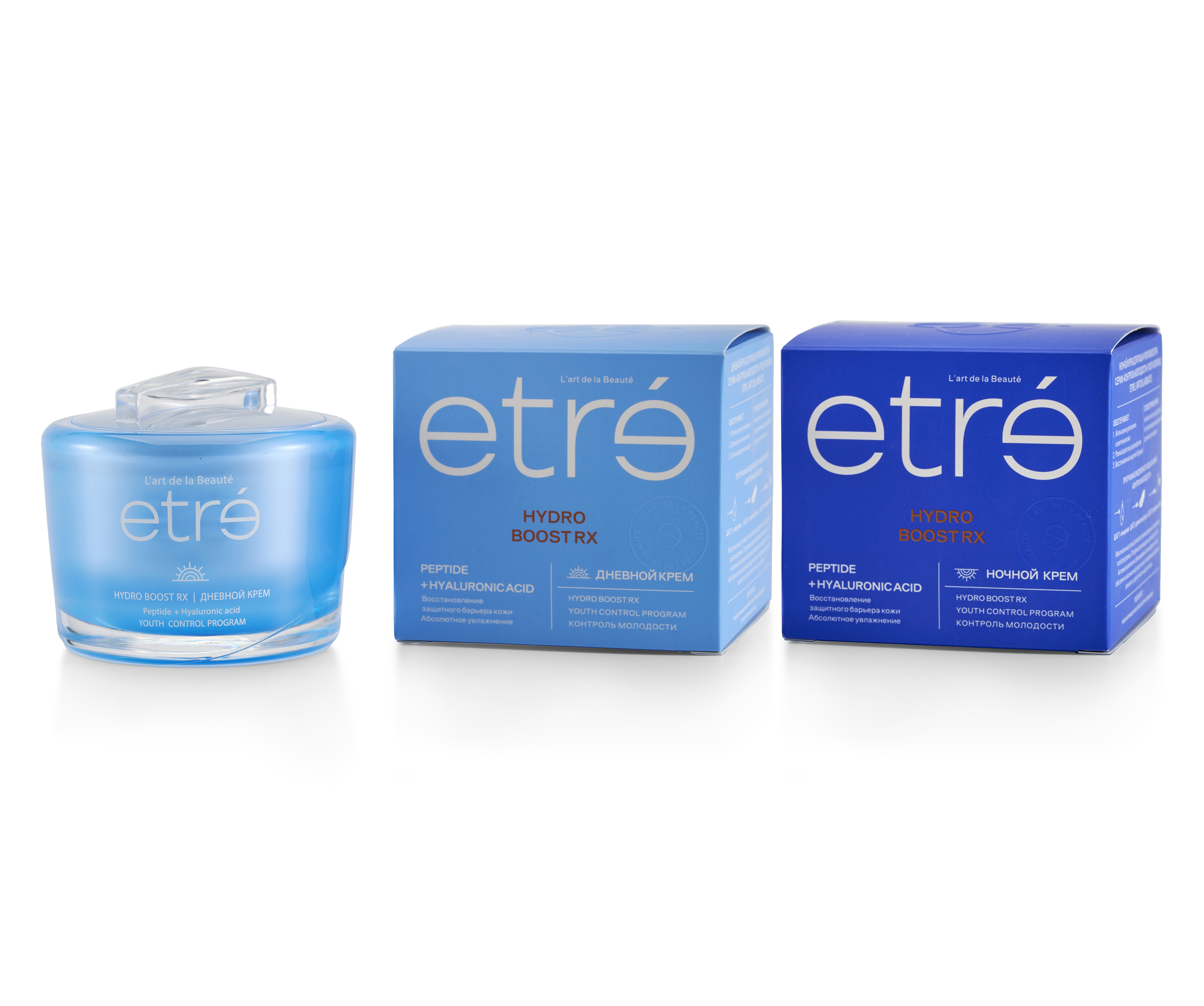
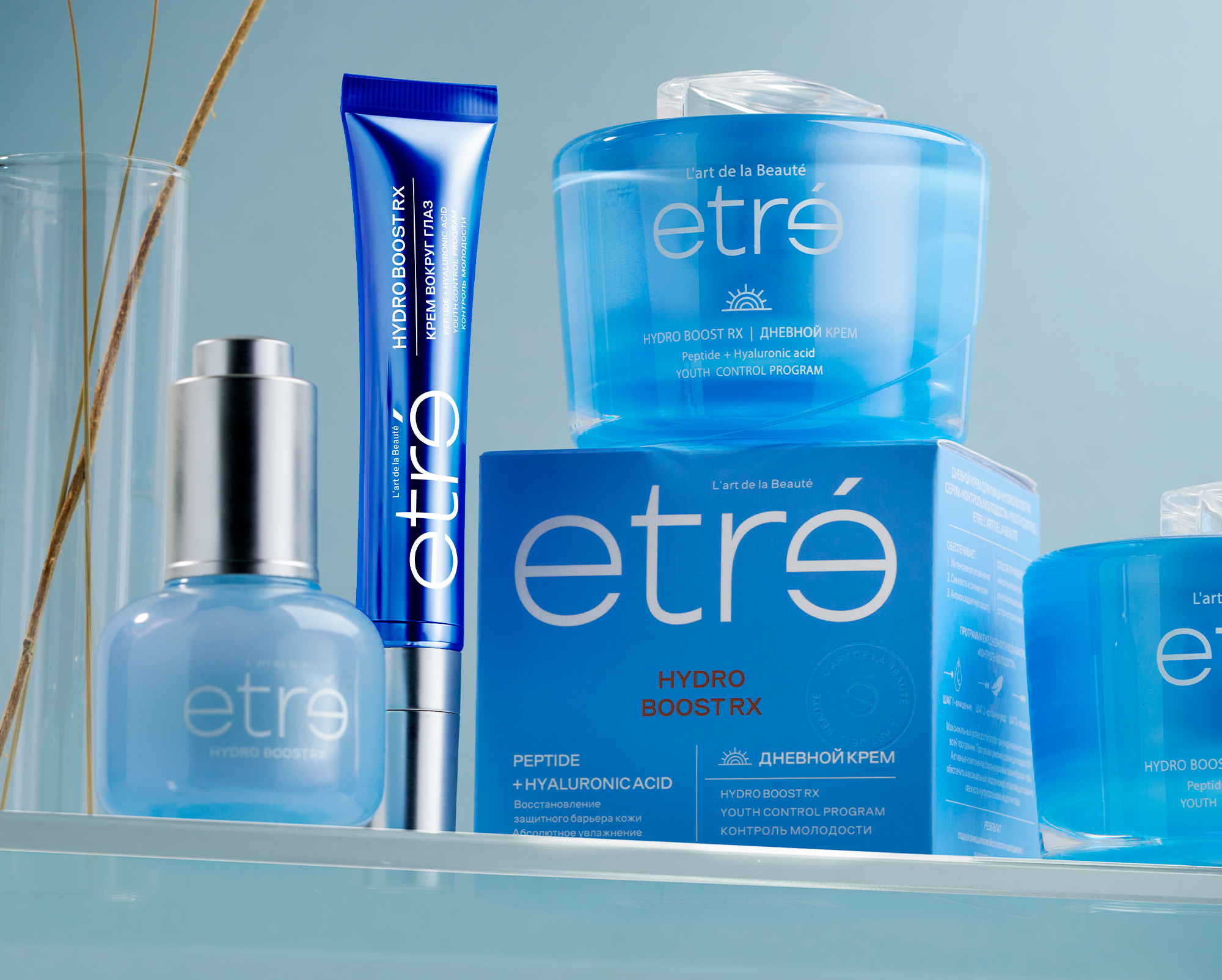
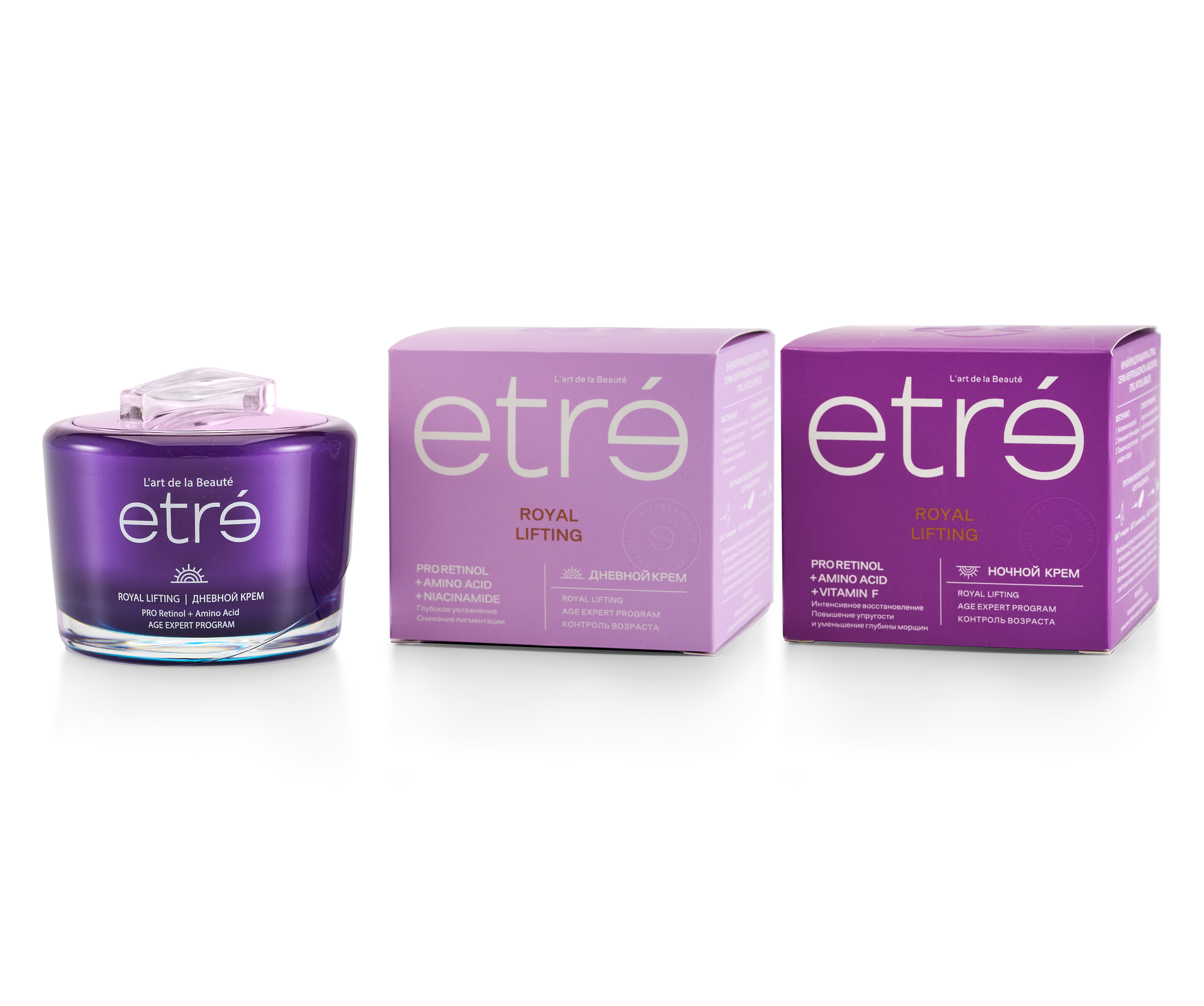
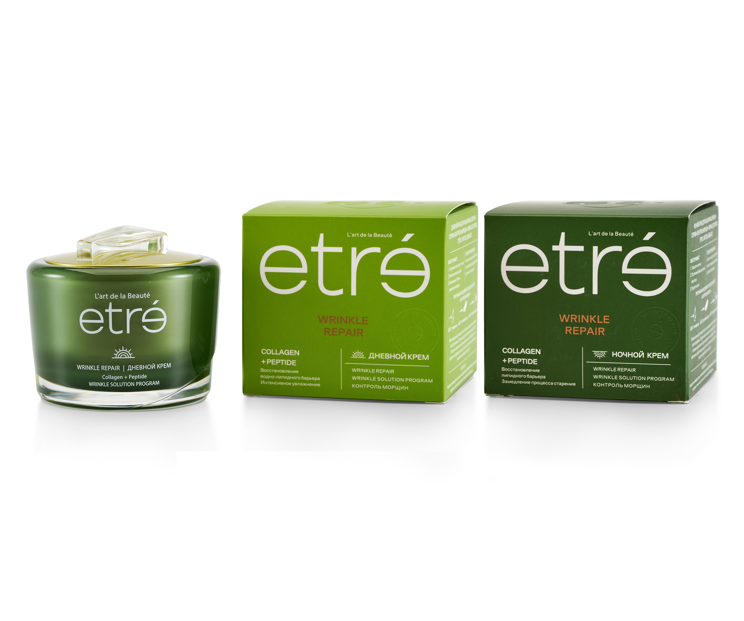
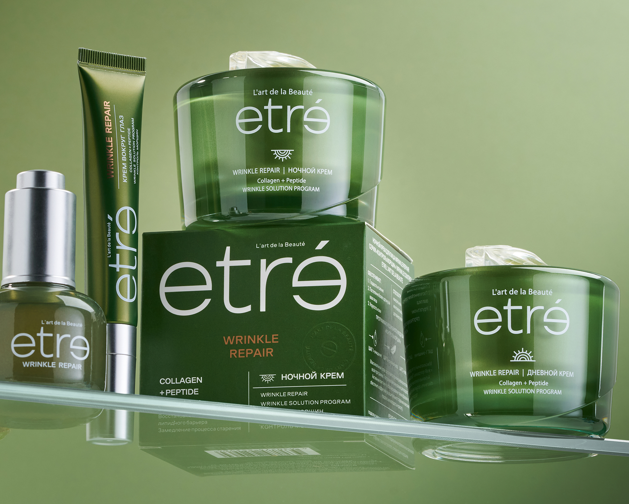
The brand speaks to women 35+ and 45+ – those who value science, aesthetics, and daily rituals of care. Its formulas are based on proven active ingredients sourced in France. Its packaging combines refined minimalism with thoughtful function.
This isn’t just a cream — it’s a reflection of care that greets you in the mirror each morning.
Finding the Idea
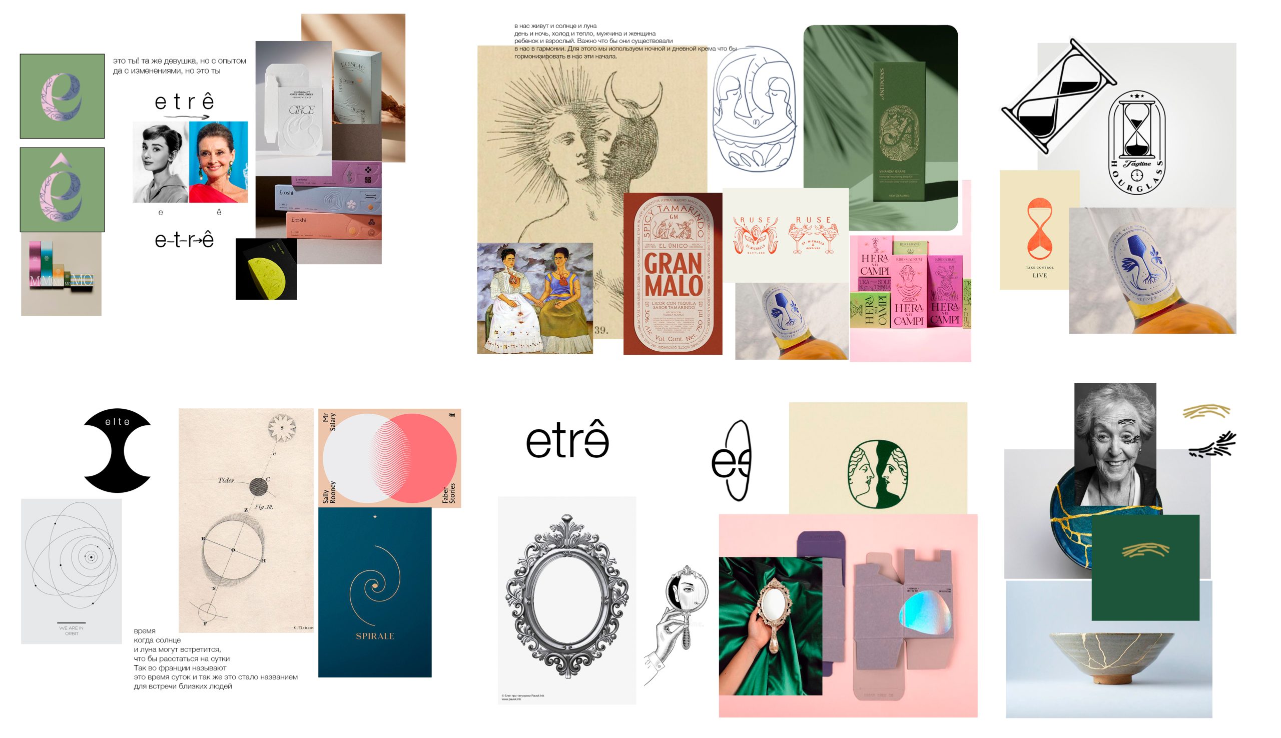
The work began with a search for a symbol that would set etrê apart from other beauty brands. We weren’t looking for a cliché or a heavy-handed metaphor about age — we needed something timeless and emotionally true.
The Core Image
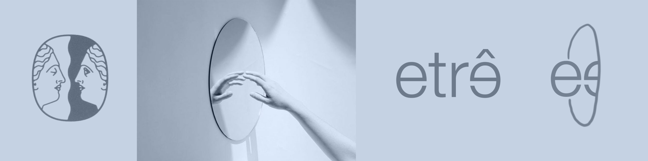
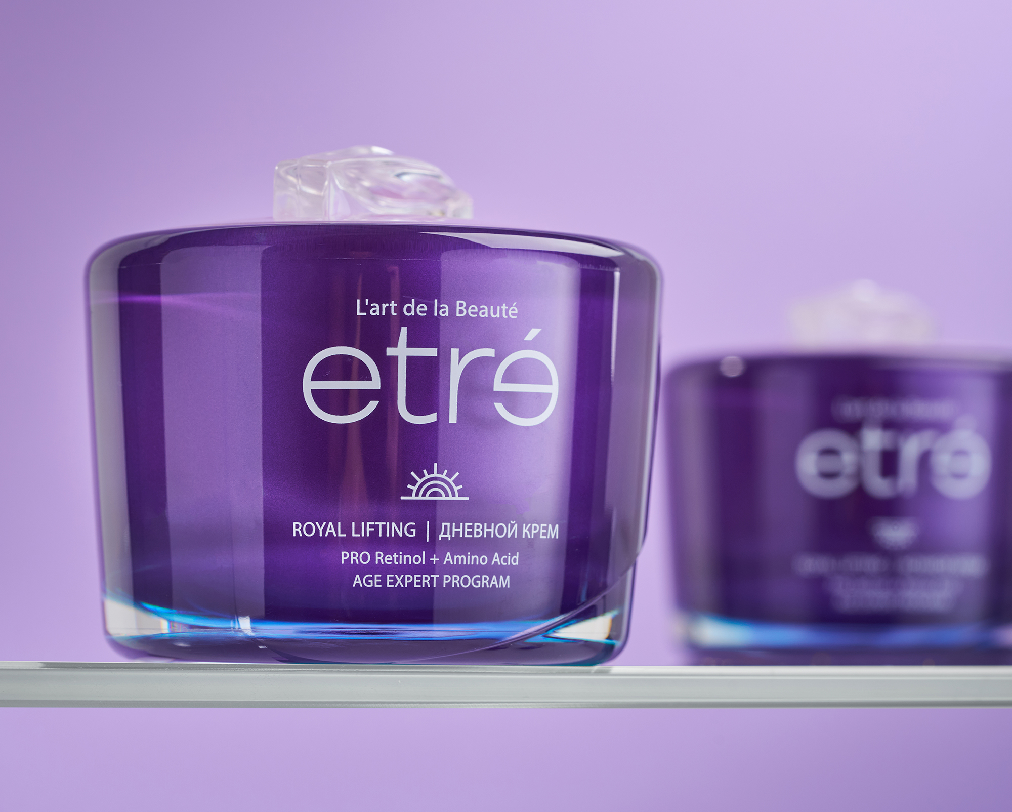
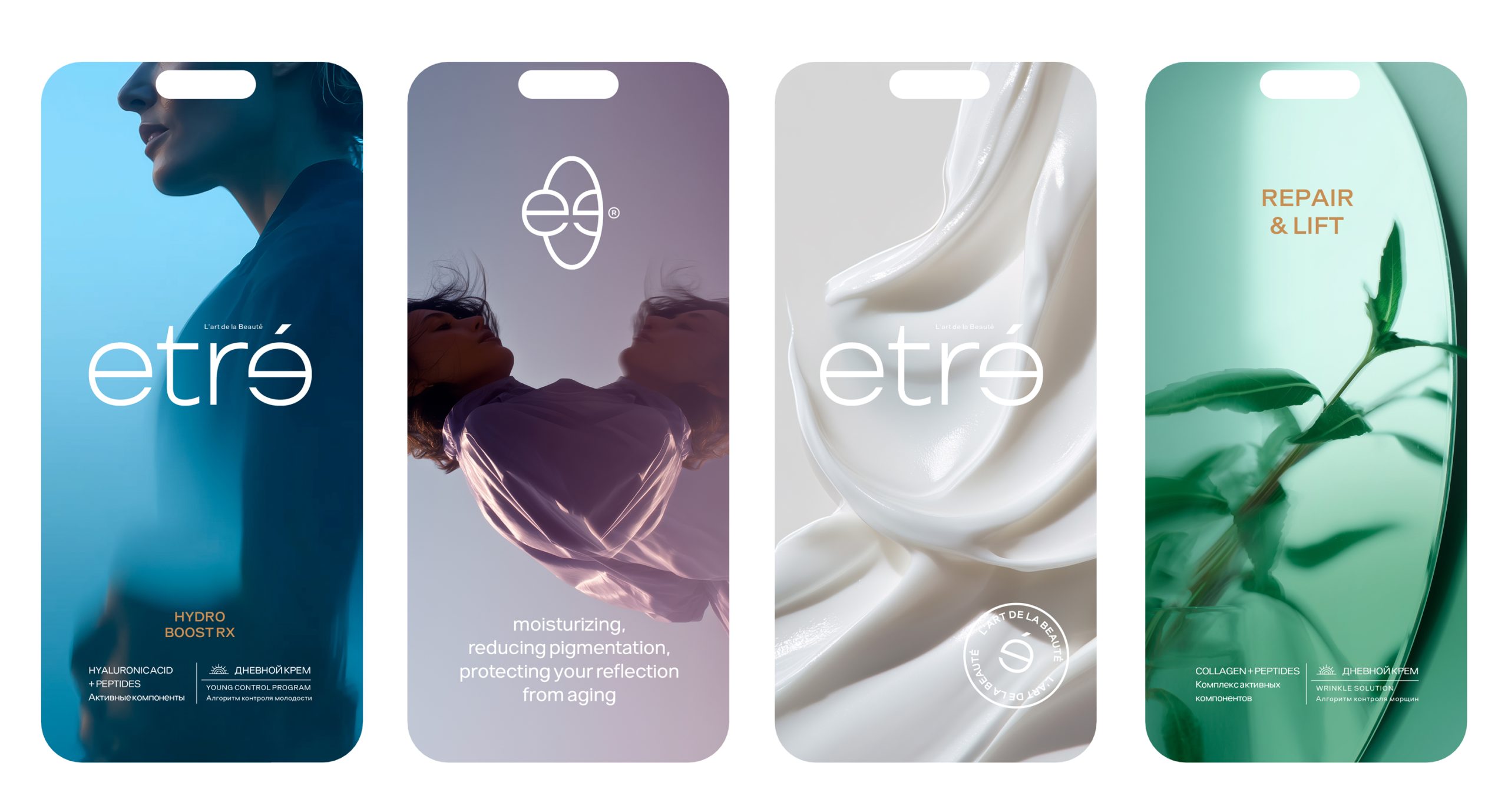
The entire brand identity is built around a single metaphor — reflection. The mirror is our daily companion. It doesn’t judge or beautify — it simply shows us as we are.
Every time we apply a cream, we meet ourselves again.That’s where the idea of the mirrored «e» came from — followed by a symbol of two e’s facing each other inside a soft oval, like a mirror.
This metaphor became the foundation of the visual system and brand language.
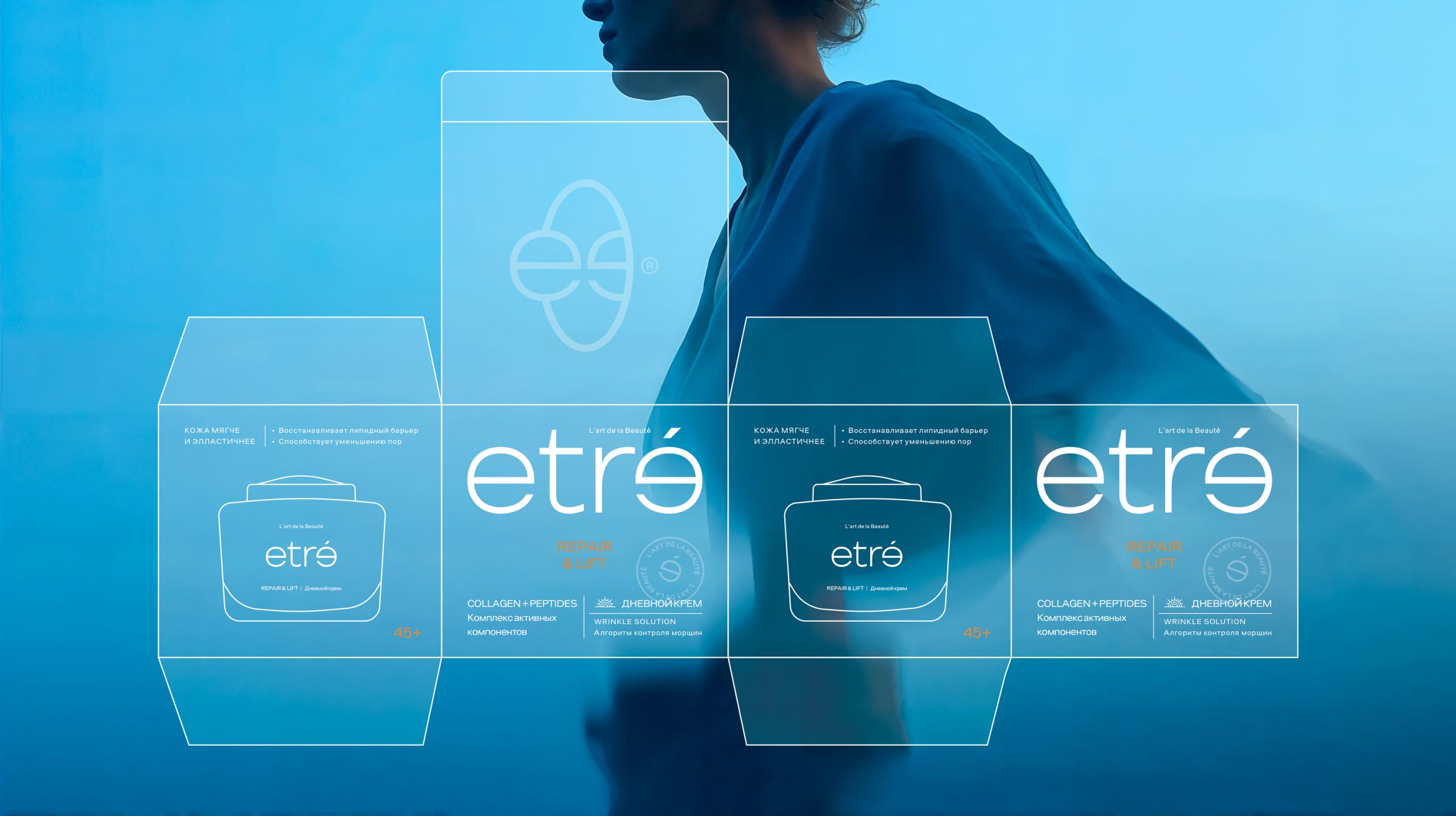
Logo
The heart of the identity lies in the logo — where one «e» is mirrored, as if seen in a reflection. Just like the user facing the mirror during her daily skincare routine, this mirrored «e» becomes a quiet symbol of presence and connection.
Symbol
An additional emblem echoes this concept and appears on the lid of every package. It can also be used across digital and print branding.
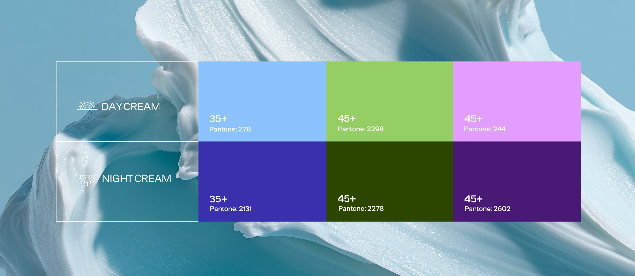
Color
The system includes clear color coding :Different palettes distinguish the linesColor is also used to separate day and night careMinimalist icons — day and night — were developed to indicate the time of application.
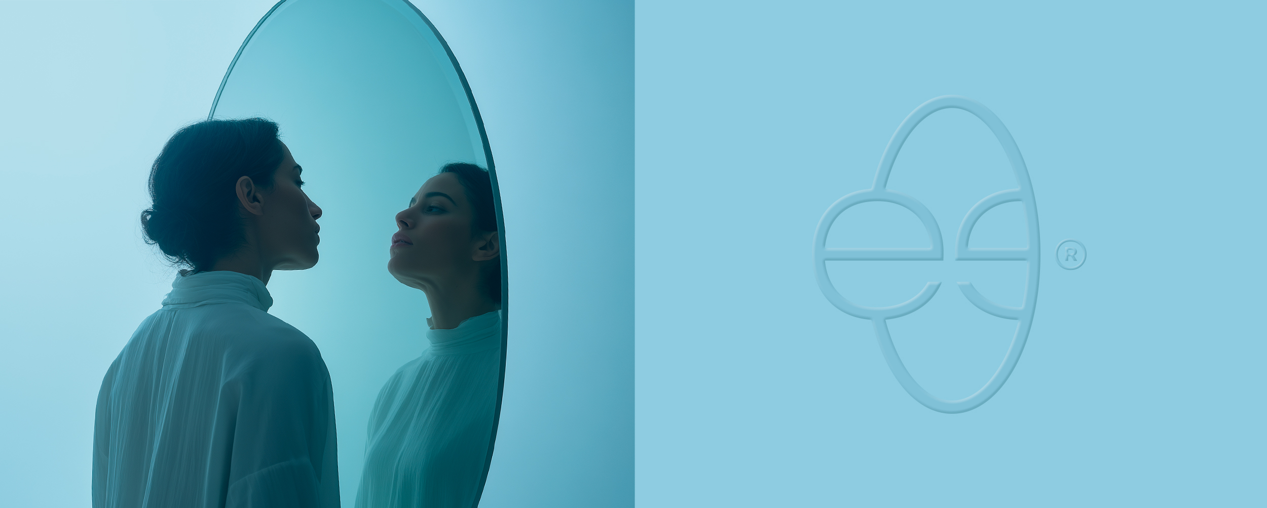
Visual Language
The photography, videos, and stories of the brand continue the theme of reflection. Light fabrics, gentle focus, soft lighting, and women looking inward.It’s a visual dialogue — between you and yourself. Not a mask. Not a promise of eternal youth. But a quiet form of self-care you can feel.