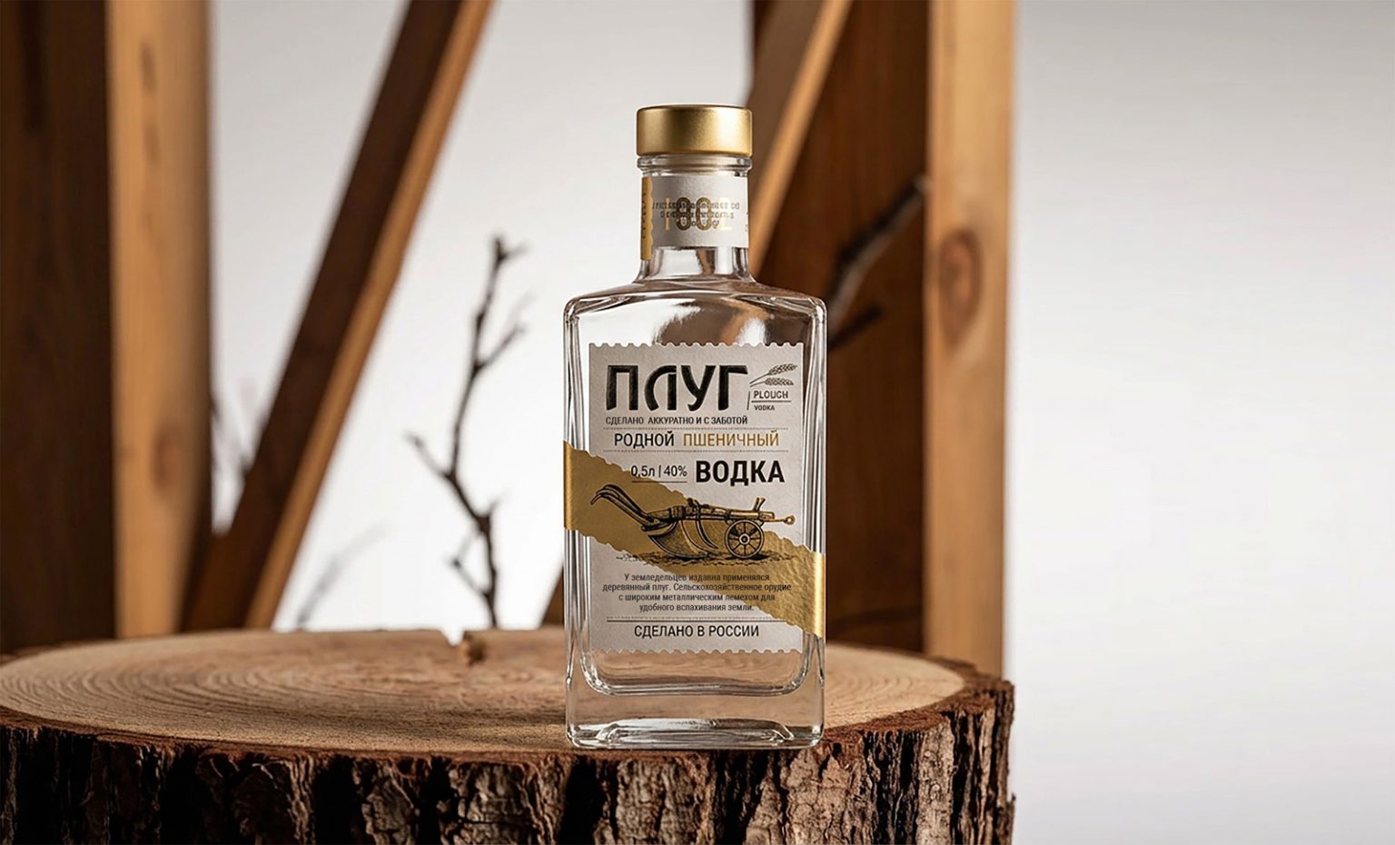

The birth of this product began with the name. The trademark “Plow” is not just a word, it is an image. A plow is a tool that plows the land, prepares it for a new harvest. It is a symbol of beginning, strength, honest work and connection with the earth. It was necessary for the naming to sound at the same time brutal, rustic, thorough, but at the same time not rude, but with dignity. “Plow” is short, clear, and without unnecessary pretense. It’s a name that sticks in your mind at first glance.
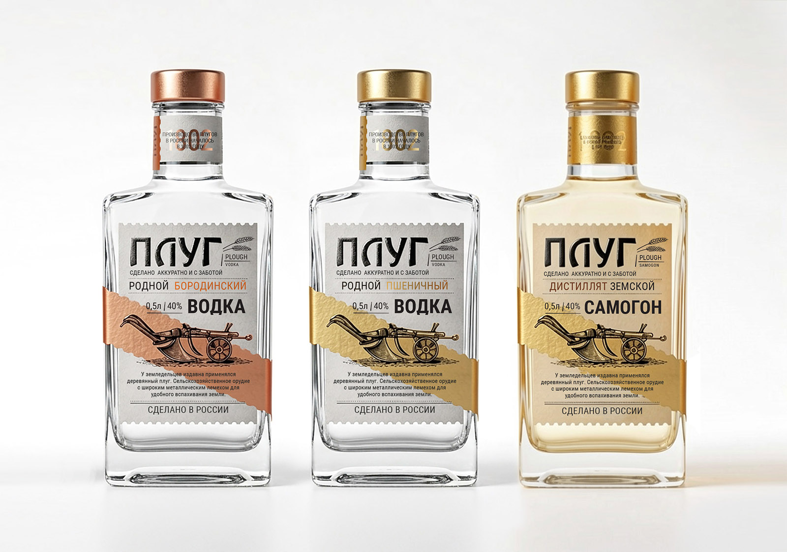
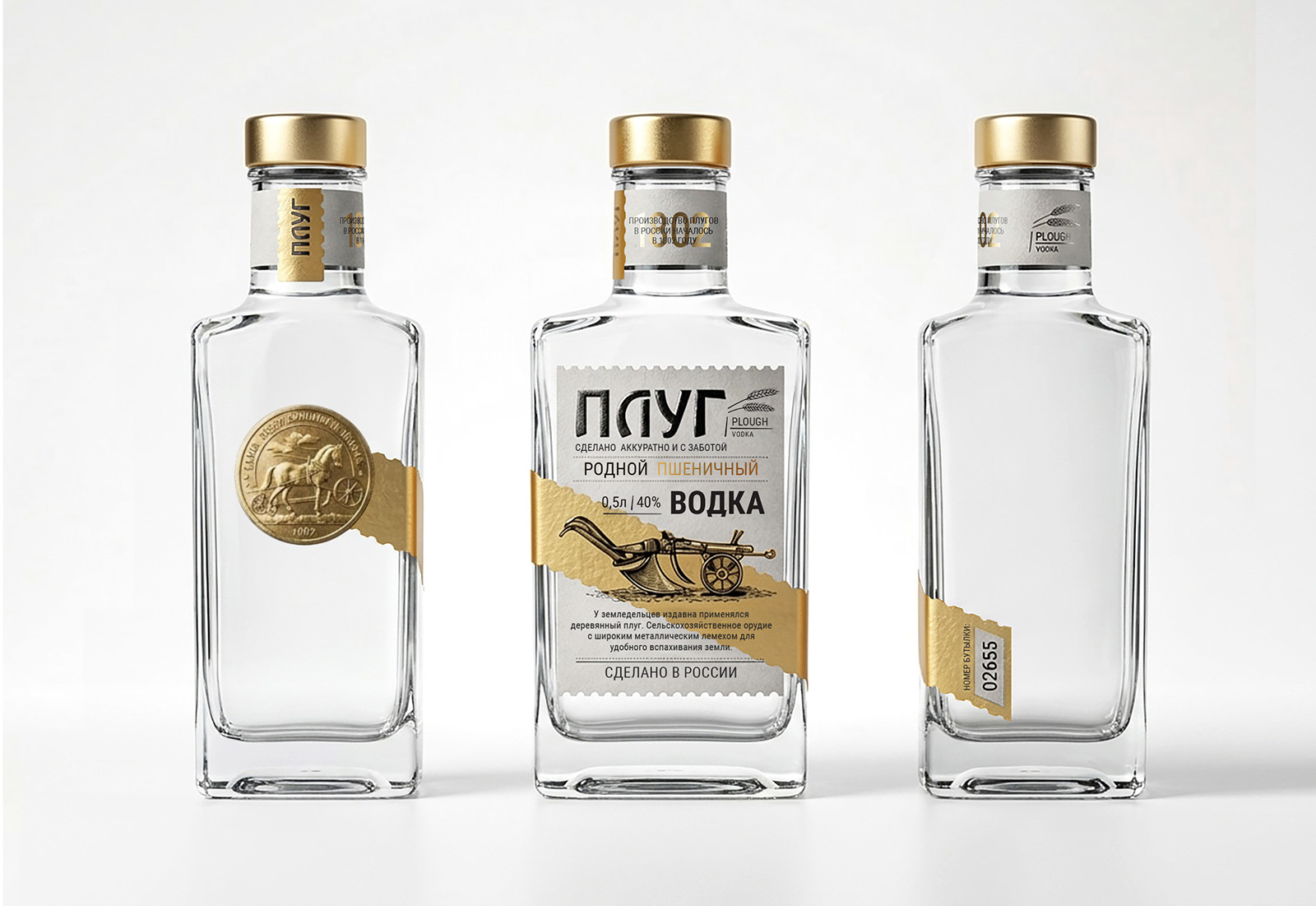
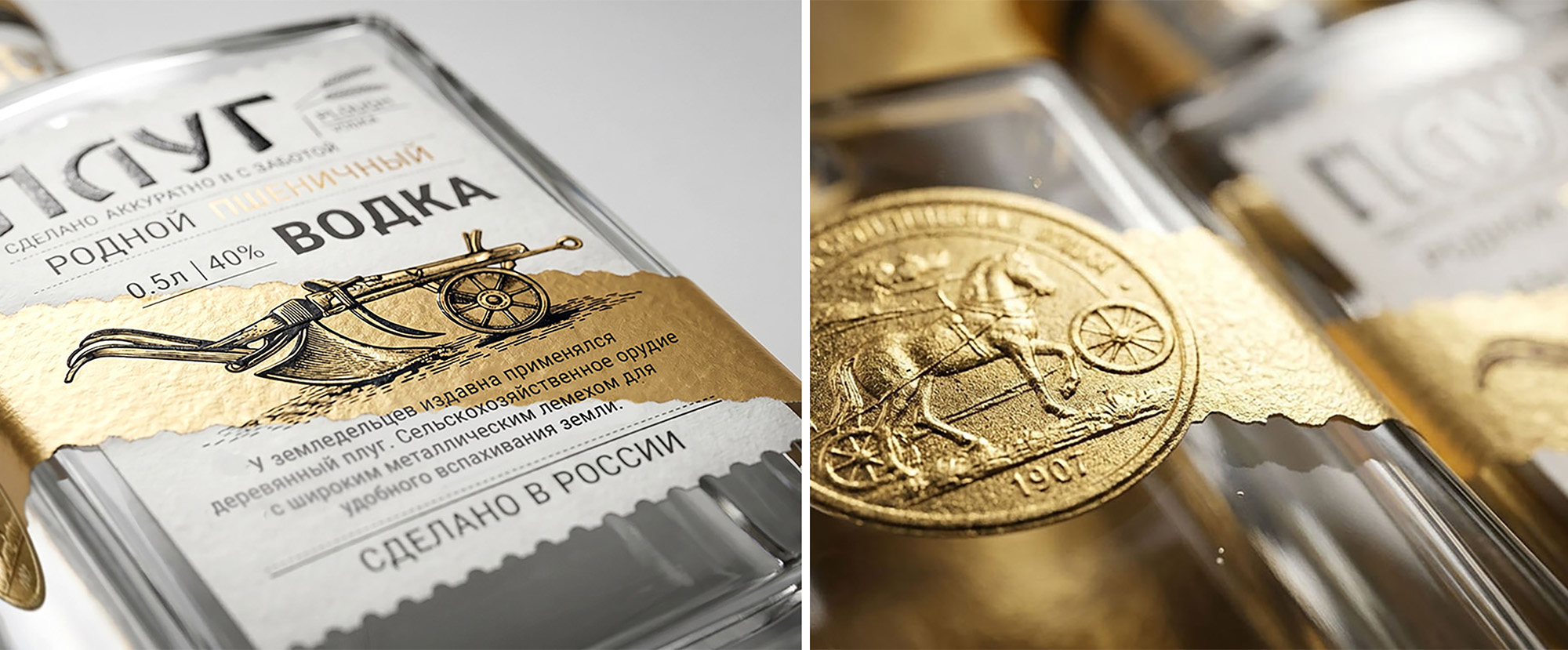
The first task is the label. The basis was minimalism in the spirit of rural constructivism. The main element is an image of the plough itself, made in the technique of engraving. Clear lines, deep black paint on matte white craft paper. The emphasis is on tactility: paper with a linen texture. On the back of the label is a short text about the traditions of cultivating the land, that a good harvest requires patience, as well as a good drink. This label is a story about the process, about the roots.
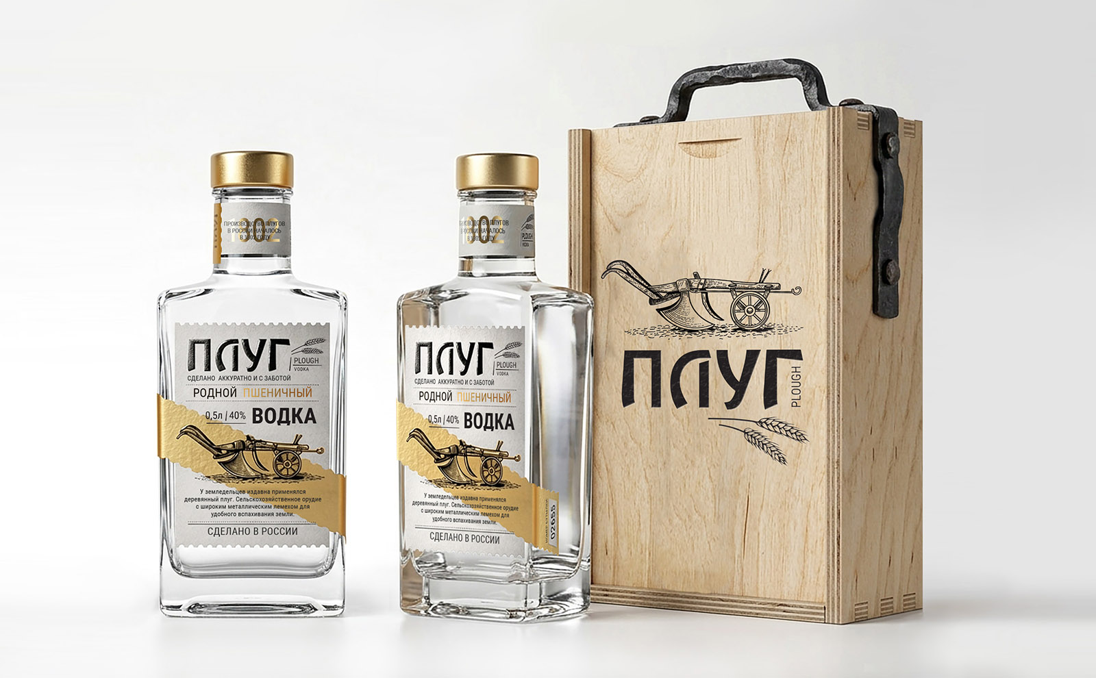
The gift box has become a separate challenge. The lid was decorated with the same engraving of a plow, but pressed with hot stamping — you can touch it with your fingers, feel the relief. The brand name is laser-etched, not printed. A gift box should give the feeling that you are holding not a bottle in your hands, but a legacy, a thing that you want to put on a shelf and examine. The whole design is a story about honesty, about the fact that beauty is in work, and luxury is in naturalness, in the very idea of “plowing the virgin land” and creating something real, your own.
 lunapanda
 Tridimage
 Analoguecreative
 lettera7
 alchimistestudioParis
 Lana B
 Colossal
 Pivot Studio
 M&A CREATIVE AGENCY
 monther al omari
 Anastasia Cherepanova | xtramez
 Hollóka Grafikai Műhely / Graphic Design Studio
 BOLD branding
 Antonia Skaraki
 Pâmella Lorrany
 Z9BKAdsgn
 Francesco Paternoster
 b1studio.ro
 Chris Creative Works
 Boordon
 Dmitriy Kuzovlev
 Brand Society
 yasharpic