

OLO — Redefining Premium Ice Cream Through Slow Pleasure
In today’s premium ice cream market, luxury is often expressed through ornate graphics, excessive visual elements, and traditional codes that have become increasingly familiar. OLO takes the opposite approach. It proves that true premium branding is not about adding more—it is about expressing more with less.
Built around the philosophy of “Slow Pleasure,” OLO celebrates the simple yet unforgettable ritual of enjoying exceptional ice cream. Every design decision reflects this mindset: slowing down, appreciating craftsmanship, and transforming a fleeting moment into a sensory experience worth remembering.
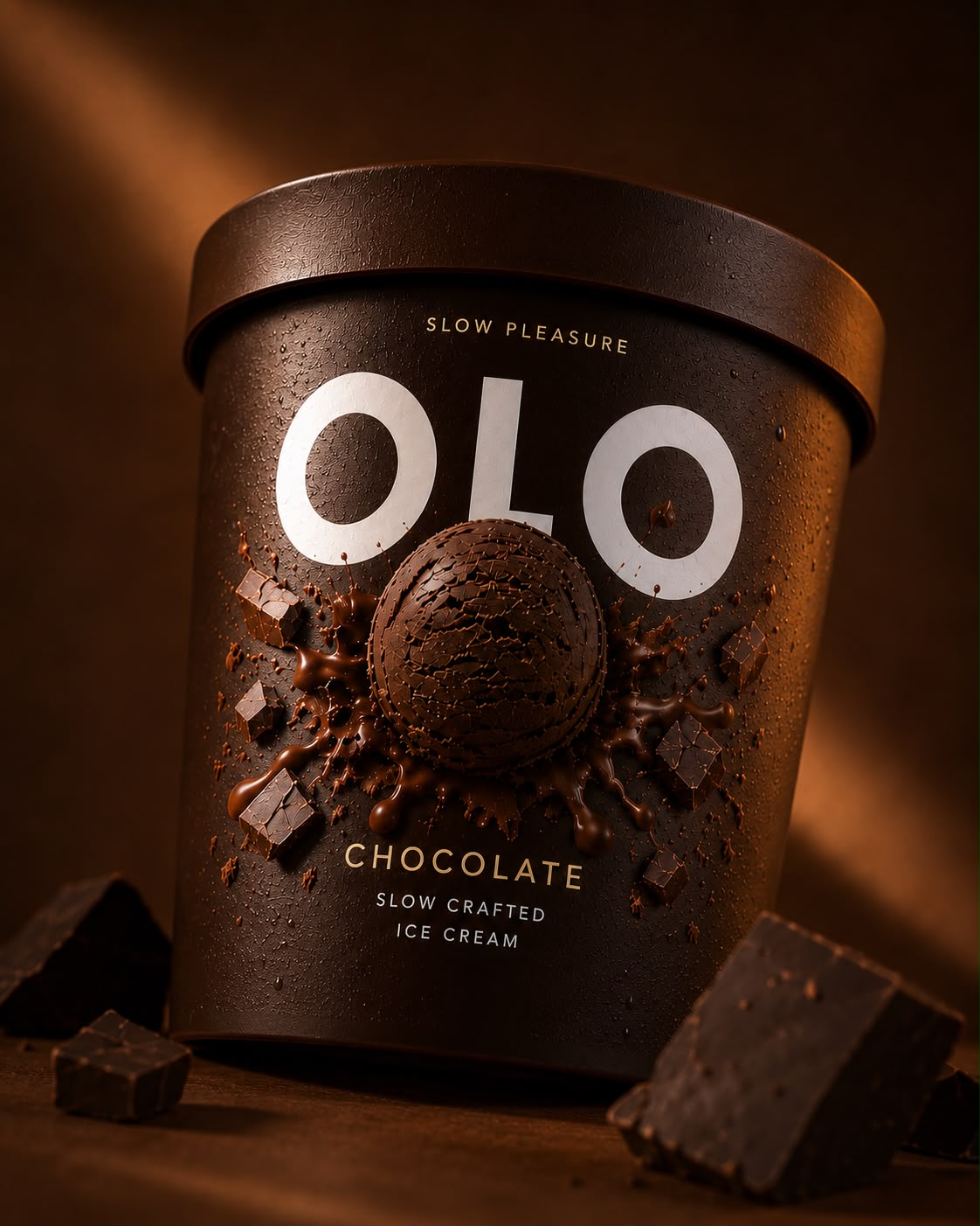
At the heart of the identity lies a bold and instantly recognizable visual system. A single sculpted scoop occupies the center of each pack, surrounded by an explosion of ingredients that visually captures the richness of flavor. The composition creates the illusion that the ice cream is emerging directly from the packaging, becoming the emotional focal point of the brand. It is more than an illustration—it is the signature of OLO.
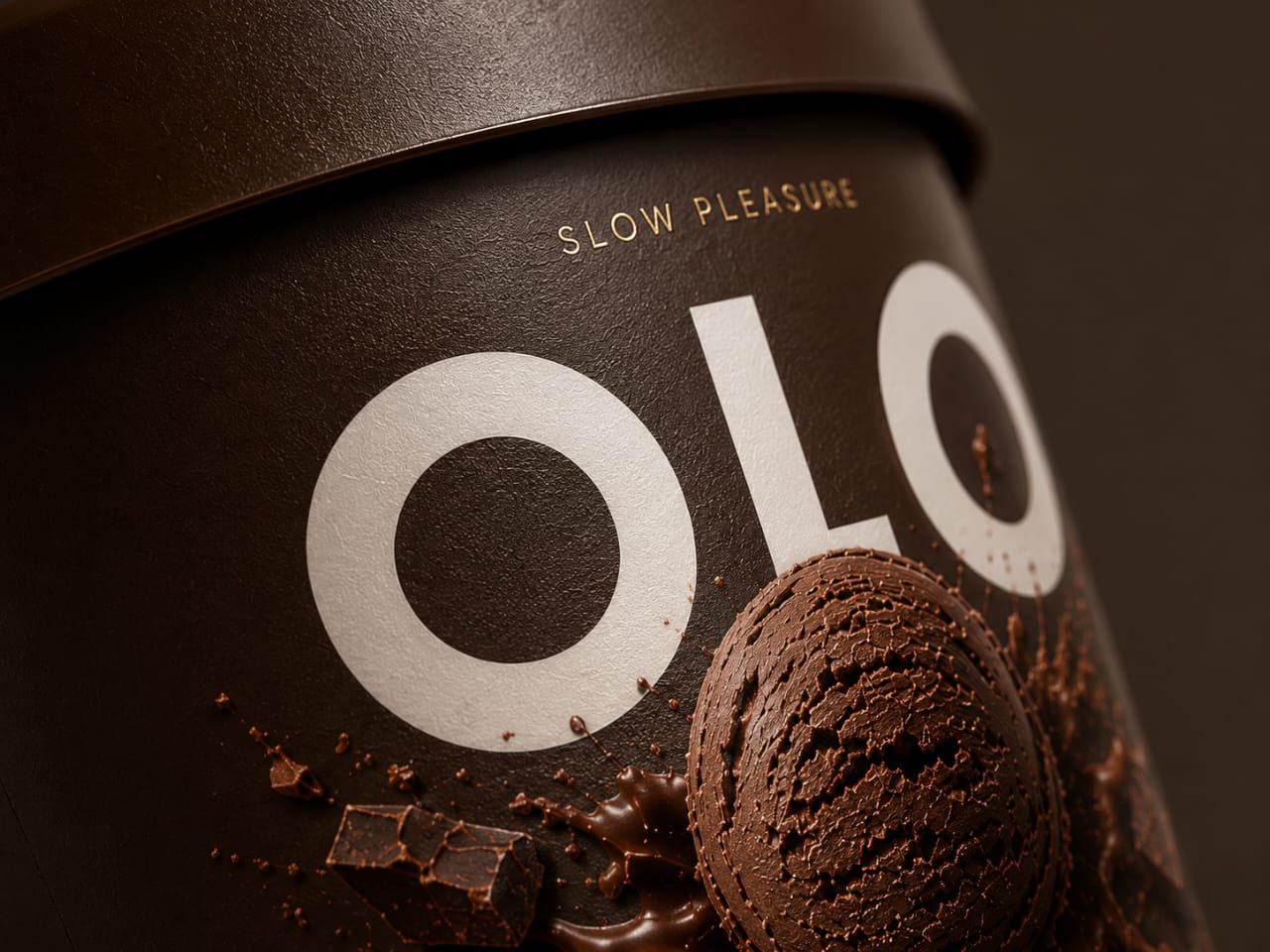
The oversized logotype reinforces this philosophy. Instead of competing with decorative graphics, the brand name becomes the strongest visual asset on shelf. Its confident simplicity creates immediate recognition while allowing the product itself to remain the true hero. This balance between minimalism and sensory richness gives OLO a timeless premium character.
Each flavor is expressed through a carefully selected monochromatic palette inspired by its natural ingredients. Rather than changing the identity from one SKU to another, the system preserves a consistent architecture across the range, allowing consumers to identify flavors instantly while strengthening overall brand recognition. The result is a collection that feels coherent, elegant, and unmistakably premium.
Beyond aesthetics, OLO was designed to create desire. Every element—from the centered scoop to the restrained typography and generous negative space—works together to evoke quality, craftsmanship, and indulgence. The packaging does not simply communicate a flavor; it invites consumers to imagine its texture, richness, and taste before opening the lid.
OLO positions itself as an accessible luxury brand: sophisticated without being intimidating, contemporary without following trends, and emotionally engaging without visual excess. It speaks to consumers seeking authenticity, quality, and beautifully crafted products that elevate everyday moments.
More than an ice cream packaging system, OLO is a branding experience built around one simple belief: premium is not defined by complexity, but by confidence, clarity, and the ability to transform an everyday product into an object of desire.
Curator’s Insight
Look at the composition dead-on and the pack reads as a face before it reads as a logo. The two O’s sit like eyes on either side of the L, and the scoop, positioned directly beneath and centered, lands exactly where a nose would fall. It is a subtle bit of anthropomorphism, likely intentional given how precisely the scoop is placed relative to the wordmark, and it changes how the whole pack functions on shelf.
Faces get processed differently than graphics. Human vision is wired to find and prioritize face-like arrangements even in abstract compositions, a phenomenon designers exploit often in logo work but rarely this literally in food packaging. Once a shopper’s eye registers OLO as a face rather than just a name and a photo, the pack stops being a static label and starts feeling like it is looking back.
This also explains why the restraint elsewhere in the design works so well. A face needs clean, uncluttered features to read clearly, so the generous negative space and the absence of secondary graphics are not just about premium minimalism, they are what keeps the illusion legible. Any additional ornament around the eyes or nose would break the read before the shopper’s brain even registers what it is looking at.
The transferable principle: when a logotype and a hero image are positioned together, consider whether their spatial relationship accidentally, or deliberately, forms a recognizable pattern like a face. That kind of dual reading gives a shopper two reasons to pause on a pack, the literal product information and a more instinctive, almost playful recognition underneath it.



 Estudio Argo
 Modern Theory
 monther al omari
 Ohmybrand
 Affogato Brand Design
 Tancybox
 waanrong
 nazystudio
 Daria Fox
 g.apolly
 sahildoesartt
 Stiandco
 BREAK DESIGN
 ShreyaDighe
 Sameh Elnahas
 Minim Brand Design
 Ebbi
Ebbi Shabouk Printing & Packaging (Shabouk Carton Boxes – شعبوق)
 Brandegree
 Abbydraw Designs Unique Conceptual Branding & Packaging Designing Ideas
 bilel tkouri
 NEV
NEV Stefano Bracci
 Alina
Alina