

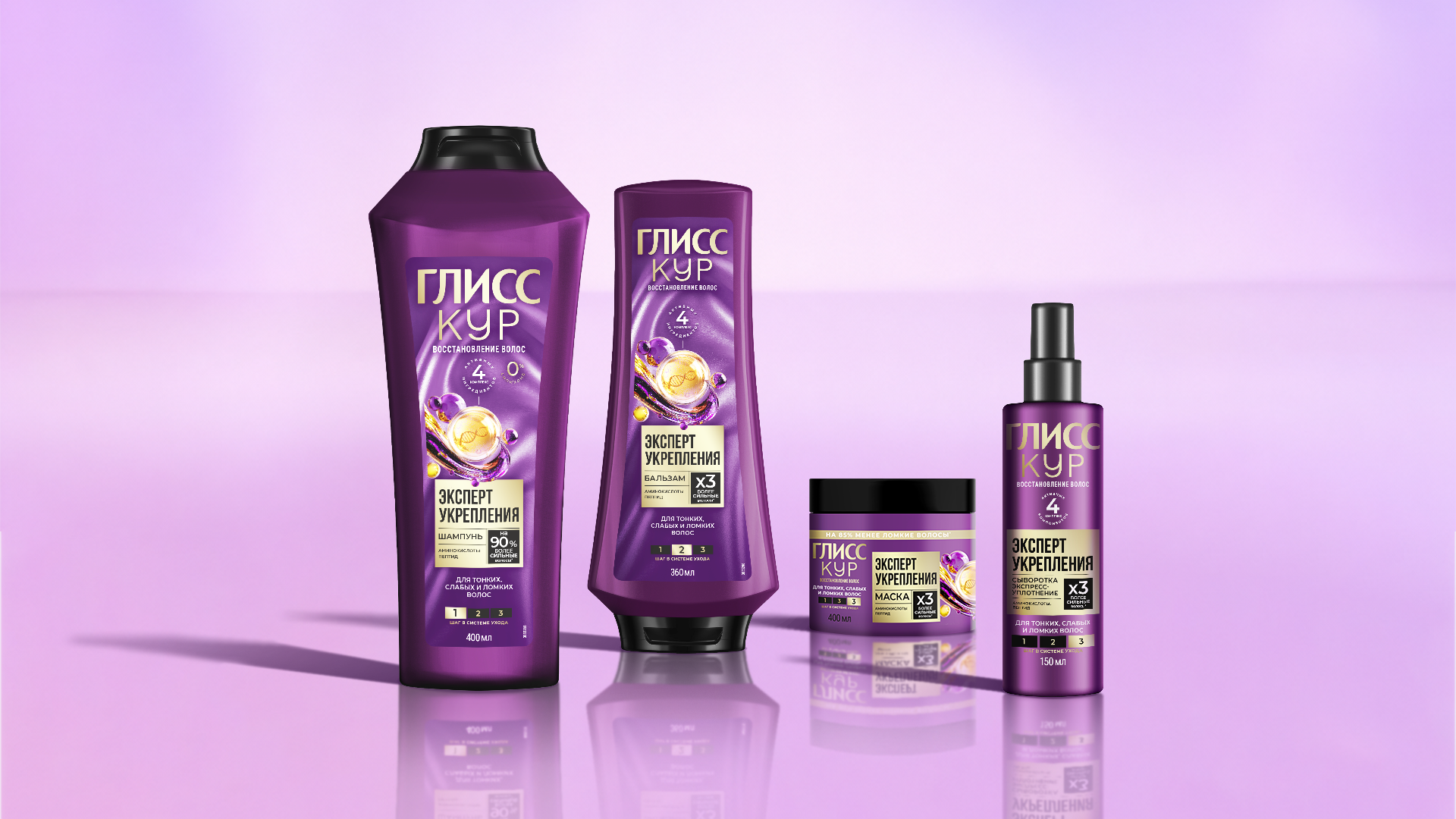
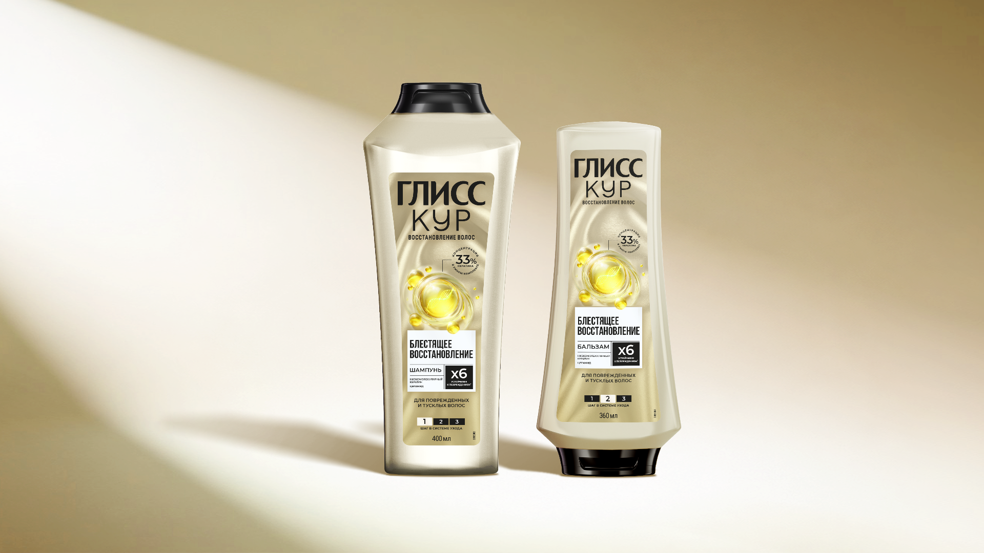
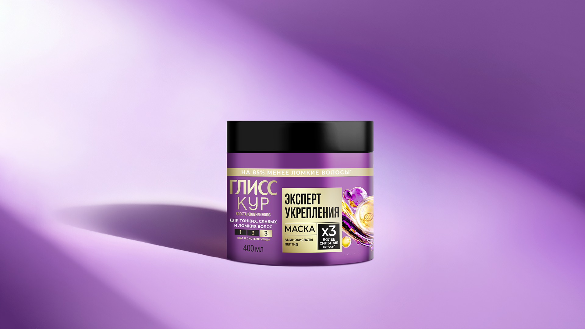
Late last year, my team and I revamped the design system for two Gliss Kur hair care lines on Russian market; we maintained brand continuity while introducing a new logic and a modern design direction for the packaging.
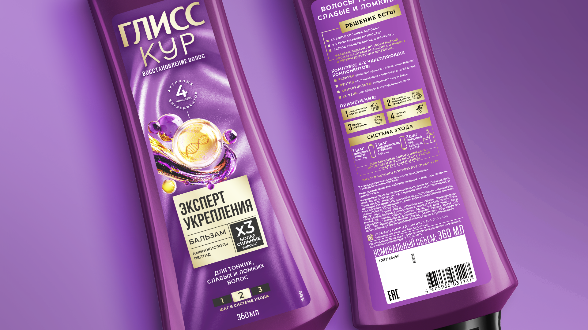
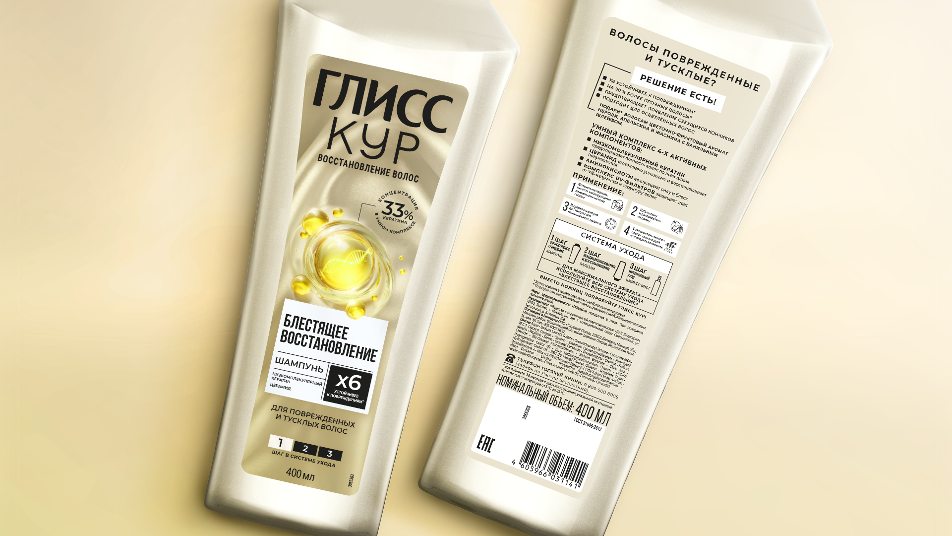
In the mass-market category, a product on the shelf has mere seconds to capture a consumer’s attention. That is why the central element of the entire system became a “molecule” representing the active ingredients—a visual cue that directly communicates the brand’s high-tech approach. This molecule is unique to each product line, reflecting its specific ingredients.
The design avoids visual clutter; instead, it offers a clean, cohesive look that clearly conveys product benefits—a crucial factor in the hair care category. Special attention was paid to the “Reason to Believe” (RTB) section, which accommodates more information while explaining the product’s Unique Selling Proposition (USP) as simply as possible from the very first glance at the label.
The “before and after” difference is immediately apparent: the brand image has shifted toward a more high-tech aesthetic without losing its recognizability, ensuring it stands out instantly on the shelf. All six SKUs across the two lines were developed in just six months—from the start of the project to the nationwide launch of the finished products.



 Derrick Lin
 Biaa
Biaa Petitmoulin Studio
 White Bear Studio
 Eva Chistyakova
 monther al omari
 Atipus
 alchimistestudioParis
 oneandother
 bloomburo
 helocrene
 Shapers Studio
 Denver Design
 Aidearte
 andrew.huerta
 softmachine
 airobtq
 Buzz & Co.
 Ruby
Ruby themythographer
 IDNB Inc.
 viktorflr
 Zenpack