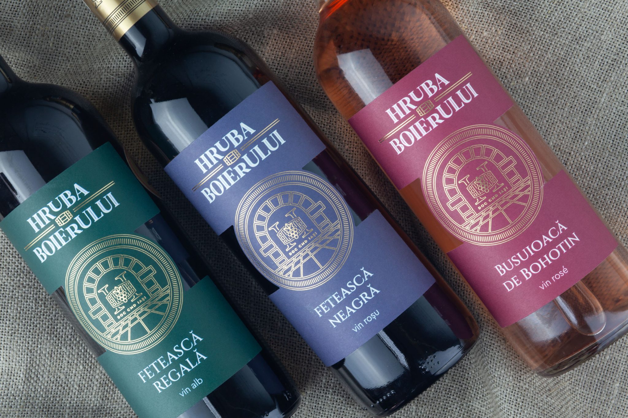

CHALLENGE
For Crama Hermeziu, the challenge was to develop a distinctive identity and packaging system for Hruba Boierului, a wine range positioned in the entry-level segment.
In a highly competitive category, the labels needed to communicate clearly, create strong shelf recognition and make each wine variety easy to identify, while maintaining a consistent visual identity across the entire range.
SOLUTION
We developed the logo, visual concept, illustration and wine label design, creating a flexible system that could be consistently adapted across multiple SKUs.
The concept was built around the idea of the traditional wine cellar — hruba — establishing a direct connection between the name, the visual identity and the world of winemaking.
A clear information hierarchy and colour-coded system help consumers navigate the range quickly, while the common graphic structure keeps all varieties visibly connected under the Hruba Boierului brand.
CHARACTER & ILLUSTRATION
The cellar became the central storytelling element of the label.
We translated its architectural character into a detailed circular illustration, combining the cellar structure with references to grapes and winemaking. The illustration creates a recognizable emblem for the range and reinforces the idea of origin, tradition and care for the wine.
Rather than functioning as decoration alone, it gives the brand a visual symbol directly connected to its name and story.
VISUAL LANGUAGE
The visual language combines classical typography, architectural line illustration and a strong colour-coding system.
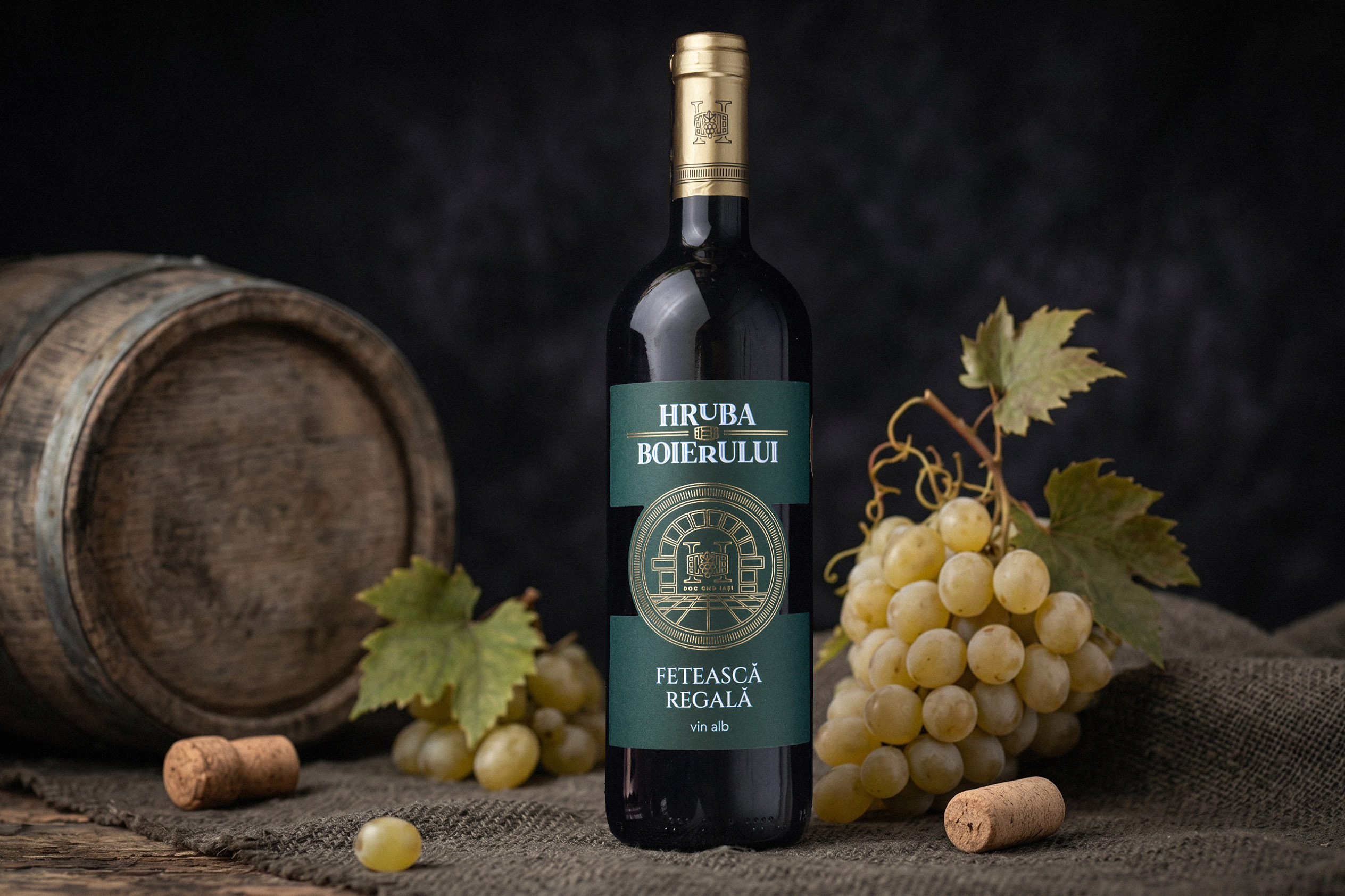
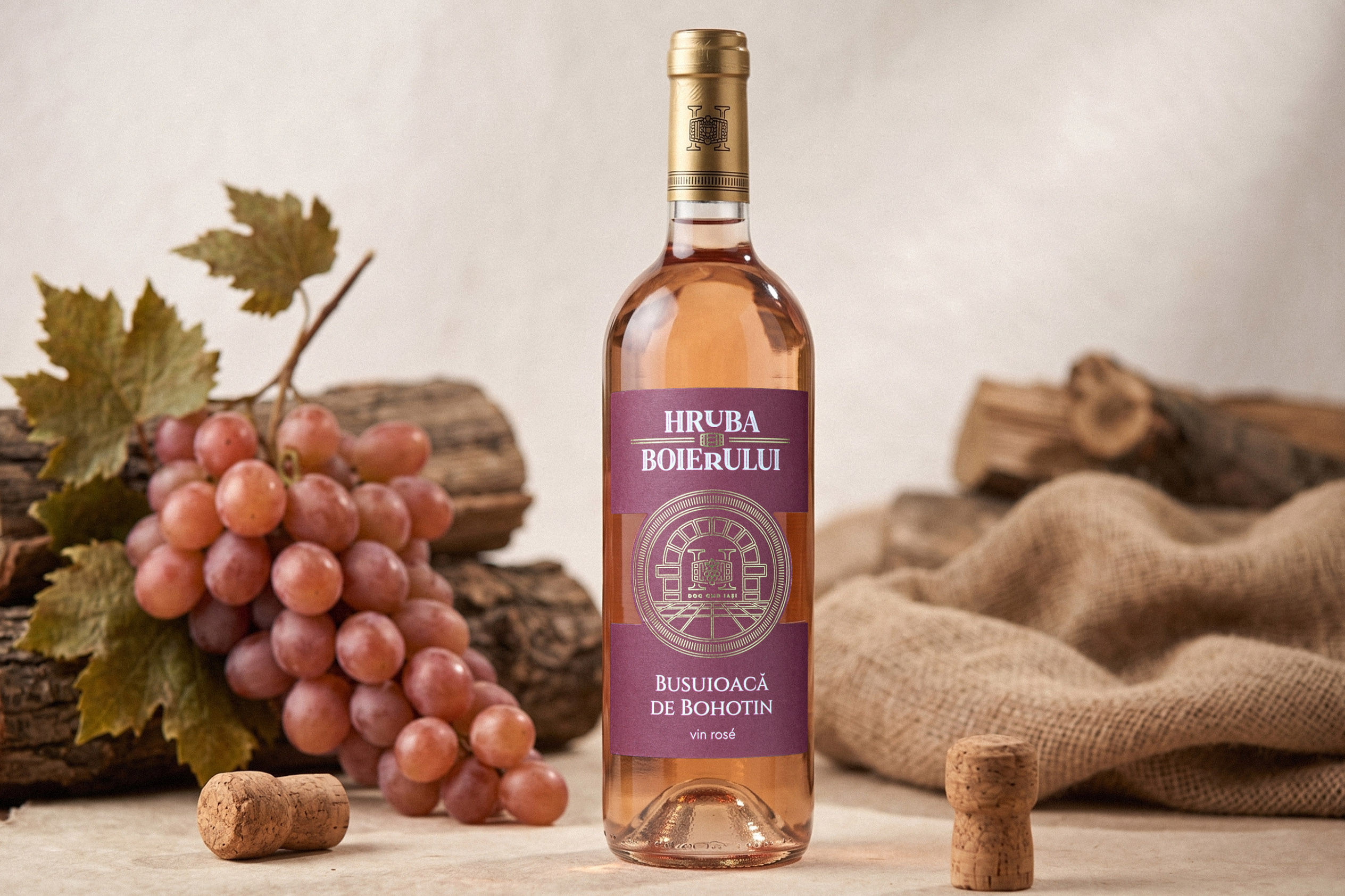
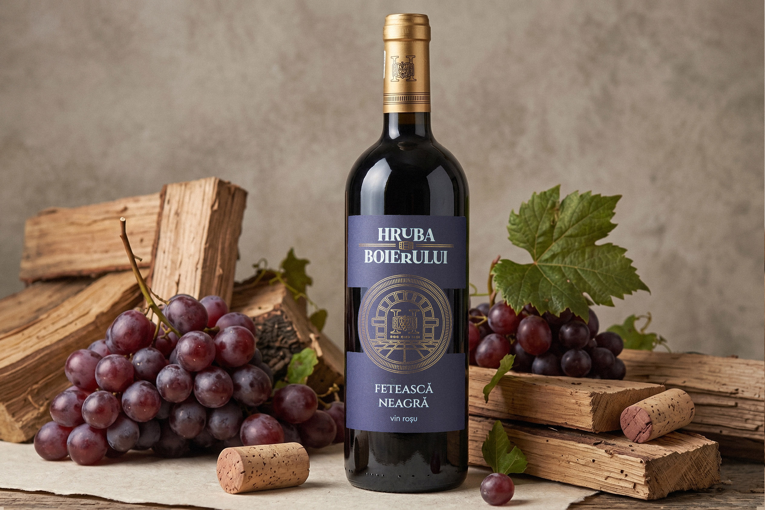
Deep green, blue and burgundy tones differentiate the wine varieties and create immediate recognition on the shelf, while gold detailing adds contrast and visual depth.
The consistent composition, prominent brand name and central illustrated emblem create a unified family appearance, allowing the bottles to work both individually and as a complete range.
OUTCOME
The result is a coherent and recognizable wine packaging system for the entry-level segment, designed around clarity, differentiation and shelf presence.
Each variety has its own colour identity, while the shared logo, illustration and label architecture build strong recognition for Hruba Boierului as a range.
The project demonstrates that entry-level positioning does not require generic packaging — a clear concept and a well-structured visual system can give an accessible wine range its own distinctive and memorable identity.
 monther al omari
 Shustova p
 mutta
mutta @Allenarts13
 Sirka Agency
 Atiq Alam
 Dozen Agency
 j.substance
 SCD
SCD Cristian Lepore | crilep Copia
 Chris Creative Works
 Aligned Design Co.
 CreativeWise
 Agence des Coteaux
 Ramyromeo2024
 Grain of Design ®
 Ebbi
Ebbi BFS Studio
 butterflyhunters
 Asprey Creative
 About House of Ta
 Up-Brands
 KJS CRAFT
 hello ocean
 PG Branding