
Pipou Turns Everyday Snack Breaks Into Playful Moments
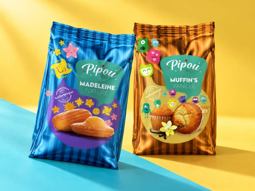
Pipou brings a cheerful personality to everyday bakery snacks. With a range spanning plain madeleines and vanilla muffins, the packaging connects the familiar pleasure of a small cake with a colourful world of expressive characters. The idea is to make the enjoyment of a snack begin with the pack itself.
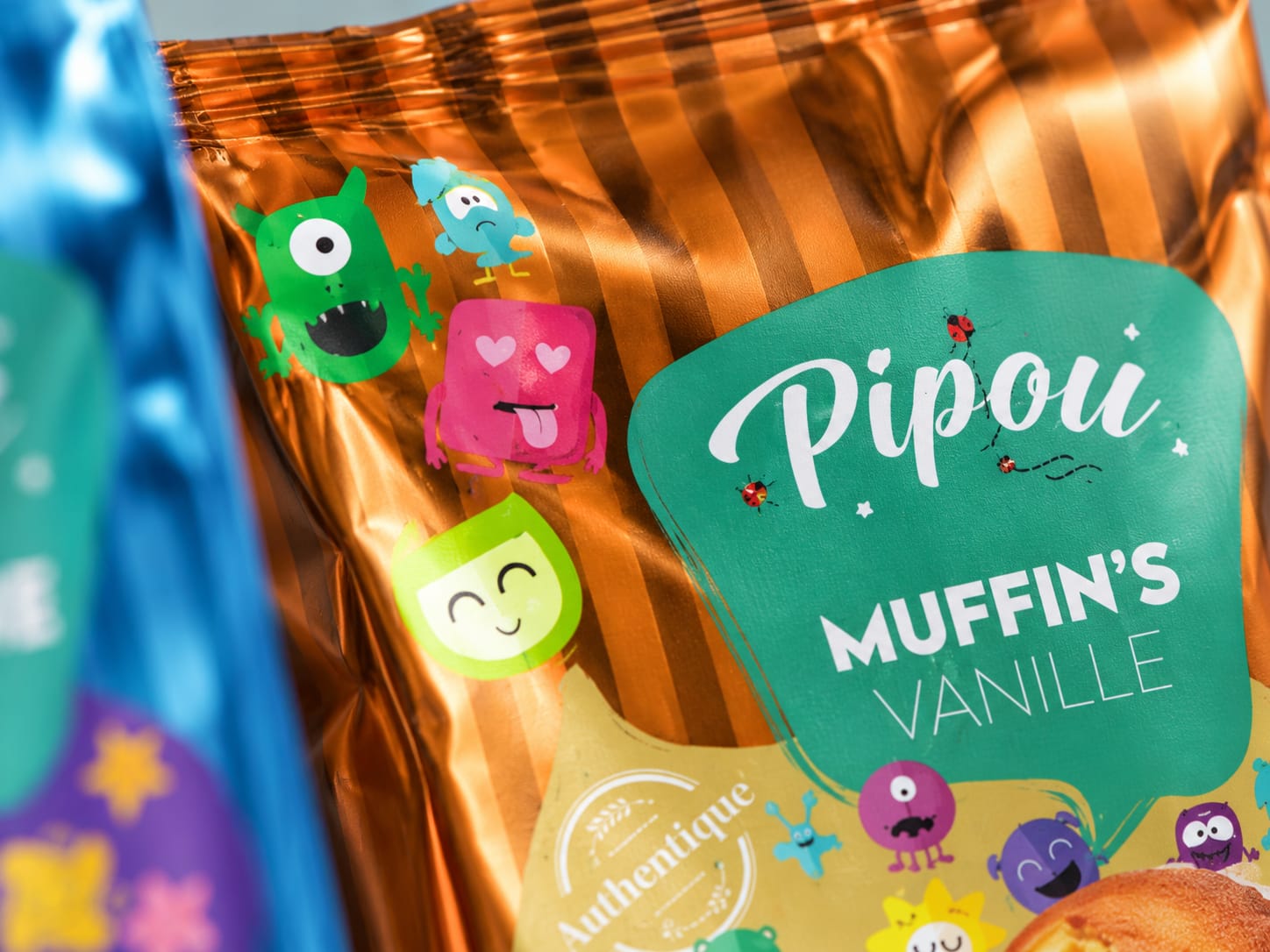
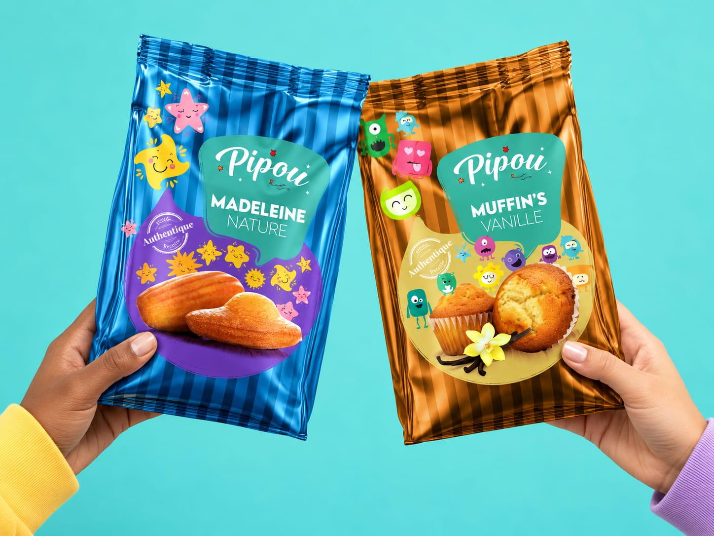
The visual identity balances appetite appeal, product recognition and playfulness. Each pack combines photography of the cakes with a cast of illustrated companions, creating a relationship between the food and the emotions surrounding a snack break. Smiling faces, small gestures and unexpected expressions give consumers details to discover beyond the product name.
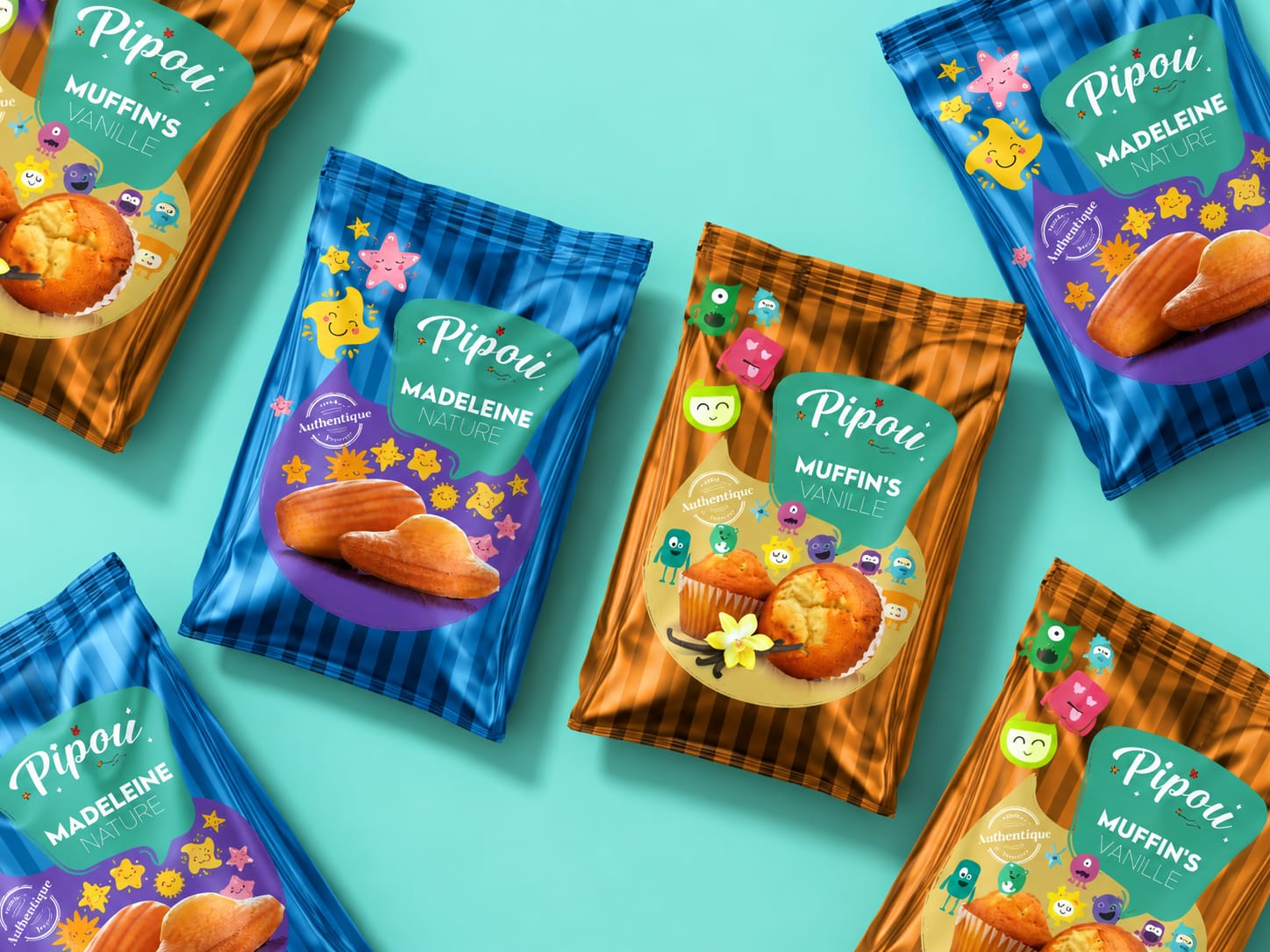
A consistent graphic structure holds the two references together. The white Pipou script sits within a rounded teal panel, establishing a recognisable focal point across the range. Its flowing letterforms introduce warmth, while the bold product names and lighter flavour descriptions provide a clear reading sequence. Vertical stripes extend across the packaging, giving both products a distinctive rhythm.
Within this shared structure, each reference develops its own personality. The madeleine pack pairs deep blue and cyan stripes with a purple lower panel, populated by bright stars and smiling sun-like characters. These elements surround the golden cakes, connecting their familiar shapes with a lighthearted illustrated world.
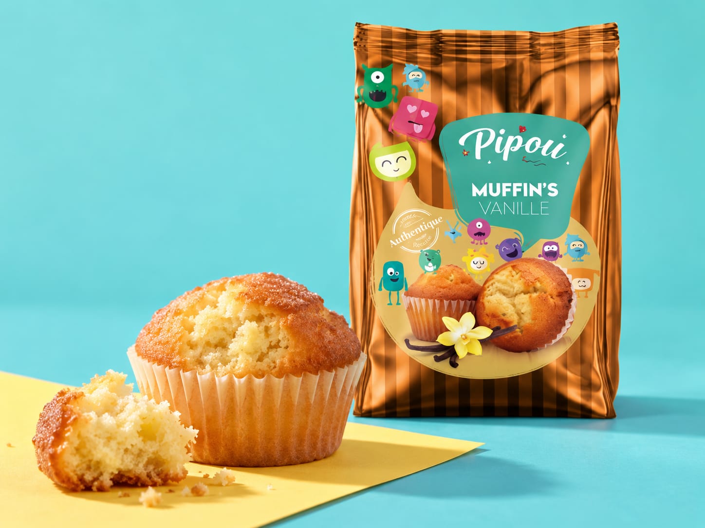
The vanilla muffin pack shifts towards amber and orange, with a pale yellow panel and a playful collection of small monsters. Their varied silhouettes and expressions bring a different energy to the same visual system. Muffin photography, together with a vanilla flower and pod, provides an immediate flavour cue. The contrast between cool and warm colour palettes helps distinguish the products while preserving their family resemblance.
Photography anchors the illustrative language in the pleasure of eating. The madeleines’ shell ridges, the muffins’ golden tops and the visible softness of the crumb communicate the character of each cake. The surrounding illustrations add personality while leaving the product central to the composition.
The presentation extends this language through cyan and yellow environments, diagonal arrangements, close material details and a shared moment with both packs held in hands. Alternating individual product views with family compositions creates a rhythm between discovery, appetite and recognition.
Pipou’s identity gives an everyday snack an approachable, expressive presence. Its striped backgrounds, teal signature and colourful companions create a coherent packaging world built around the small pleasure of taking a break and sharing something sweet.


 Derrick Lin
 Biaa
Biaa Petitmoulin Studio
 White Bear Studio
 Eva Chistyakova
 monther al omari
 Atipus
 oneandother
 bloomburo
 helocrene
 Shapers Studio
 Denver Design
 Aidearte
 andrew.huerta
 softmachine
 airobtq
 Buzz & Co.
 Ruby
Ruby themythographer
 IDNB Inc.
 viktorflr
 Zenpack
 Wessam Hussien
 samarabdelmonem