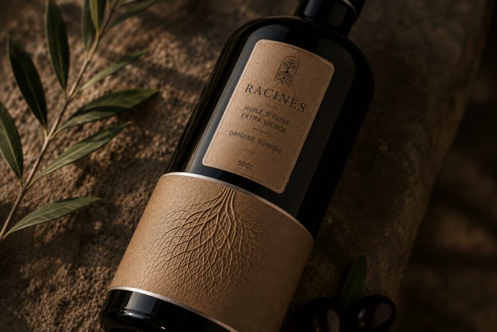

Racines was born from a simple belief: to tell the story of Tunisian olive oil, we must begin beneath the surface with its roots.
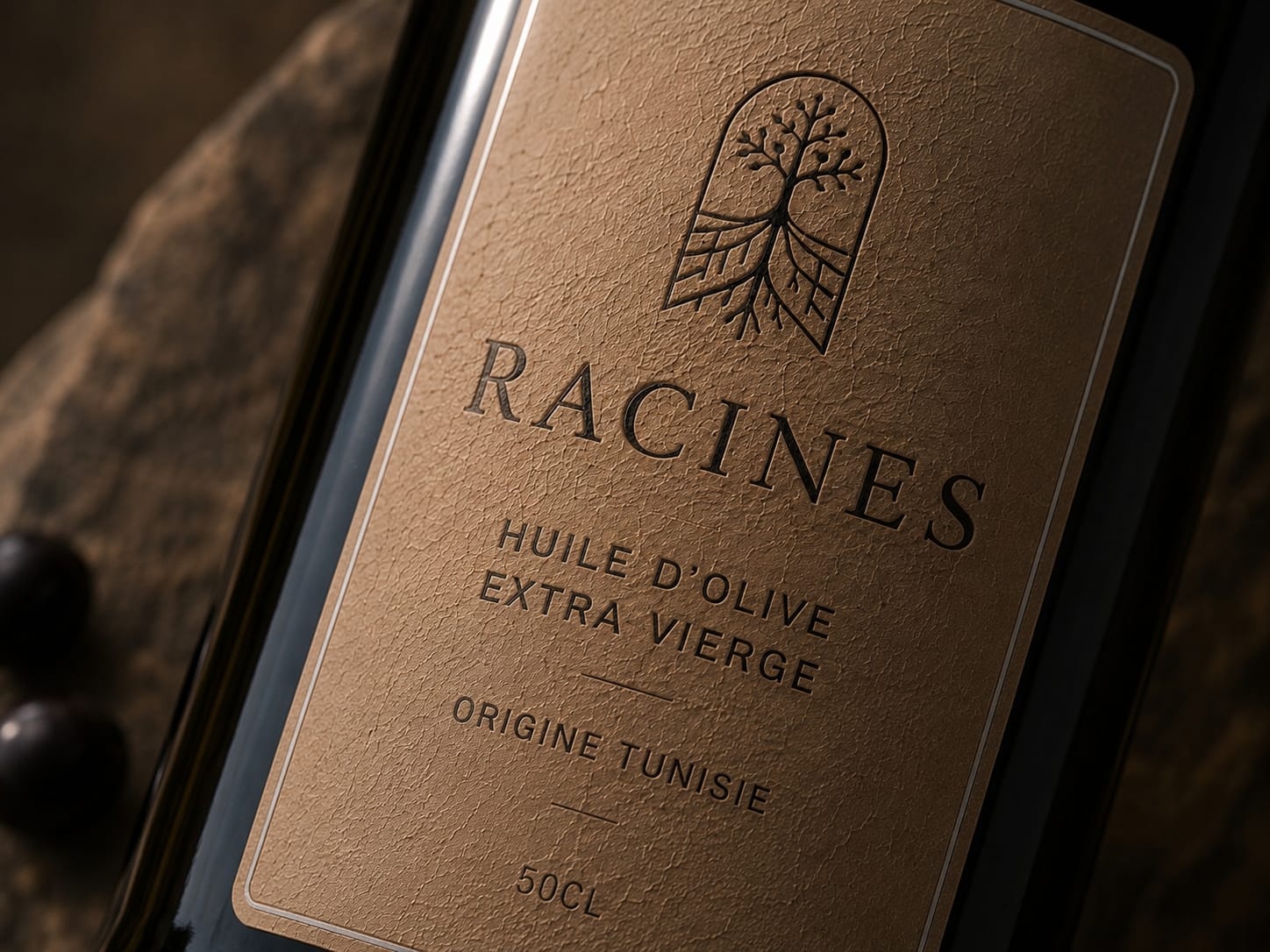
The brand identity draws inspiration from the invisible connection between the olive tree, the soil, and the land that gives it life. At the heart of the visual system, the roots become more than a symbol of origin: they become the brand’s signature. The tree, its fruit and its underground structure merge into a single emblem, expressing heritage, growth and transmission.
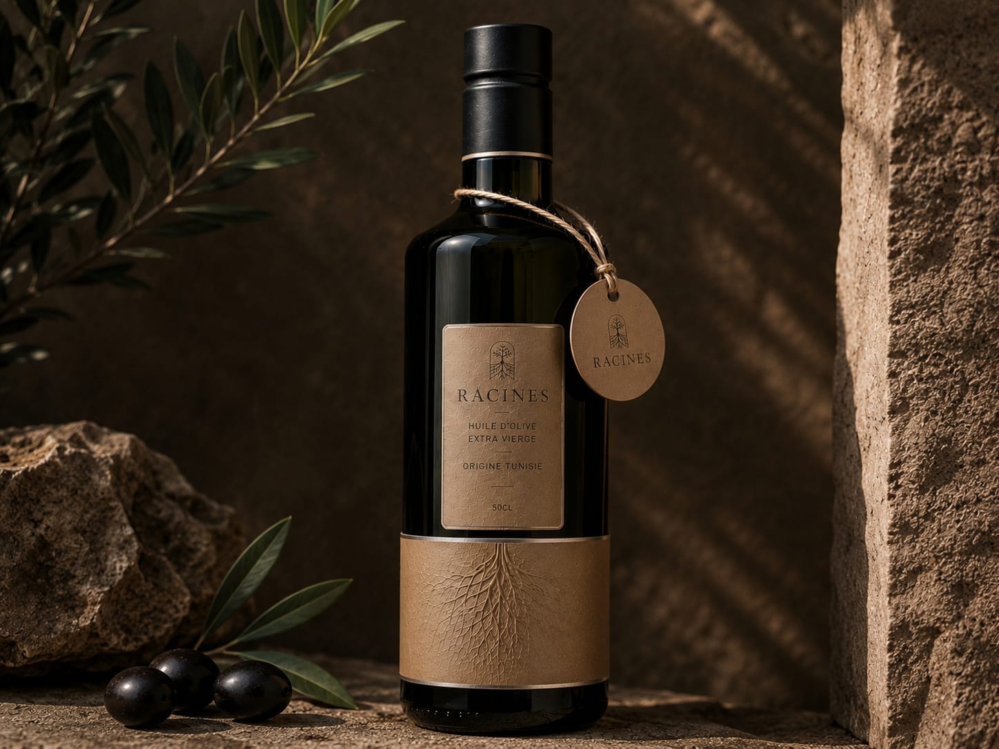
The packaging was designed around materiality and authenticity rather than decoration. Deep black glass contrasts with warm, earthy paper tones, while tactile textures and embossed root patterns create a physical connection with the landscape. Every detail is deliberately restrained, allowing texture, light and shadow to become part of the identity.
The lower label extends the concept beyond the traditional front label. Its sculptural root pattern appears to grow across the bottle, creating continuity between the graphic identity and the object itself. Natural paper, subtle relief and a minimal typographic composition reinforce the feeling of something crafted, timeless and deeply connected to the Mediterranean.
The art direction follows the same philosophy. Stone, olive branches, raw surfaces and warm sunlight create a visual world that feels almost archaeological — as though the bottle had emerged directly from the Tunisian soil.
Racines is not designed to simply communicate where the olive oil comes from. It is designed to make its origin tangible.
Because before the tree, before the olive, and before the oil, there are the roots.
 Eva Chistyakova
 Puigdemont Roca
 marianaaworks
 bloomburo
 andreamarinnn
 Alina
Alina Saadmost
 Bruhken
 Maruf Nishat
 Richest Branding Pvt. Ltd.
 Sophiagdotcom
 saifullahmaslool
 Up-Brands
 Atiq Alam
 daniitenaa
 artworkbysofia
 monther al omari
 Valérie Colace
 Tianqii
 Anum
Anum anisameur
 tauqueer
 SOT B&D
 Palashcc
 Derrick Lin