
Festival “Rakovka”
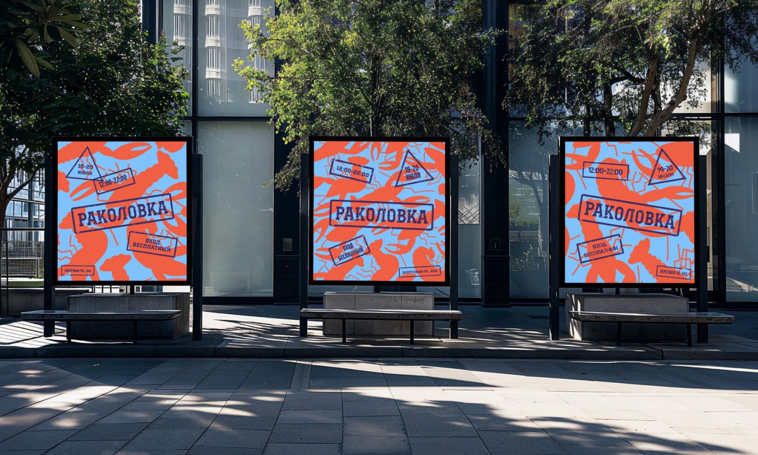
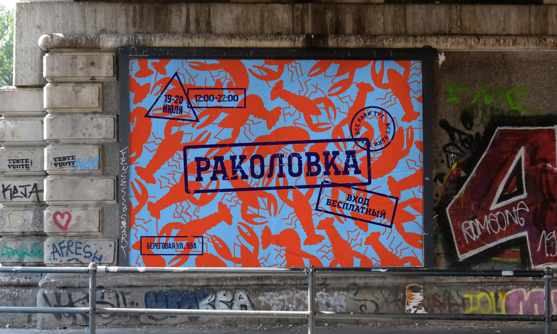
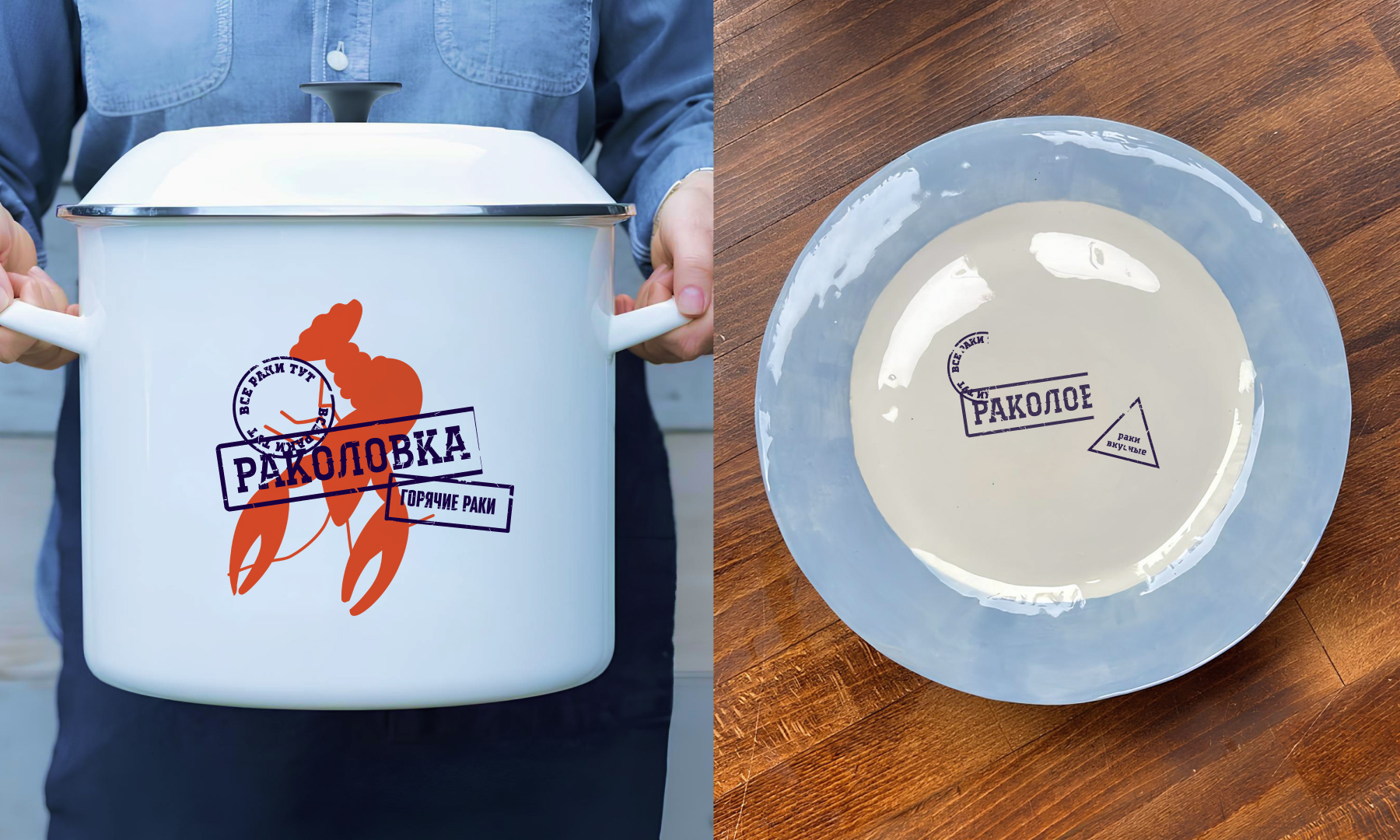
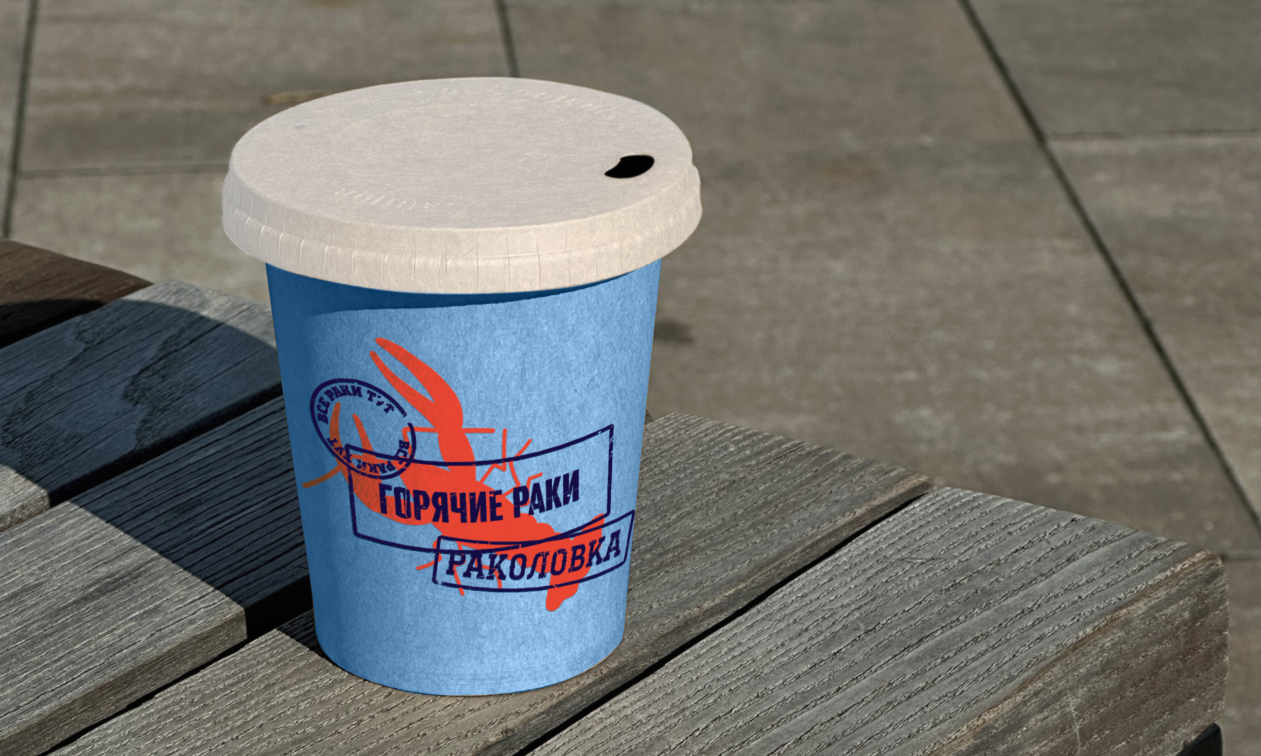
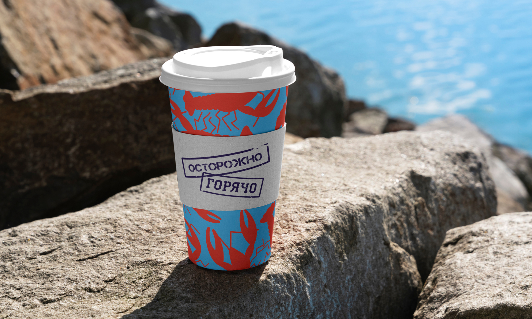
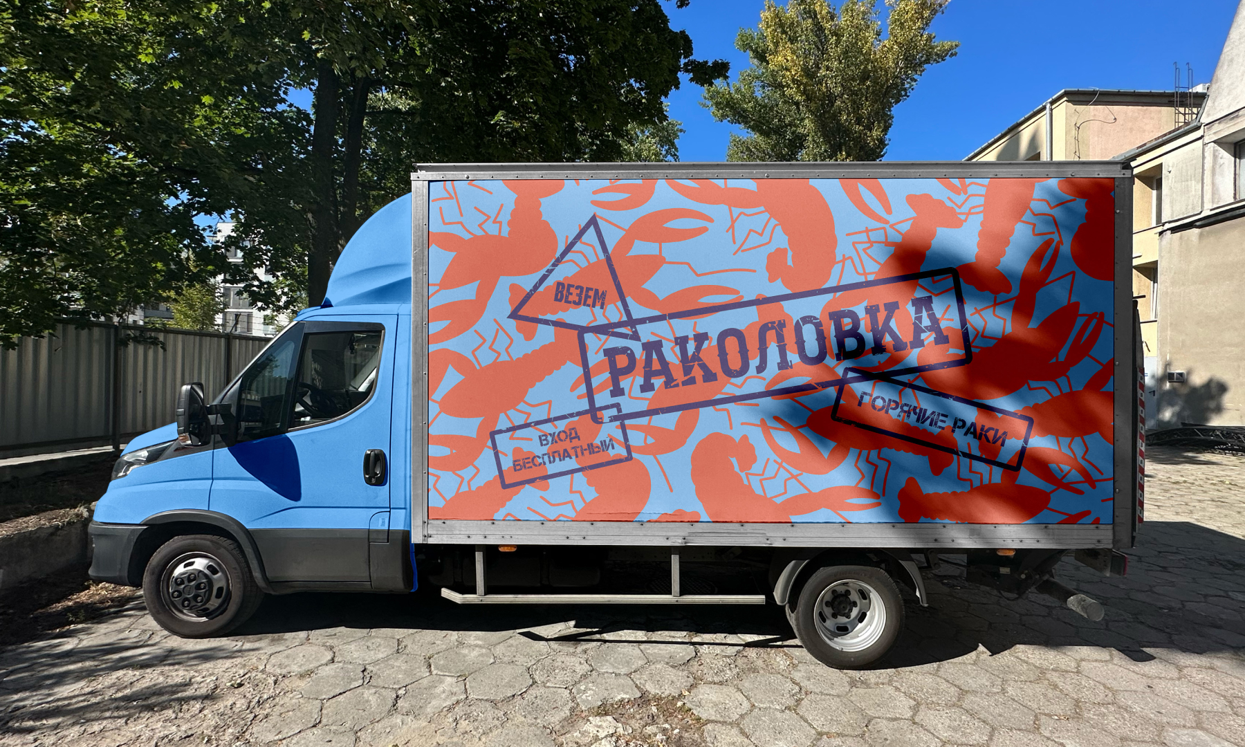
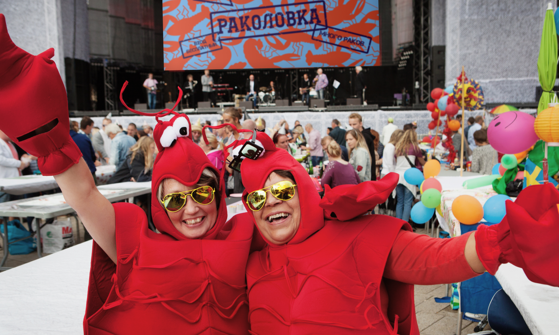
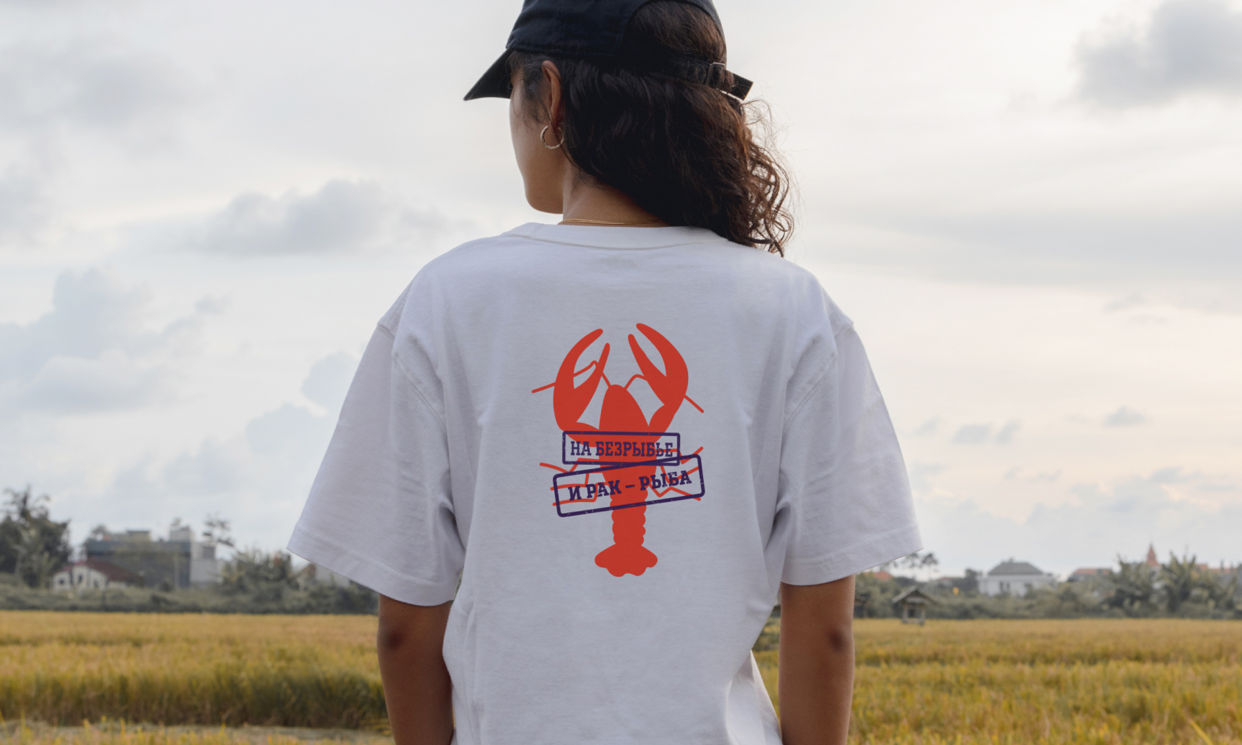
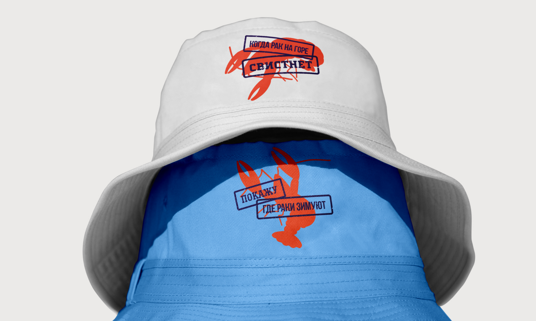
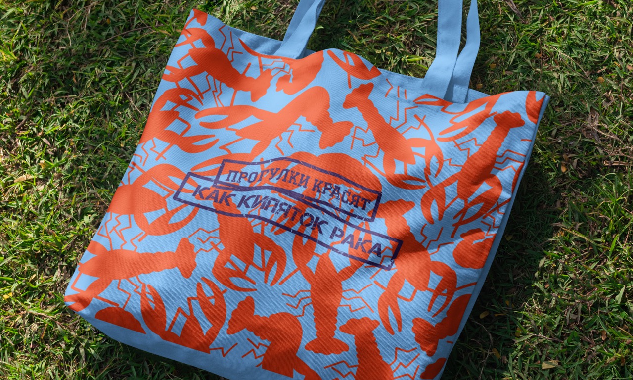
The “Rakovka Festival,” held in Rostov-on-Don, is a unique event that brings together food enthusiasts and the cultural traditions of the city. The design project is built around two key colors: blue and red. The blue color symbolizes the majestic Don River, which flows through the city and is an integral part of it. This color conveys a sense of freshness and natural beauty, reminding us of the region’s natural splendor. The red color is associated with the aromatic cooked crayfish, which are the main attraction of the festival. It stimulates the appetite and attracts attention, creating a festive atmosphere.
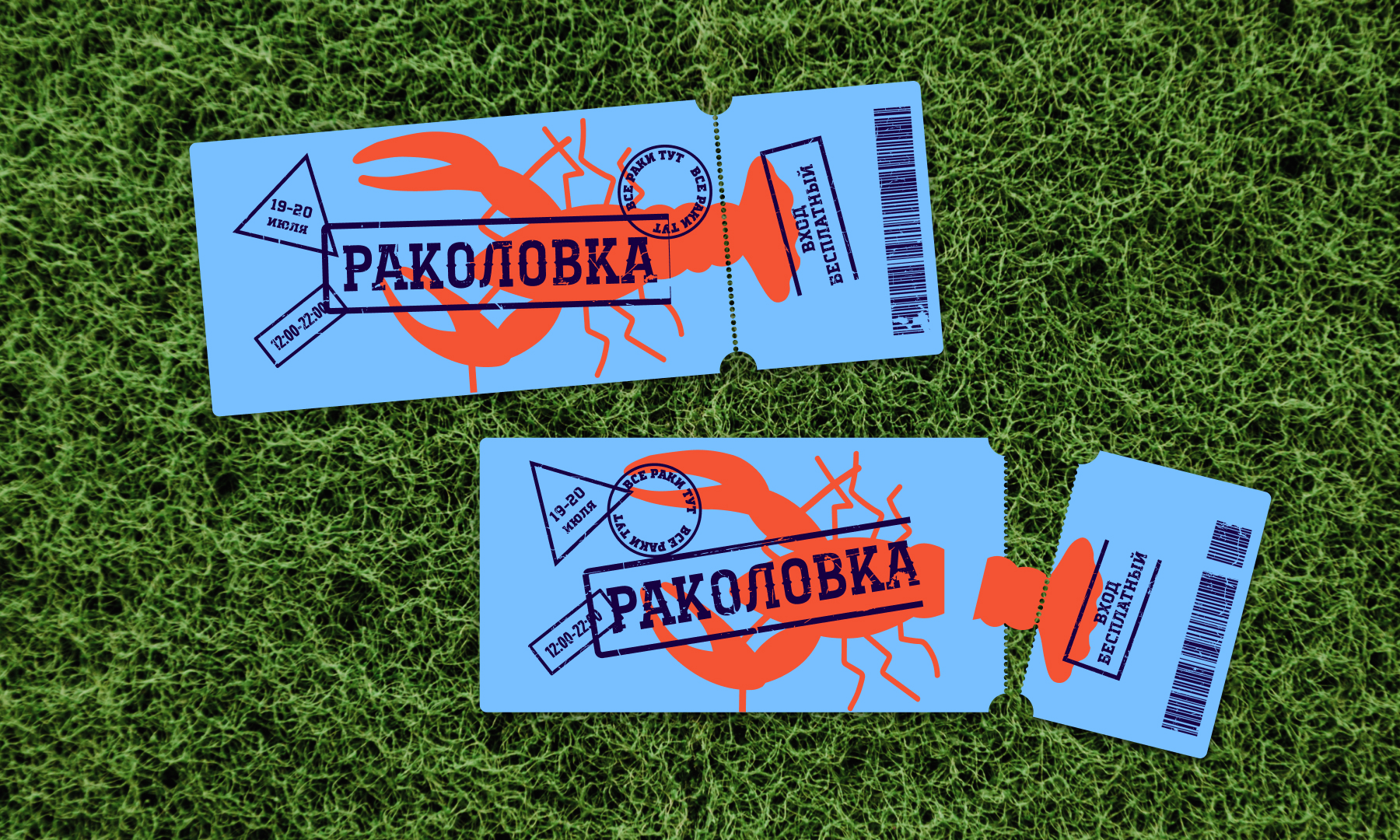
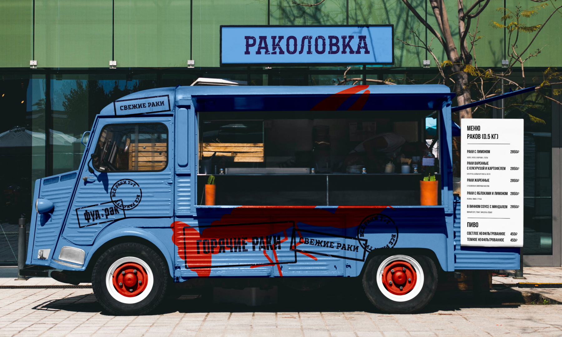
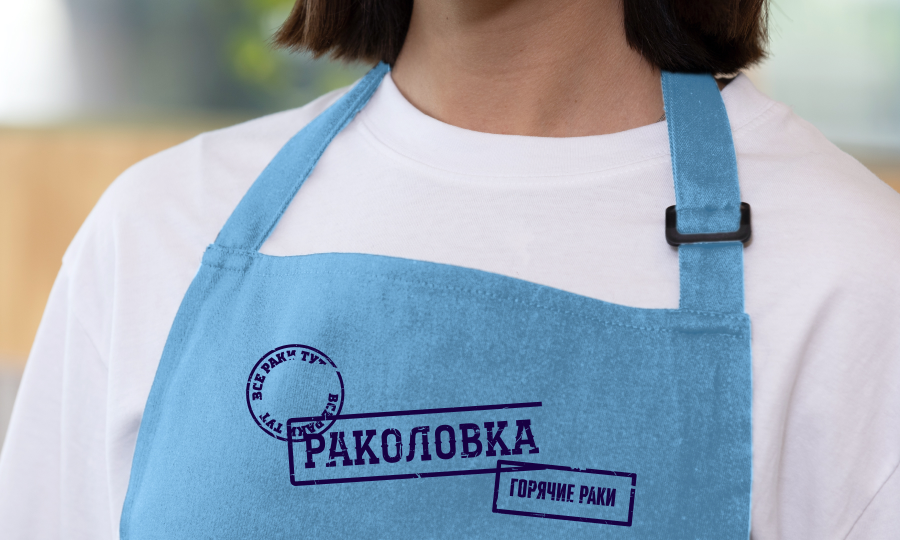
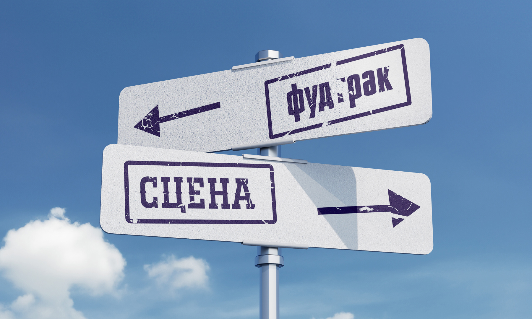
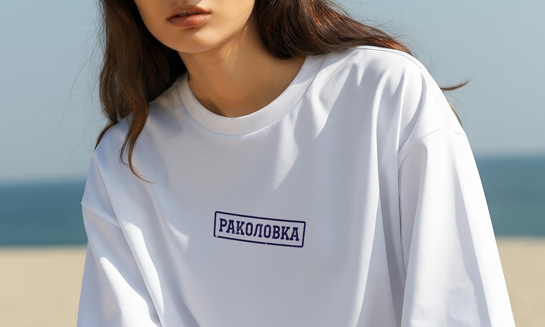
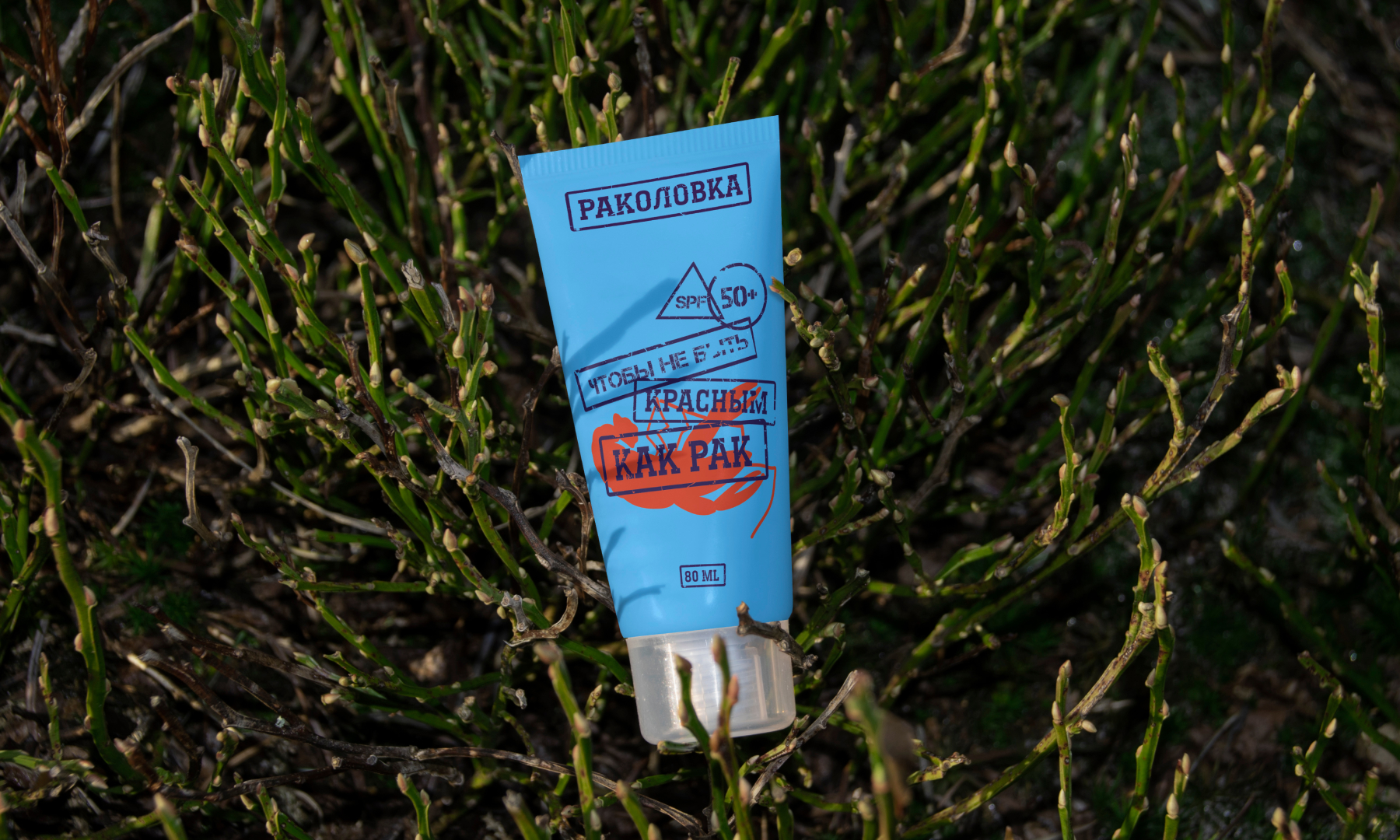
The typography of the project is inspired by the stamps and markings found on product packaging and crayfish sale announcements. This style gives the design authenticity and recognizability, reminiscent of traditional marking and packaging methods. The use of elements such as stamps and prints creates a sense of handcrafted and personalized approach, making the design more personal and memorable. These elements can be seen on poles and announcement sheets, helping to create a visual connection with the urban environment and traditions.
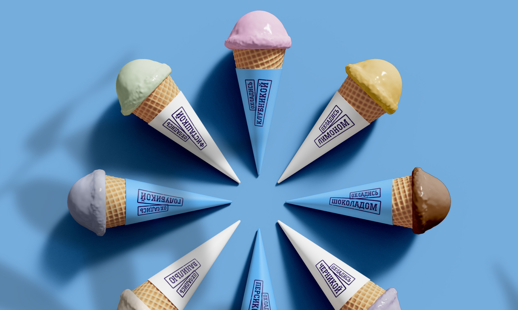
The design of the packaging and marking of products at the festival also corresponds to the overall style, creating a cohesive and harmonious image. The “Rakovka Festival” aims to combine tradition and modernity, creating a unique atmosphere where every guest can enjoy the taste of aromatic crayfish and immerse themselves in the culture of Rostov-on-Don. The design project emphasizes the importance of local traditions and natural resources, making the event bright and unforgettable.
 Otherness
 Alena Chemodurova
 Estudio Argo
 Pomodoro Design Office
 amandacoppeti
 Rabia zouina
 VANESA GARCÍA ESTUDIO
 anima
 Radar Agency
 Aadarsh Jain
 M&A CREATIVE AGENCY
 Valérie Colace
 Antonia Skaraki
 Aurora Baréalisse
 Artrime Graphic Design
 Just Design
 ANONIMA/
 Armoder Arte y Diseño
 eimanbeh
 Biaa
 Hartson Creative
 Karen Danielyan
 AUN BRANDS
 Studio Zak
 Hey Joe Studio