KARIORA – Premium Dry Fruits Packaging Design
KARIORA is a premium dry fruits brand created with the intention of delivering purity, quality, and trust through a bold yet refined packaging system. The challenge was to design packaging that looks premium, stands out instantly on retail shelves, and clearly differentiates each product variant while maintaining strong brand consistency.
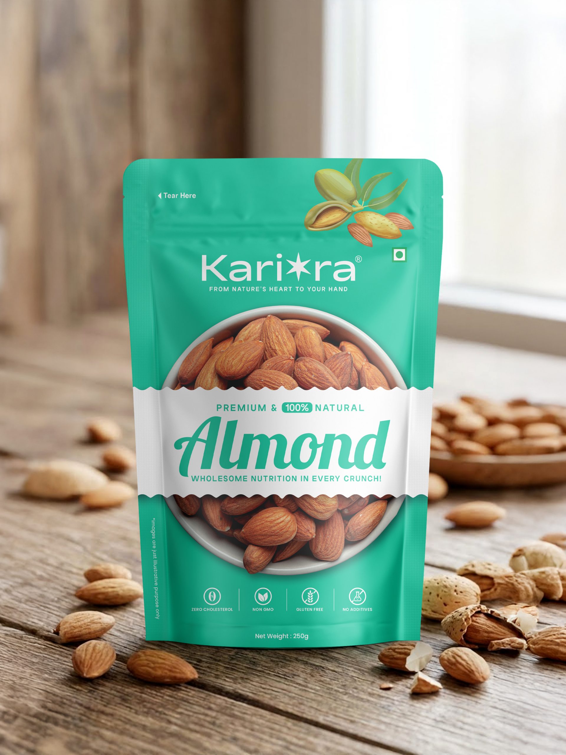
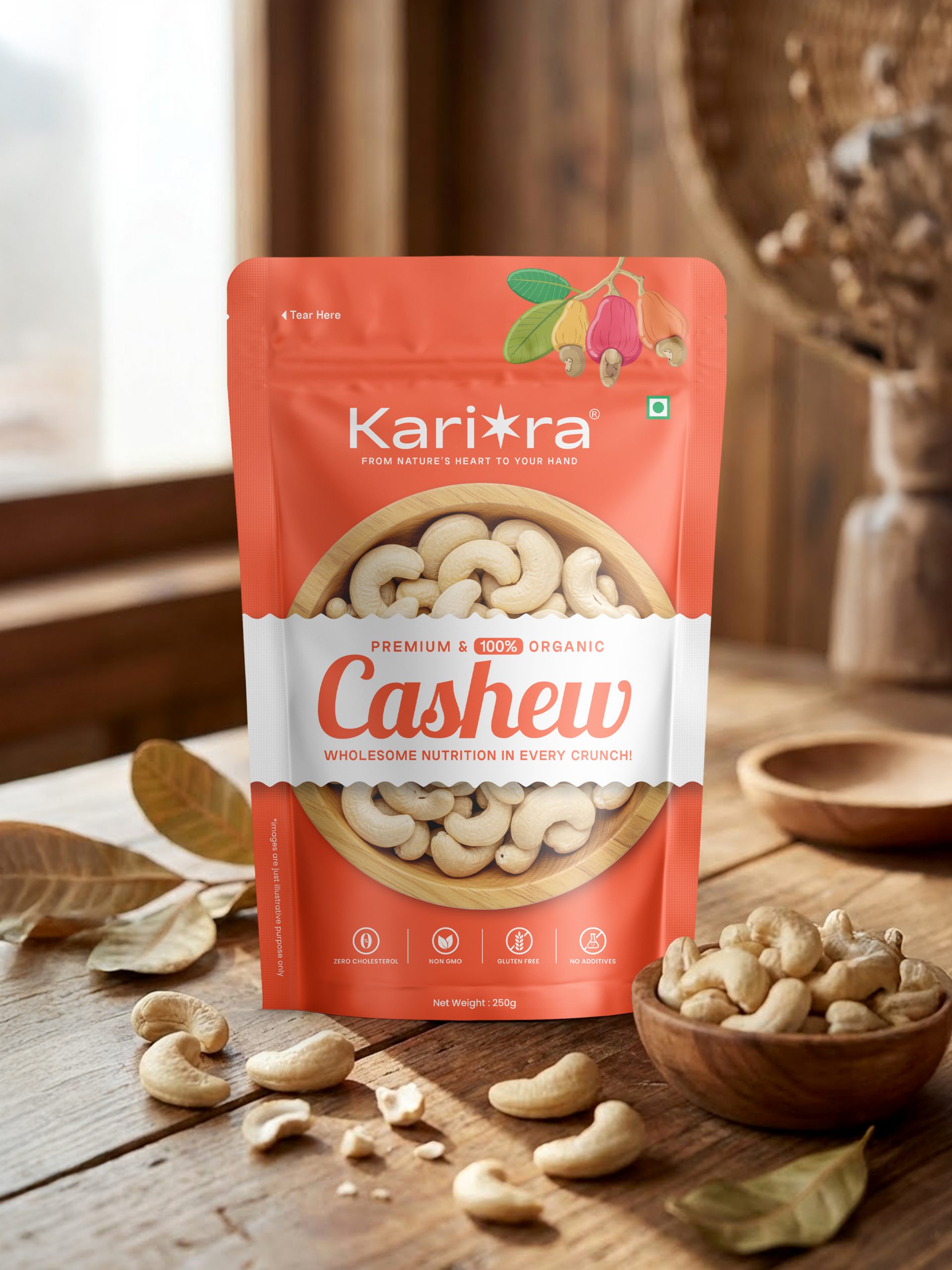
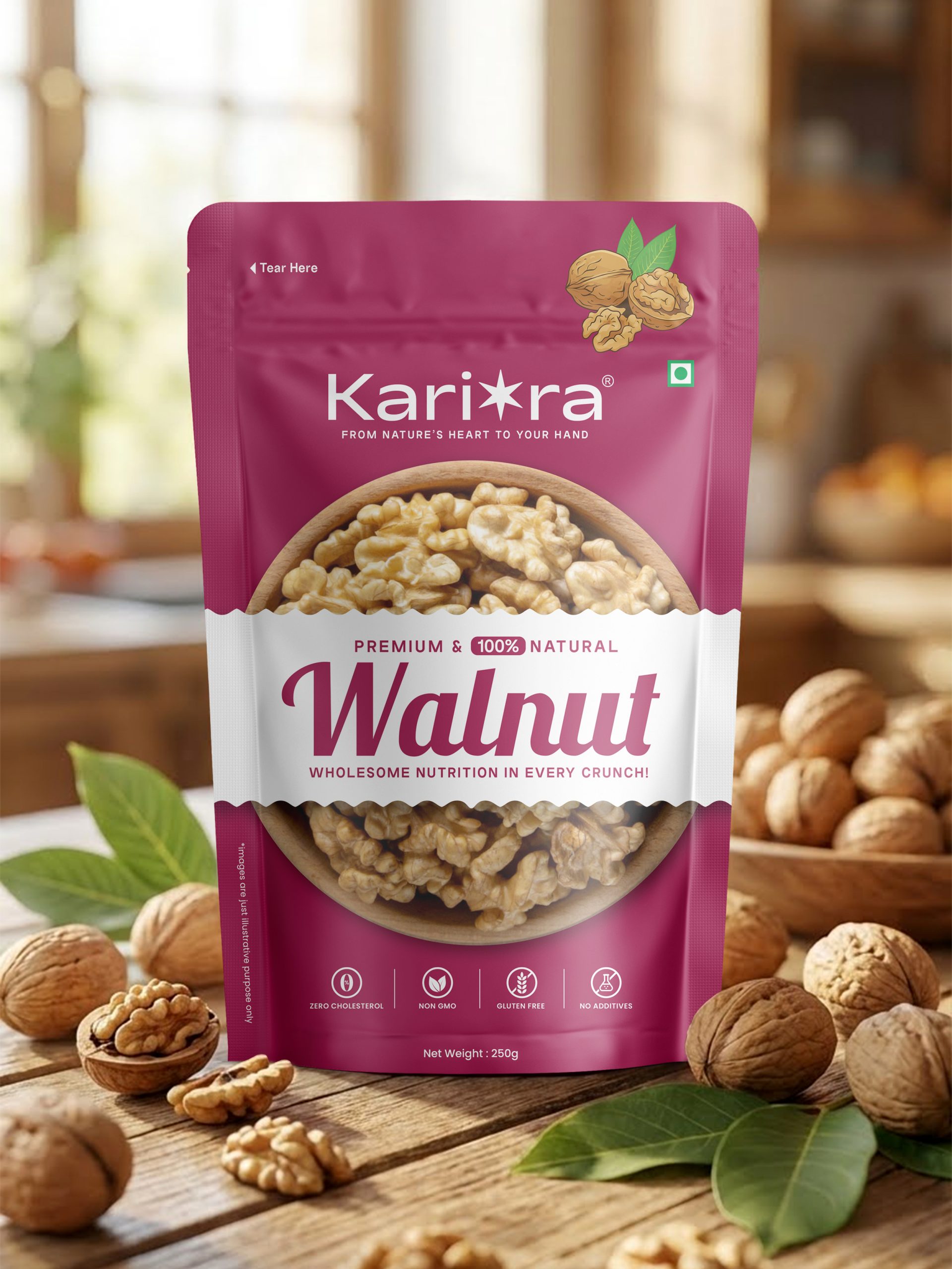
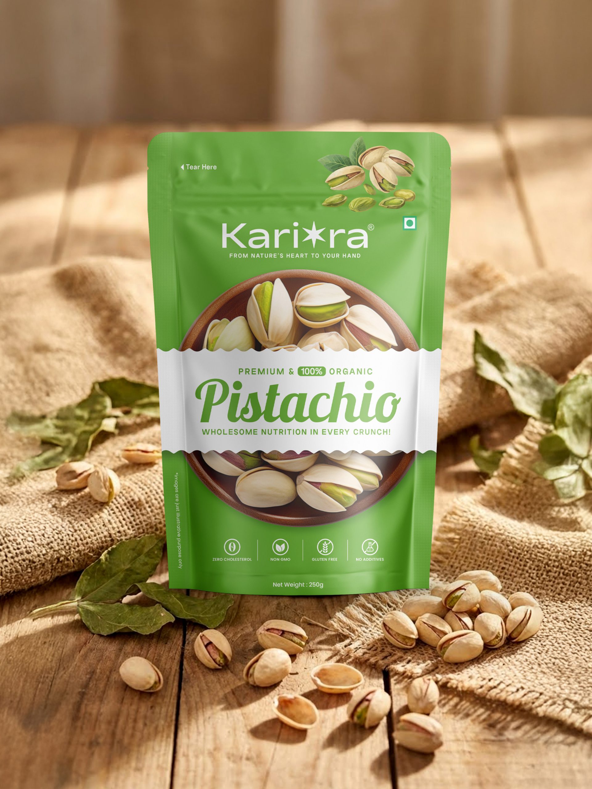
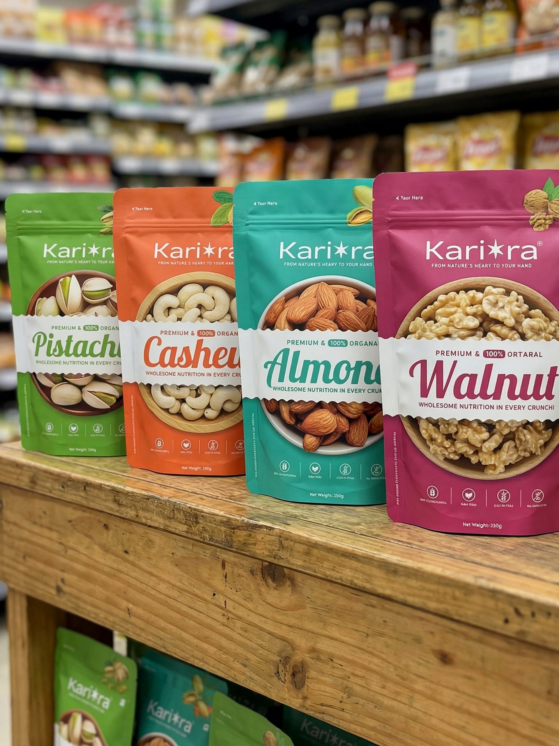
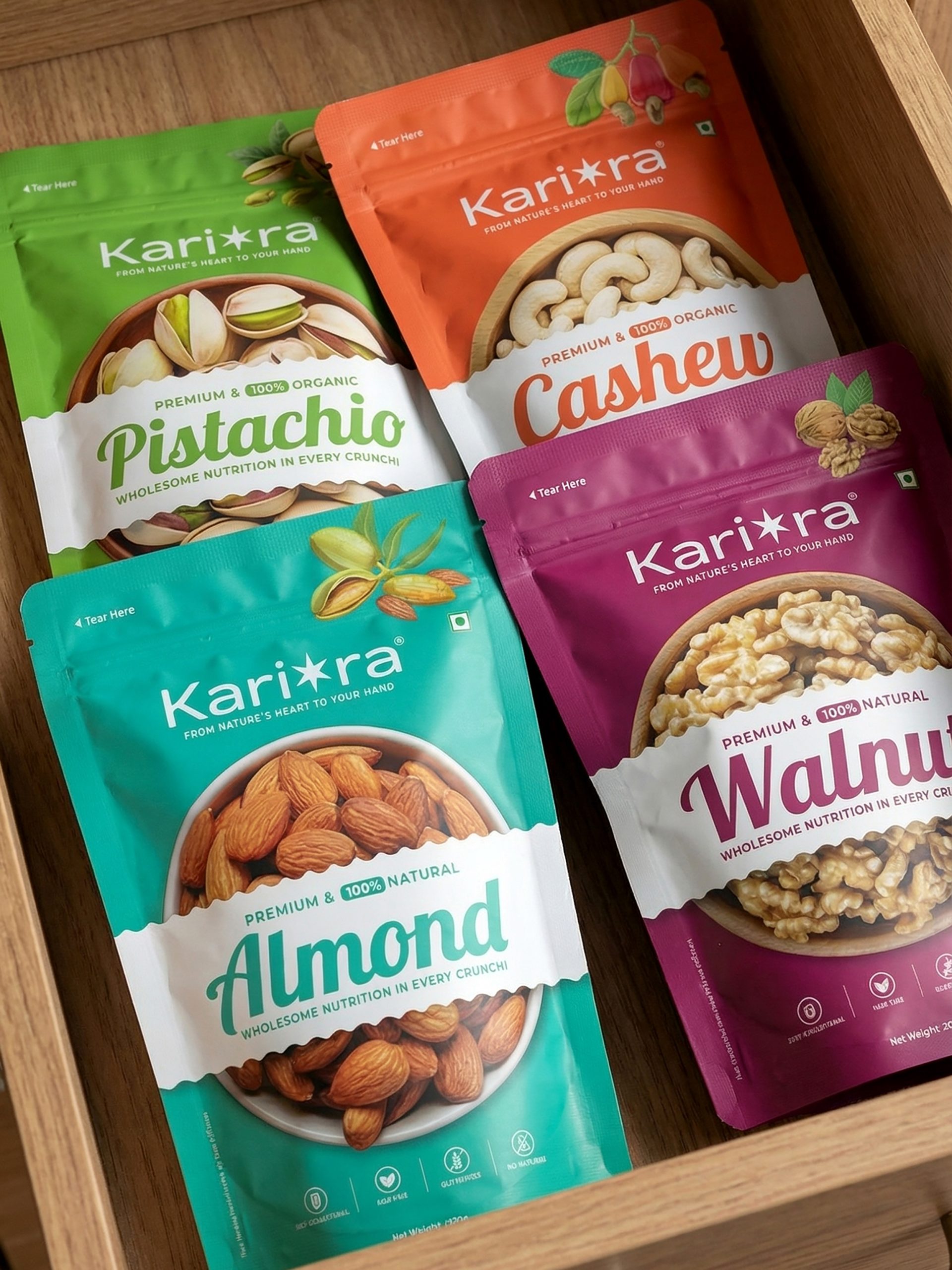
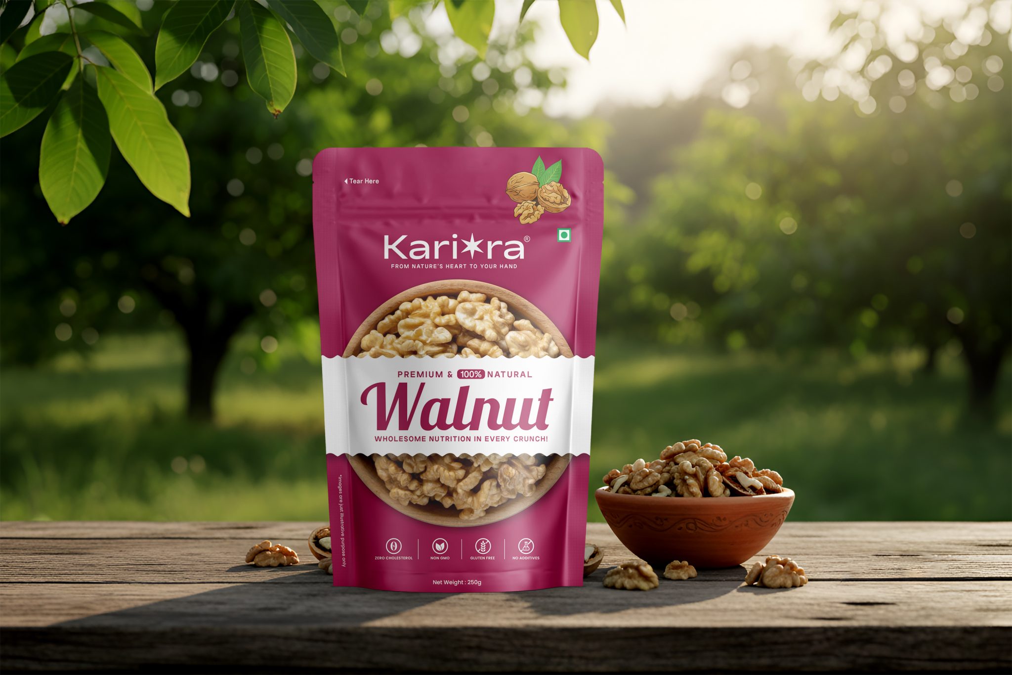
The packaging range includes Pistachio, Almond, Cashew, and Walnut, all developed under a single, cohesive visual system.
Design Concept
The core idea behind the design was clarity from a distance and confidence at first glance. To achieve this, each SKU uses a bold, product-specific color palette that allows quick identification while creating a strong visual block on the shelf. The colors are vibrant yet controlled, ensuring a premium and modern appeal rather than a loud or cluttered look.
A clean white central band anchors the design, helping balance the bold colors and providing a clear area for product naming and key information.
Visual Hierarchy & Layout
The design follows a strong and simple visual hierarchy:
- Brand name placed prominently at the top for instant recognition
- Large, bold product names for quick readability
- High-quality nut visuals to clearly communicate the product inside
- Minimal supporting text to keep the layout uncluttered and premium
This structure ensures the packaging is easy to understand within seconds, even from a distance.
Color Strategy
Each dry fruit variant is assigned a distinct color inspired by its natural character:
- Green for Pistachio
- Teal for Almond
- Warm Orange for Cashew
- Deep Maroon for Walnut
Despite the different colors, all packs feel like part of one family due to consistent typography, layout, and graphic style.
Brand Consistency
Consistency was a key focus throughout the project. All packs follow the same design system, icon style, spacing, and visual balance, helping KARIORA establish a strong and recognizable shelf identity across all SKUs.
Final Outcome
The final packaging system is bold, clean, and market-ready. It enhances shelf presence, improves product recognition, and communicates premium quality at first glance. The design successfully balances visual impact with simplicity, making KARIORA stand out in a competitive dry fruits category while building trust with consumers.