REDEFINING COFFEE BRANDING
Sane and Crazy is a coffee brand built on inspiring contrasts – a place where logic and emotion coexist, where every cup of coffee is not just awakening, but creatively insane. We believe coffee is not only a source of energy, but also a catalyst for breakthrough thinking.
THE CHALLENGE
In an increasingly saturated coffee market, Sane and Crazy needed a brand identity that was both distinctive and balanced – refined yet rebellious – to truly reflect the essence of being “insanely sane.”
THE DESIGN SOLUTION
The logo is crafted from the tension between seriousness and disruption, using a palette of black, white, and red to highlight the duality of order and chaos. This results in a brand image system that is bold, expressive, and highly adaptable across various platforms.
SANE AND CRAZY – BREWED FOR THE BOLD.
BRAND ORIGIN & INSIGHT
In a coffee market that’s gradually becoming saturated, most brands are choosing the safe route — sticking to familiar formulas. “Sane and Crazy” emerges as a bold response to this status quo — a refreshing force that blends contradiction with inspiration, rationality with emotion, clarity with creative madness. We believe a cup of coffee is not just for staying awake — it’s a catalyst that sparks bold ideas and unlocks perspectives no one dares to imagine.
BRAND NAME & MEANING
“Sane and Crazy” is more than just a name — it’s a manifesto. The combination of two opposing words evokes a world where logic and clarity coexist with creativity and rebellion. The brand embodies the spirit of paradox — a space where contradictions merge to create the extraordinary. It represents the madness of intellect and the sanity of a mind that constantly challenges limits.
CONCEPT COFFEE THAT AWAKENS ALL SENSES – WHERE REASON MEETS EMOTION
Sane and Crazy is a coffee brand that brings together two seemingly opposite extremes: clarity and madness. We believe that each cup of coffee not only keeps you alert but also sparks creativity—helping you break free from everyday routines. It’s a dual energy — balanced yet disruptive — crafted for the new generation constantly on the move, seeking fresh inspiration and authentic self-expression.
IDEA DESIGN TYPOGRAPHY – STRUCTURE MEETS REBELLION, JUST LIKE THE BRAND SPIRIT
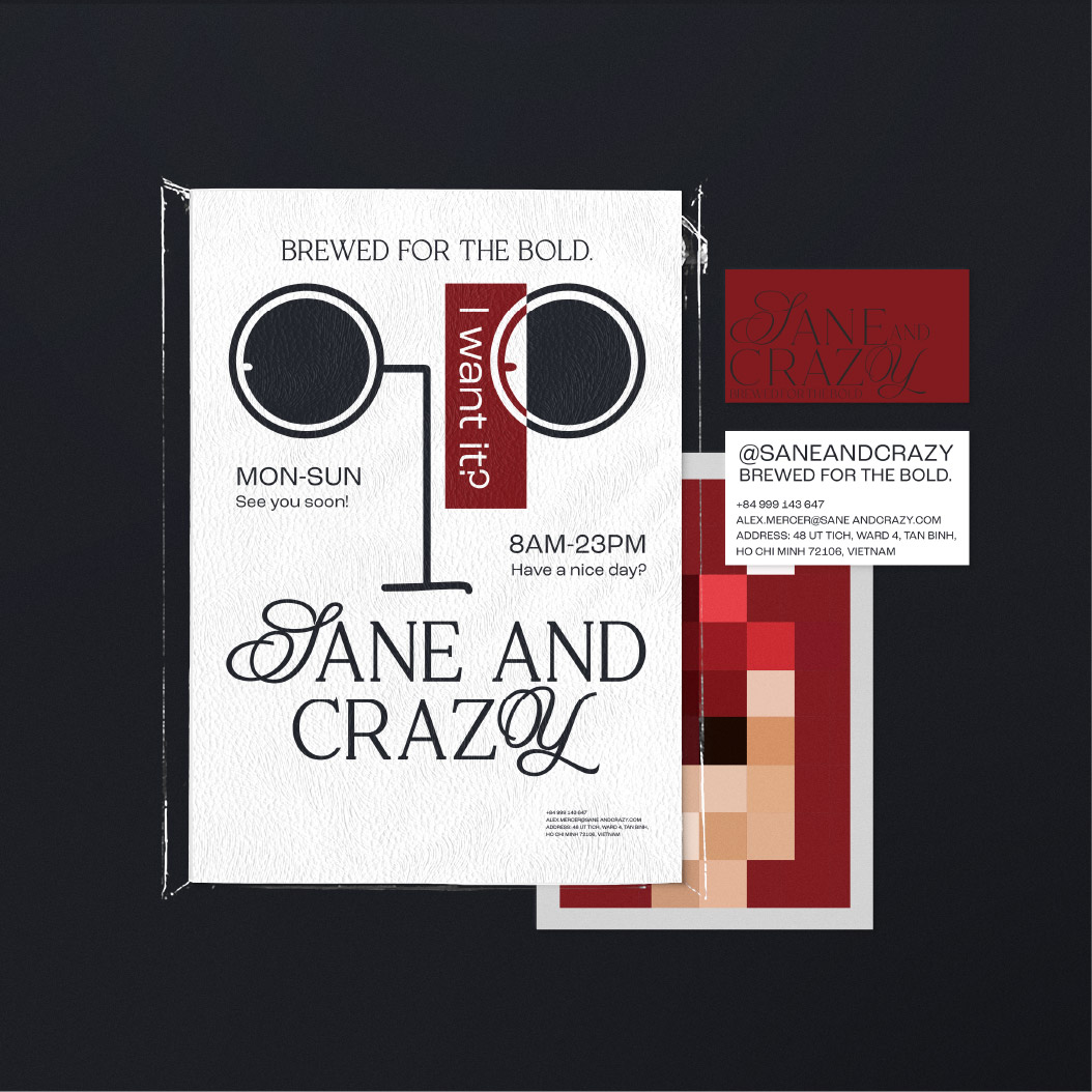
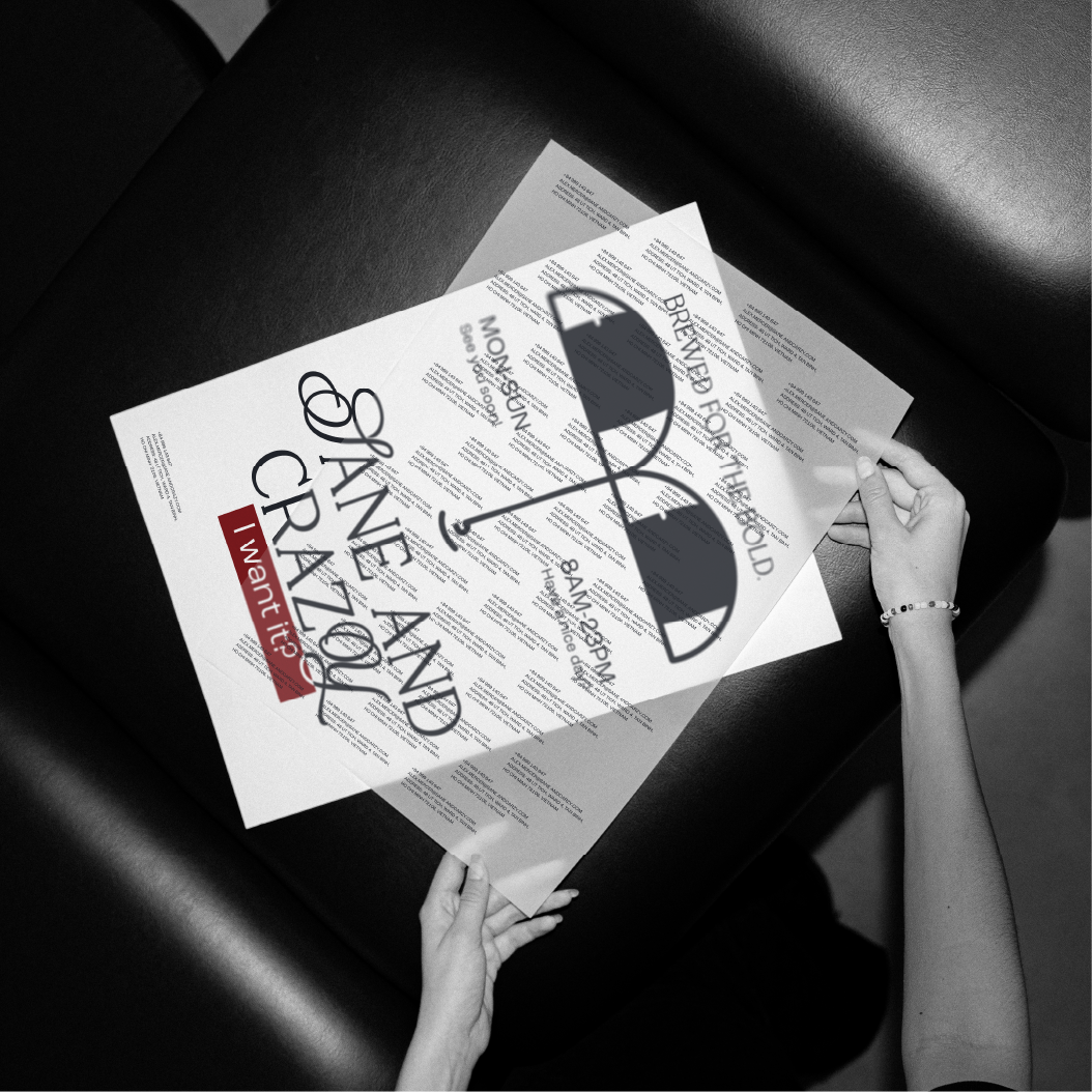
The Sane and Crazy logo uses a modern serif typeface subtly blended with script-like softness, symbolizing the fusion of logic and emotion. The standout elements — the initial “S” and the ending “Y” — represent a journey that begins gently but ends with explosive impact. Letter arrangement is intentional: both orderly and unconventional, creating a sense of “calculated chaos” that reflects the brand’s core. The logo isn’t just a name — it’s a declaration of a lifestyle: bold, creative, and full of energy.
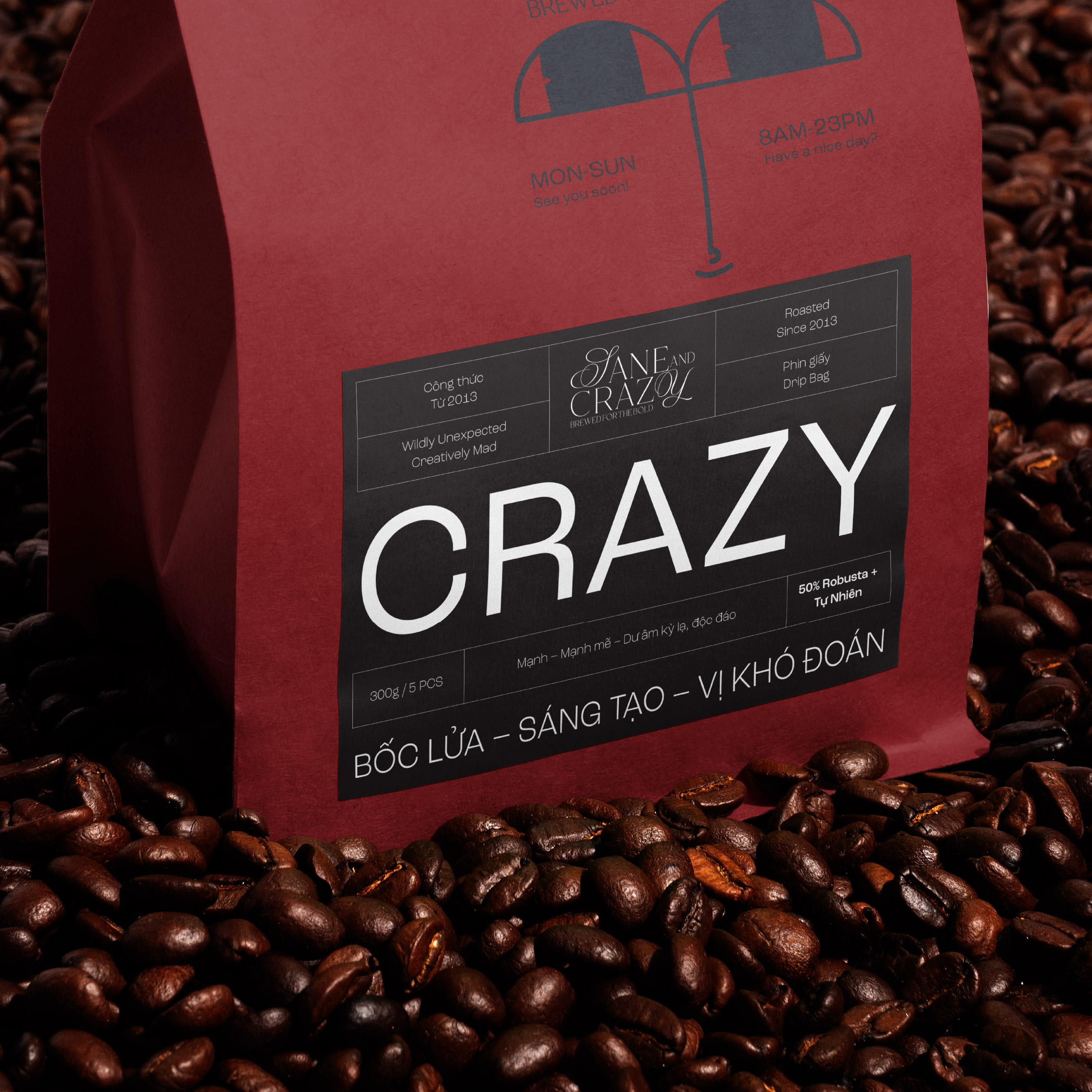
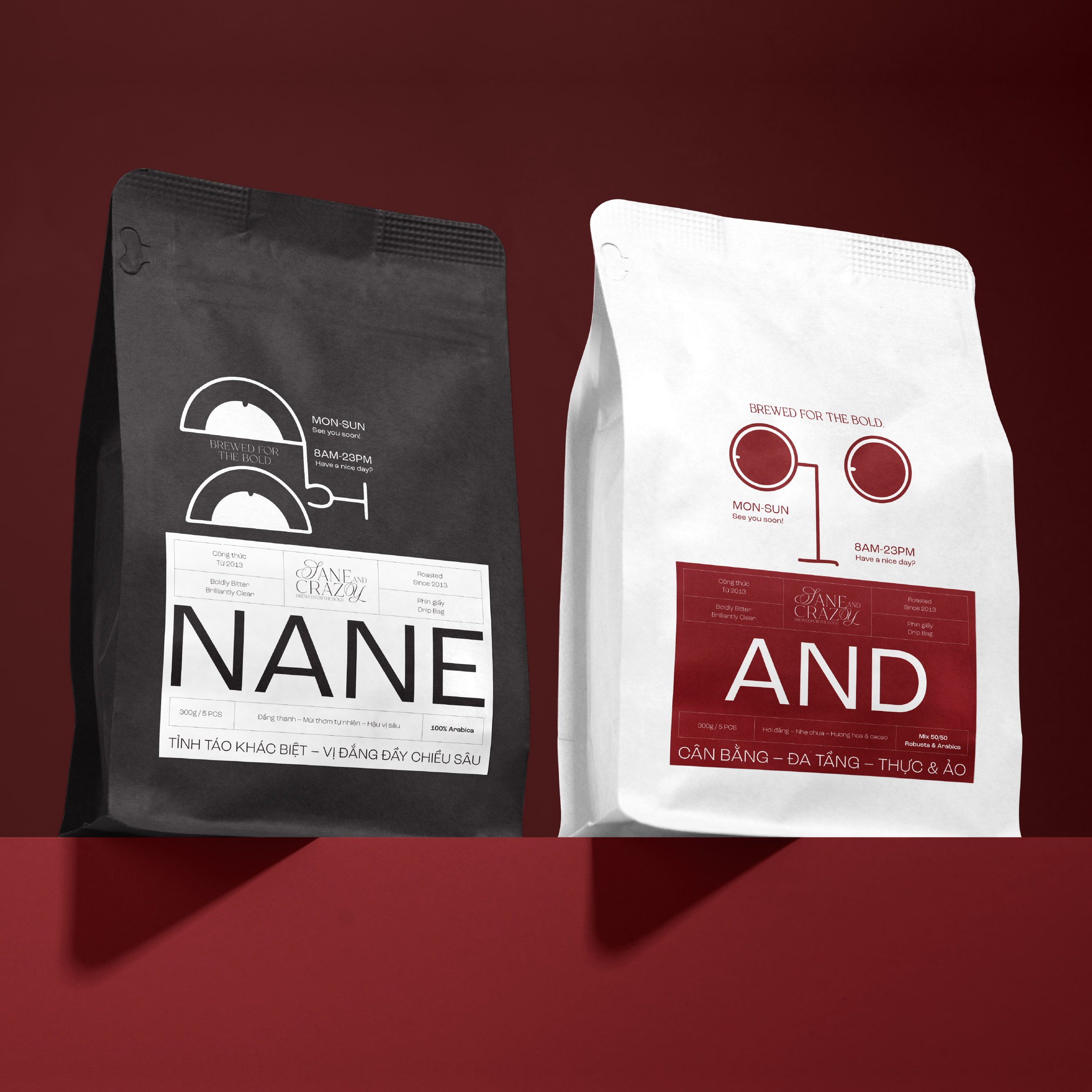
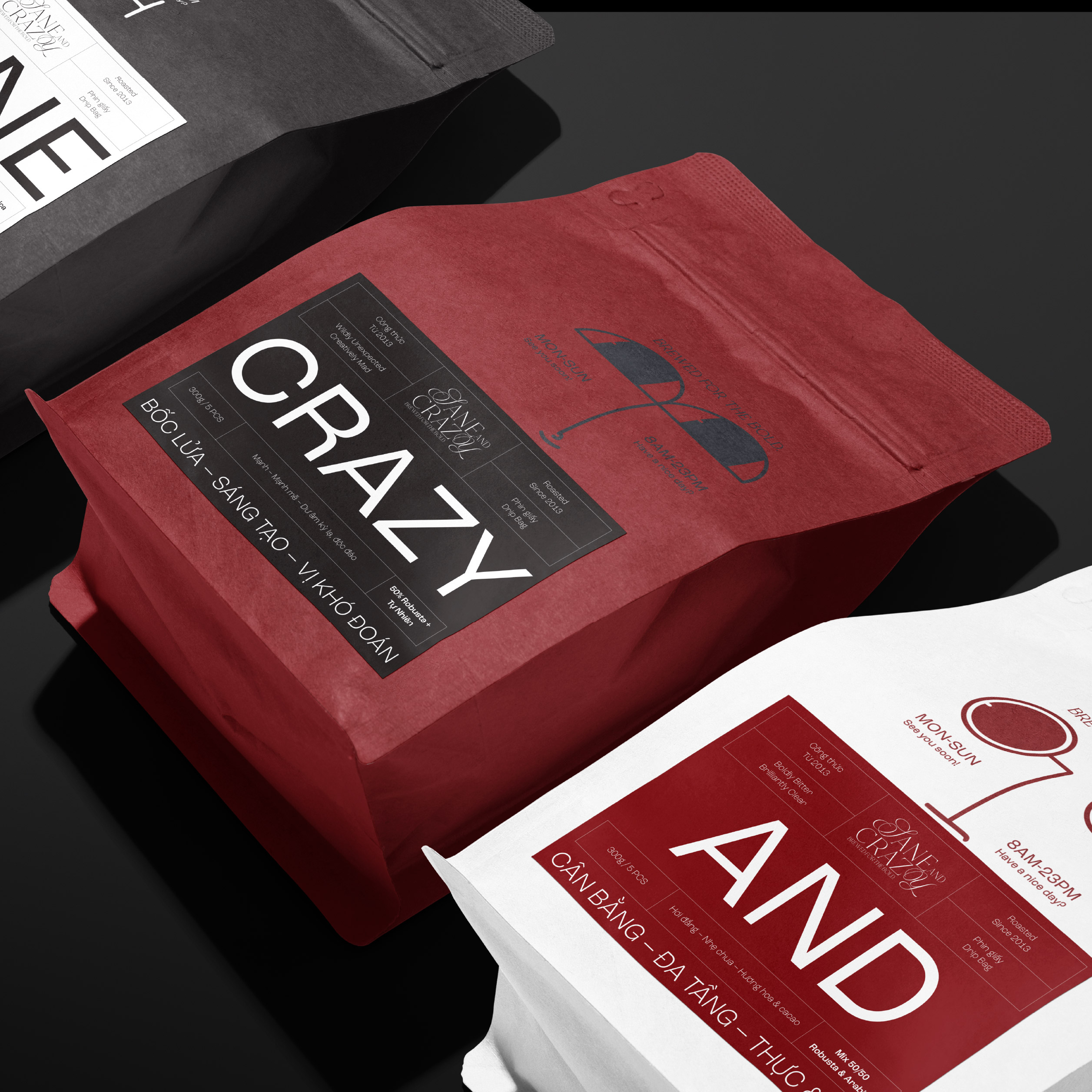
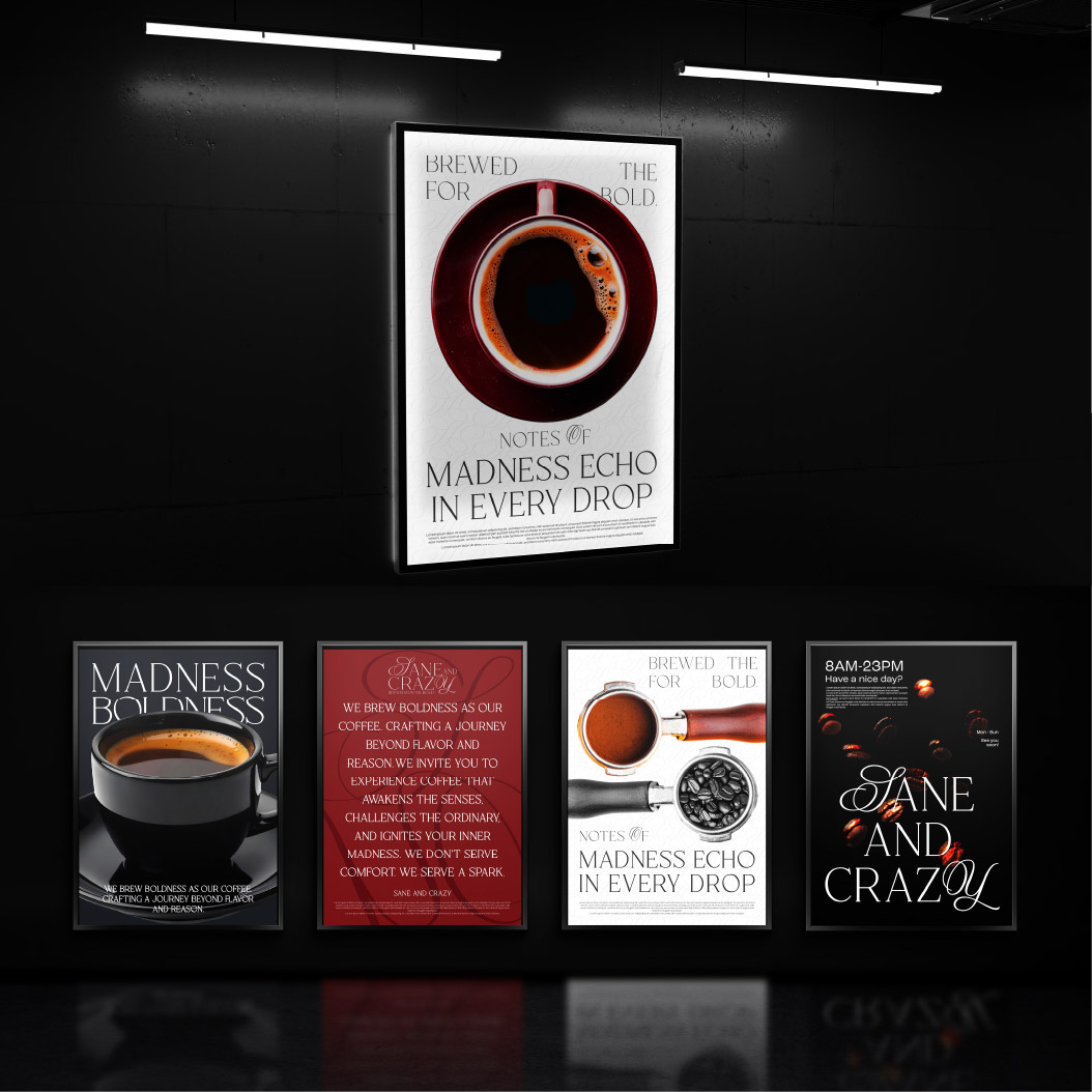
BREWED FOR THE BOLD (PHA CHẾ DÀNH CHO KẺ TÁO BẠO)
At Sane and Crazy, we believe not every rule is meant to be followed. The boundaries of traditional coffee-making are simply where we begin — then we break them. Every cup we craft isn’t just about tasting good — it’s about awakening disruptive thinking, challenging the ordinary, and inspiring “crazy” ideas born from clarity. Sane and Crazy isn’t for the faint of heart — we brew for those who dare to be different, to feel deeply, and to create boldly on their own terms.
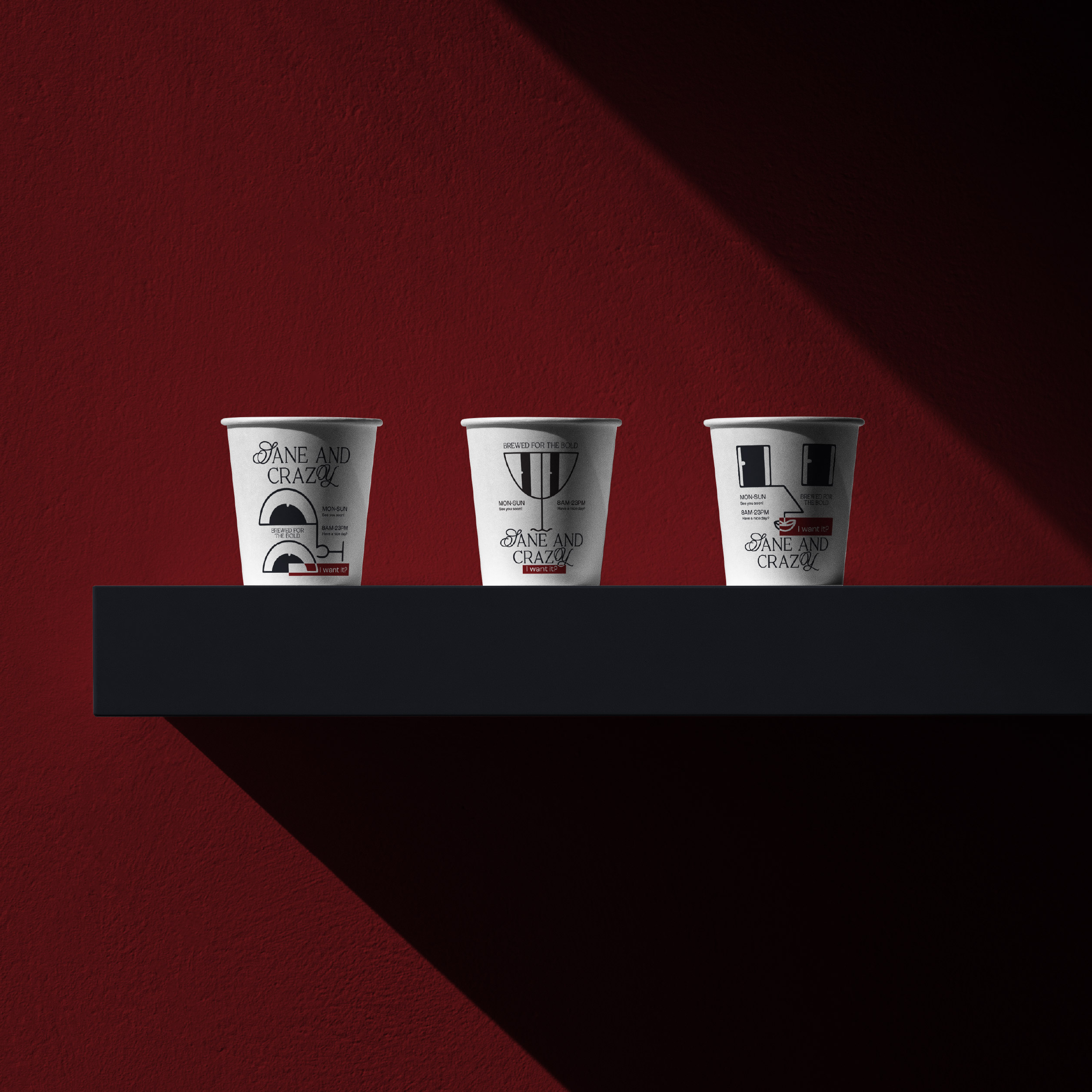
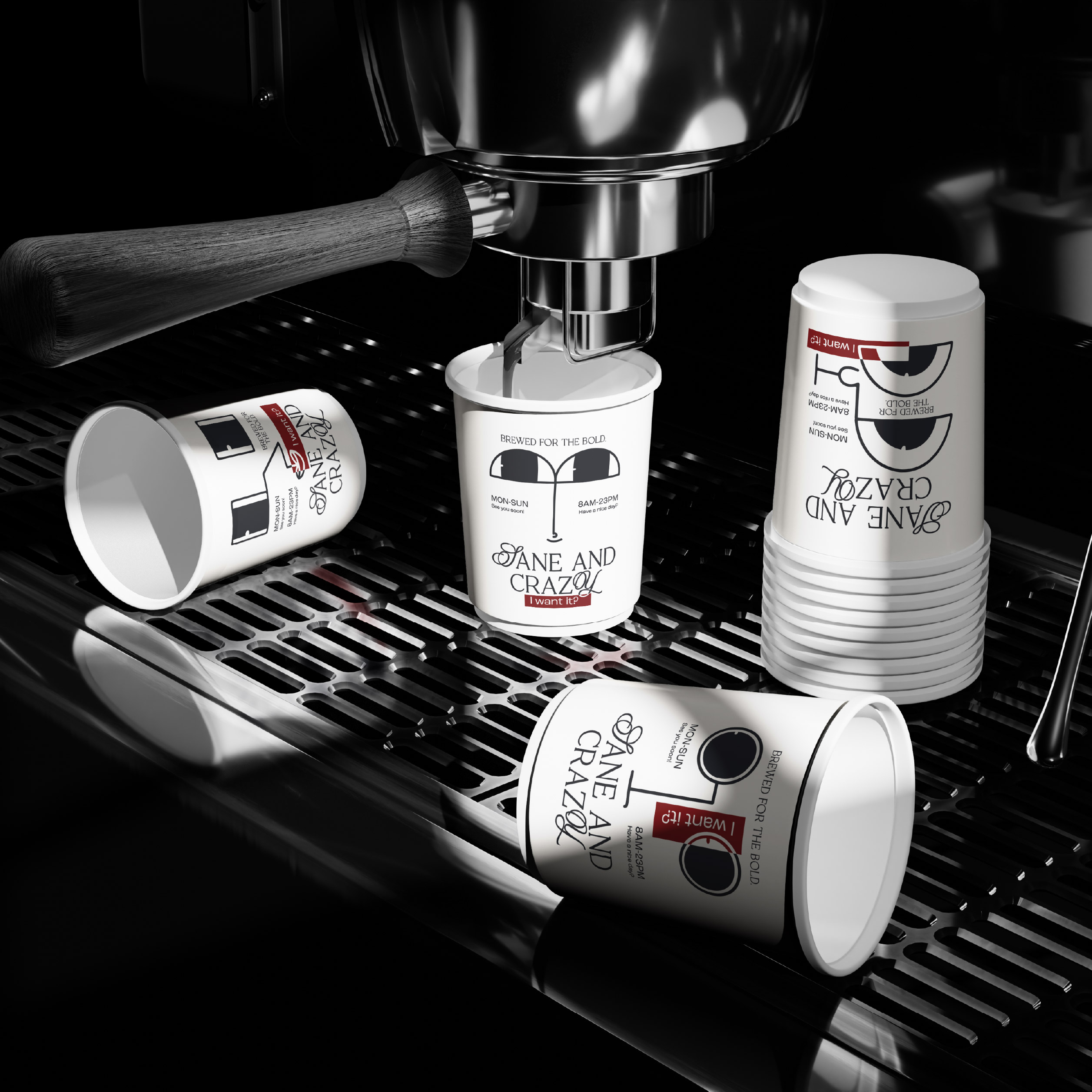
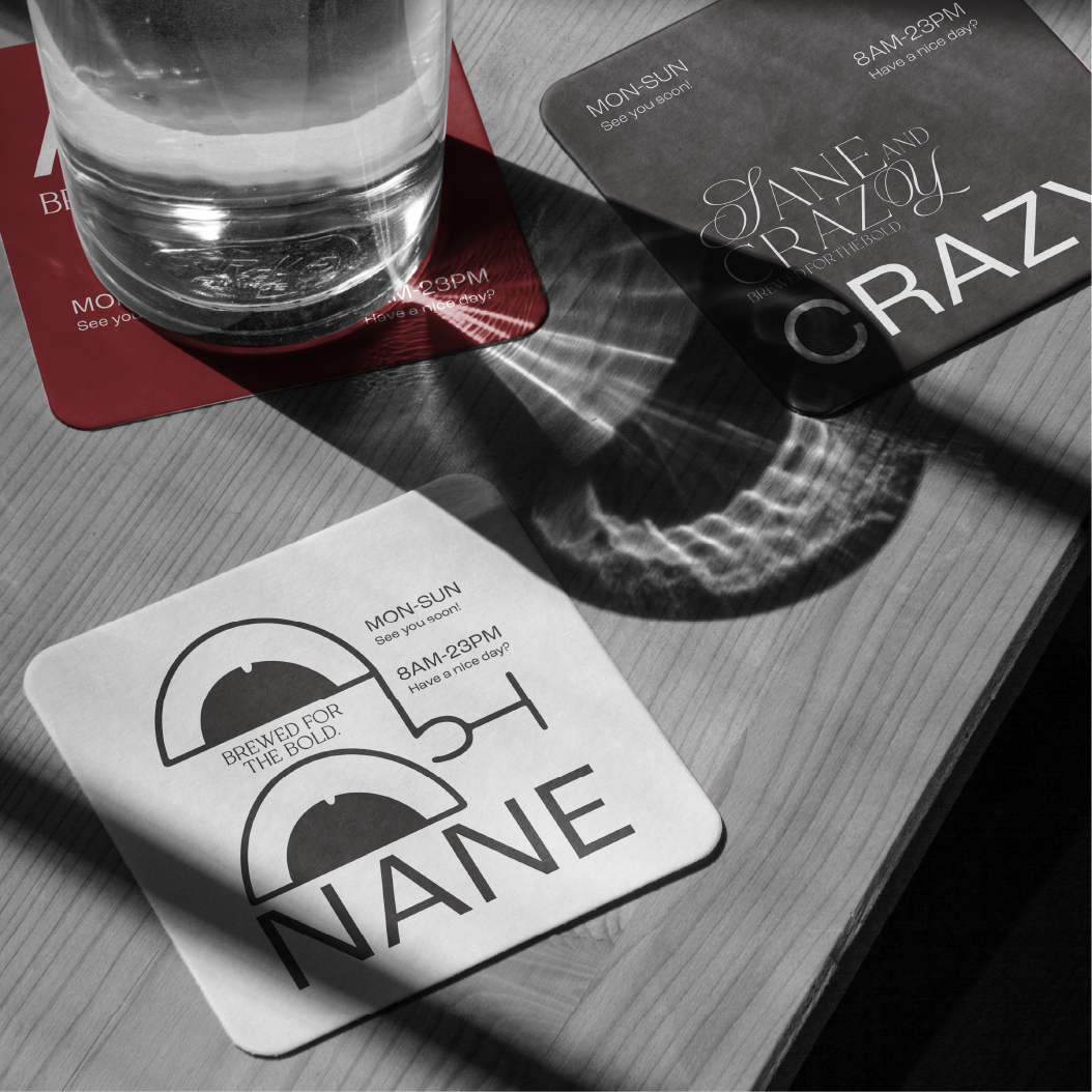
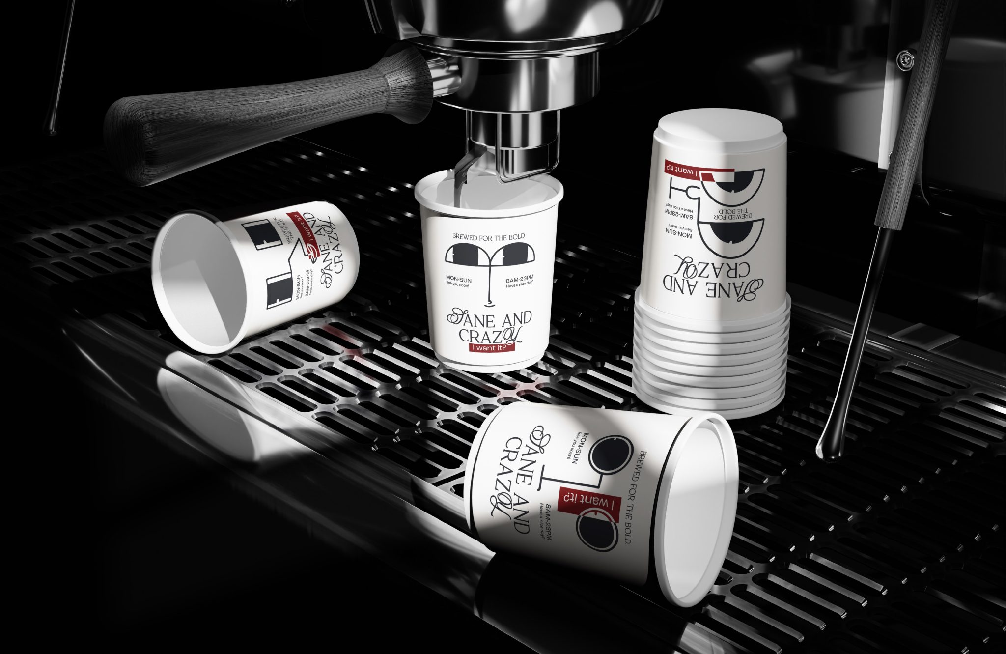
VISUAL IDENTITY
The visual identity of Sane and Crazy embraces a minimalist spirit infused with bold, unconventional energy. A system of basic geometric forms—primarily squares and sharp lines—establishes a stable visual foundation, symbolizing the “sane” aspect (clarity and order). In contrast, abstract facial expressions serve as key highlights, representing the “crazy” side—emotions sparked by unexpected product experiences. This interplay creates a visual structure that is both grounded and emotionally charged, distinct in its personality.
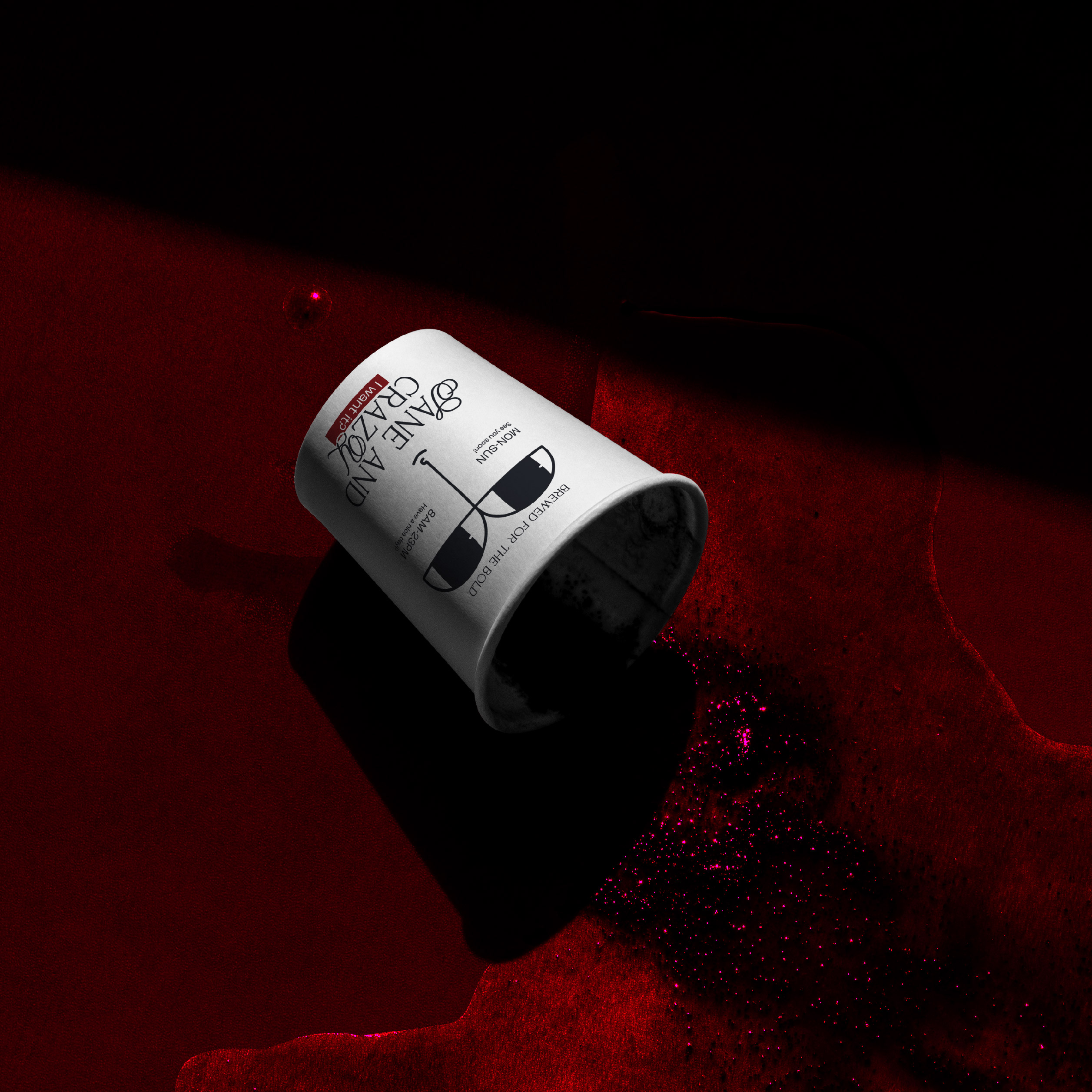
BRAND COLOR PALETTE
The brand’s primary color palette consists of Black – White – Red: Black: Represents depth, mystery, and powerful madness. White: Conveys purity, logic, and elegance. Red: Acts as a striking accent that evokes passion, rebellion, and intense emotion. The bold, contrasting combination of these three tones results in a highly recognizable visual identity—one that perfectly encapsulates the brand’s core duality: clarity meets creative chaos.
PRODUCT EXPERIENCE
At Sane and Crazy, coffee is the intersection of tradition and innovation. We start with high-quality beans that offer refined, delicate flavors, then infuse them with uniquely crafted flavor formulas developed exclusively by us. The result is a multi-layered taste experience—unfamiliar yet irresistibly captivating, awakening all the senses. Beyond just taste, each cup is a sensory journey—touch, sight, and emotion—where coffee becomes an adventure in inspiration.
BRAND PERSONALITY & MESSAGE
Sane and Crazy is made for those who dare to think differently. This brand isn’t for those seeking safety — it’s for those who crave discovery, experimentation, and creativity — in work, in life, and in every sip of coffee. “Brewed for the bold” isn’t just a tagline — it’s an invitation: Let coffee awaken you, take you from sane to crazy, and back again.
Link Project: https://www.behance.net/gallery/231582821/Sane-and-Crazy-Branding