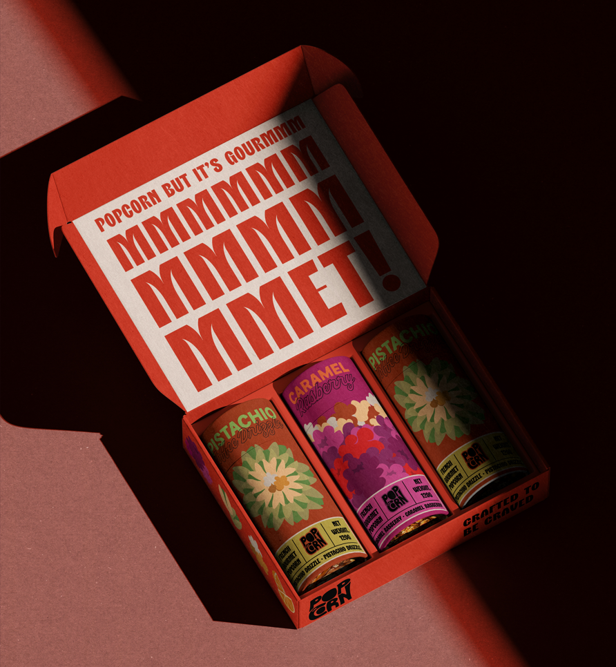
Built around the mission of sharing unique, French gourmet popcorn flavours, the goal for Pop the Corn was to elevate the packaging design to stand out and be seen as more than a standard confectionery. The goal was to balance the brand’s premium and playful sides, bringing them together harmoniously on the packaging to create a boutique yet playful and approachable brand.
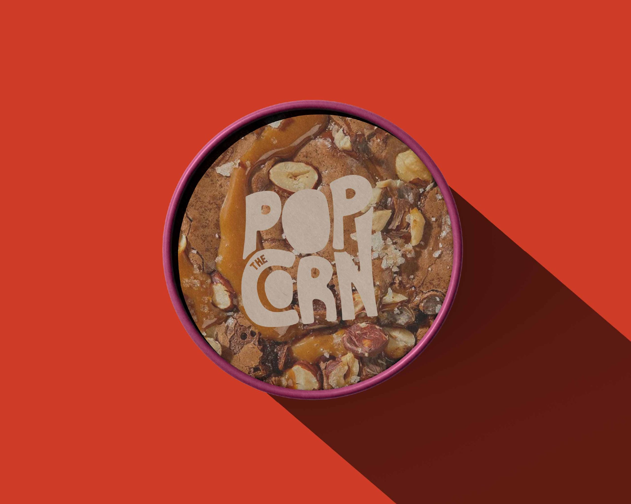
The packaging was built the same way the brand identity was, refusing to be seen as just another traditional popcorn brand. Instead of settling for typical creative choices such as buckets, plastic bags, loud photography, and predictable colour schemes, PoptheCorn needed to immediately stand apart on the shelf, which led to the decision to use a cylindrical tube as the packaging; a format more commonly associated with speciality chocolate, coffee, or patisserie goods. This shift alone helped reposition the product before any graphics were applied.
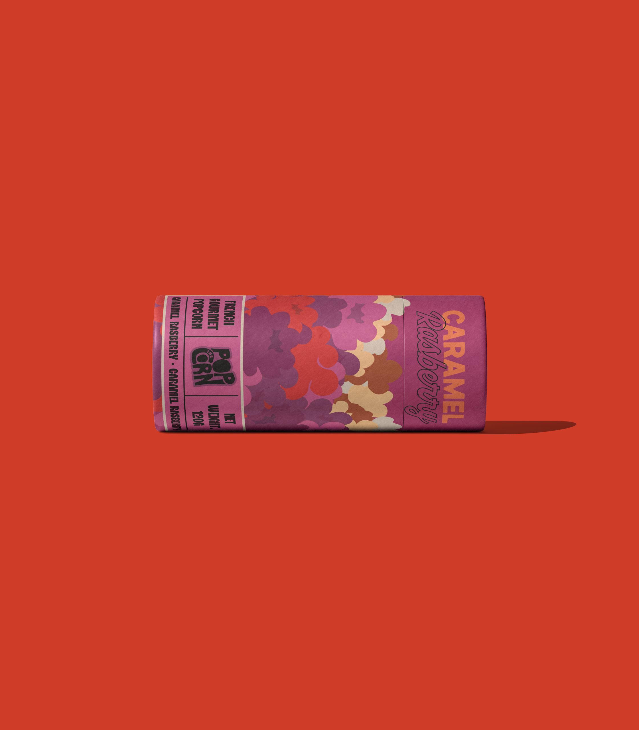
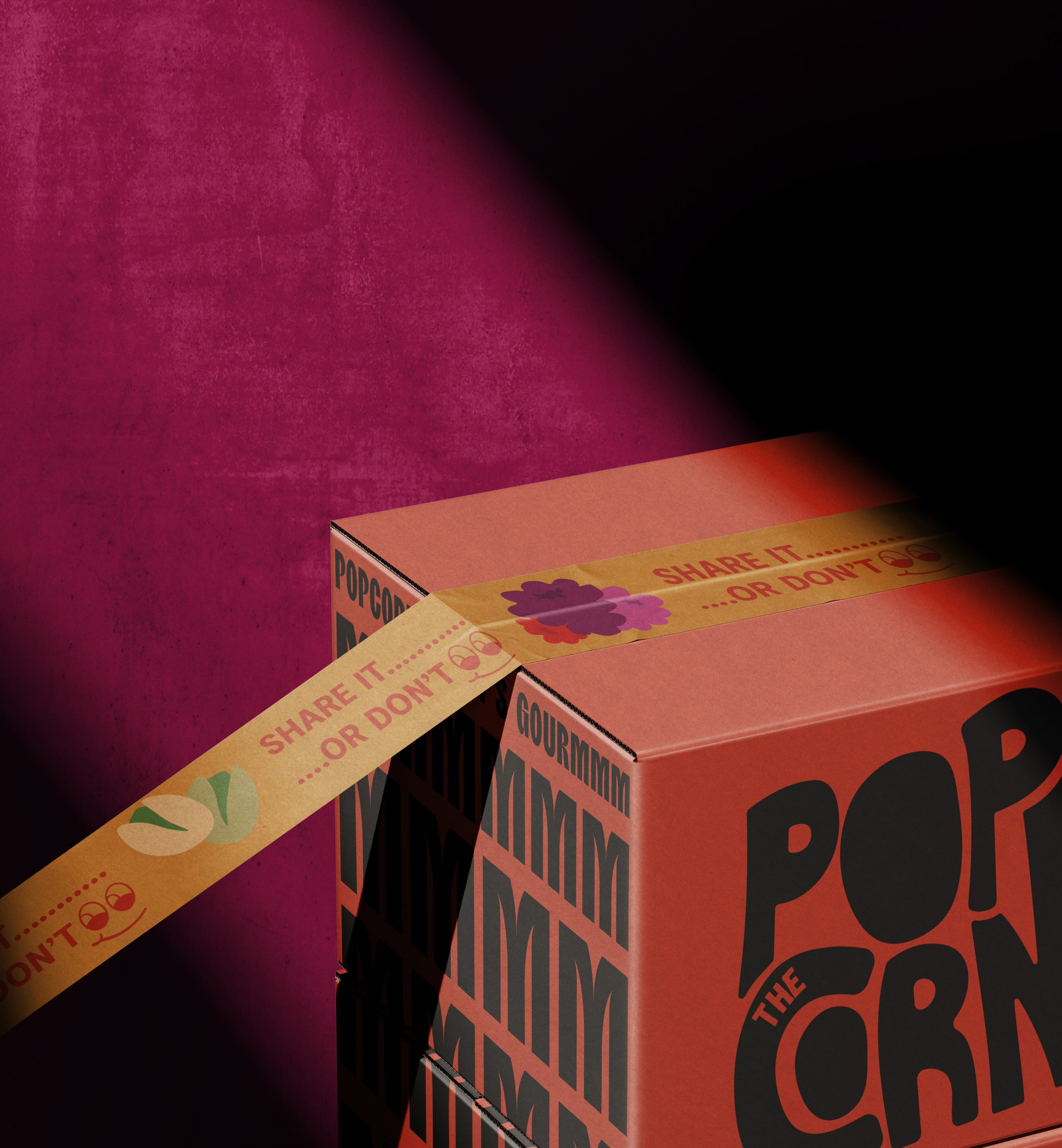
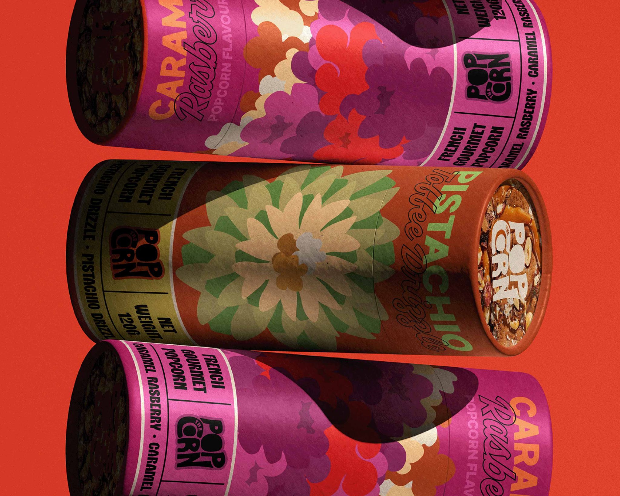
The gourmet popcorn selection is built to showcase vibrant flavour combinations through illustrations paired with intense, playful colours. The key to giving the packaging its engaging feel was telling a story with each flavour, such as using layered illustrations for the raspberry flavour to highlight its sweetness and energy, while having the pistachio with a more refined and artisanal feel by having the pistachios lined up as flower petals, with popcorn in the centre. By incorporating playful copy like “gourmmmmmmet,” the packaging design goes beyond visuals, reinforcing the brand’s whimsical tone while maintaining a minimal, refined overall experience.
This approach to the packaging design made the brand memorable and eye-catching when displayed, celebrating the rich, vibrant flavours of France through popcorn while making it something for everyone to enjoy.