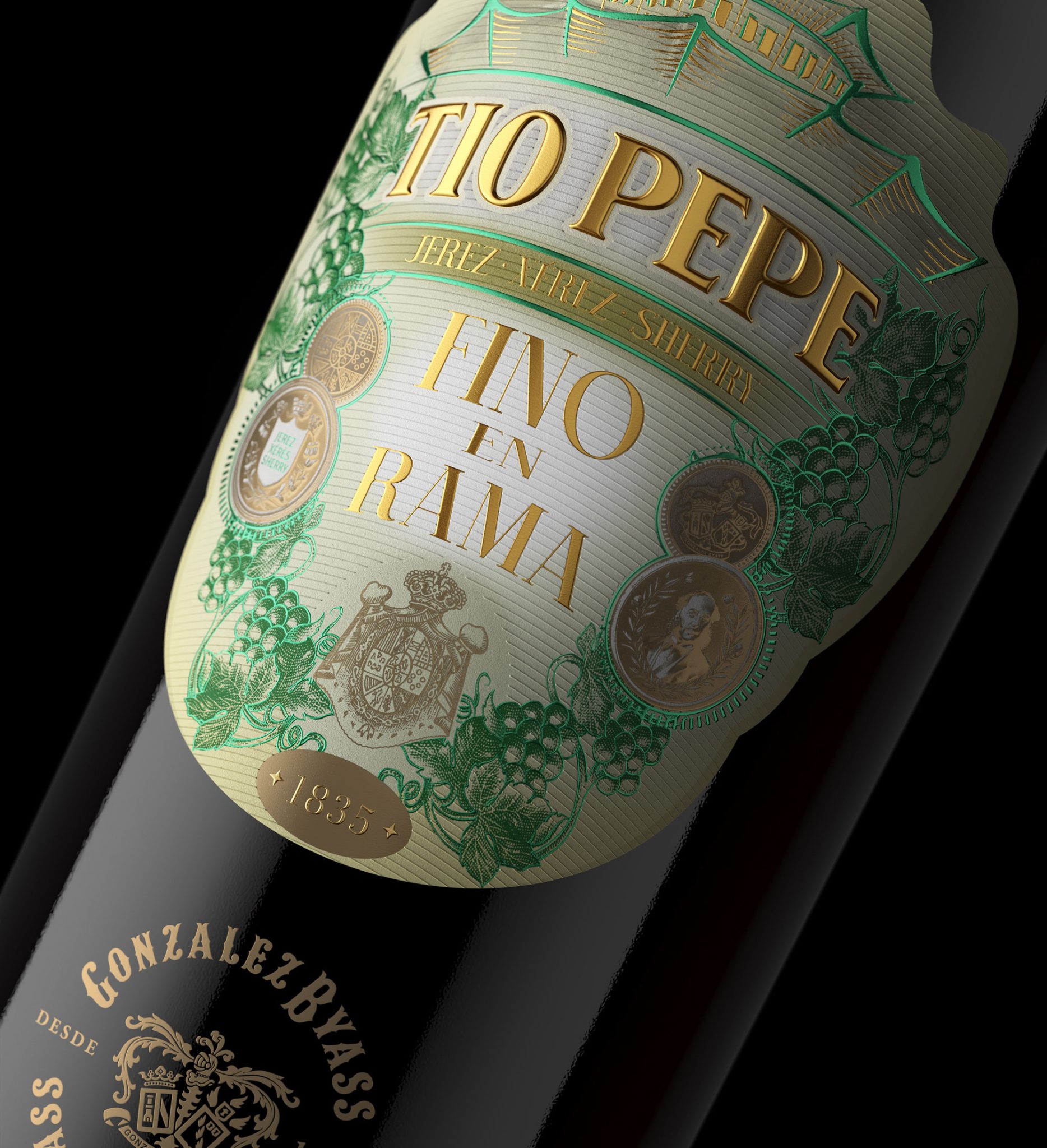

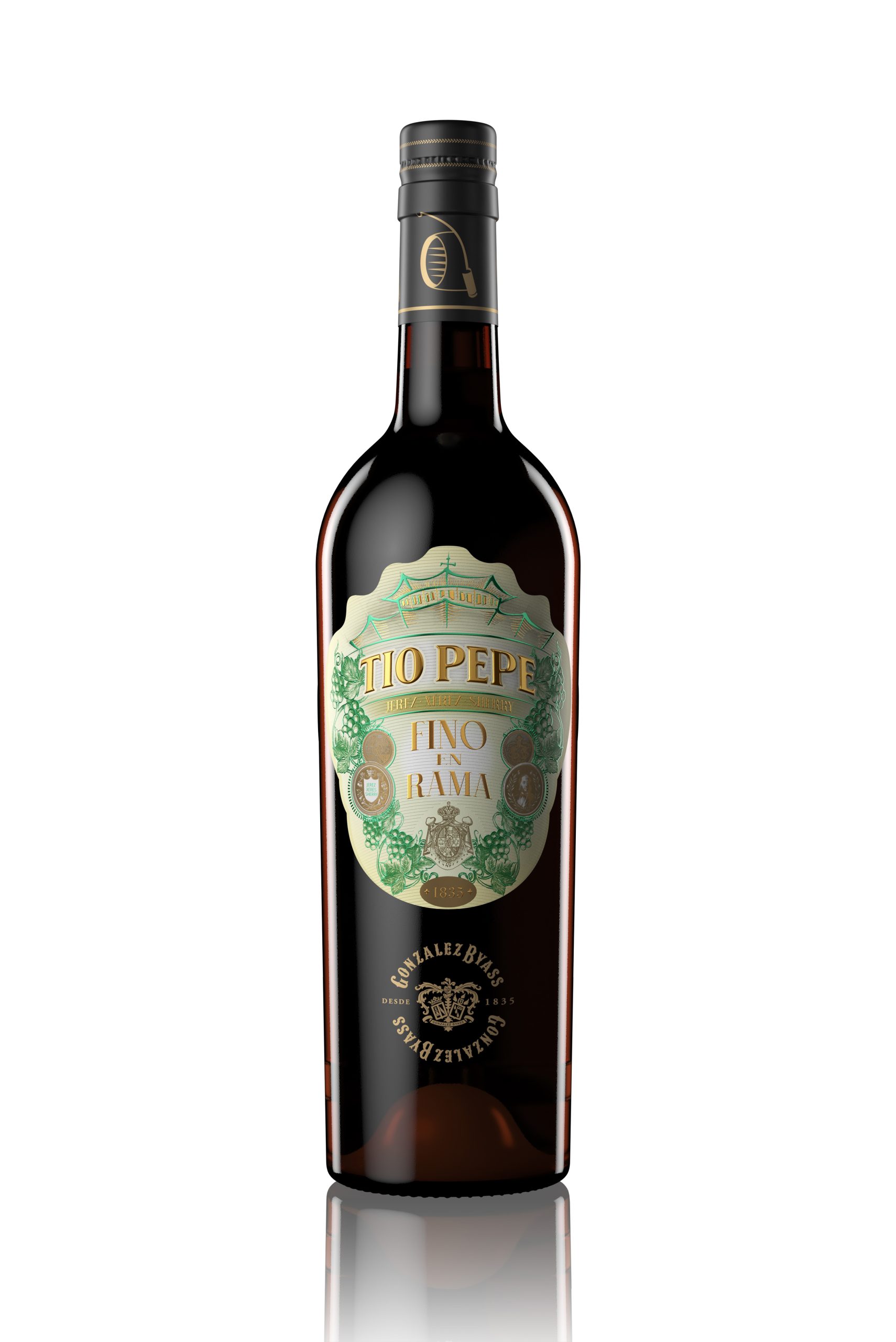
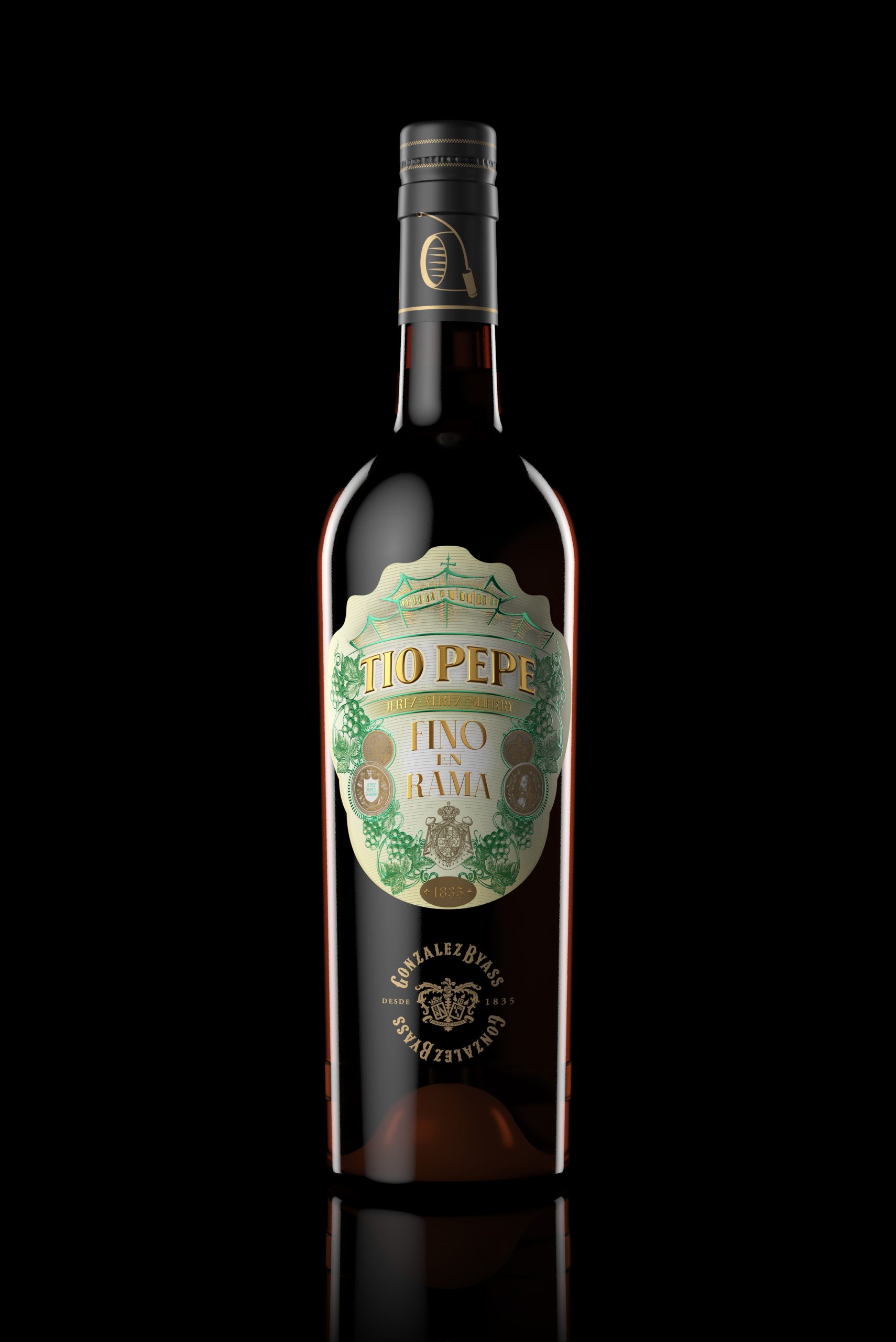
Each spring, Antonio and Silvia carefully select some of our finest casks to present Tío Pepe in its most essential state: unfiltered, straight from the cellar, with its full organic expression intact.
Thus, Tío Pepe en Rama 2026 is born — a living fino where the balance between biology and craftsmanship is expressed with precision. This year’s conditions have favored an optimal development of the flor yeast, bringing greater complexity and definition. In the glass, it shows a pale, slightly hazy golden color; on the nose, notes of chalk, salinity, nuts, chamomile, and citrus; on the palate, it is dry, fresh, and saline, with a fine bitterness and a long finish.
A limited edition that captures the purest expression of Jerez.
Design, art, and technique
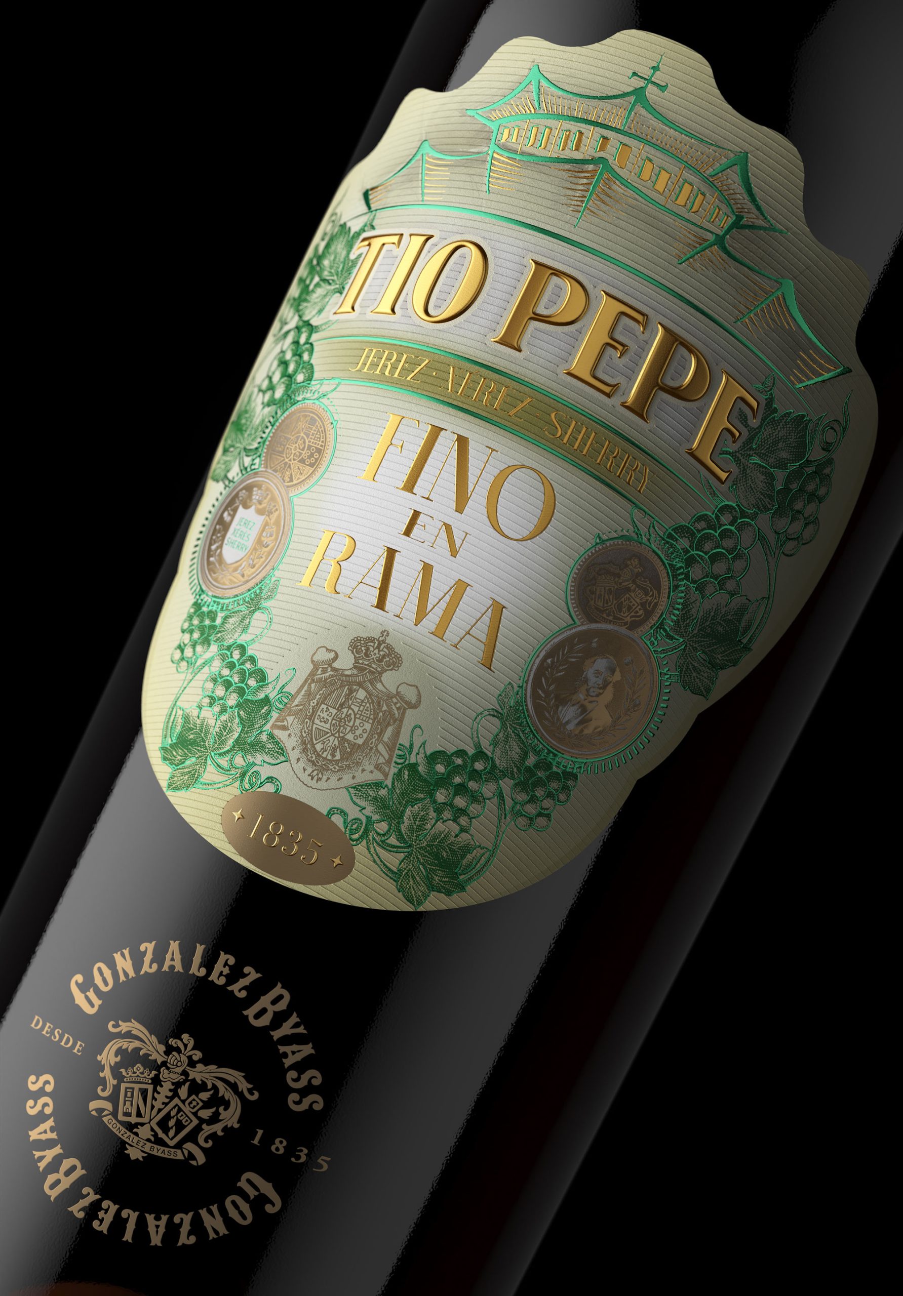
The label is built on Avery Dennison Fasson Lin Fiber 110 g/m² recycled paper, a visible-fiber stock whose absorption and texture reinforce the tactile and organic reading of the en rama concept. Printed in offset CMYK + 2 spot colors, enabling controlled chromatic reproduction and precise management of solids, screens, and illustrative nuances.
The header features the illustration of La Concha winery, a key element of the González Byass visual heritage, while the TIO PEPE logotype is executed in elegant pure liquid gold (manual application), creating a focal point of maximum reflectance, volume, and hierarchy on the front.
A double hot foil stamping system enhances the brand’s heritage and value: aureolin gold as the primary light-bearing layer, and Arqué ultra jade green introducing material contrast and depth. The Palomino Fino grape illustrations are developed in continuous perimeter flow, acting as a narrative layer that wraps the packaging and amplifies its sensory dimension.
A balance between technical precision and material expressiveness, elevating shelf perception and reinforcing the unique character of the edition.
Printing specification
Uncoated 110 g/m² substrate with medium-high absorption. Prepress in CMYK + 2 Pantone colors under PSO Uncoated v3 (FOGRA52), AM screening at 250 lpi, with controlled TVI (18–22%) and medium-high GCR to stabilize neutrals. Ink densities adapted to uncoated stock with TAC limited to 280%, ensuring gray balance stability. Spot inks optimized for the green/ochre range with overprint in critical transitions.
Knockouts defined under metallic elements, trapping set at 0.08–0.12 mm, and controlled overprint for blacks and fine lines. The logotype is produced in liquid gold screen printing (high ink deposit, 120–140 threads/cm mesh, ±0.10 mm tolerance), complemented by double hot foil (aureolin gold + jade green) with ±0.15 mm global registration tolerance.
Multilayer construction sequence (offset → drying → screen printing → foil stamping), with substrate tension control throughout. Die-cutting with minimum 2 mm bleed and 1.5–2 mm safety margins.
Quality control targets ΔE < 3 against certified proof, with verification of inter-process registration and inspection of dot gain, screen integrity, fine line definition, and foil adhesion.
Final result: a system where paper absorption and metallic reflectance build hierarchy, depth, and a balanced perception between industrial precision and organic expressiveness.

 Derrick Lin
 Axiniya Knyazeva
 Hadi Samir
 Atiq Alam
 Furt Goods
 宏洛图品牌设计HONGLT
 Ampersand Creative
 Modern Theory
 Palashcc
 neo creative studio
 Valérie Colace
 Anshuman
 Archi Jain
 DESIGN CONCEPTS
 Shapers Studio
 jamajkajakub
 tamara barakat